Propelled figma Learning
This project served as a catalyst for significantly enhancing my Figma prototyping skills and overall comfort level with the platform. It provided a comprehensive learning experience, allowing me to fully leverage Figma's features to optimise button design, alignment, visual hierarchy, and grid systems within my designs.
Through a comprehensive user testing approach, including A/B testing, in-depth interviews, affinity mapping, storyboard analysis, and fly-on-the-wall observation, I gained valuable insights that directly informed the design's aesthetics. This meticulous user-centered research allowed me to refine the visual hierarchy and illustration style to ensure the design resonated effectively with its target audience.
RSPCA Mobile App
The task is to create a mobile app prototype that addresses the mentioned problems, while staying true to the RSPCA branding and design language, and incorporating modern UX design principles for a contemporary audience. The RSPCA team expects three initial design concepts with their own variations, outlined as follows:
1 Context variation catering to new owners interested in adopting a rescue pet
2 Aesthetic variation utilising the photon design language, emphasising illustration, iconography, and high contrast colours
3 An accessibility variation specifically designed for visually impaired, particularly low-vision users, requiring higher contrast in UI design to accommodate challenges related to small font sizes and iconography.
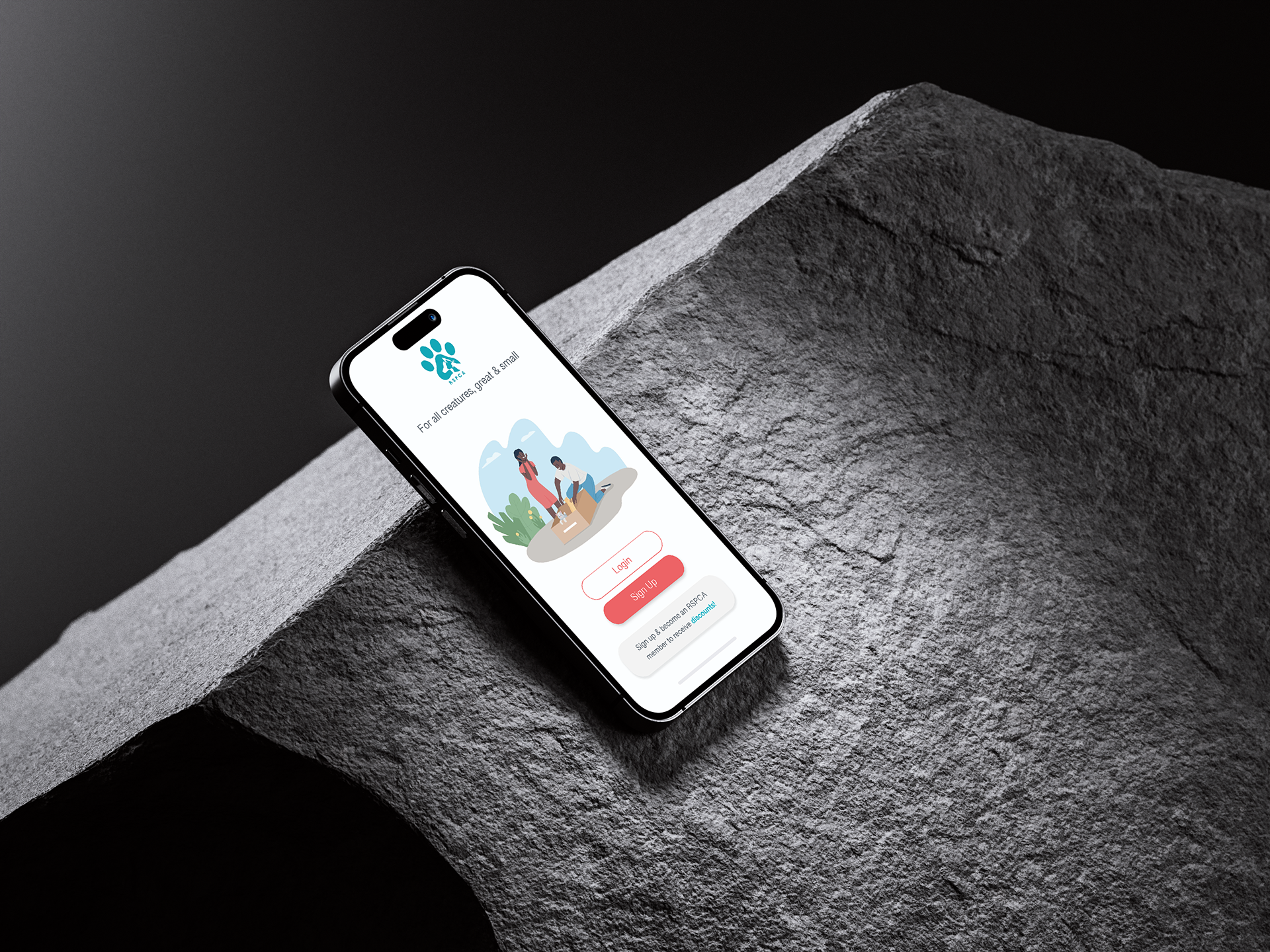
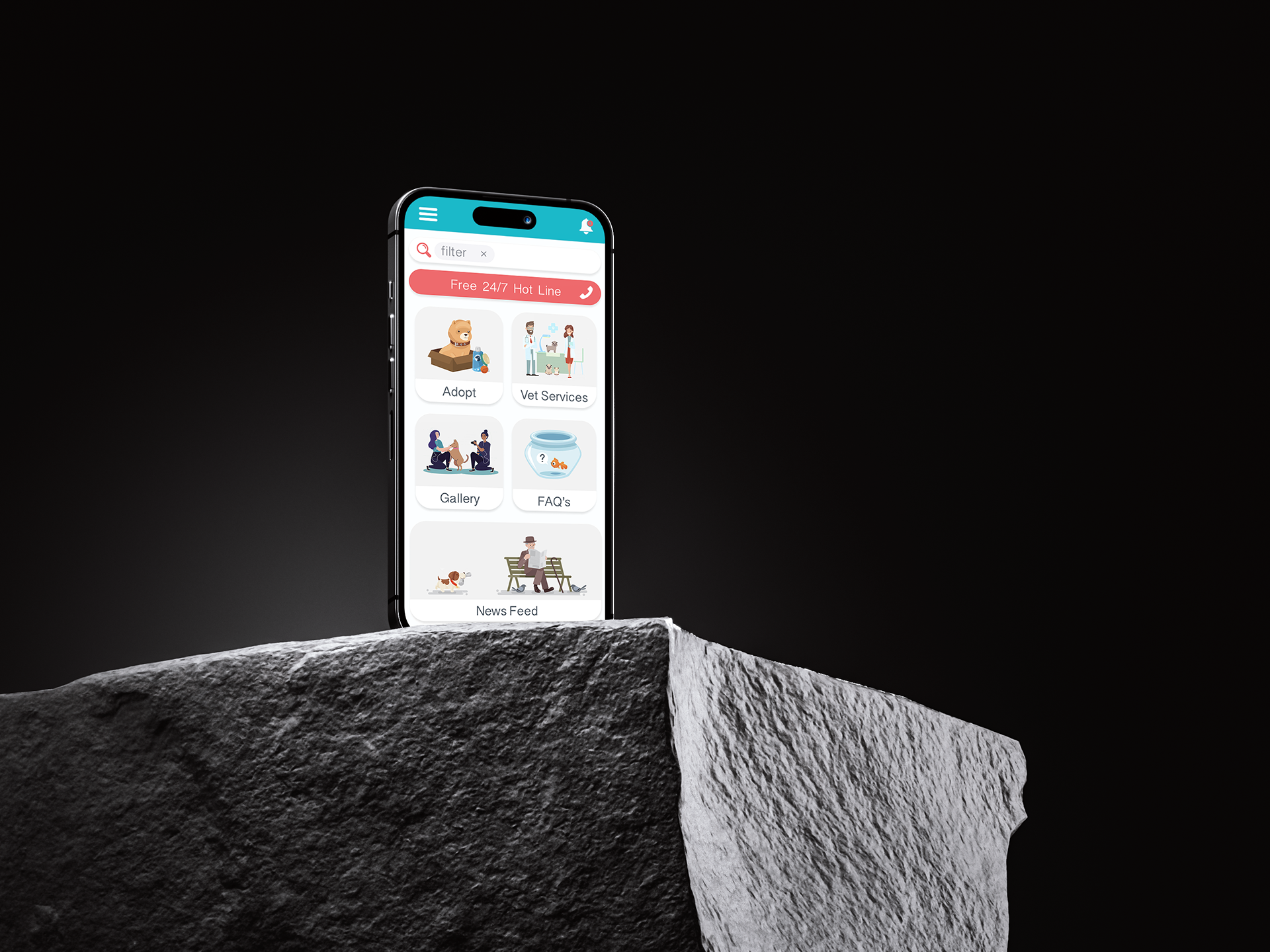
ui / ux - visual communication through illustration & iconography
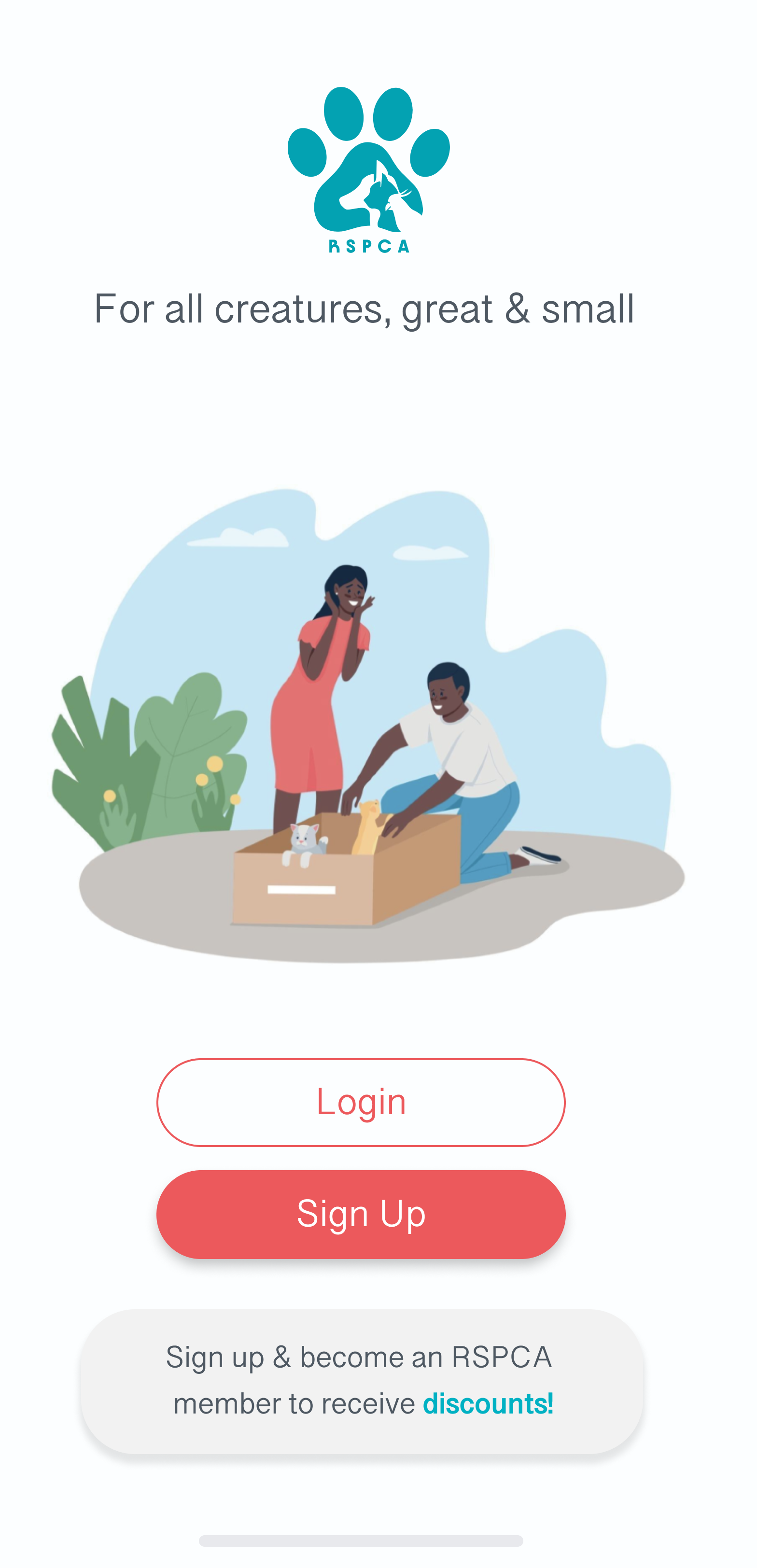
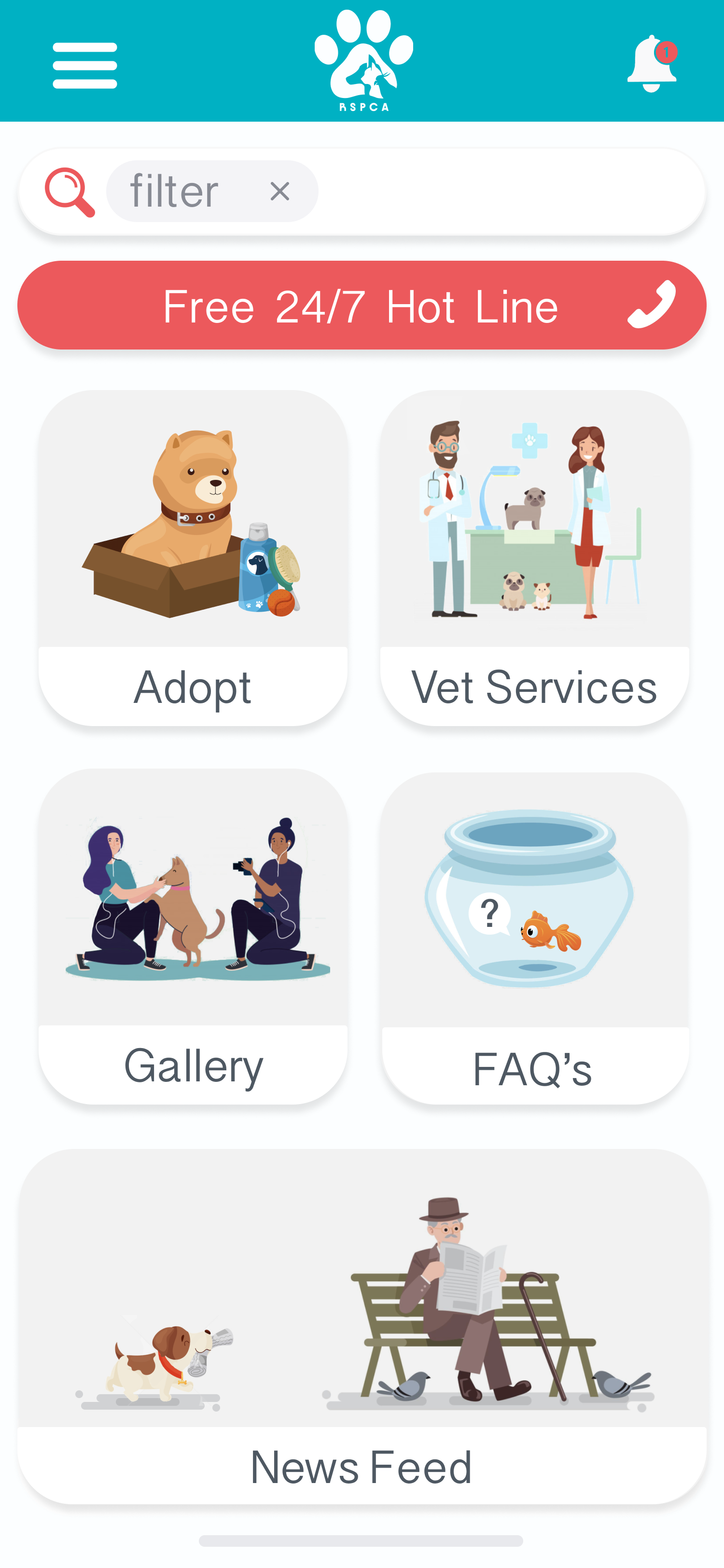
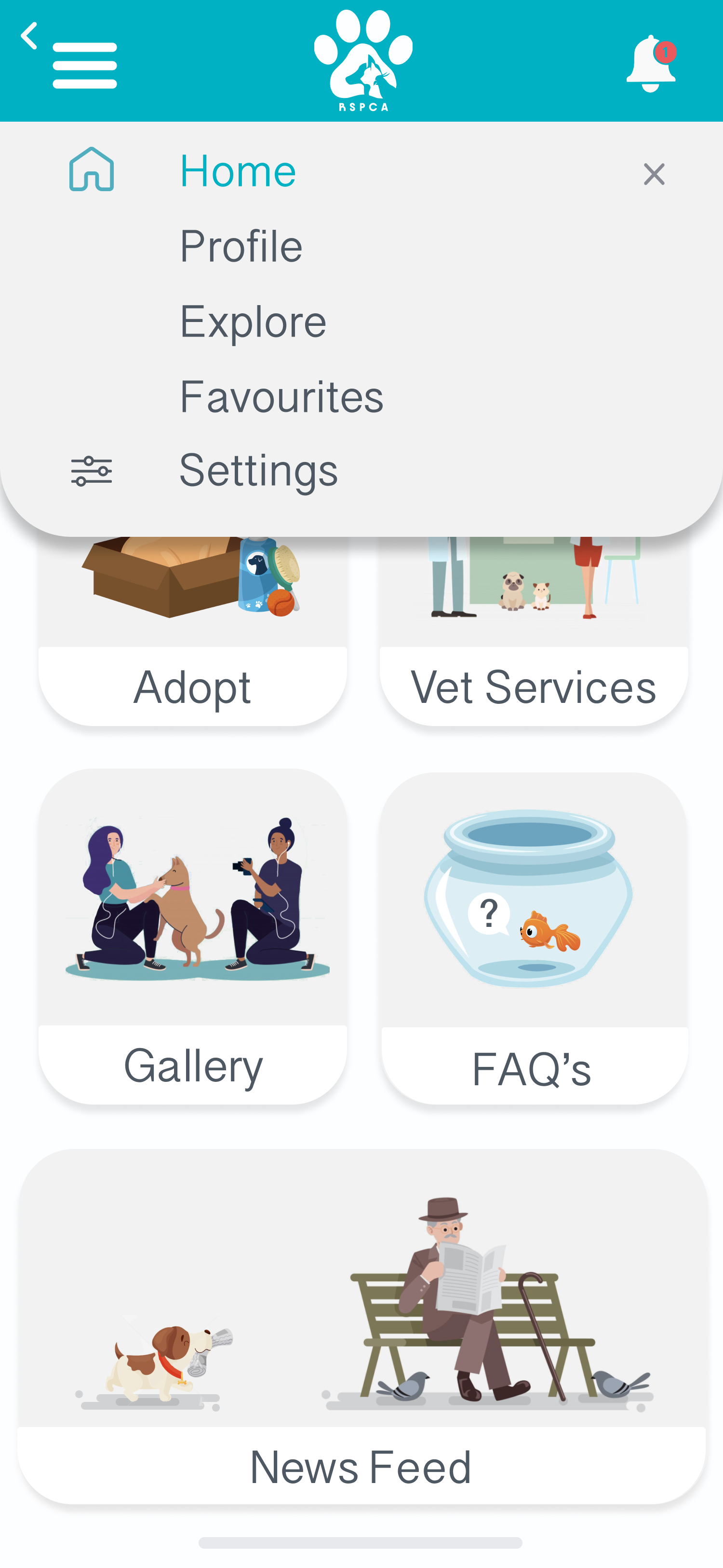
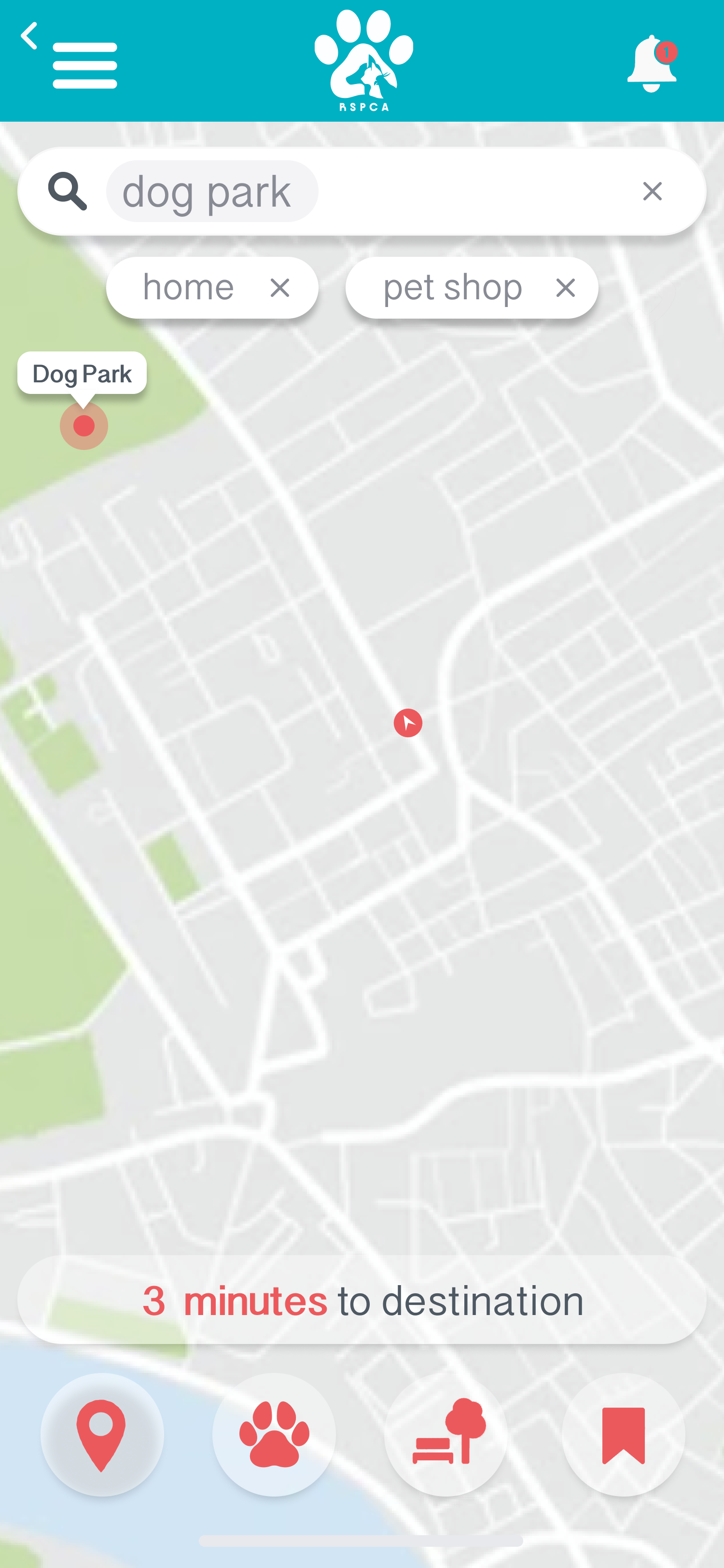
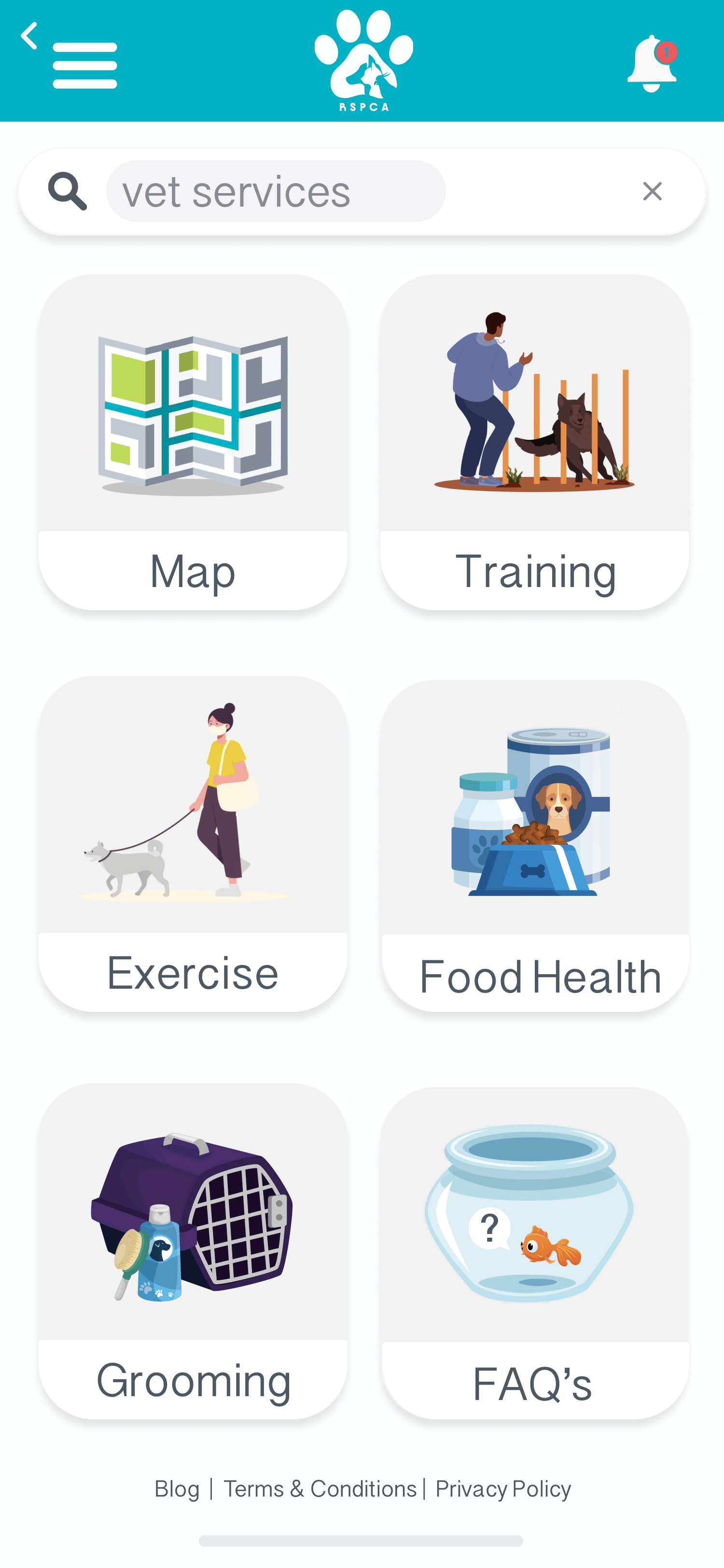
Leveraging illustration and iconography, I effectively communicated key design features. Illustrations provided clear visuals, while icons, drawing upon universal symbols, conveyed ideas instantly.
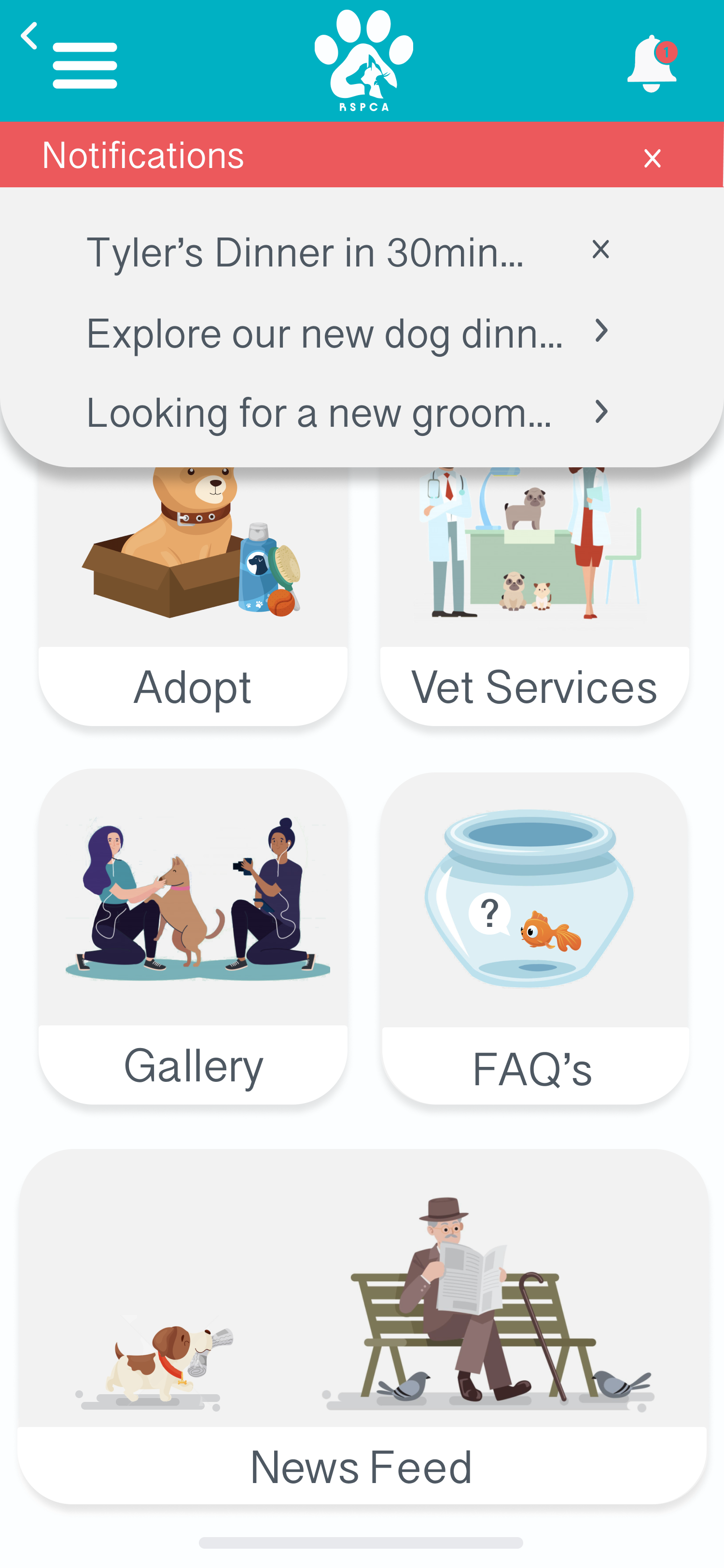
The colour palette utilised a vibrant contrast of light aqua and red, strategically placed to highlight important information. Light greys and whites ensured optimal background readability.
Following the Western reading style, I prioritised the placement of crucial features and information at the top, where the viewer's eye naturally focuses. This deliberate approach, considering context and concept variations, ensured clarity and visual hierarchy within the design.
