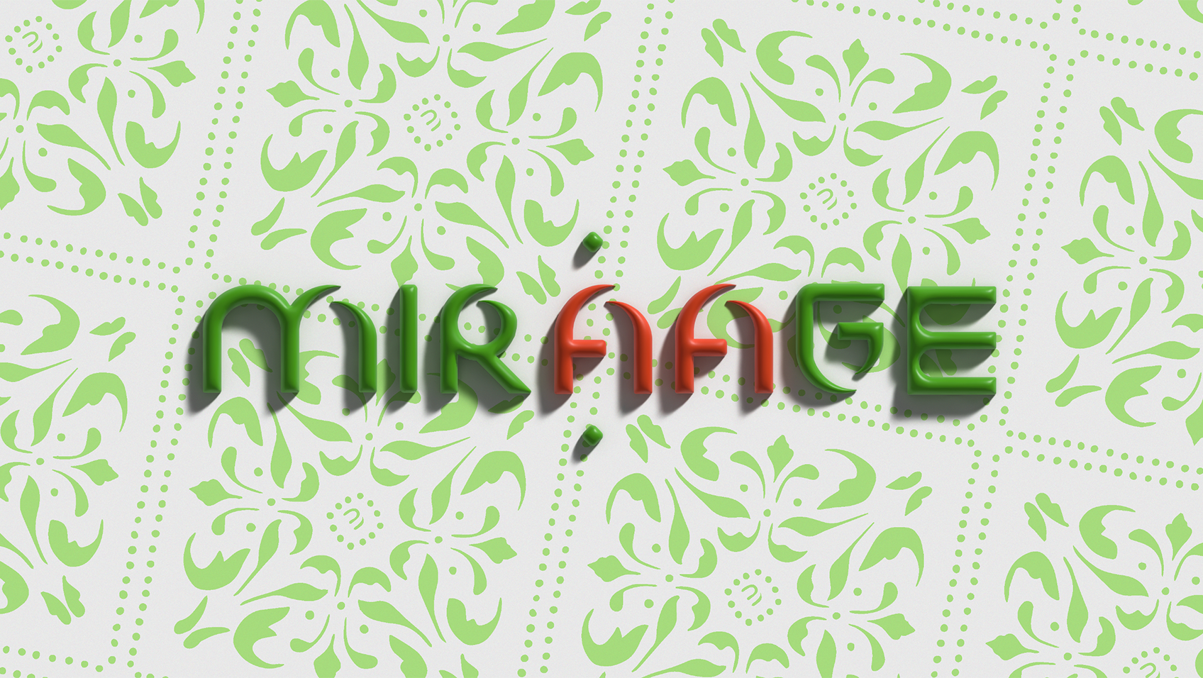
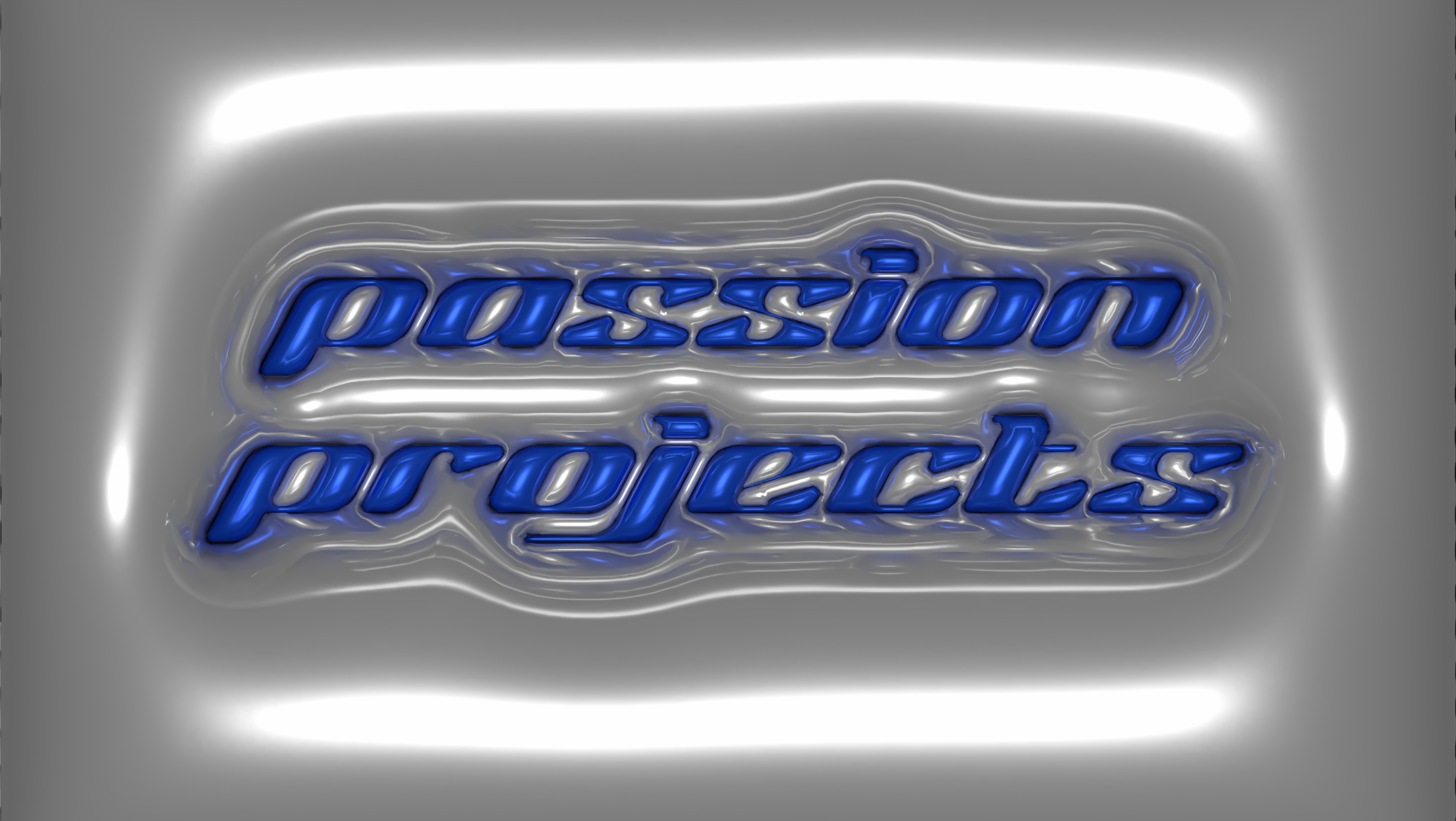
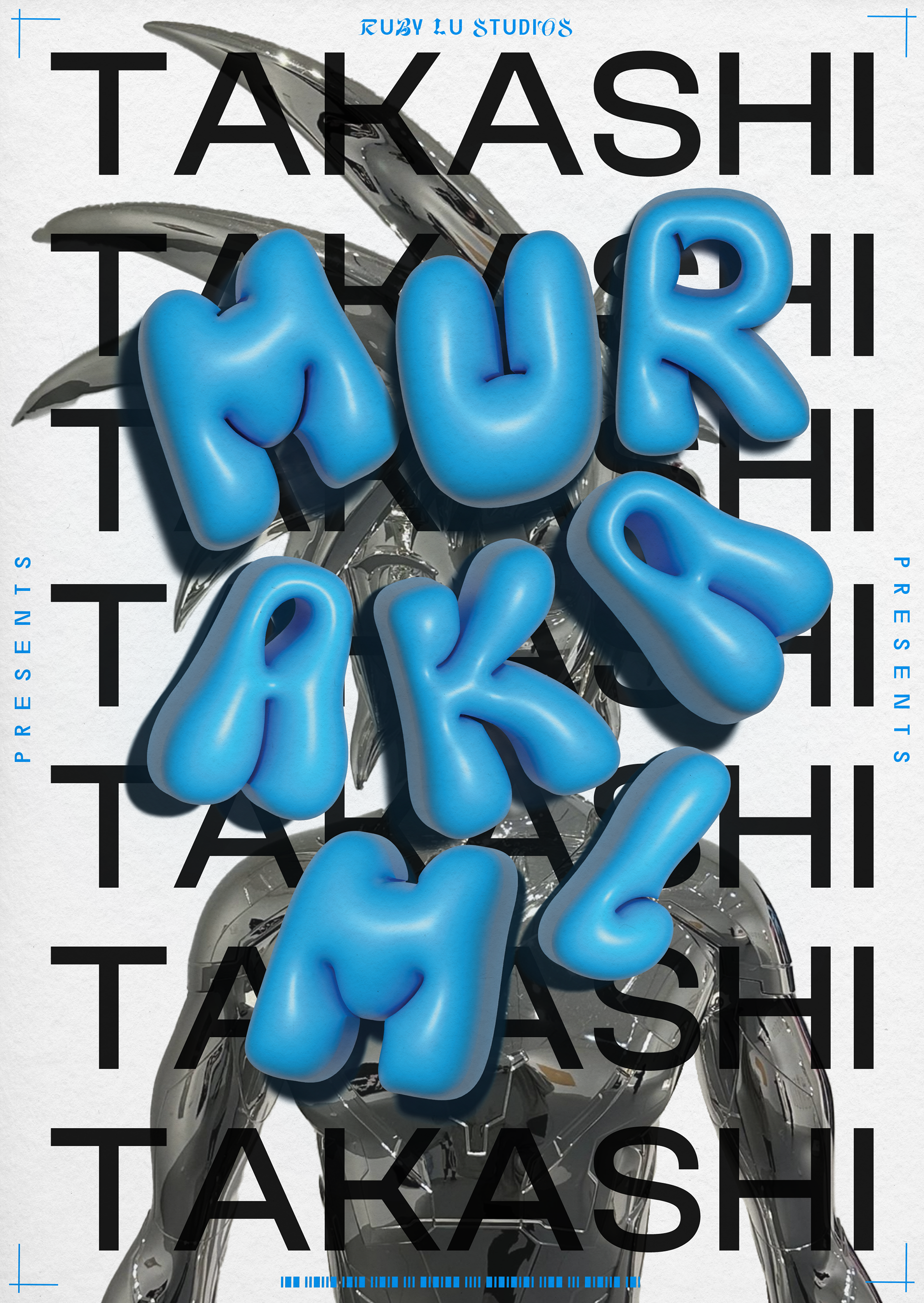
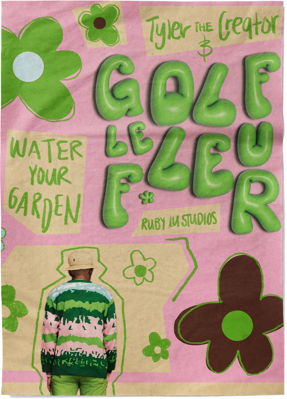
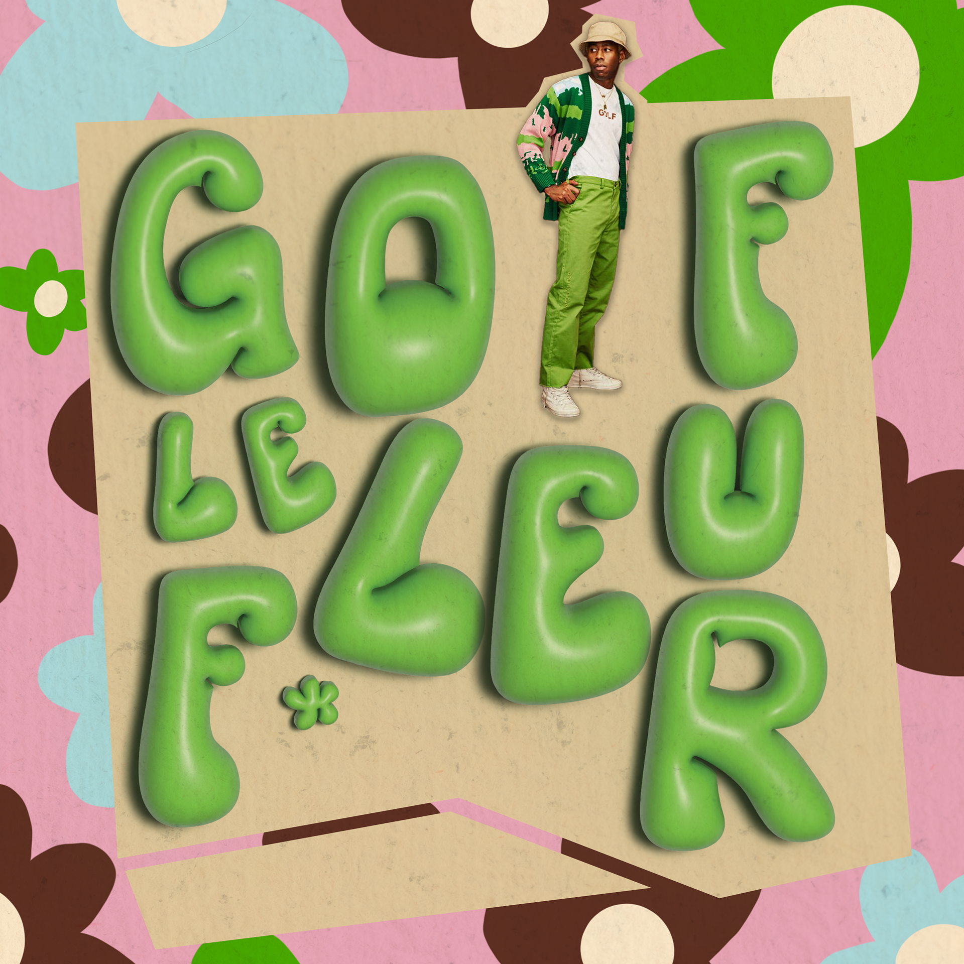
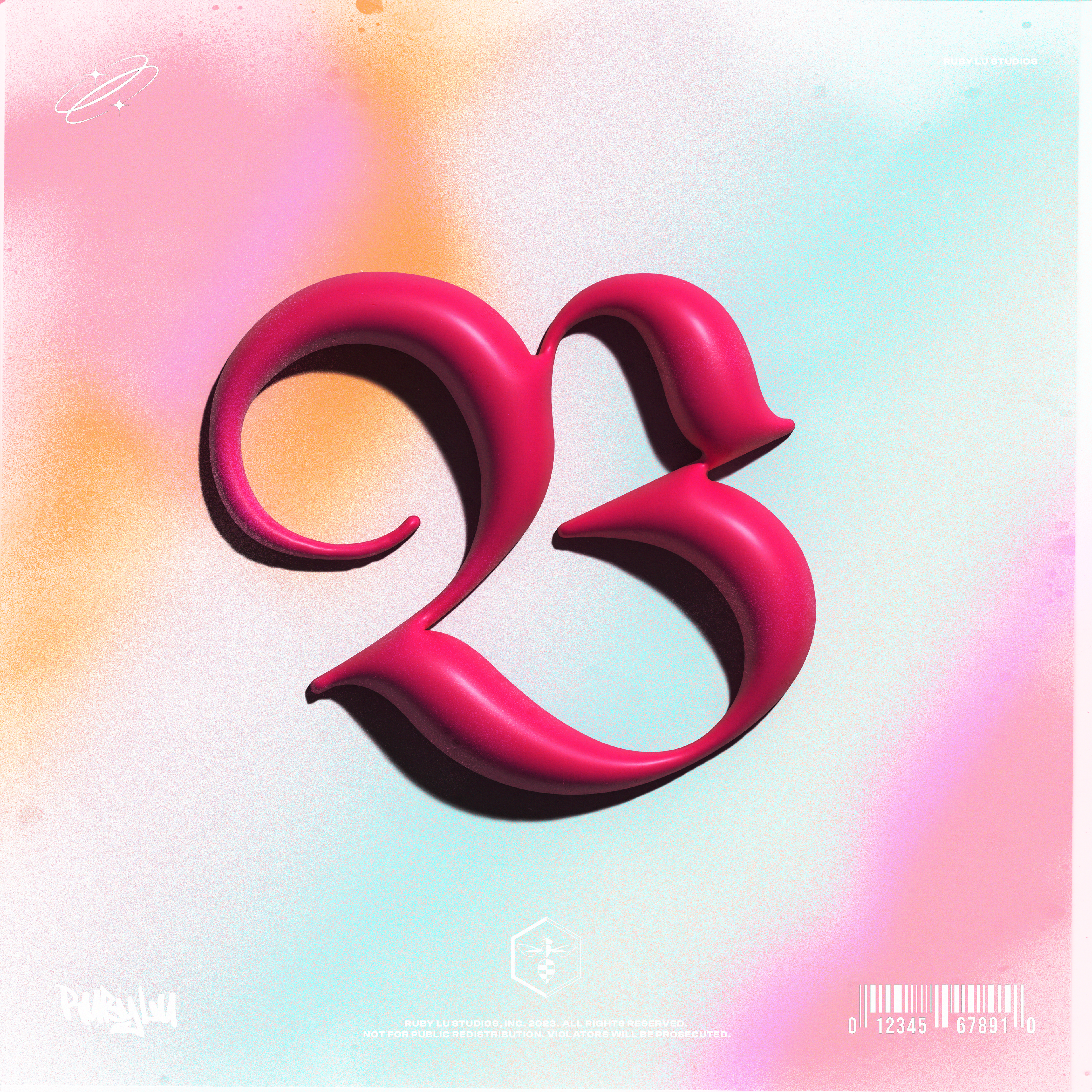
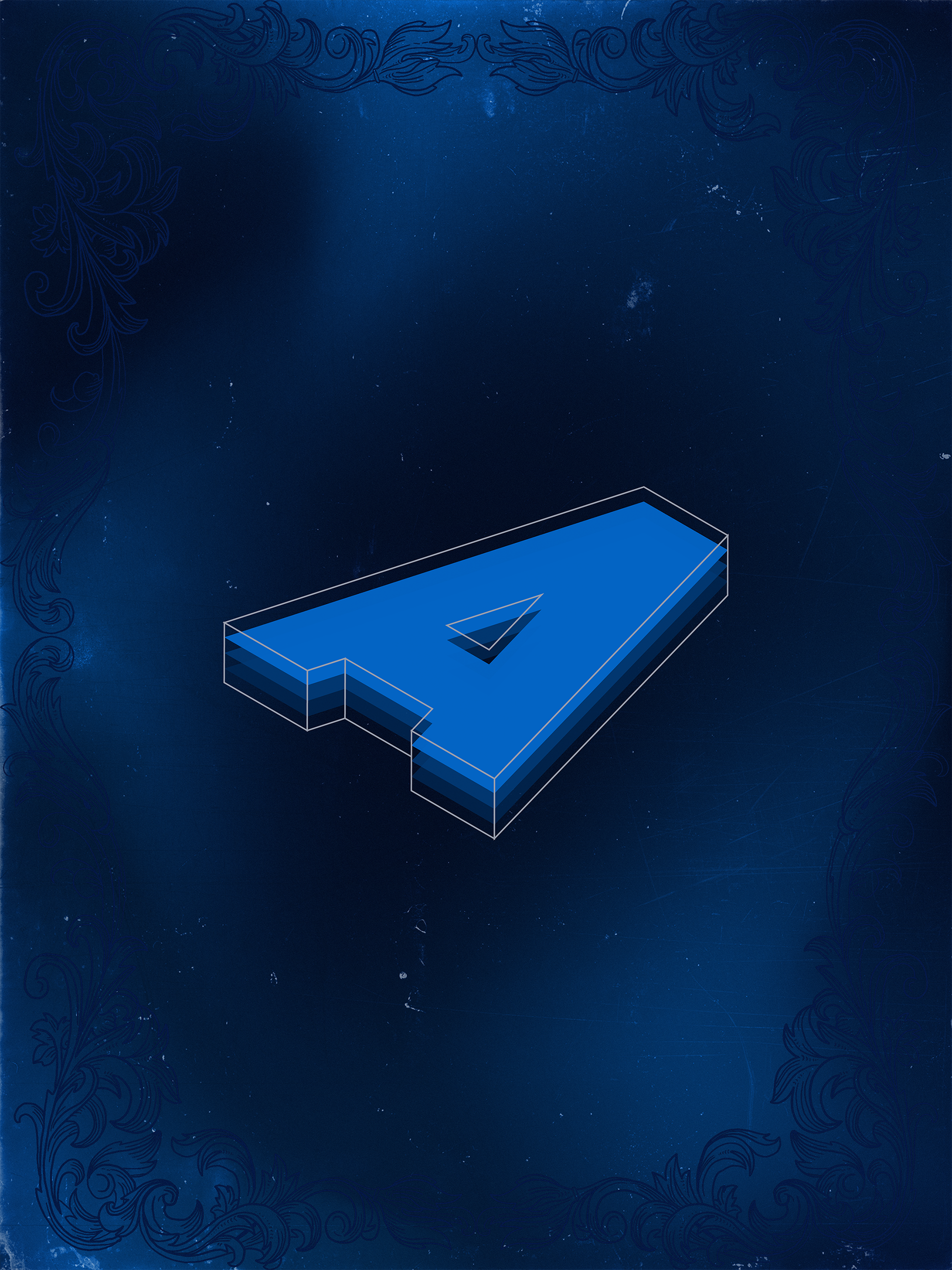
3d hyper-surrealism poster Design
Intrigued by the 2024 design trend of 3D hyperrealism, I utilised this style to explore and define my brand identity. These posters showcase familiar objects meticulously rendered in a hyper-realistic 3D style with playful twists, serving as a platform to discover the visual aesthetics that best represent my brand in print media and poster advertising.
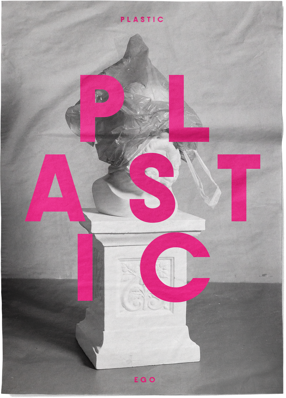
bold minimalist poster Design
The 2024 design trend of bold minimalism, with its focus on impactful simplicity, captivated me. This exploration revealed the inherent challenge of achieving an effective "less is more" aesthetic, where the power lies in the precise use of limited elements. While best suited for clear communication and artistic expression, it demands a deliberate approach to maximise impact within the world of print media and poster advertising.

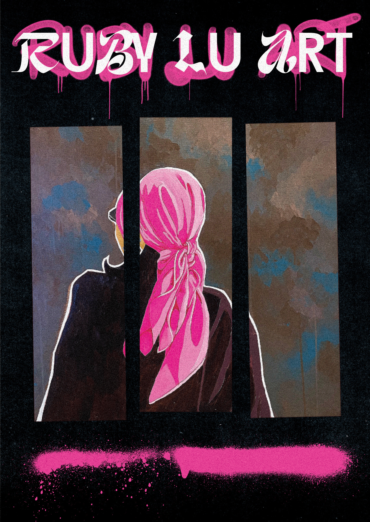
hand drawn poster Design
The 2024 design trend of hand-drawn posters, with its human touch and inherent personality, captivated my artistic spirit. This exploration allowed me to delve into the creative challenge of injecting personality into design, pushing the boundaries of what digital tools like Procreate could achieve. Experimenting with spray paint brushes and line work, I explored the expressive potential of each technique to create impactful poster designs.
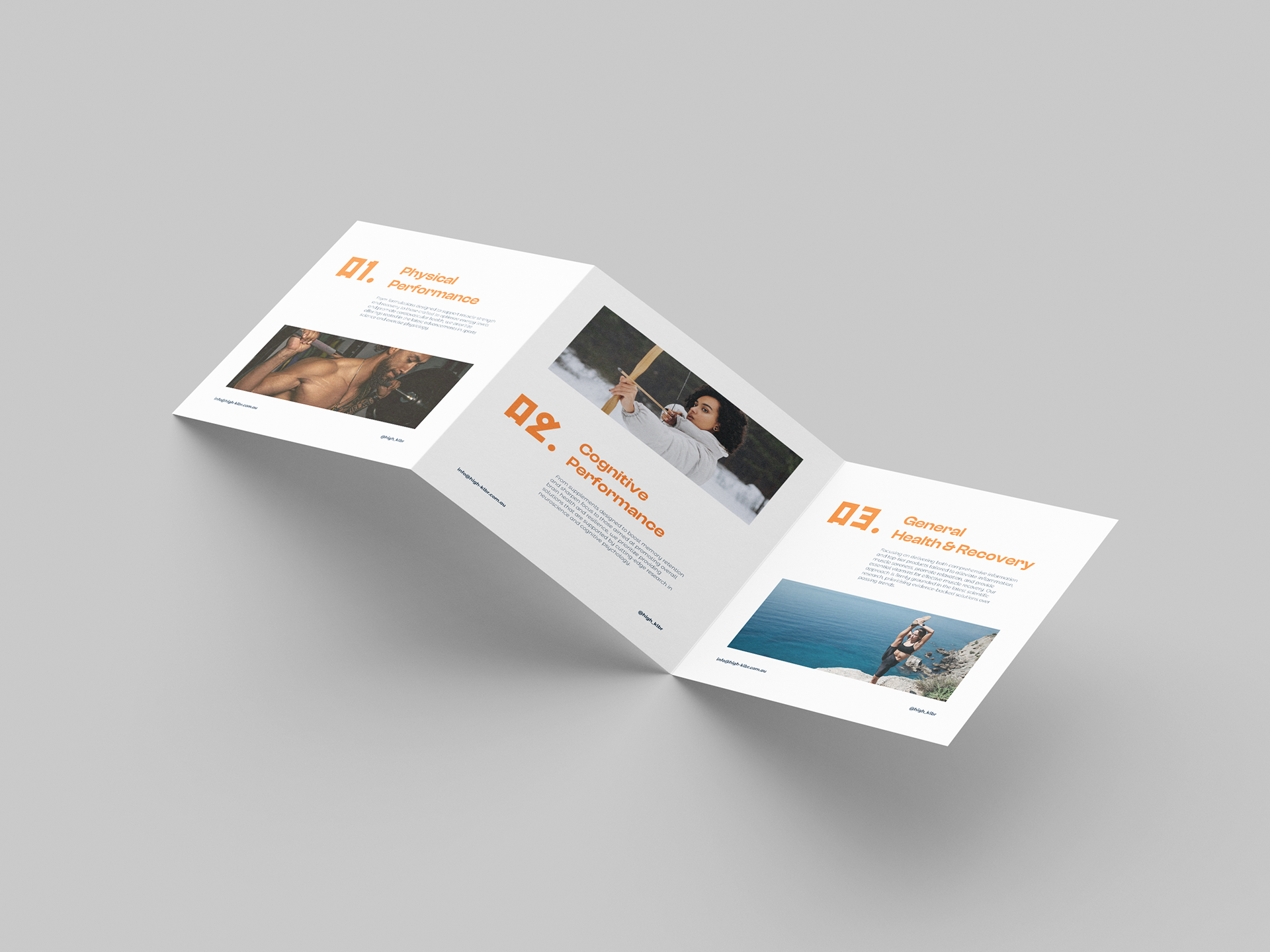
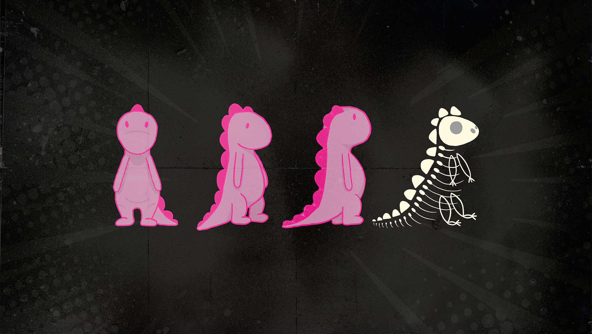
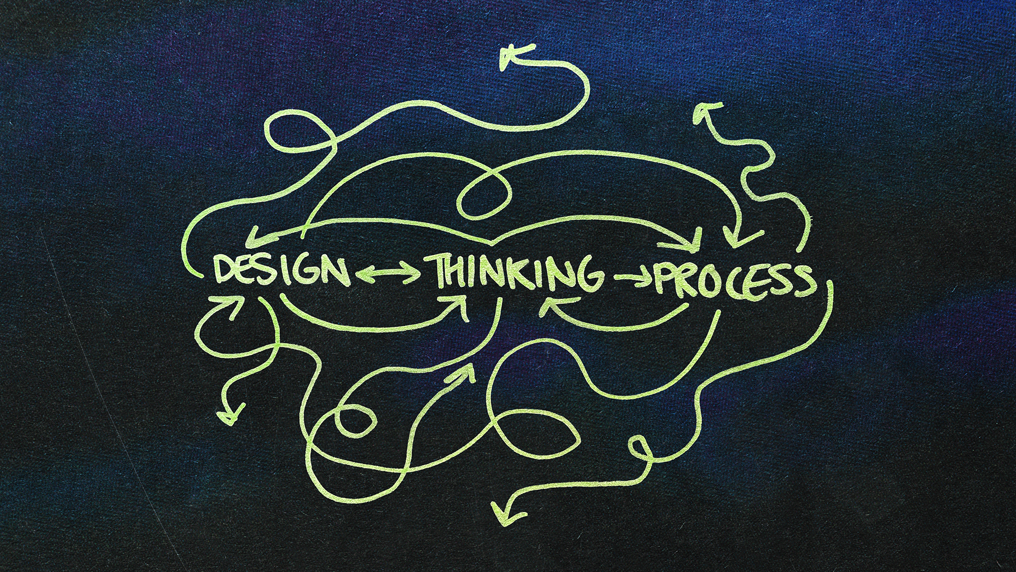
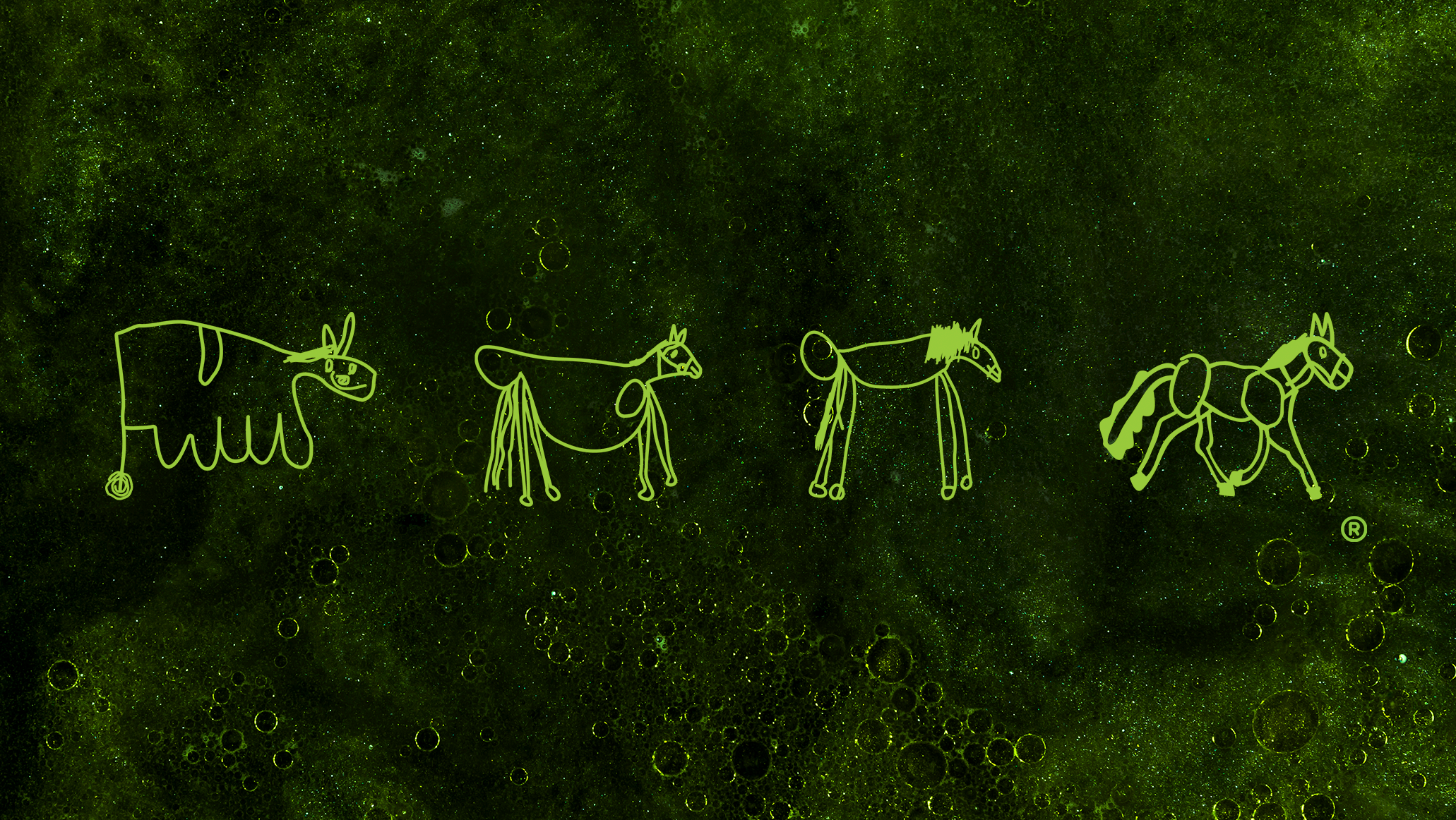
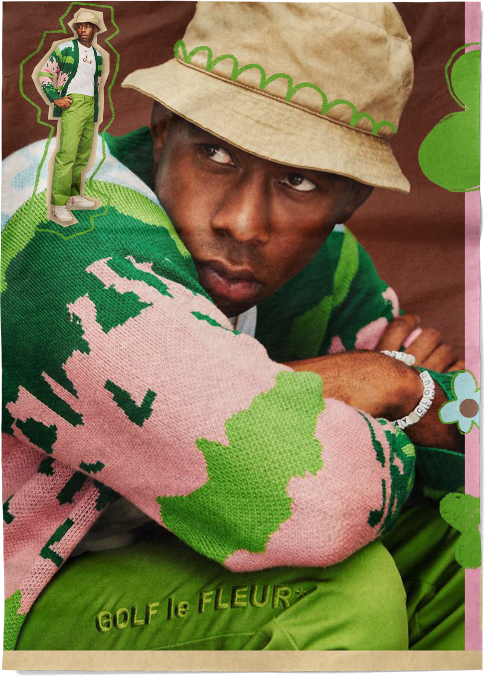
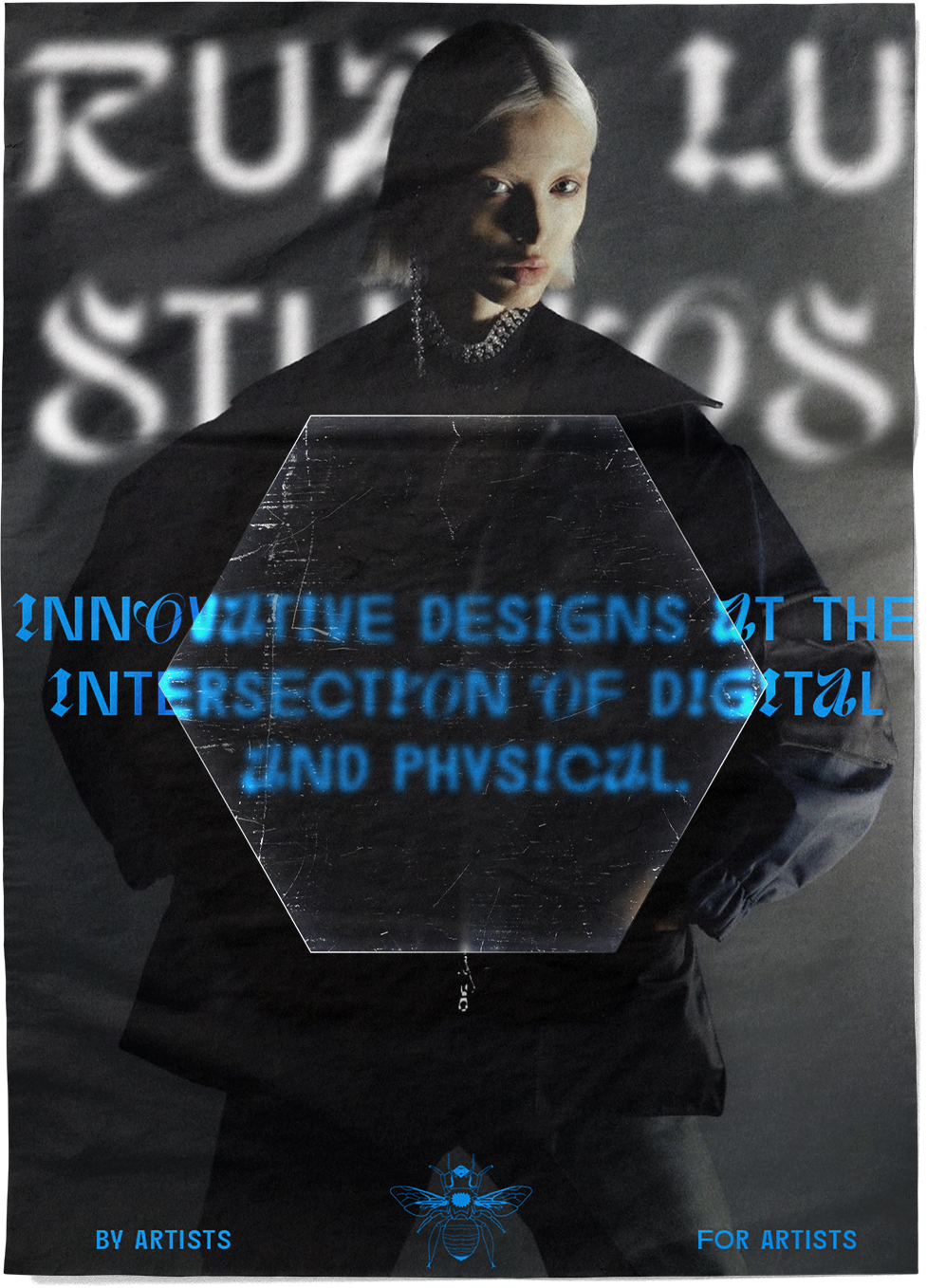
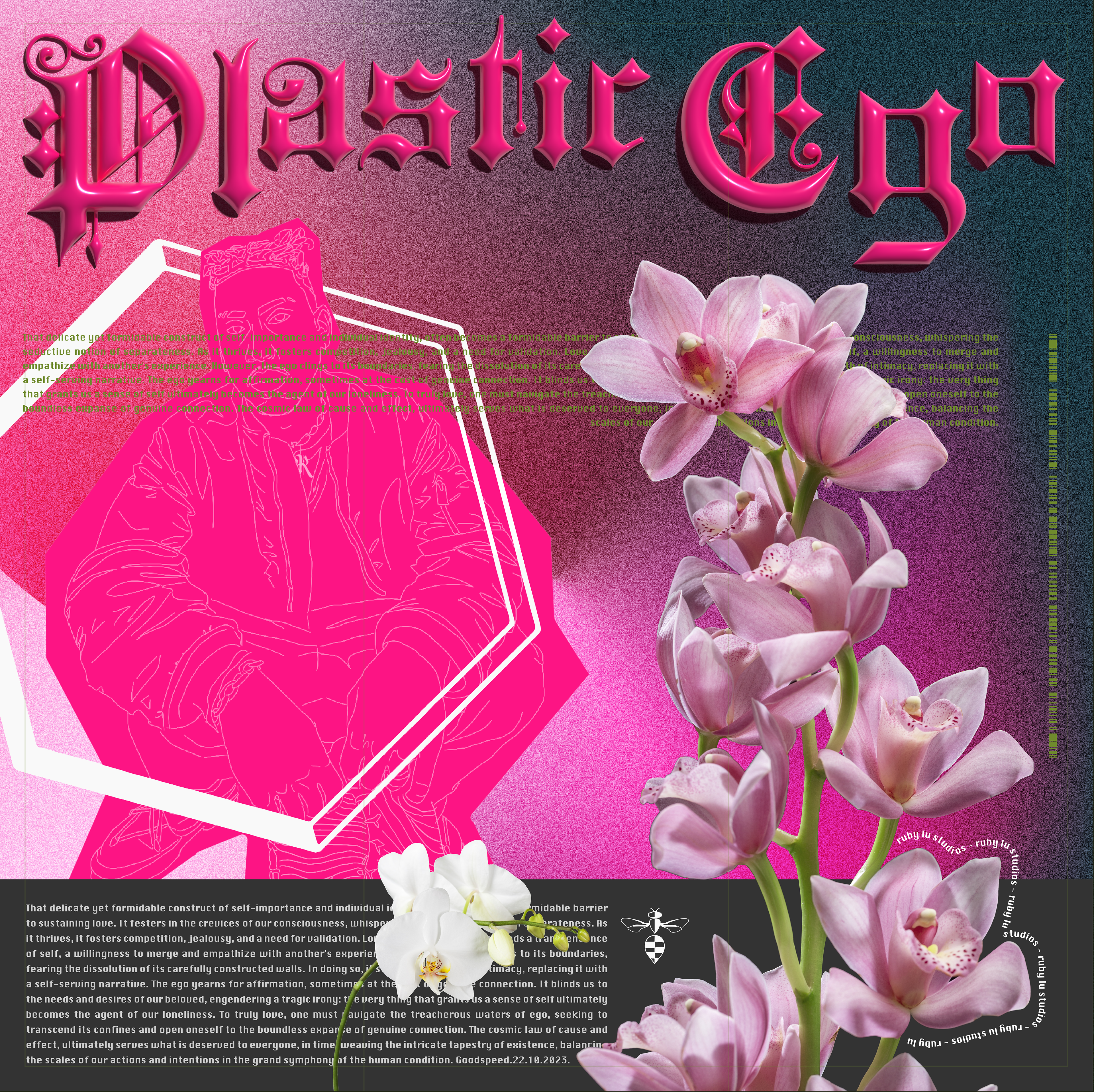
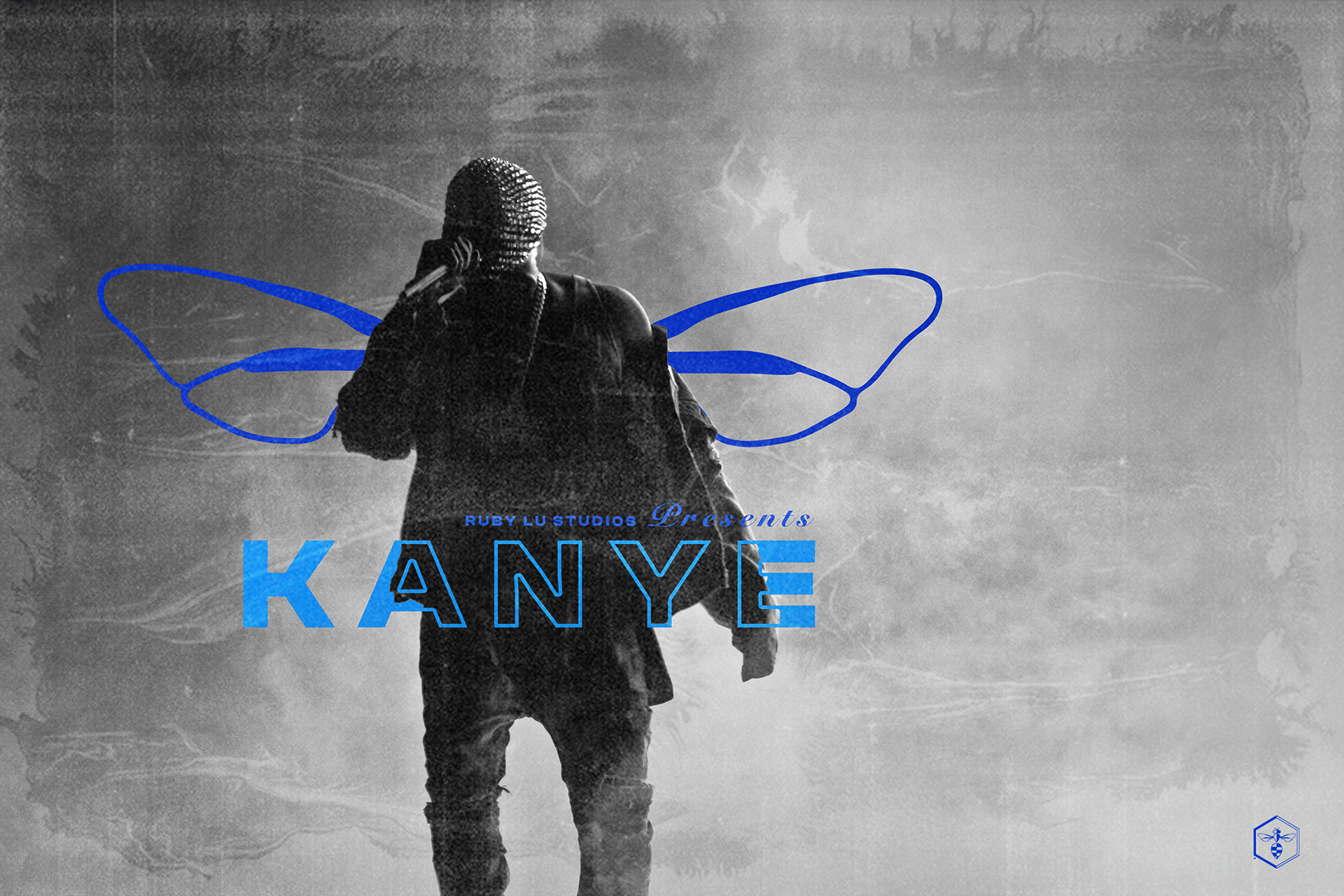
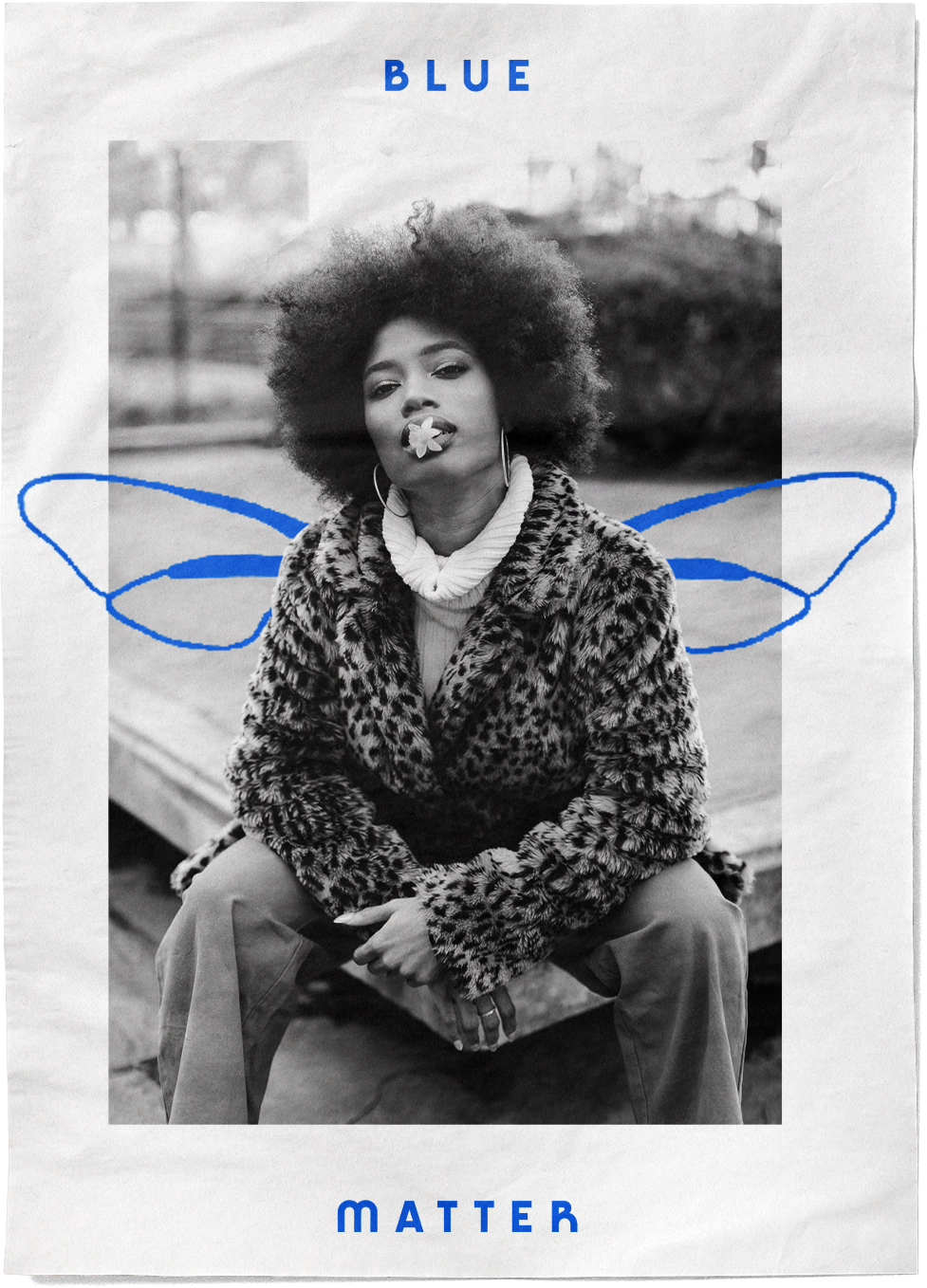
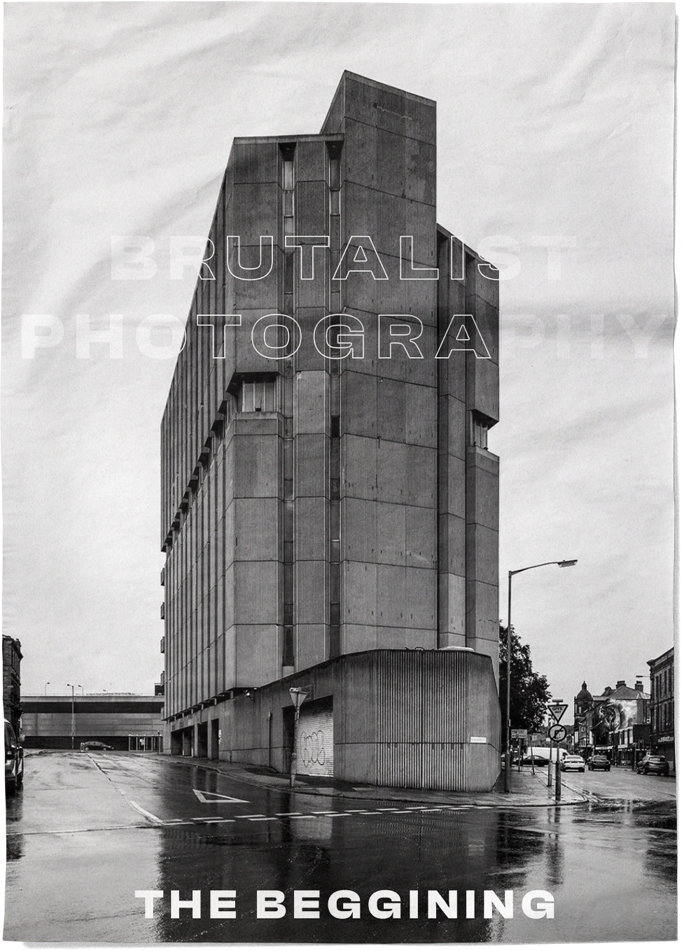
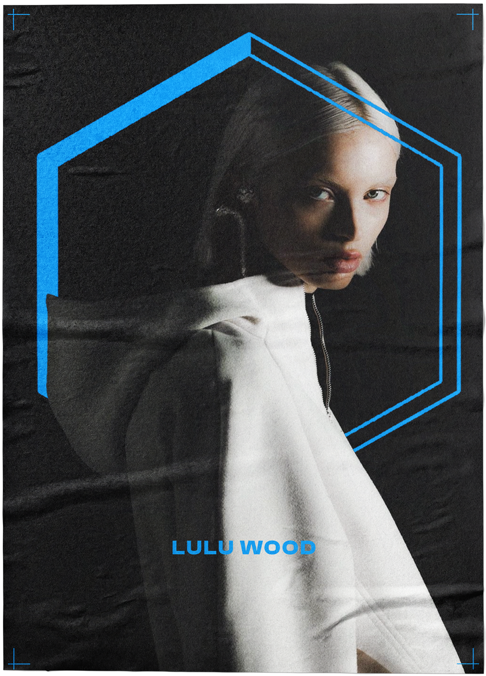
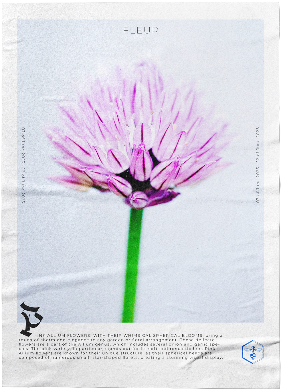
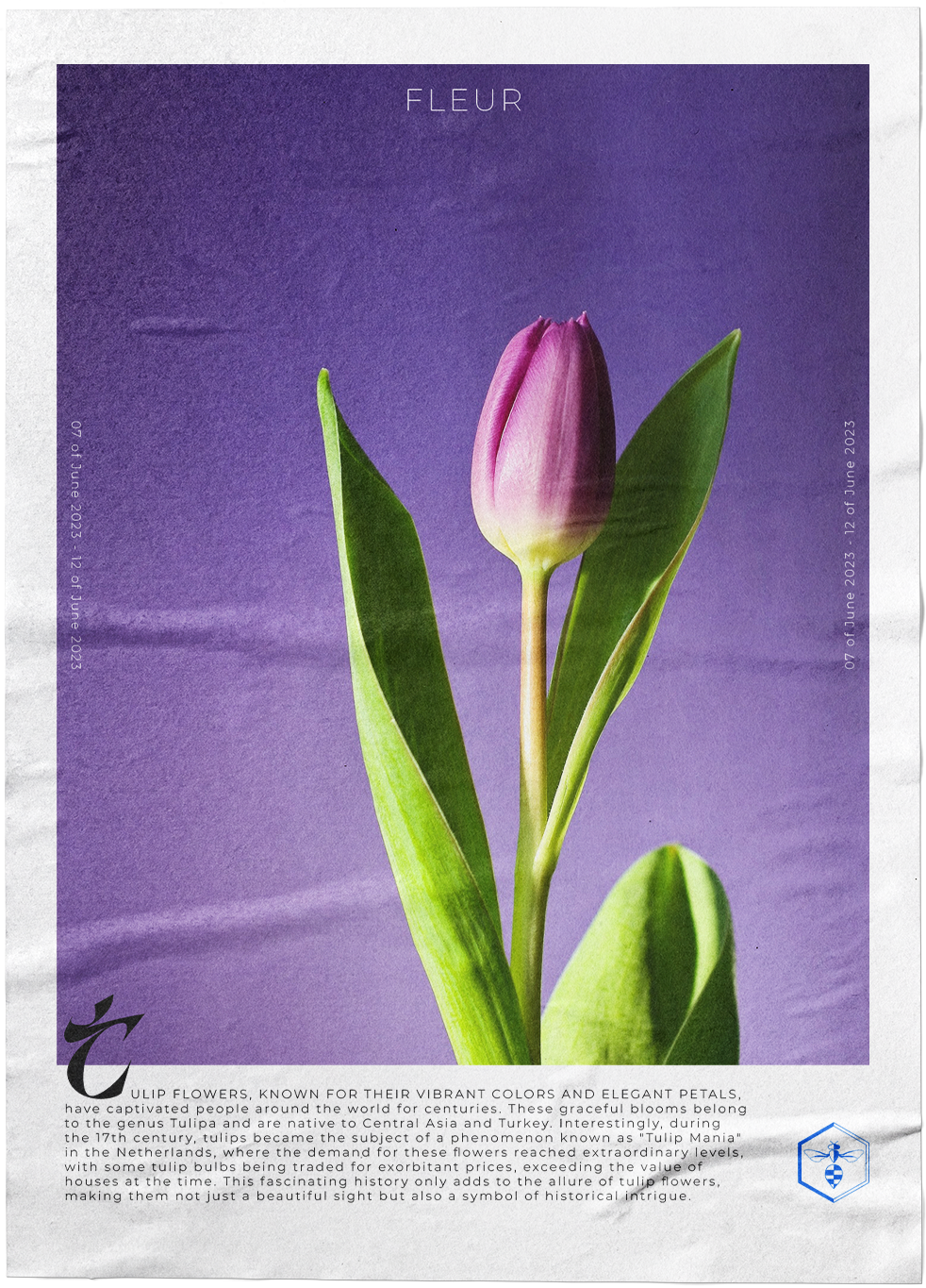
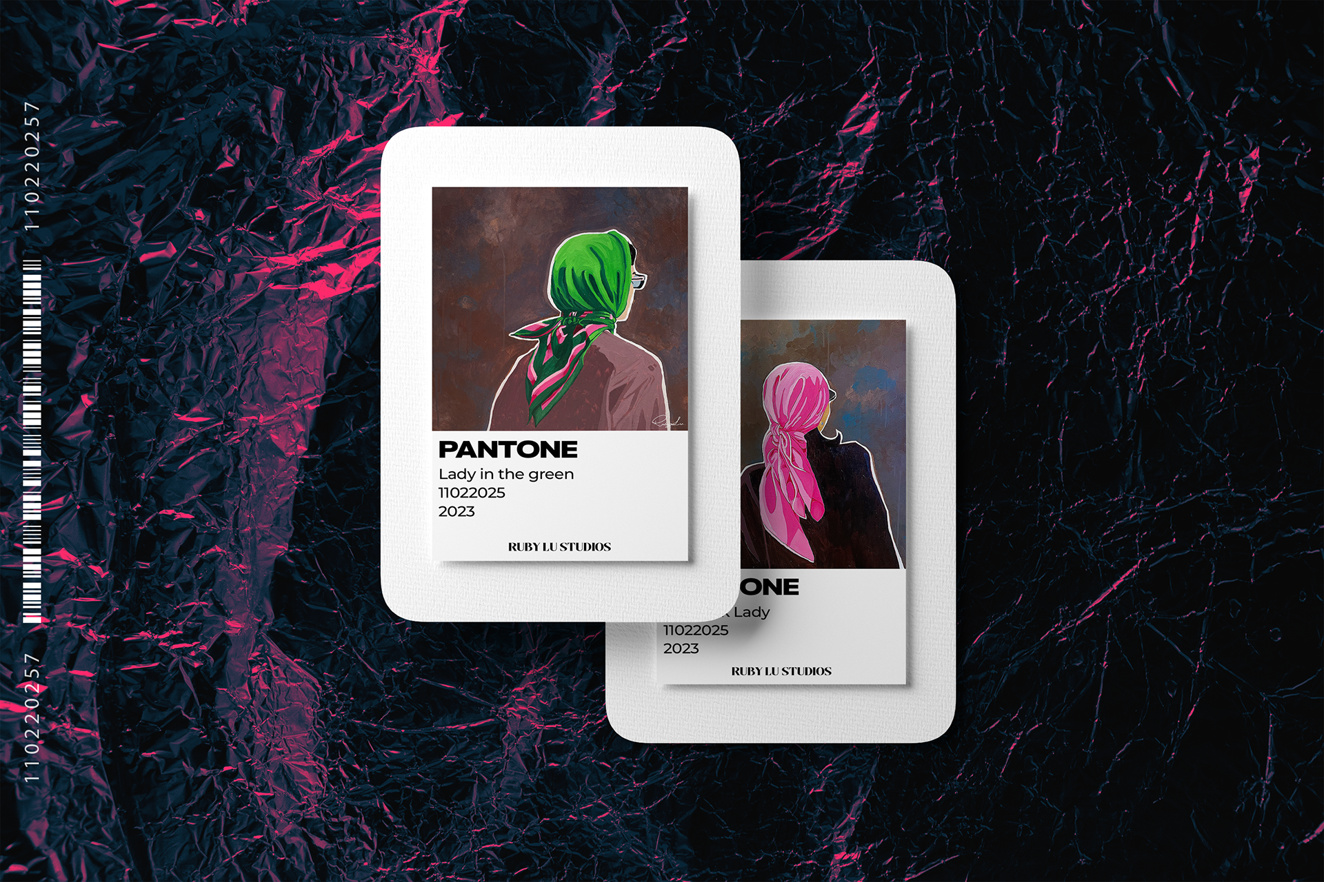
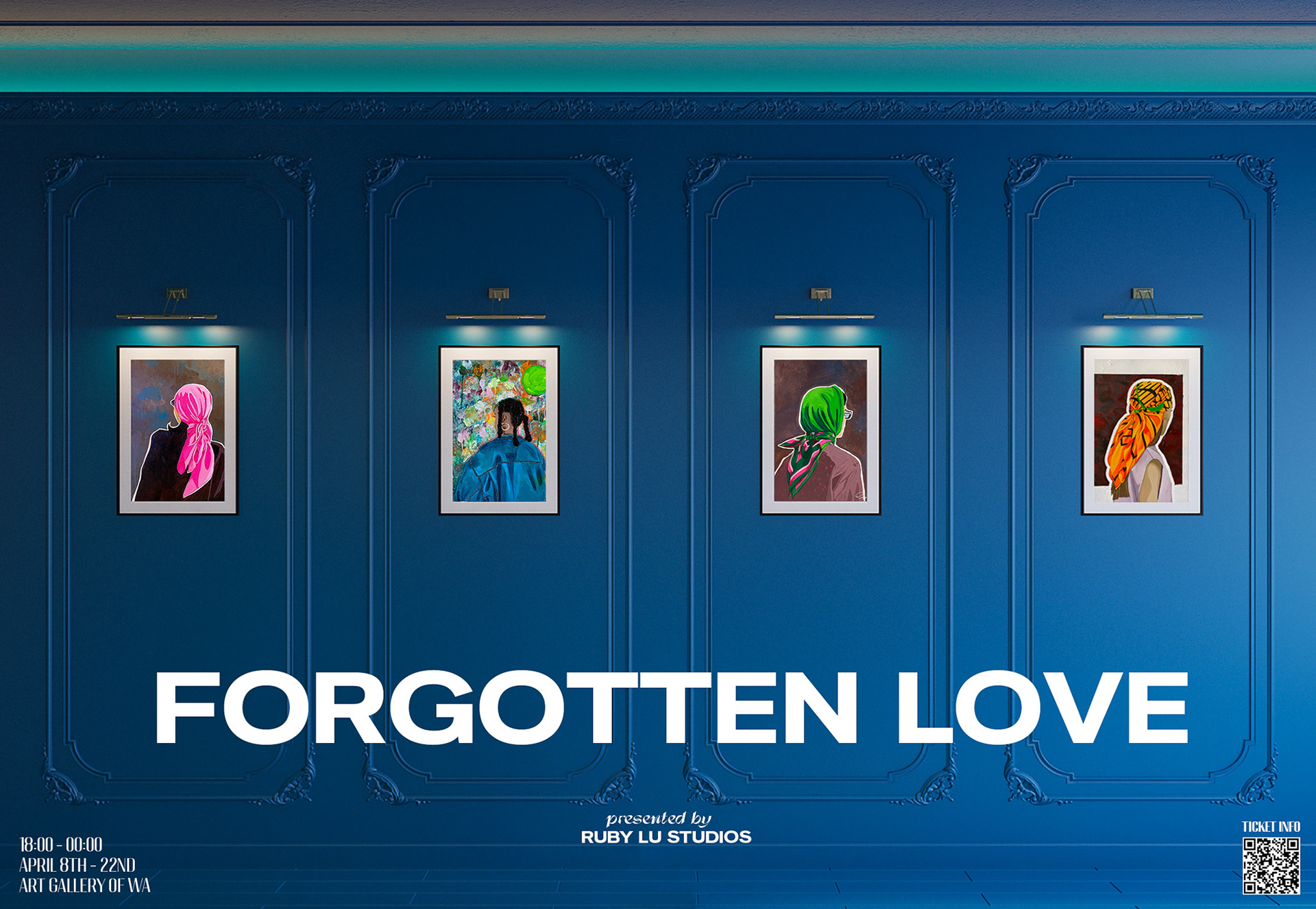
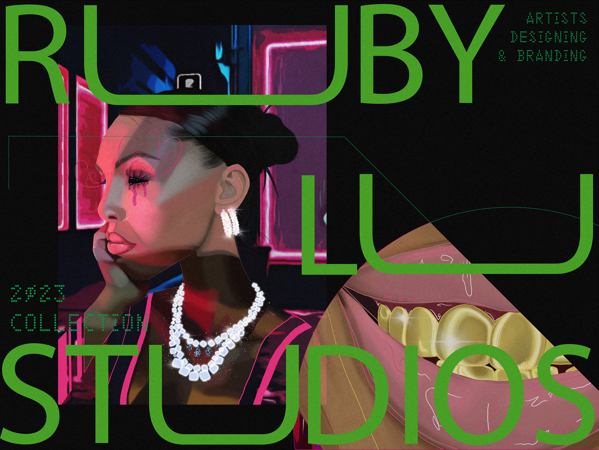
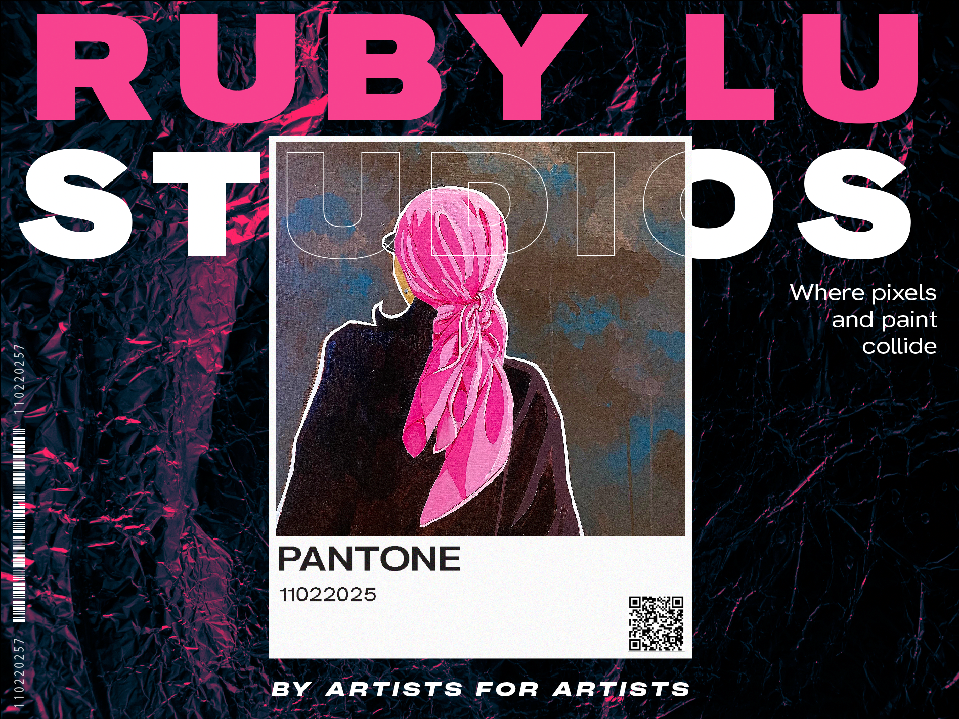
Miscellaneous & experimental Poster Designs
This collection of posters reflects my ongoing exploration of diverse design styles and techniques. Driven by curiosity and a desire to experiment, these works showcase a range of visual approaches, from bold colours to minimalist compositions. Each poster serves as a stepping stone in my creative evolution, demonstrating the value of experimentation and the unexpected discoveries it can yield.
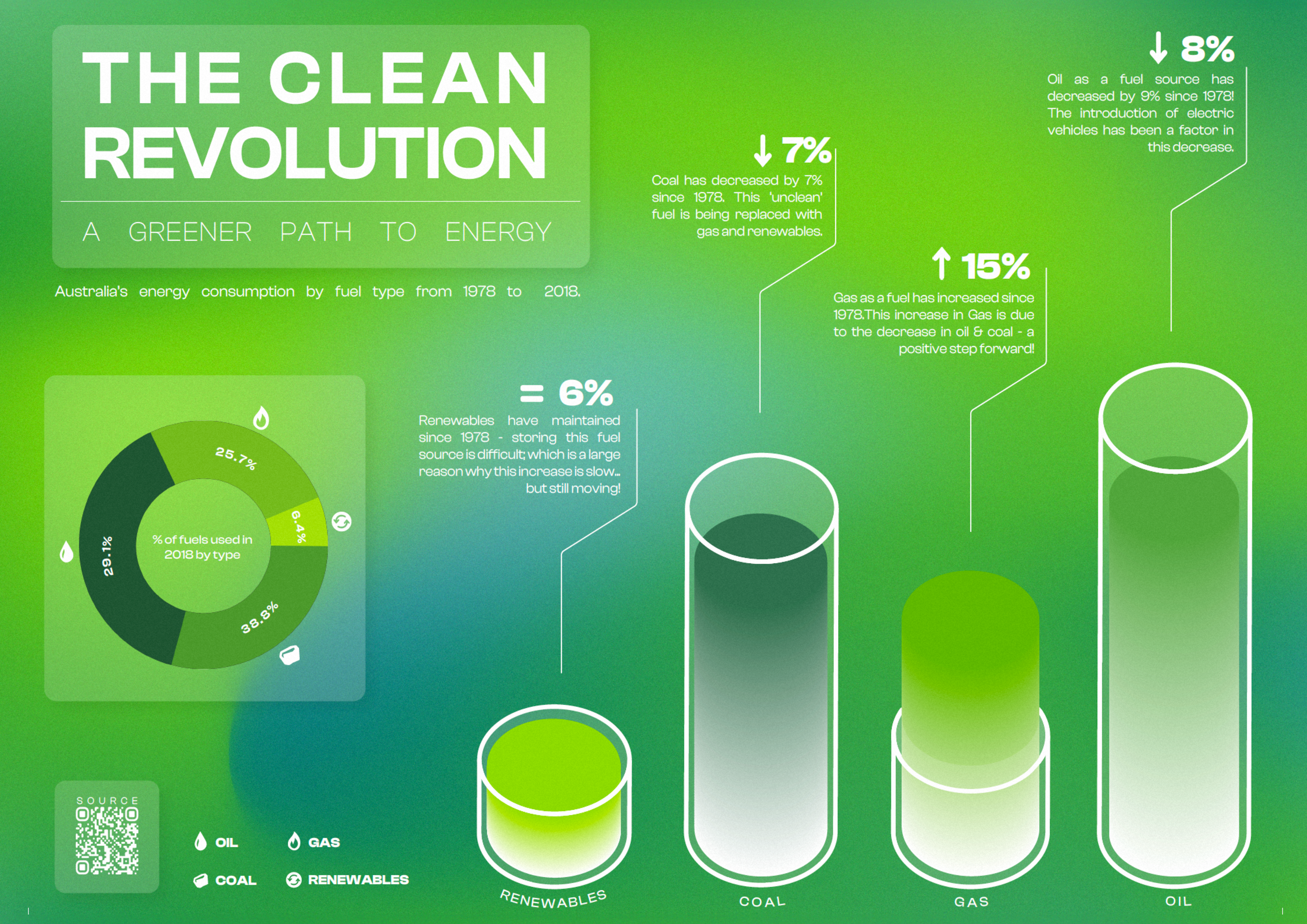
Infographic & Data Communication Design
This infographic was crafted to convey a wealth of data regarding the yearly consumption of 'clean' energy by the average Australian over a 40-year span, emphasising the reduction of 'unclean' energy usage.
Employing colour theory, I combined the design with a fresh, natural, and innocent vibe. The graphics were deliberately kept simple, leveraging the familiarity of traditional graph formats, ensuring ease of comprehension for the viewer.
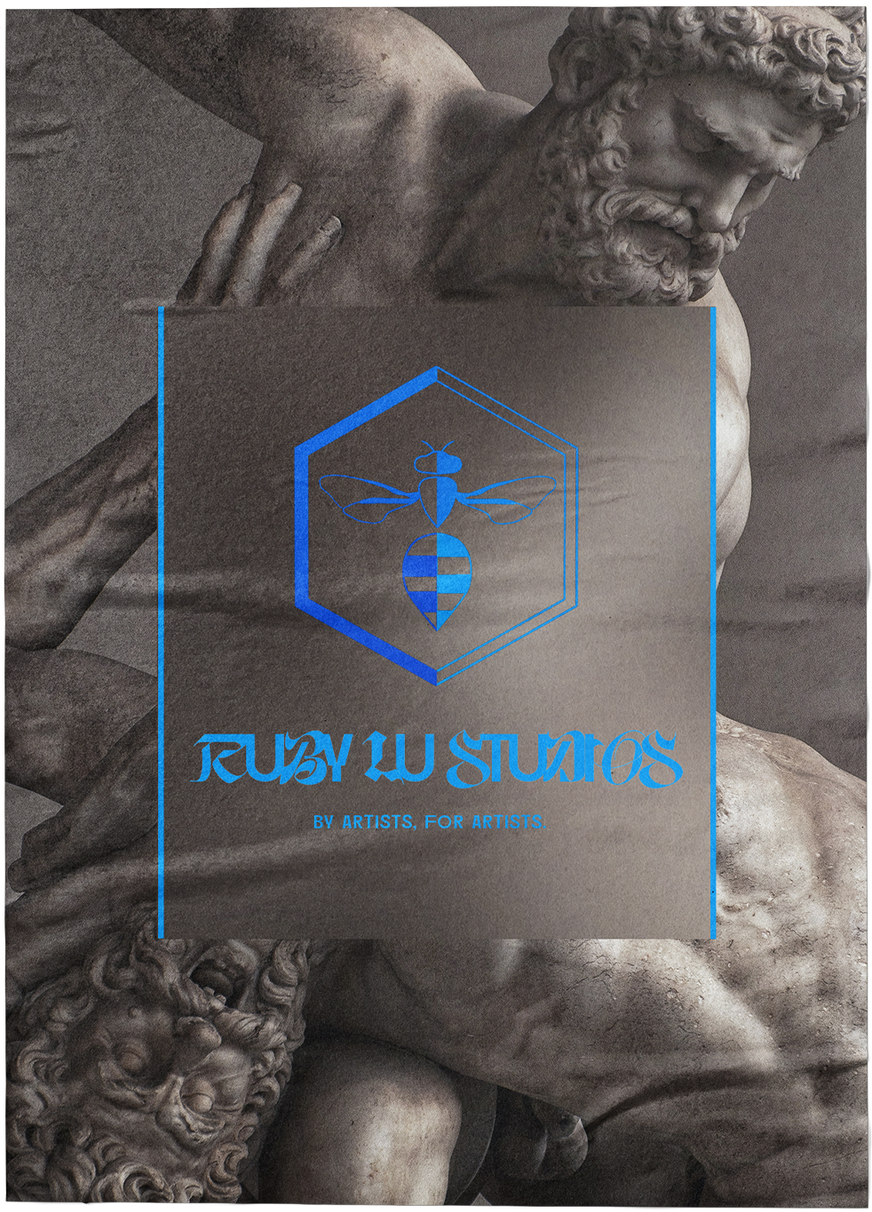
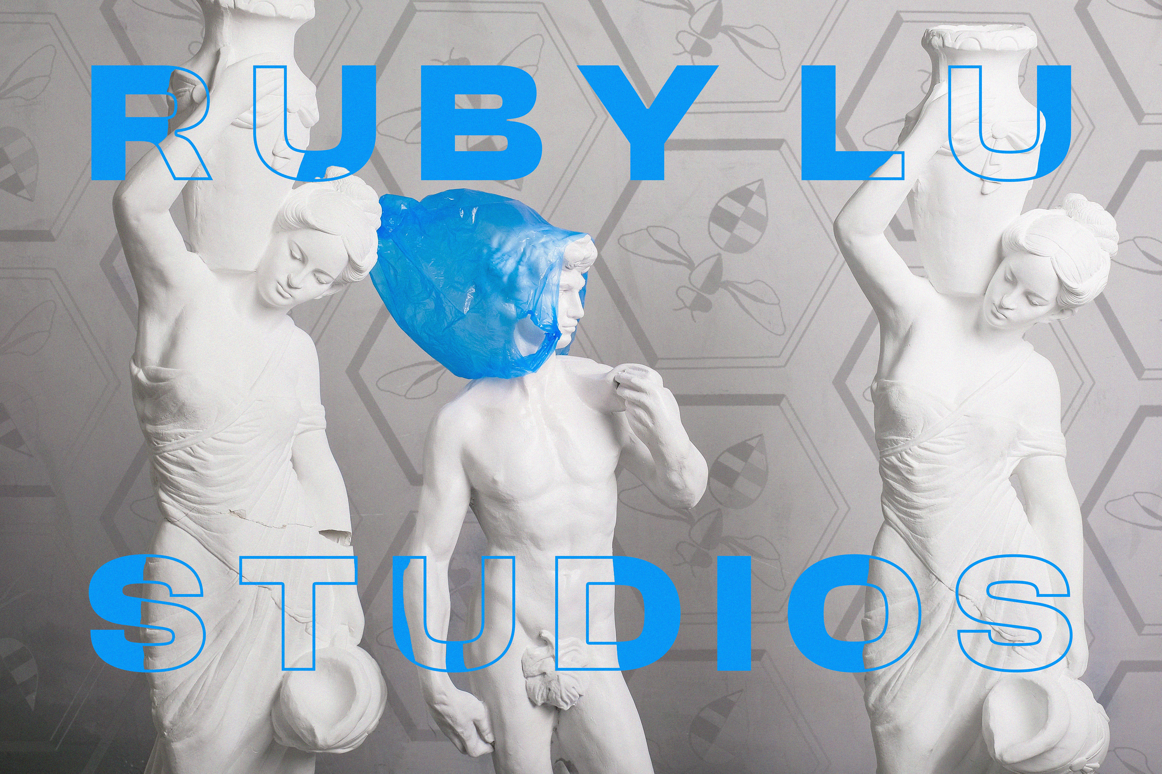
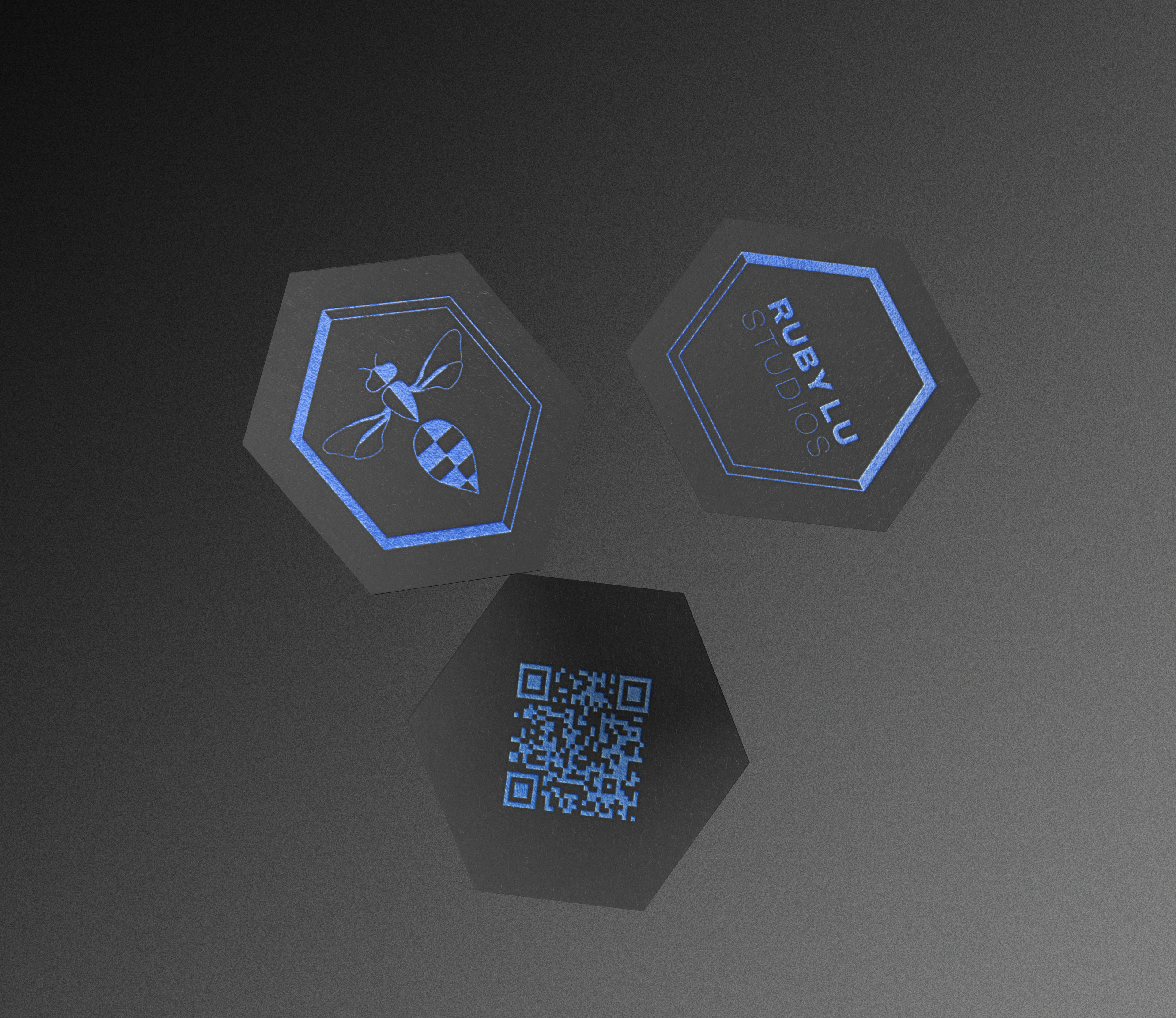
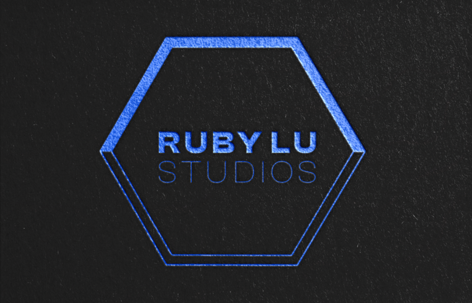
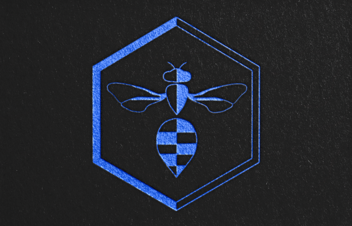
Business Card Design
My business card features two front designs: one with the main logo and the other with the type logo, both elegantly embossed in blue foil for a touch of sophistication. The choice of blue foil is inspired by the Blue Banded Bee's chrome bands, while the hexagon shape symbolises the bee hive, representing concepts like community and stability.
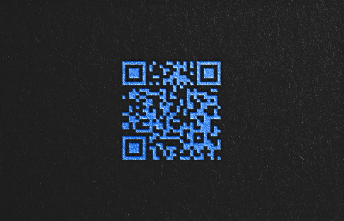
On the back, a QR Code links to my Linktree page for easy access to contact details, social media, portfolio, and websites, maintaining a sleek and professional appearance.
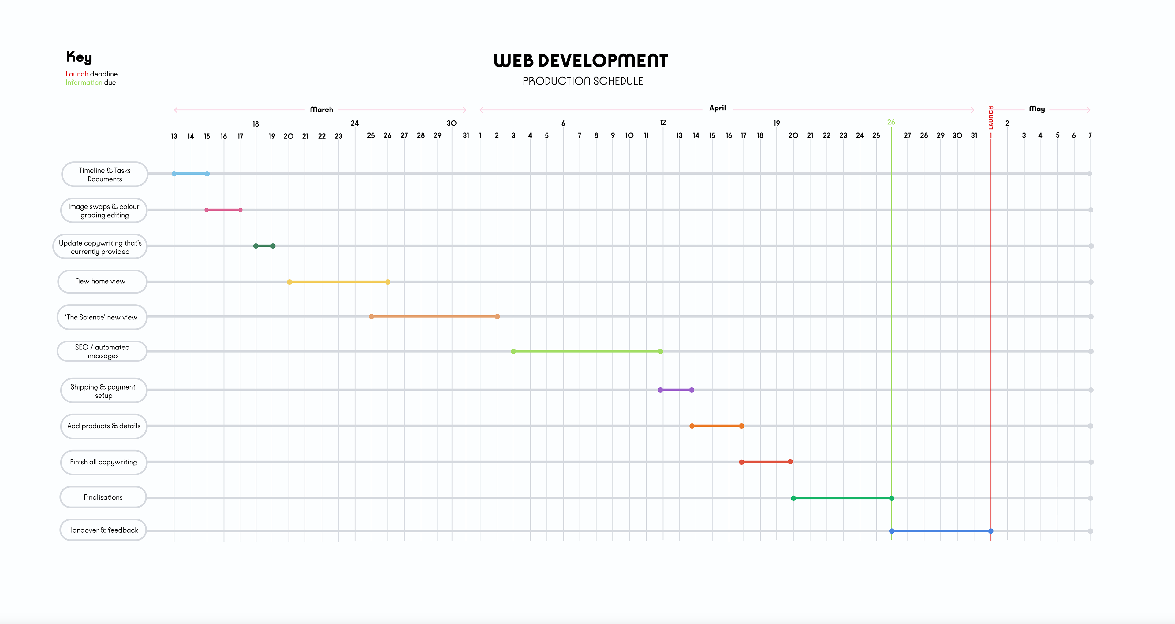
Website development timeline diagram
The client requested a visual timeline to comprehend the remaining tasks and their projected completion dates for a website development project. Key milestones, such as the due date for copywriting and information submission, along with the launch date, were highlighted to emphasise their significance.
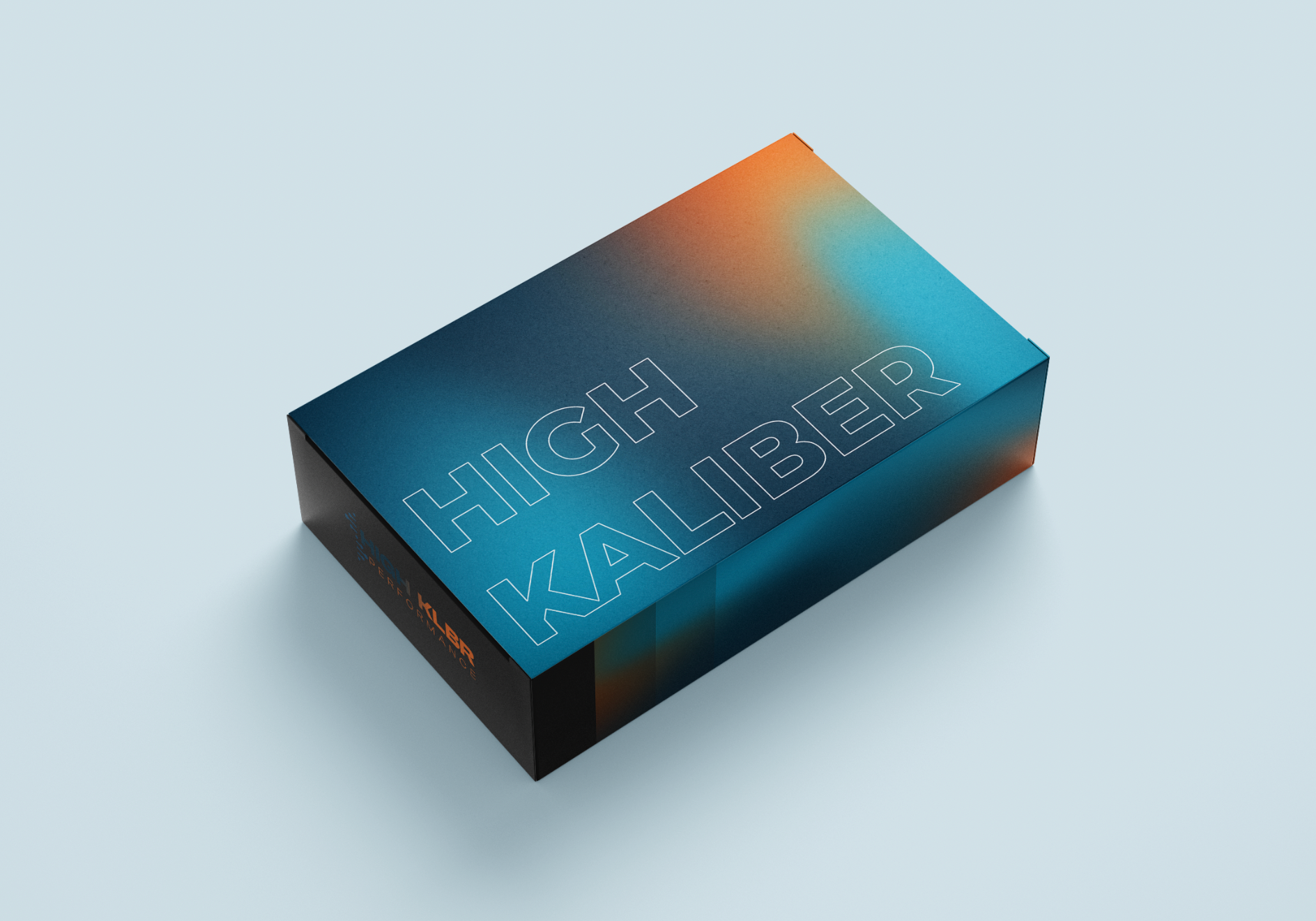
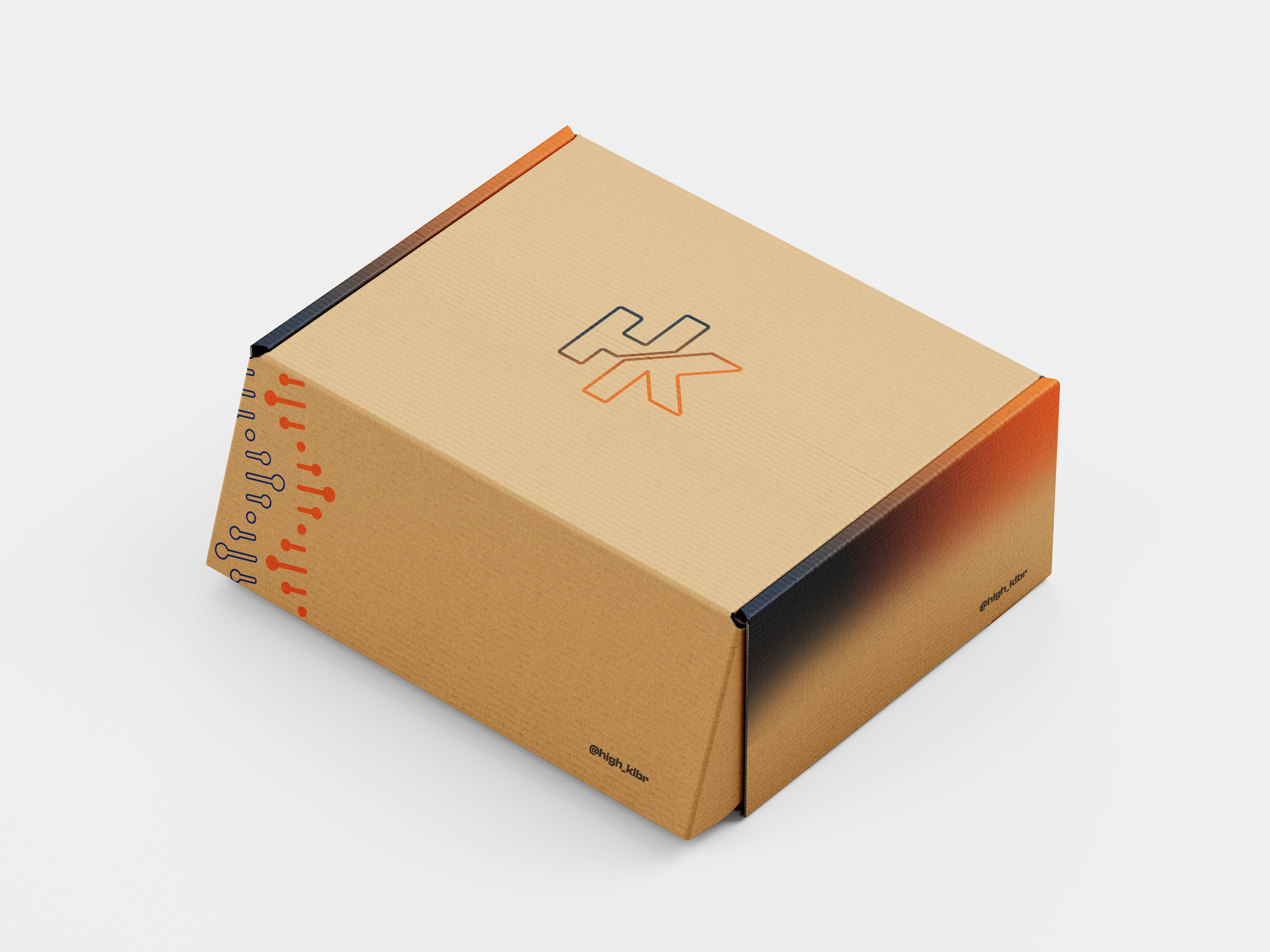
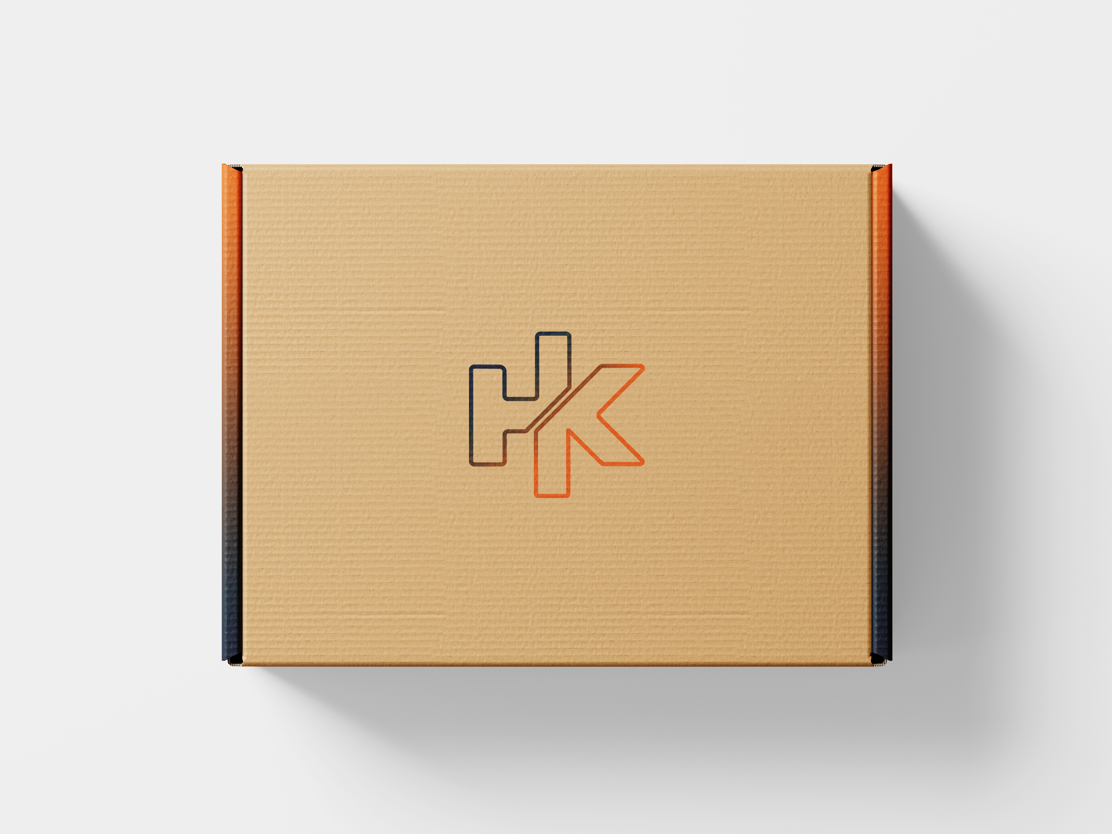
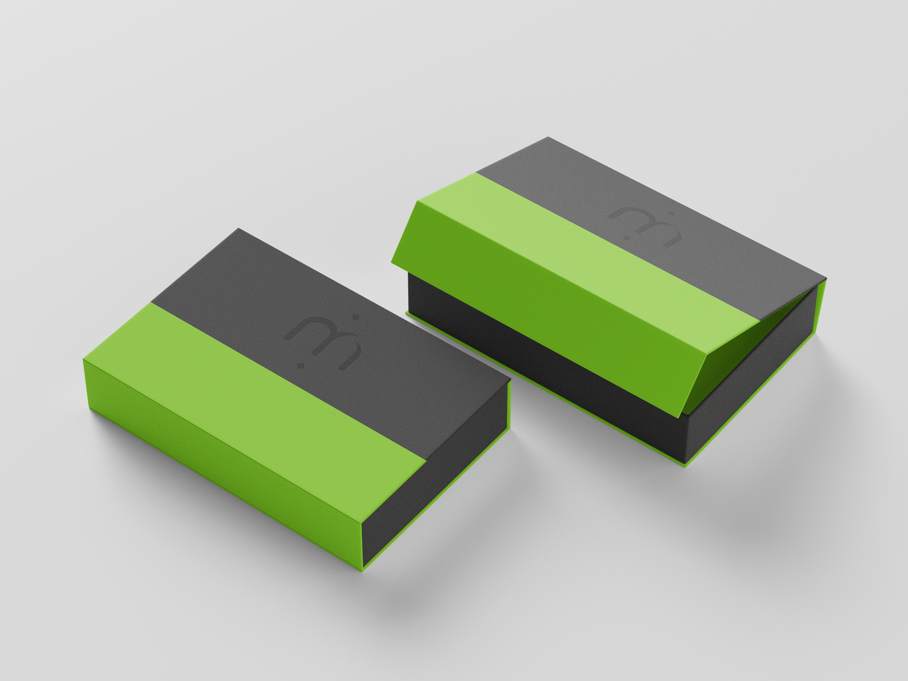
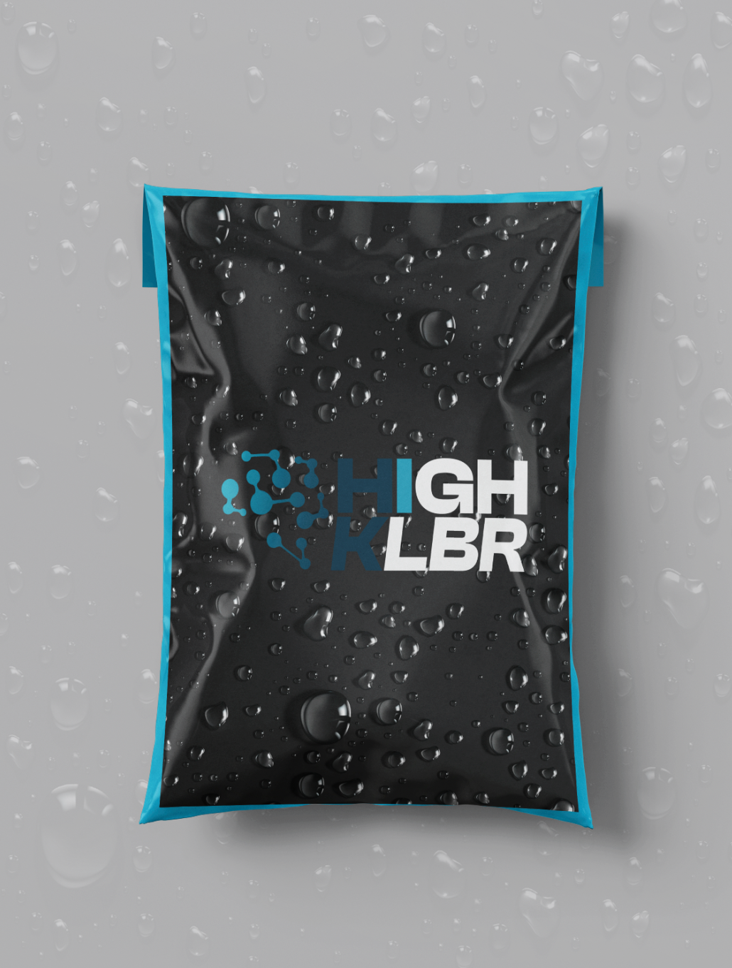
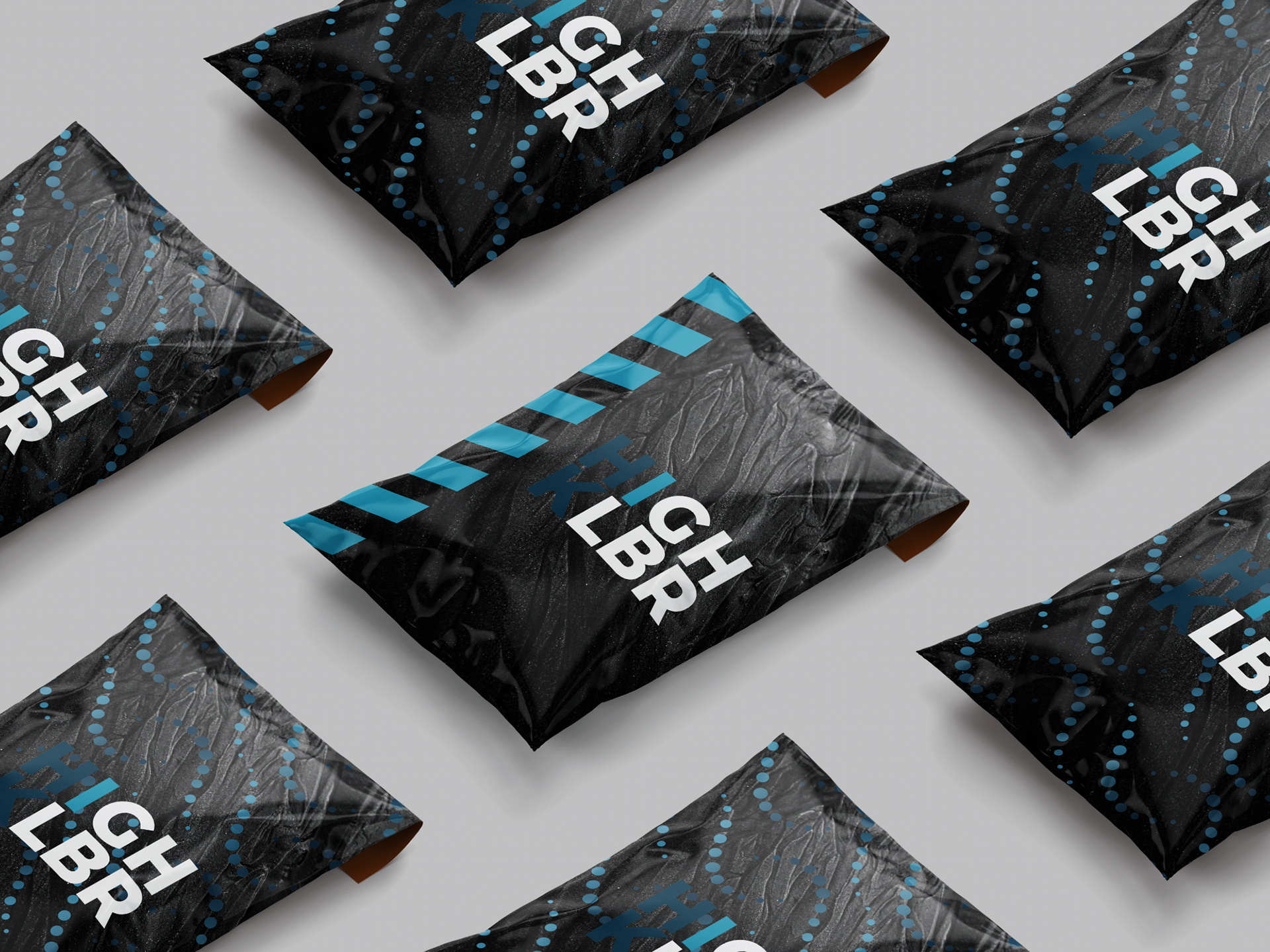
packaging
These packaging designs were experimental to test the strength and visual impact of various brand identities. Utilising bold minimalist principles, I explored different materials and the integration of brand-specific textures to discover the most effective ways to communicate brand essence
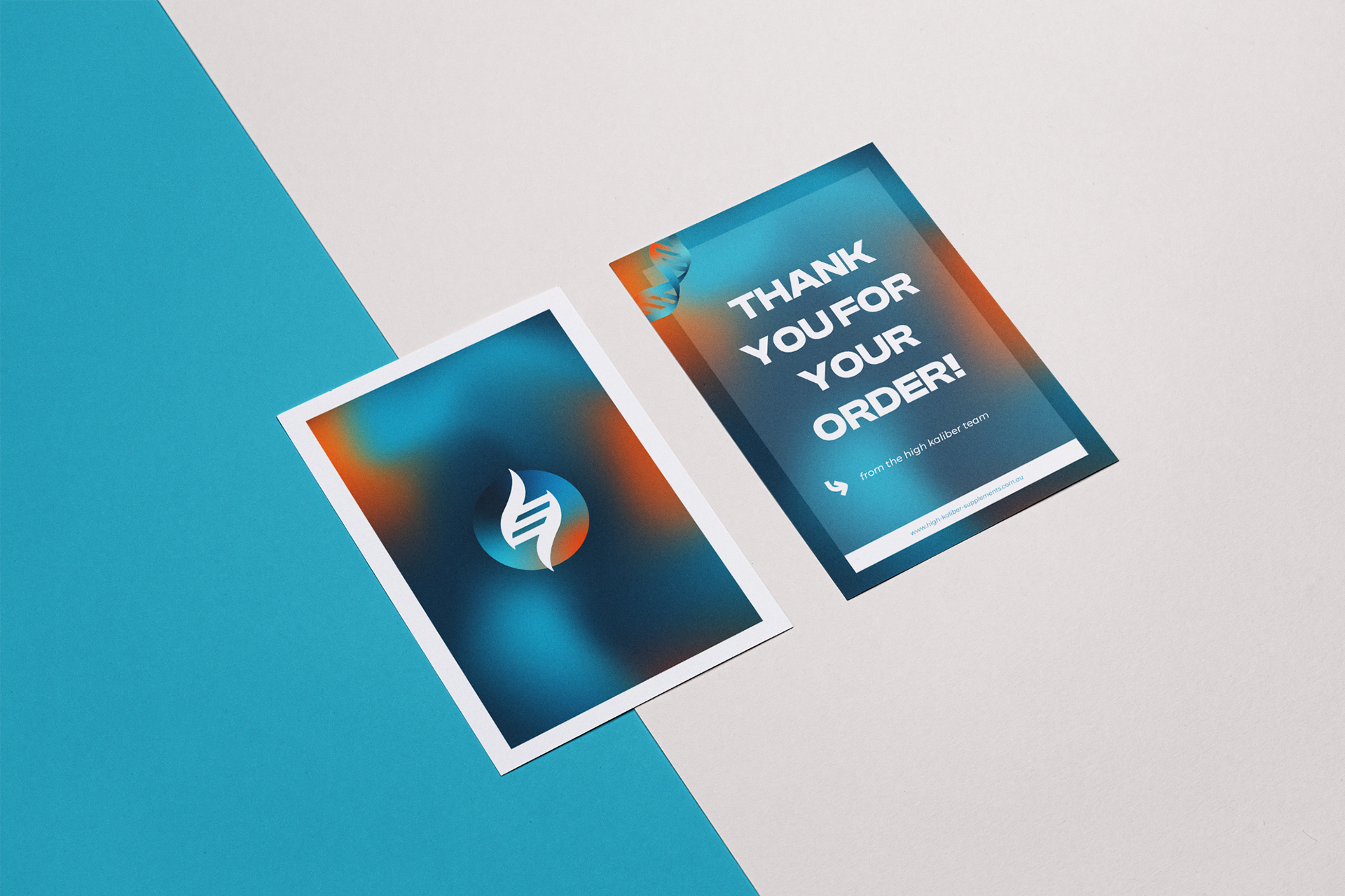
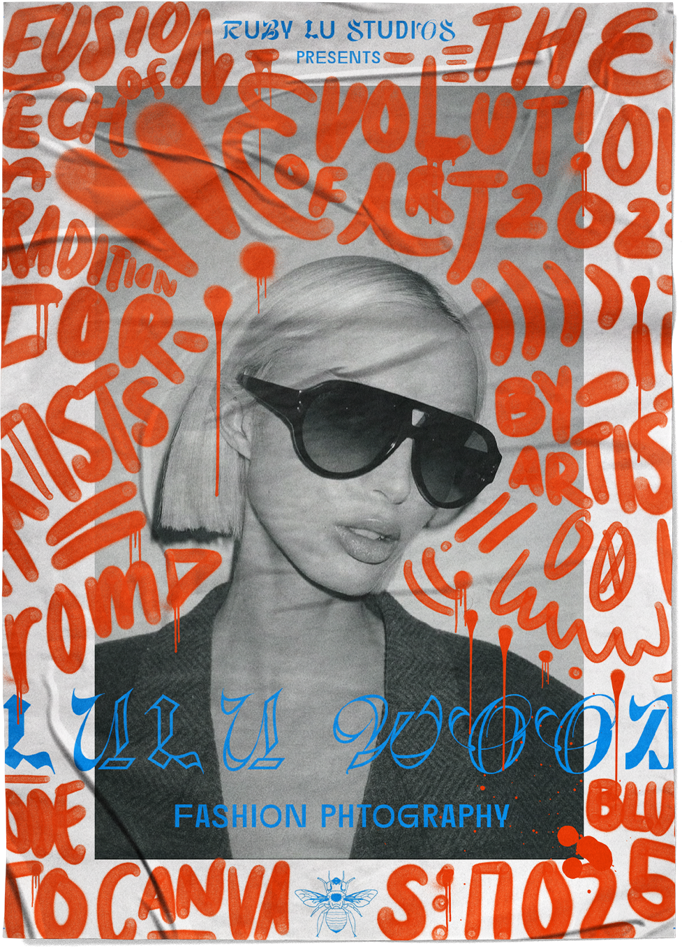
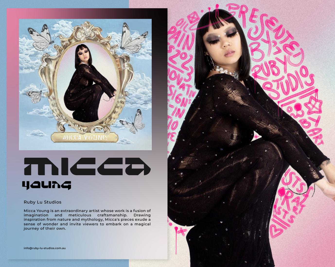
flyers
These flyers served as a platform to rigorously test the strength and visual impact of my brand identity. By meticulously applying colour theory, prioritising legibility, and establishing clear visual hierarchy, I explored various aesthetic and stylistic approaches to determine what resonates most effectively with the brand message.