high quality, high performance, high kaliber
mission statement
To provide high-quality supplements that empower individuals to optimise their physical and mental performance.
At HIGH KLBR we believe individuals in all walks of life are capable of achieving their goals when given the right tools. Though our individual stories differ, the need for a healthy body and mind remains constant.
Our mission is simple: funnel through the masses of products in the nutrition industry to bring to the forefront only the highest quality products, and second, to educate our customers to ensure they can align their chosen products with their personal requirements.
Our vision extends beyond just the products - it’s about pioneering wellness possibilities and lighting the way to optimised vitality and performance for every individual. HIGH KLBR stands for the decision to be great, which is not beyond any person’s means to achieve.
Values
Innovation - High Kalbier is committed to pioneering wellness possibilities and embracing cutting-edge technology, as evidenced by their AI Health and Fitness Assessment Tool. This reflects a value for innovation in developing new solutions for optimising vitality and performance.
Excellence - The brand's dedication to providing premium, high-quality supplements and nutritional tools underscores a commitment to excellence. They strive to offer products that meet the highest standards of quality and efficacy.
Empowerment - High Kalbier aims to empower individuals to take control of their health and performance by providing tailored solutions and expert guidance. Through their products and resources, they seek to enable customers to unlock their full potential and achieve their goals.
Trustworthiness - Trust is a core value for High Kalbier, reflected in their emphasis on scientifically backed products and their commitment to transparency and integrity. Customers can trust that the brand's offerings are reliable, safe, and effective.
Holistic Well-being - High Kalbier values a holistic approach to health and performance, addressing both physical and mental aspects. By integrating sports performance supplements with mental health enhancers and promoting overall wellness, the brand emphasises the importance of holistic well-being in achieving peak performance and vitality.
Personality
Innovative - High Kalbier exhibits an innovative spirit, constantly seeking new ways to enhance wellness and performance. From their AI Health and Fitness Assessment Tool to their integration of mental and physical performance supplements, the brand embraces cutting-edge solutions.
Confident - The brand exudes confidence in its ability to provide premium quality products and expert guidance. High Kalbier is fearless in its approach to helping individuals unlock their potential and achieve their goals, projecting a strong sense of self-assurance.
Authentic - High Kalbier maintains an authentic and genuine demeanor, prioritising transparency and integrity in all interactions. The brand's commitment to providing scientifically backed solutions and its focus on making a positive change reflect its authenticity and sincerity.
Exciting - High Kalbier injects excitement into the journey toward optimal health and performance. With a bold and revolutionary personality, the brand sparks enthusiasm and anticipation, making the pursuit of wellness an exhilarating adventure.
Health-conscious - At the core of High Kalbier's personality is a deep commitment to health and well-being. The brand is health-conscious, promoting sustainable, natural, and holistic approaches to enhancing both physical and mental performance. This emphasis on health underscores the brand's caring and nurturing personality.
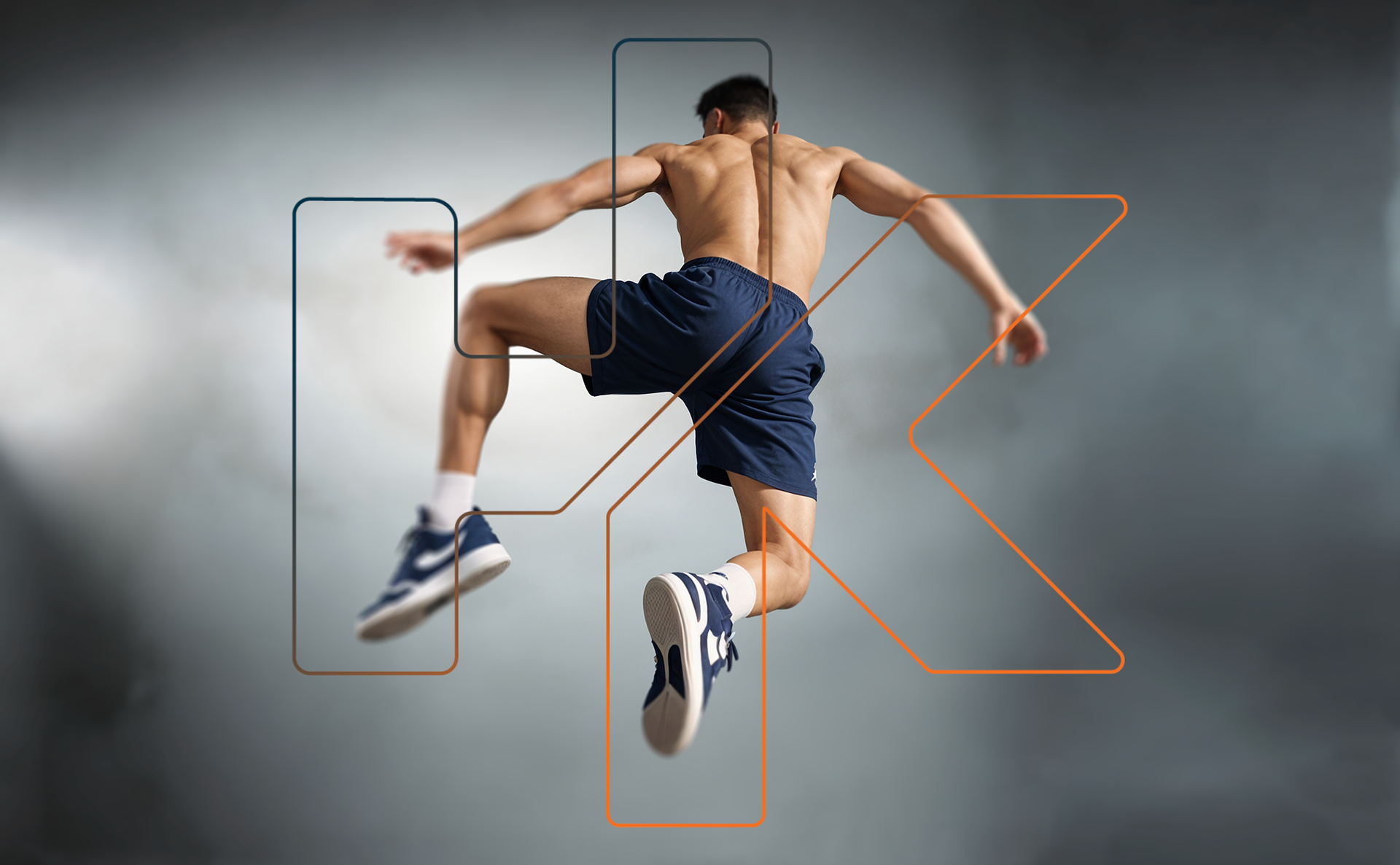
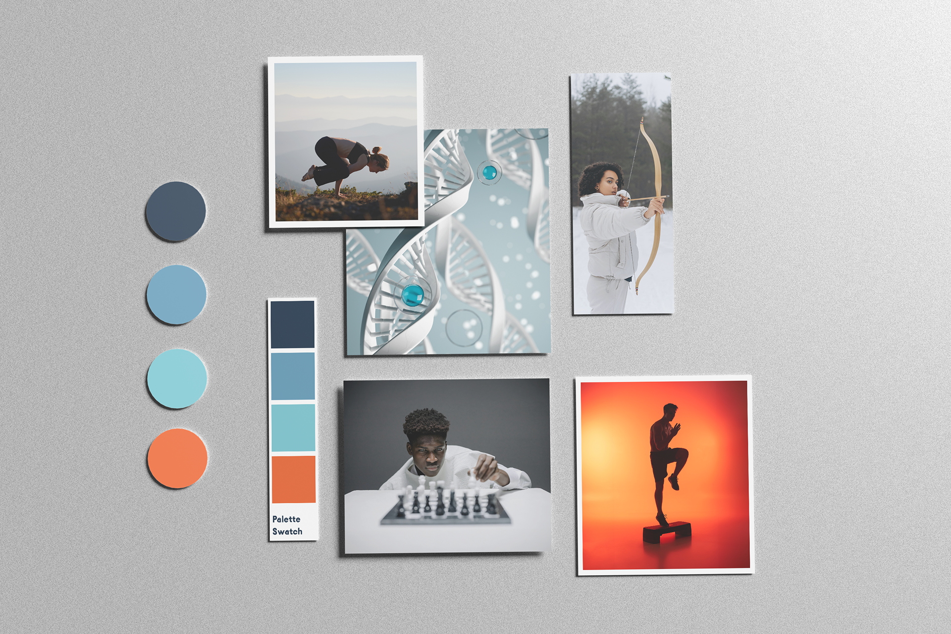
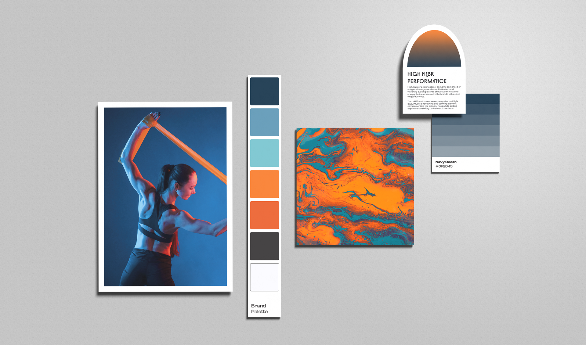
Mood Board
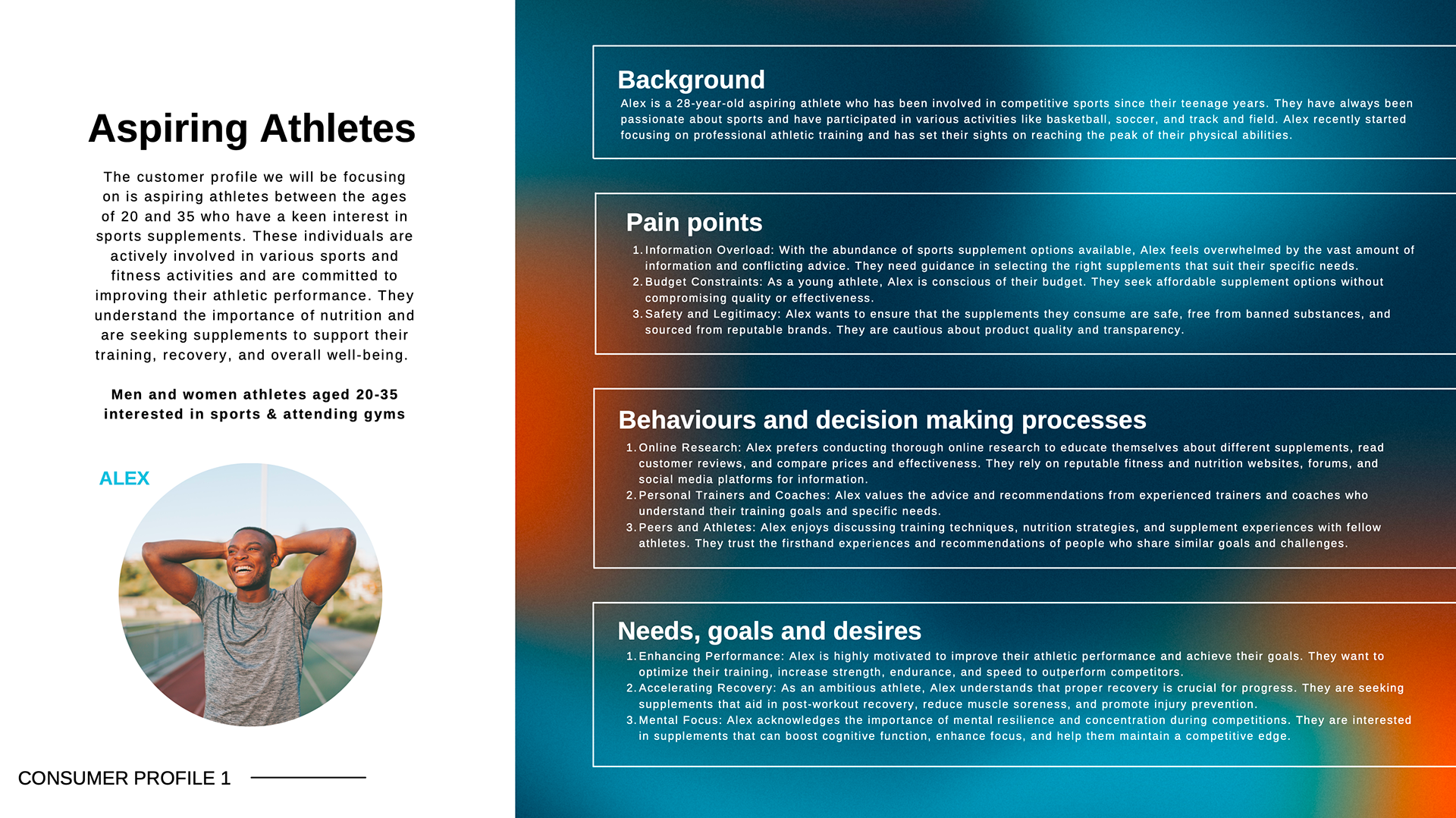
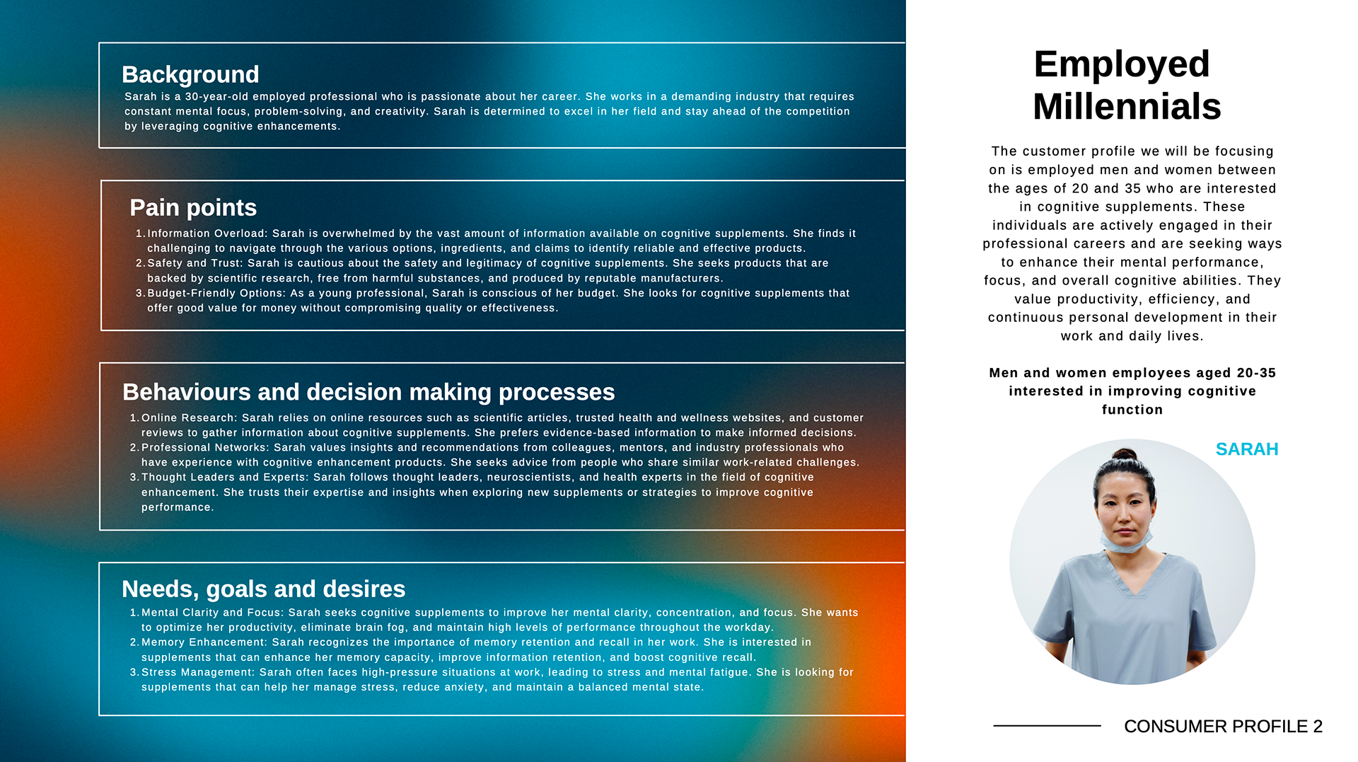
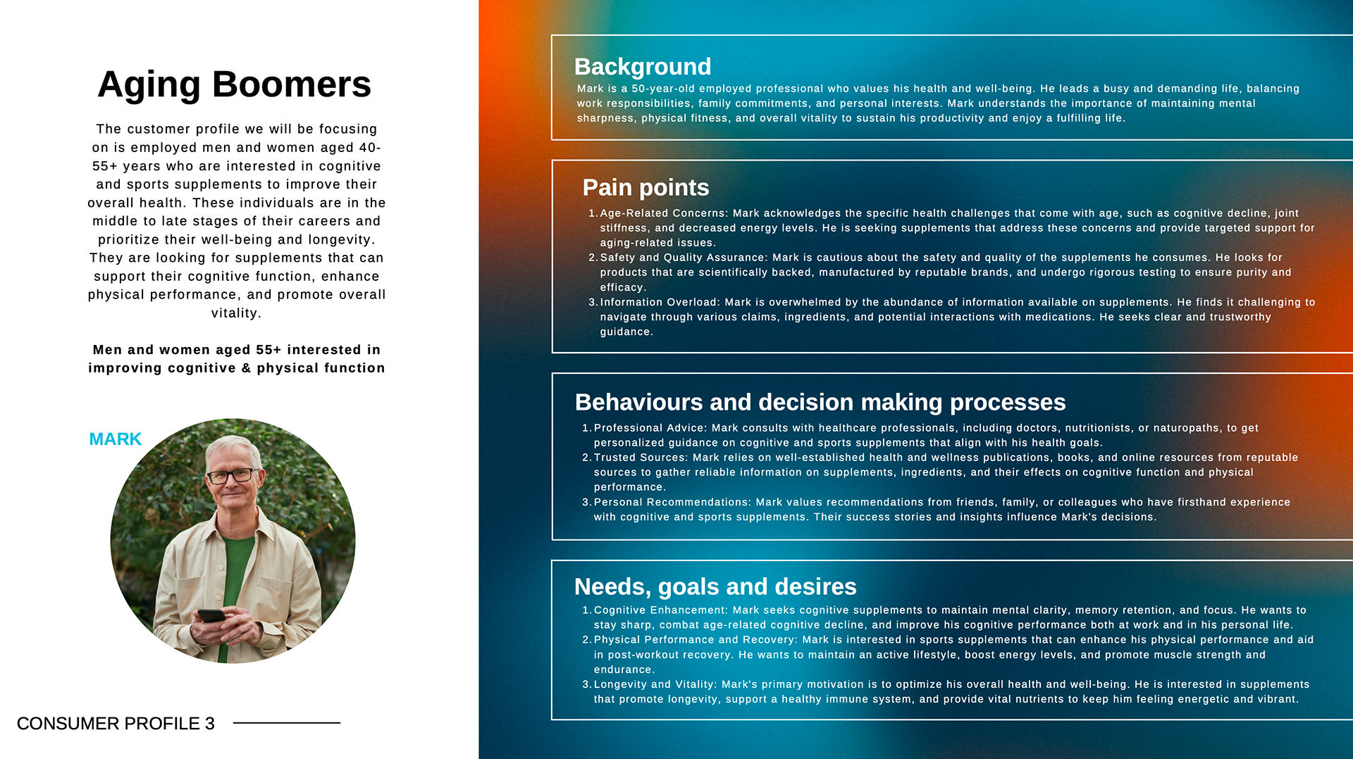
CONSUMER PROFILES
This project targeted a multifaceted audience, encompassing aspiring athletes, health-conscious aging boomers, and busy employed millennials. Despite their varied demographics, a unifying thread emerged – the desire for premium-quality supplements. Each segment craved solutions that would empower them to achieve their unique health and performance goals.
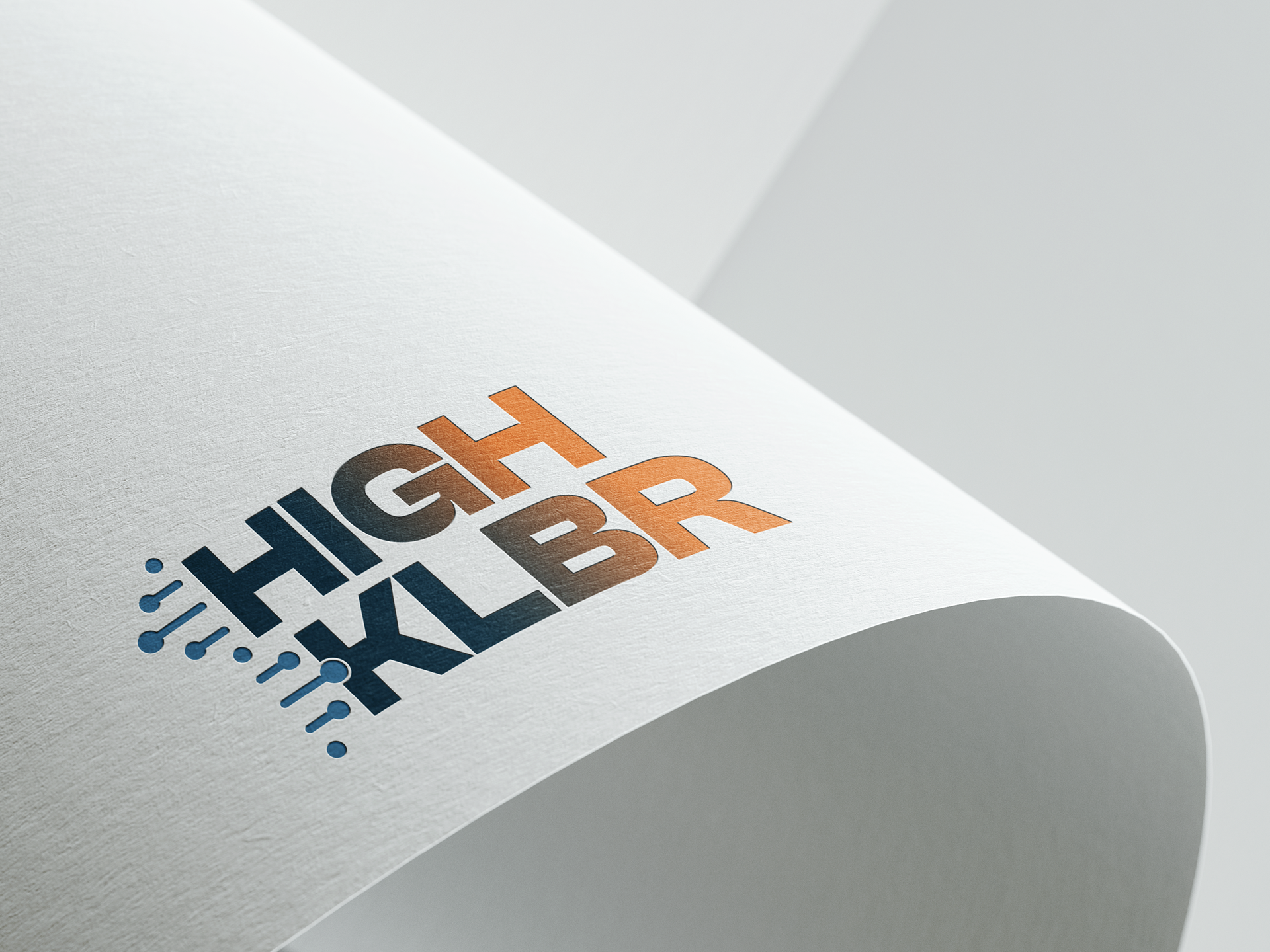
LOGO DESIGN
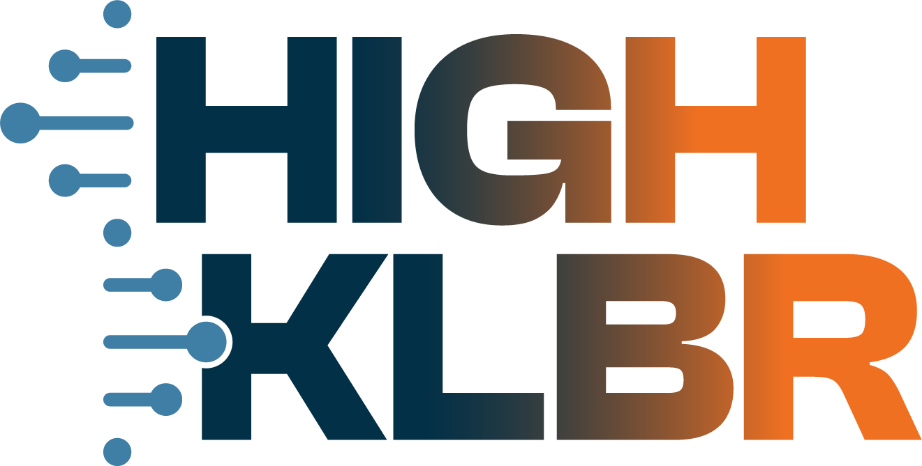
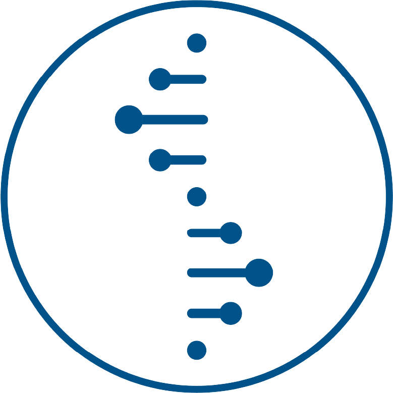
This monogram logo seamlessly combines the letters 'h' and 'k,' representing 'High Kaliber' with its asymmetrical design inviting viewers to perceive it as its own distinct element while also associating it with the brand name. Employing a blue and orange colour scheme as requested by the client, the logo features a gradient for digital use, while brand textures are reserved for print media.
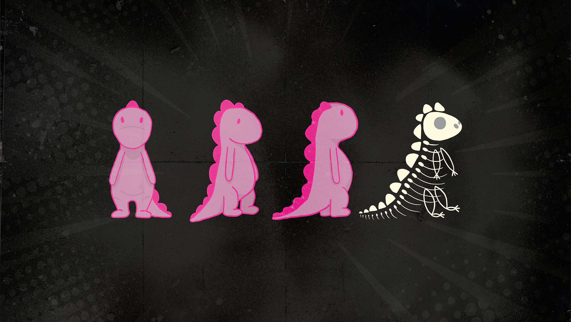
The deep navy blue conveys notions of loyalty, trust, and honesty, while the vibrant orange evokes emotive concepts such as heat, energy, and youth (The Designer's Dictionary of Color', 2017). Symbolising the brand's research and the atomic changes occurring in the body, the simplified DNA strand adds depth to the design.
Utilising ample white space maintains cleanliness and legibility, allowing individual elements like the DNA strand to stand out, further emphasised by the slightly lighter brand blue.

Secondary Logo
This project explores two logo variations for a brand, ensuring optimal brand recognition across different media formats.
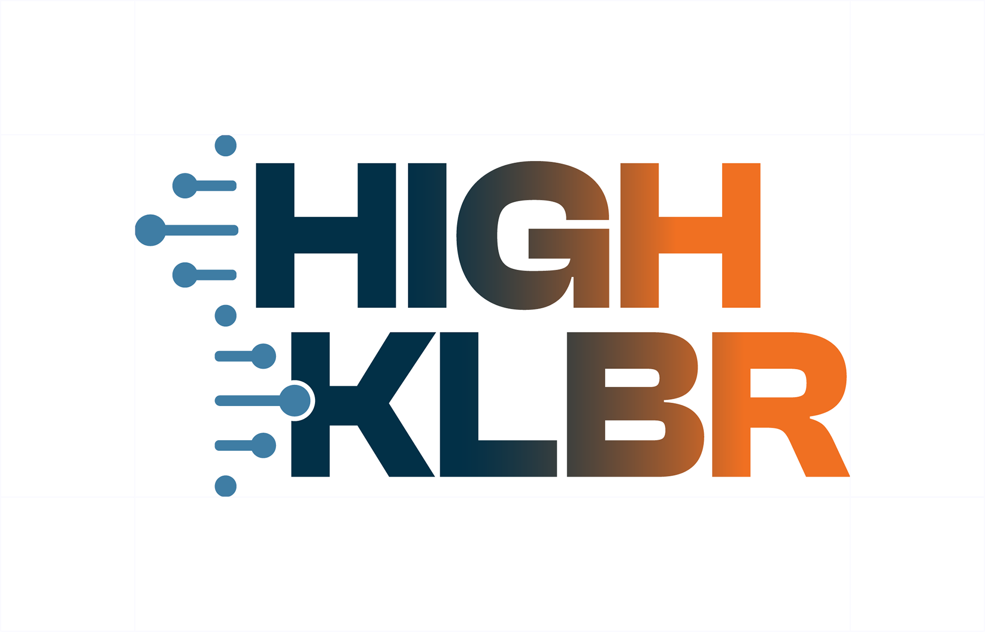
The secondary mark emphasises legibility at reduced sizes, often encountered in web applications or packaging stickers. It simplifies the brand name to "HIGH KLBR" and utilises a cascading arrangement for the text elements that follows the natural curve of the DNA strand. This approach ensures brand recognition remains strong even at smaller scales.
The secondary mark emphasises legibility at reduced sizes, often encountered in web applications or packaging stickers. It simplifies the brand name to "HIGH KLBR" and utilises a cascading arrangement for the text elements that follows the natural curve of the DNA strand. This approach ensures brand recognition remains strong even at smaller scales.
Exclusion Zones
Ensuring enough clear space (exclusion zone) around your logo is crucial. This minimum zone, defined by the height of the capital 'H' in the logo name, prevents visual clutter and safeguards the logo's impact.


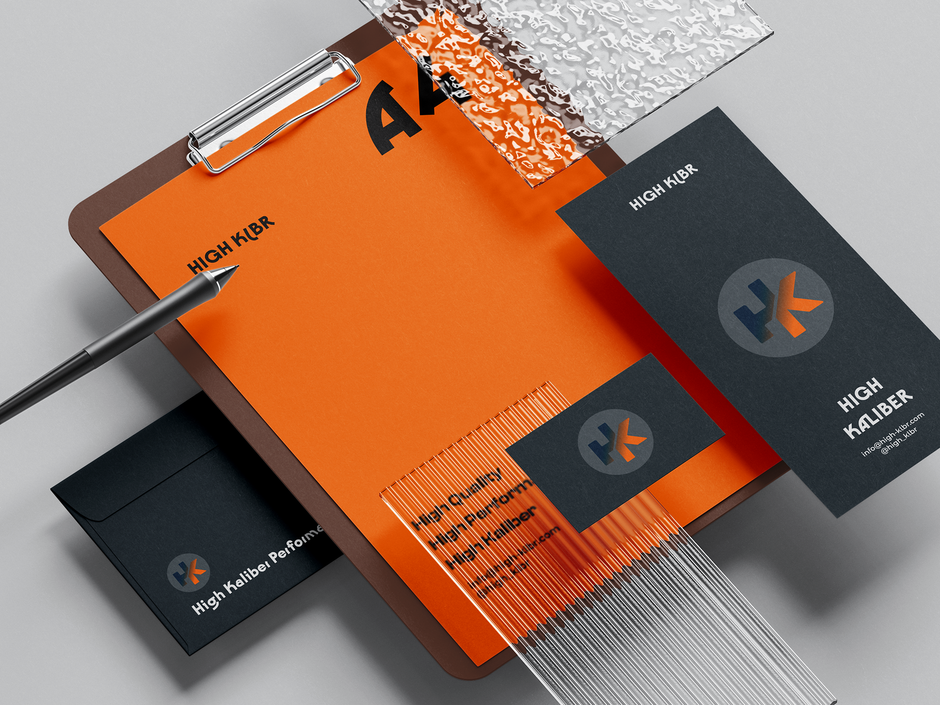
Logo Variations
These two brand-mark variations are used for simple print media (such as packaging stickers) and web media where the secondary logo becomes illegible.
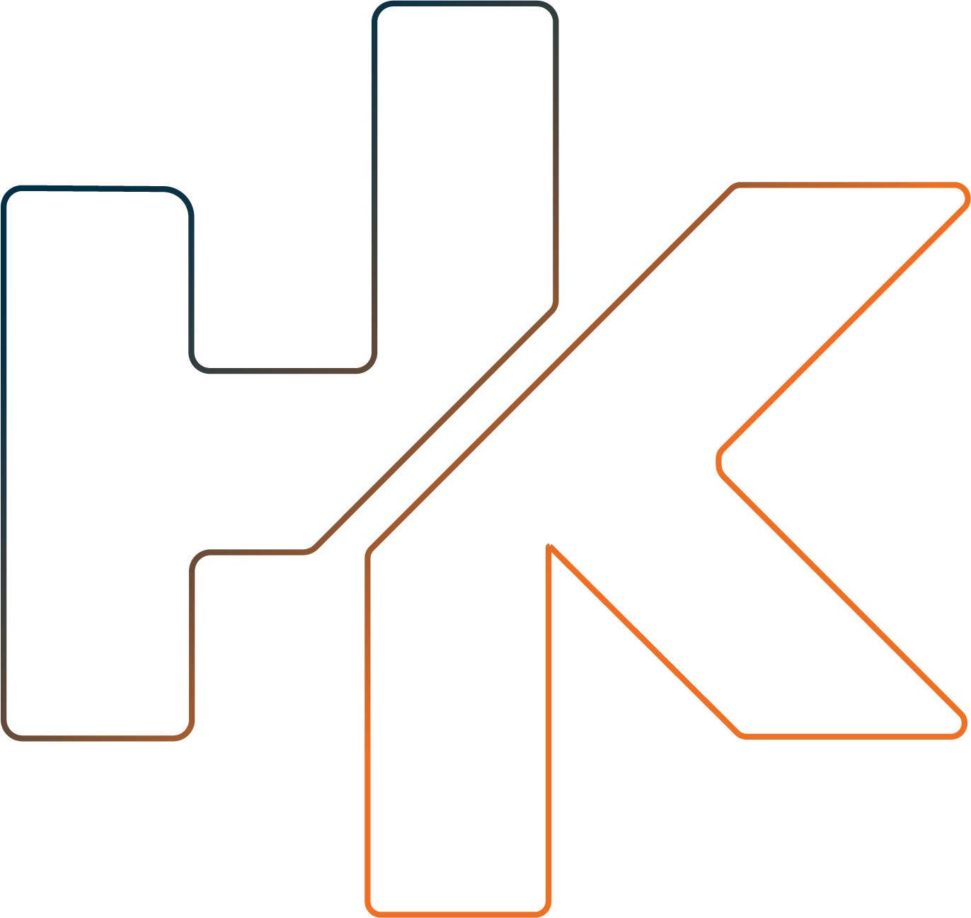
The left design features the brand's monogram logo intertwined with a DNA strand. This design utilises negative space to create a balanced and abstract composition. Notably, the client requested flexibility in the DNA element's visual weight. This allows the logo to function effectively as a cohesive whole or as individual elements (monogram and DNA) depending on the application.
The variation on the right is a simple 3pt stroke of the brand-mark and is used to bring character to mundane imagery, CRM and sometimes used as a watermark.

Typographic Treatment
Utilising crisp & clean serif fonts with a hint of accent in san serifs.
'Clash Display' is dedicated to headings & sub-headings, 'Montserrat' dedicated to body text, & 'Kobe 1.1' being utilised for accent & occasional headings.
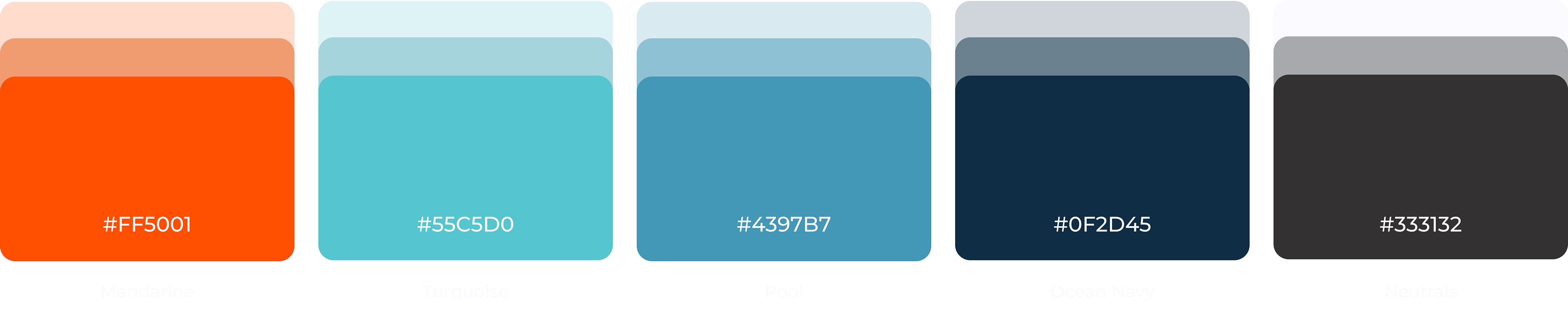
colour palette
The brand's colour palette exudes boldness and energy, reflecting its vibrant personality and the emotions it seeks to evoke in consumers.
'Mandarine' serves as a striking highlight, enhancing visual hierarchy within text and guiding users through the web design as breadcrumbs and high-priority features. 'Turquoise' acts as a secondary highlight, gently indicating web features and providing balance against the darker hues.
'Ocean Navy' takes centre stage as the primary hue for headings, body text, and all web copywriting. 'Pool' adds subtle nuances to the web design, with its tinted hues used for background colours and lighter gradients in social media post designs.
Neutrals are strategically employed for occasional body text, buttons in web design, and header navigation, ensuring cohesion and readability across all elements.
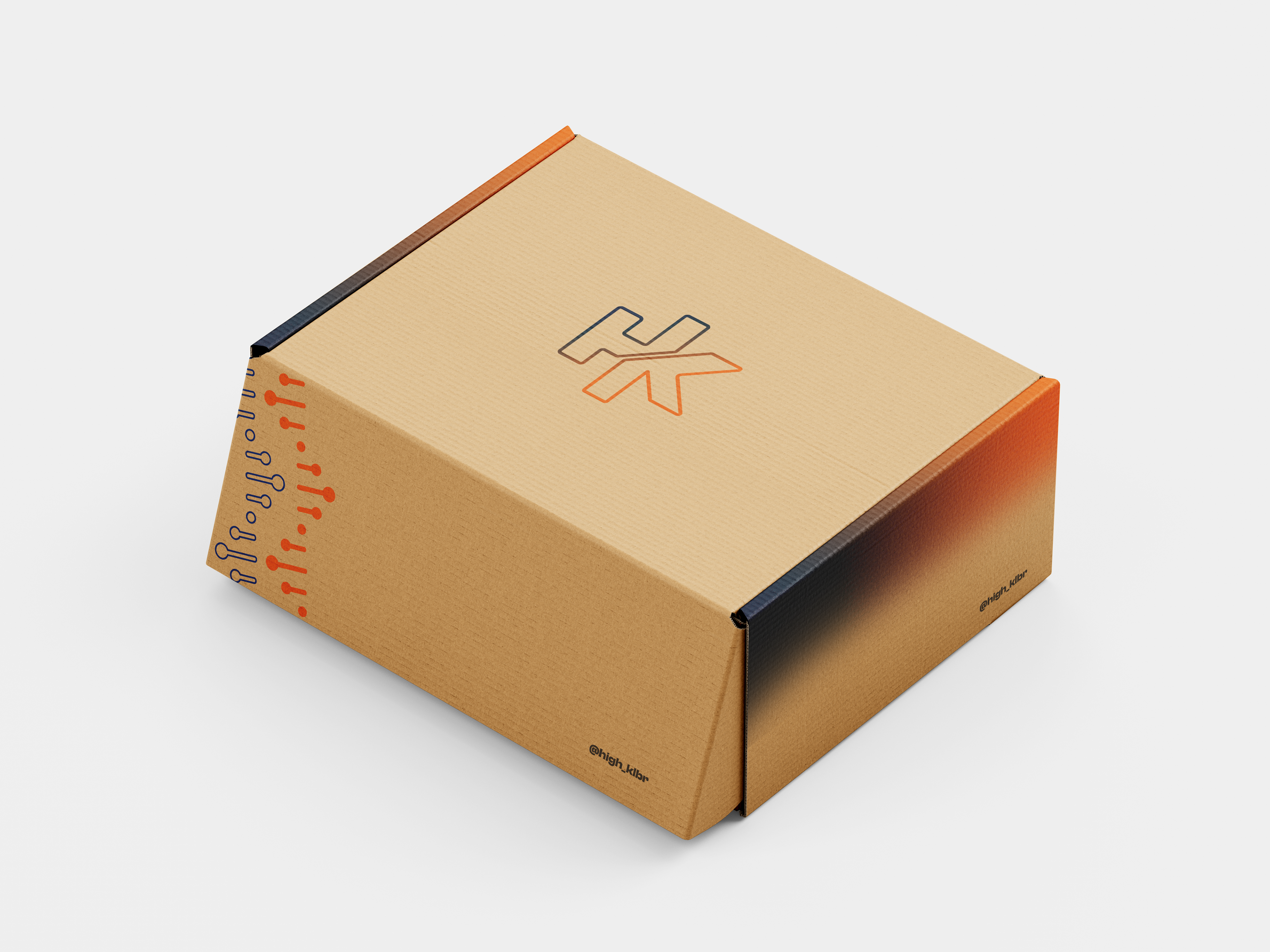
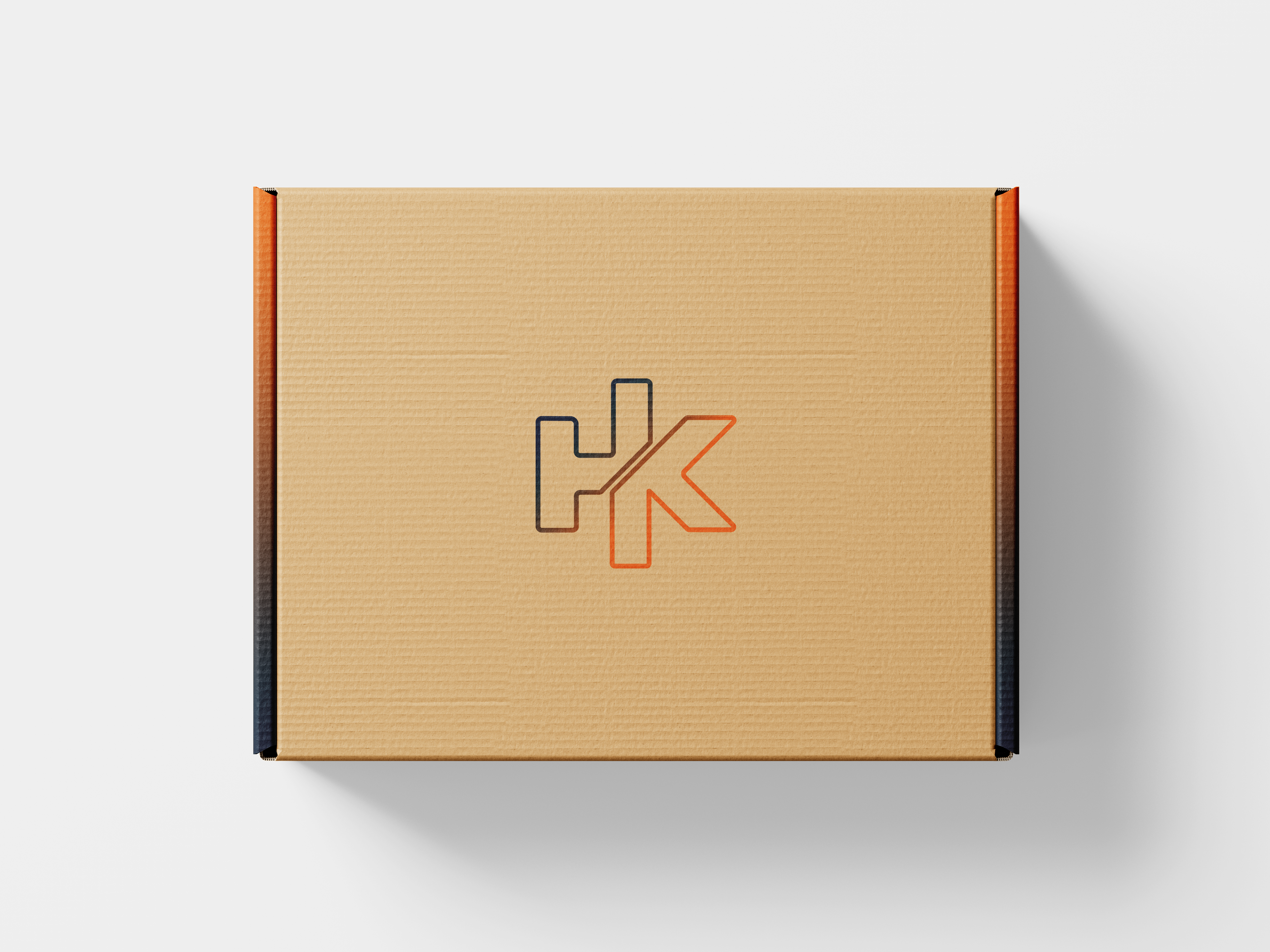
Packaging
Crafted from recycled cardboard and adorned with vibrant illustrations in the brand's navy and orange colours, evokes a sense of excitement and motivation for users. The minimalist design and simple silhouette invite curiosity, promising a premium experience while reflecting the brand's commitment to sustainability and aesthetic appeal.
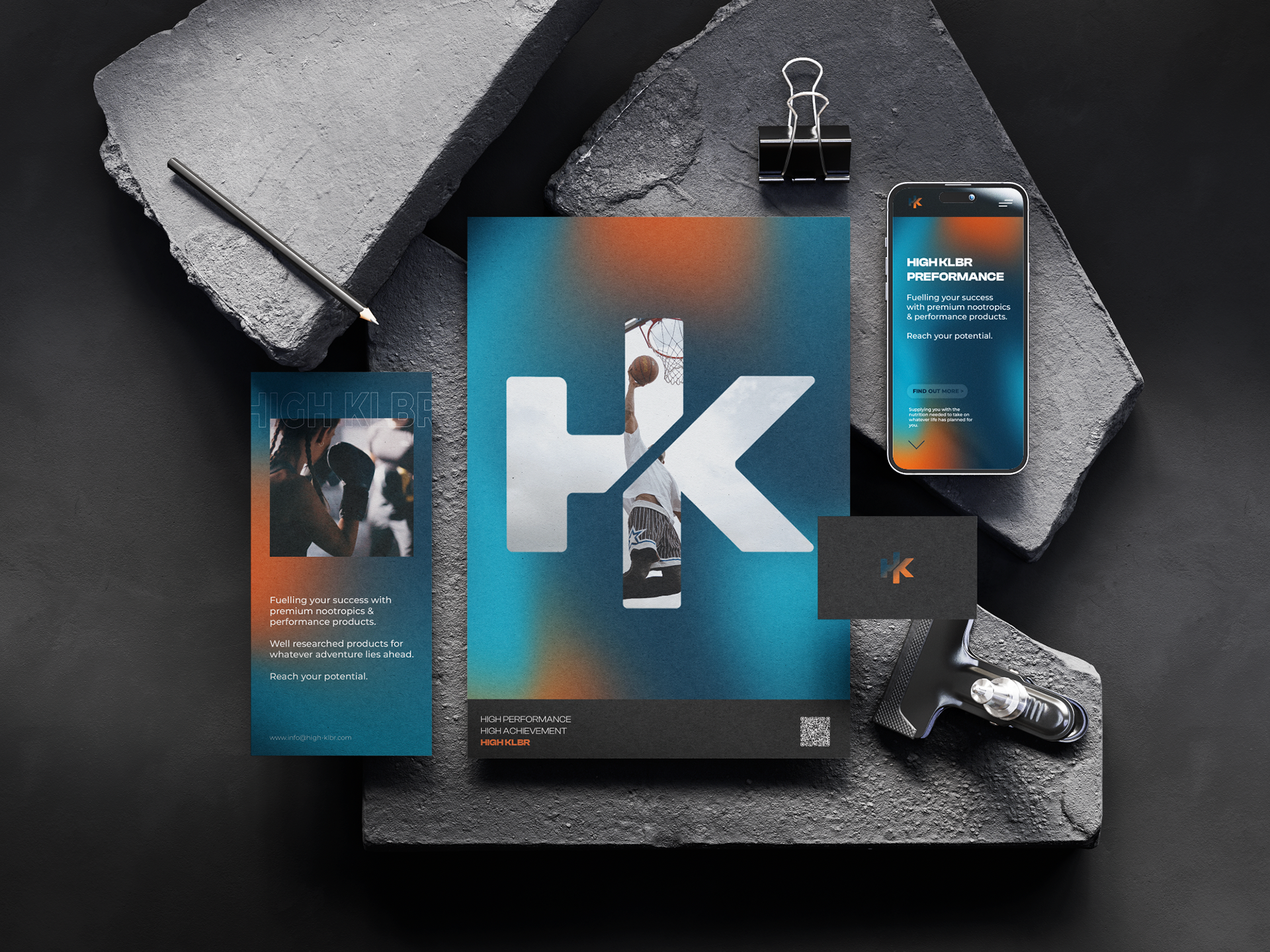
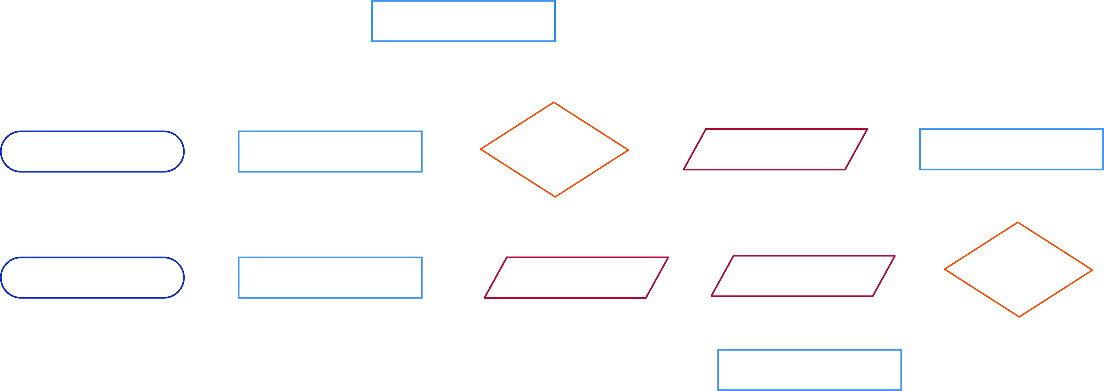
kit of parts
Kit of parts description...
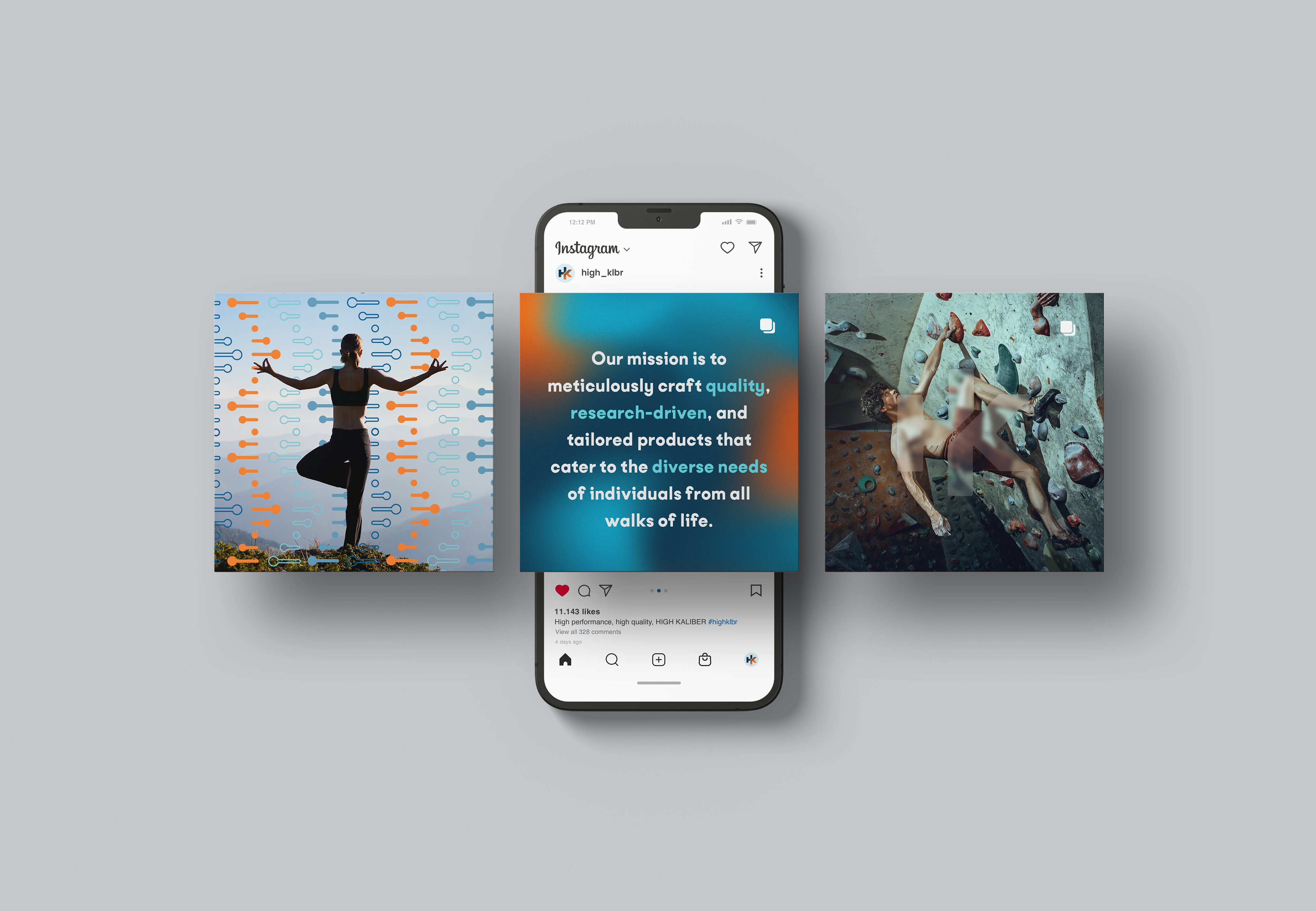
social media
In our social media strategy, we emphasise clear messaging, distinct design elements, and minimalism. We play with light and dark aesthetics, using our brand's texture and iconography to create a cohesive visual identity.
This approach ensures our content is both informative and visually engaging, perfectly capturing the essence of our brand
Iconography
High Kalbier's iconography champions minimalism, strategically employing the brand's refined colour palette across social media highlights and stories.
Each icon, enhanced with simple gradients for a modern edge, swiftly communicates the brand's commitment to premium quality, innovation, and holistic well-being.
This minimalist approach ensures quick comprehension, making High Kalbier's presence unmistakably elegant and impactful across digital platforms.

Articles

Common Questions

Reviews & Testimonials

Ocean Navy Bubble

Turquoise Bubble
Mandarine Bubble

Cognitive Performance

Research & Articles

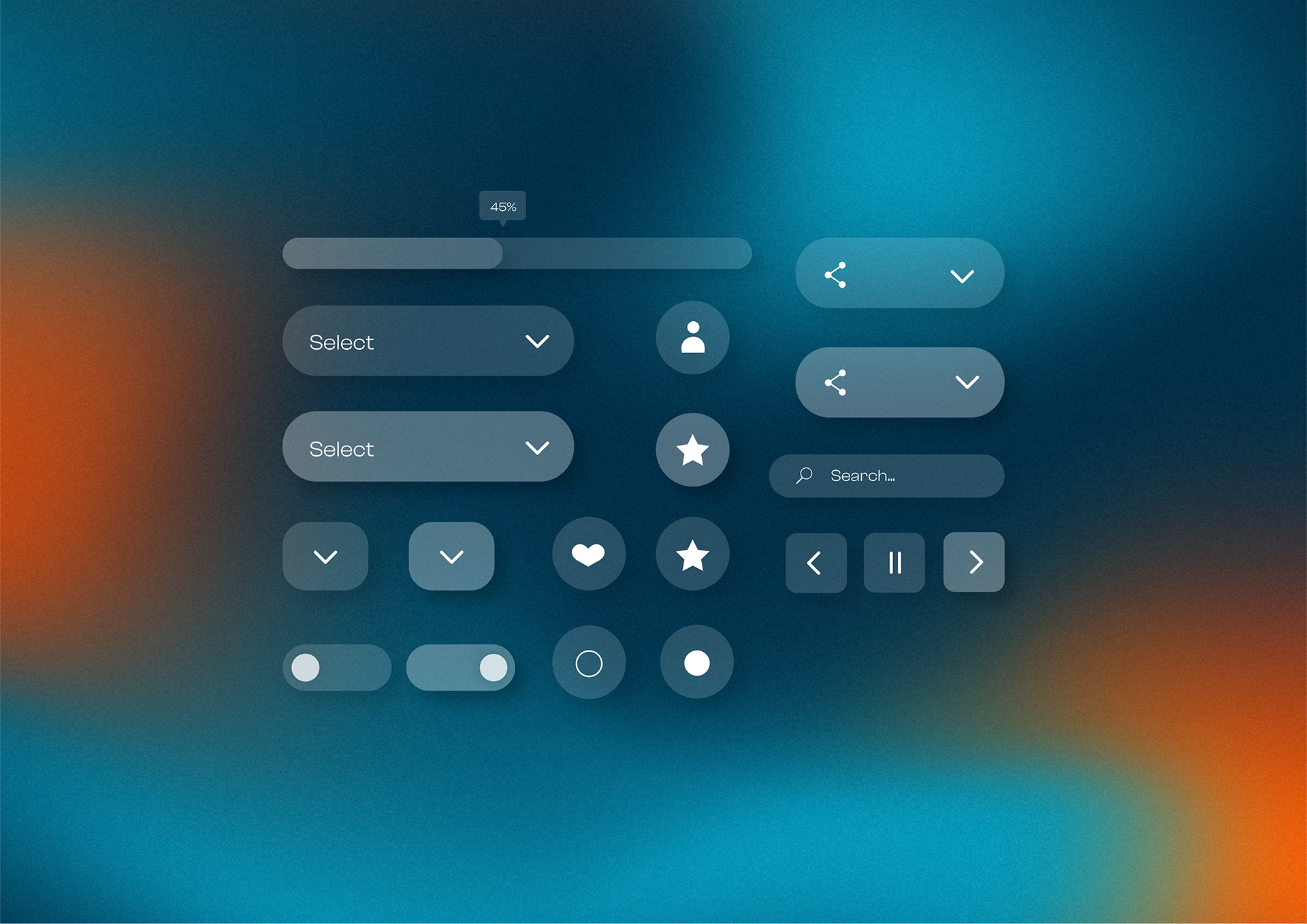
button style
Buttons designed in the glassmorphism style, which adds a clean and modern touch. This design choice maintains simplicity while enhancing visual hierarchy and providing a sense of depth. The translucent effect of glassmorphism improves the overall aesthetics and makes the buttons visually appealing and easy to distinguish, contributing to a sleek and intuitive user experience.
user flow chart
As a digital designer, I led the creation of a user flow chart that serves as the backbone of the website's main function. This journey revealed several challenges and pain points for users. Firstly, users struggled to find sections or categories related to their personal issues. Secondly, negative reviews and navigation difficulties hindered the user experience. Thirdly, users faced difficulty in choosing the right product among multiple options or feeling overwhelmed by the lack of suitable choices.
To address these challenges, we implemented several solutions. Firstly, we introduced a self-assessment tool to streamline the product search process and help users find the right solution faster. Secondly, we highlighted positive reviews and directly addressed negative ones according to a communication guidelines plan to foster trust and transparency. Thirdly, we redesigned the navigation system for seamless usability and minimised views to reduce information overload and competition.
Additionally, we implemented proactive measures such as sending emails and notifications about new products and encouraging users to engage with a call-to-action (such as a contact us form) to communicate their concerns directly. This ensures that users are aware of available products that can address their needs. We also guide users to utilise the self-assessment tool to identify their unmet needs, as many may not know exactly what they're looking for but seek resolution.
Lastly, we created educational tools such as blog posts about each product's purpose to reduce decision fatigue and stress associated with too many choices. By scientifically understanding that humans feel less stressed with fewer options, we optimised the user experience to prioritise ease and effectiveness.
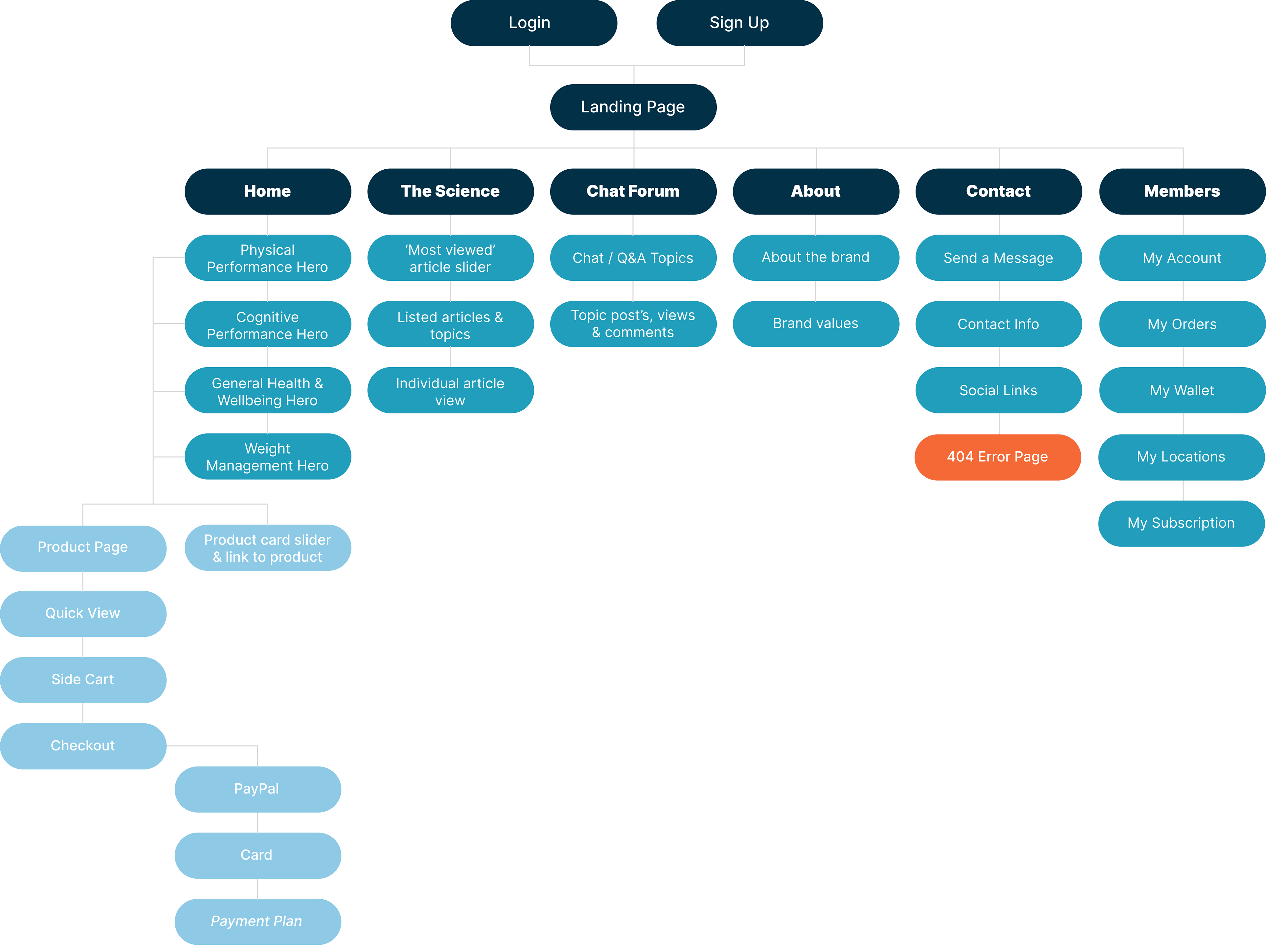
website sitemap
A well-structured sitemap is the foundation of a user-friendly website. For this client's website, I collaborated with them to understand their target audience and website goals. Utilising information architecture principles, I designed a sitemap that organises website content into logical categories, ensuring a clear and intuitive navigation structure. This user-centric approach not only simplifies navigation for visitors but also enhances SEO by providing a clear roadmap for search engines.
ui / ux
The grid system utilised for the desktop website consists of an 80px margin, 32px gutter, and 64px column. This structure ensures consistency and alignment, promoting symmetry, balance, and visual hierarchy.
By dividing the grid by multiples of two for mobile dimensions—resulting in a 40px margin, 18px gutter, and the same 64px column—we maintain these design principles while ensuring functional responsive design across multiple screen sizes. This approach allows for a cohesive and user-friendly experience, regardless of the device used, enhancing usability and engagement.
user-centered site design
This website design is nearing completion and is expected to launch in May, 2024.
This selection showcases key screens from the site design; prioritising user experience with a meticulously crafted interface that reinforces brand identity and mission. Targeting customers who desire a more curated approach to online supplement shopping, the design showcases four distinct sections brimming with hand-picked products representing the market's highest quality offerings.
Appealing to the modern consumer, the user experience takes centre stage. The website employs a bright and minimalist aesthetic, creating a calming and uncluttered atmosphere that stands out from the crowded field of traditional supplement retailers. Bold colours are strategically used to enhance information hierarchy and user navigation, exemplified by elements like breadcrumbs. This airy and spacious feel reflects the website's core mission – promoting balanced wellness – and subtly foreshadows a positive user experience.
Subtle animations for text boxes, coupled with the smooth parallax scrolling of images and interactive hover effects, breathe life and depth into the design. This combination of visual elements, alongside compelling product imagery and clear, concise copywriting, effectively communicates the value proposition – a seamless user experience intertwined with premium products.
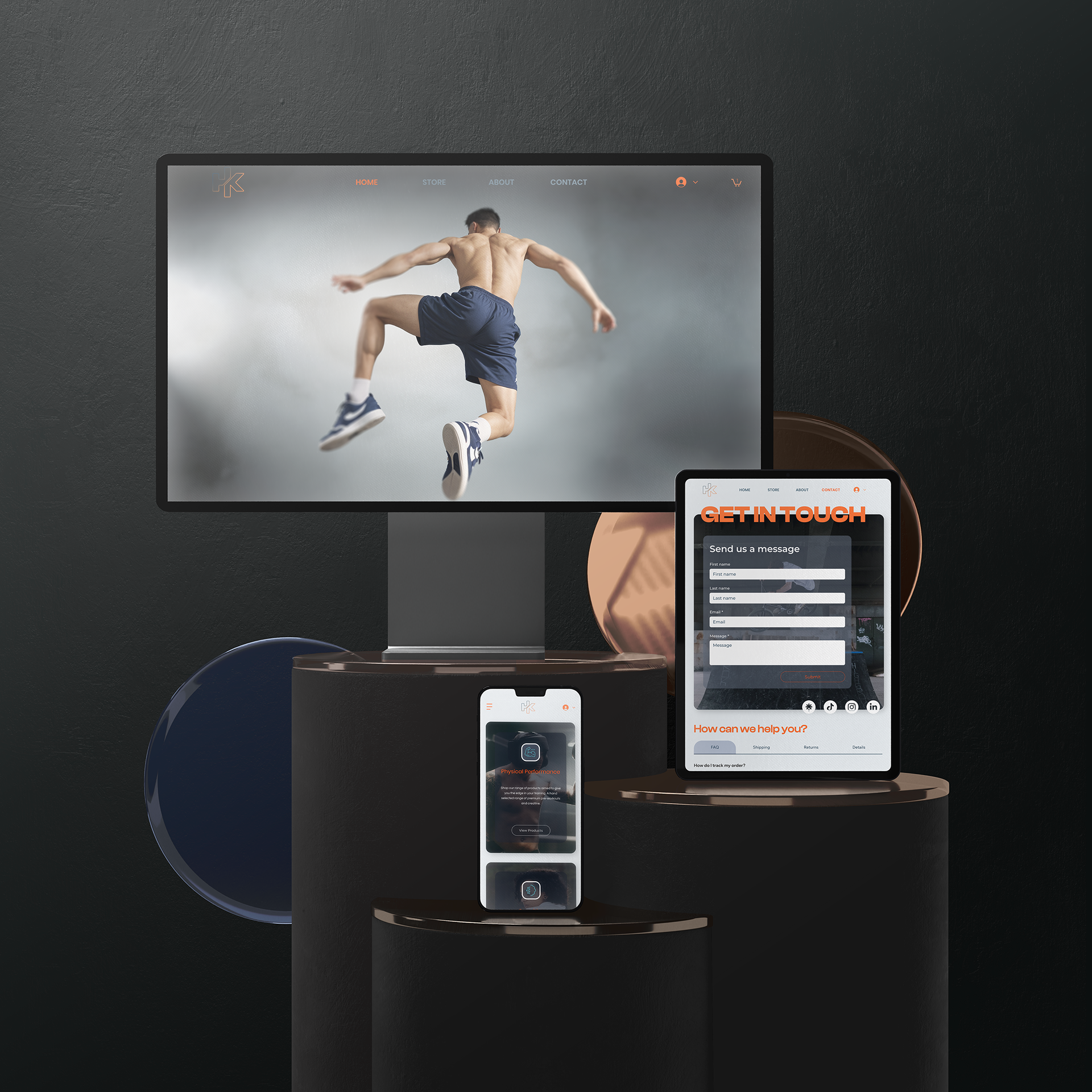
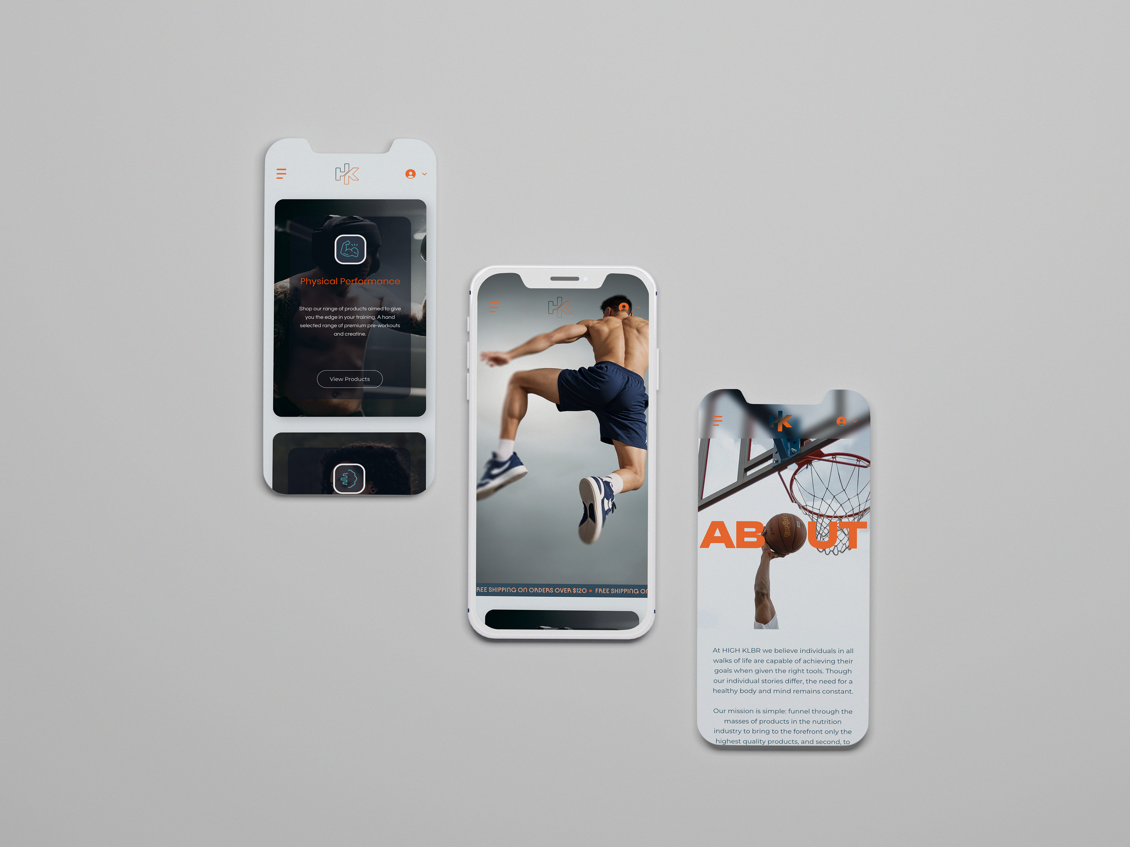
The website seamlessly adapts its layout across all devices, ensuring an optimal user experience for desktop, tablet, and mobile users.
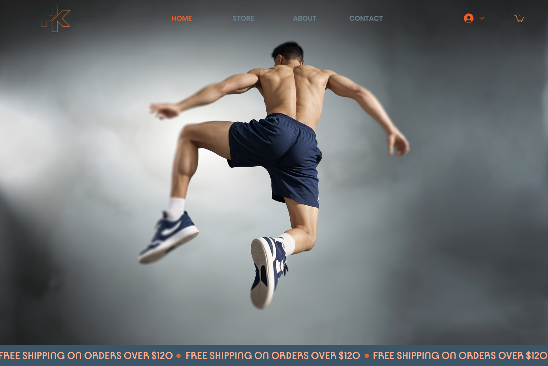
Hero Image
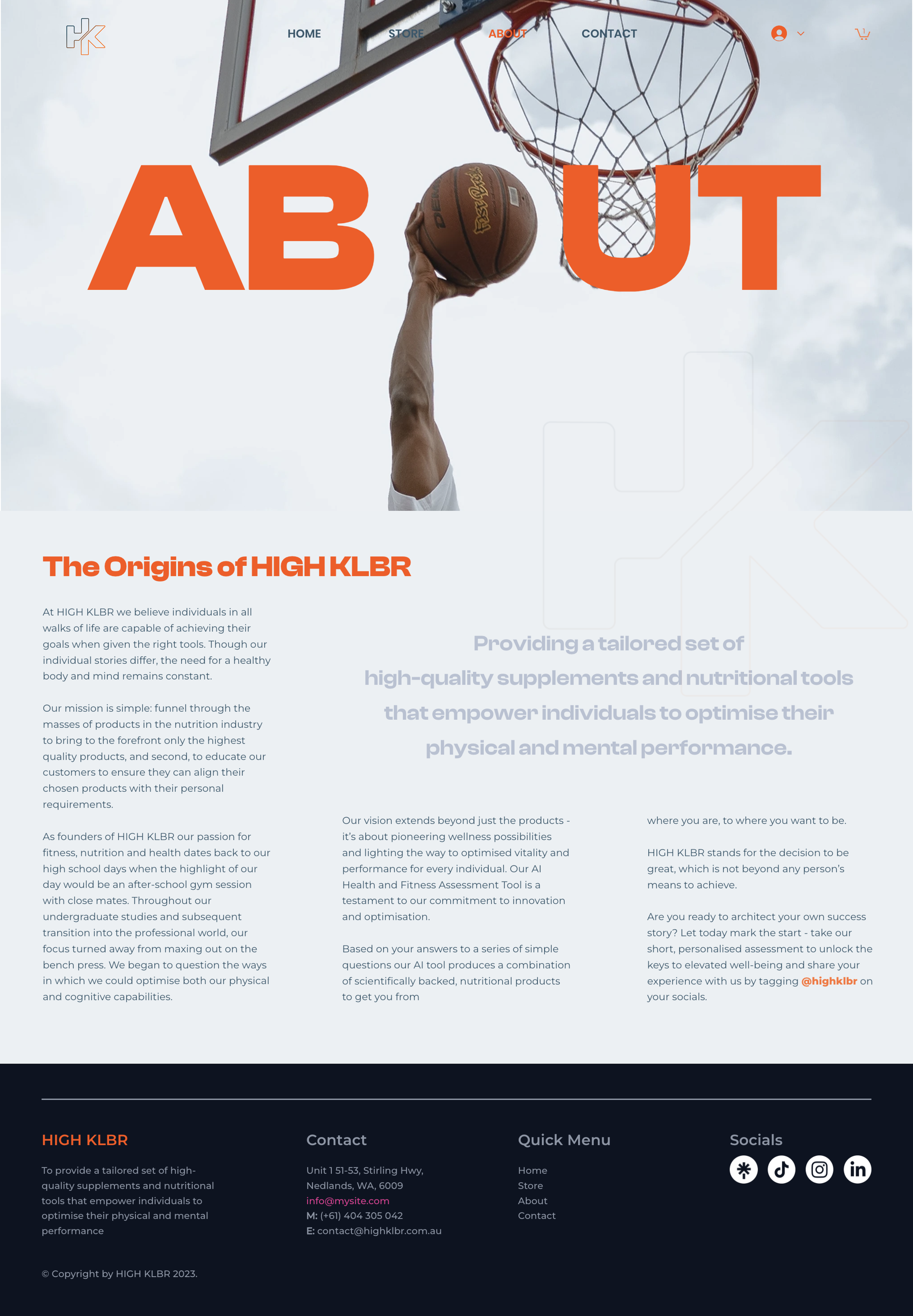
About View
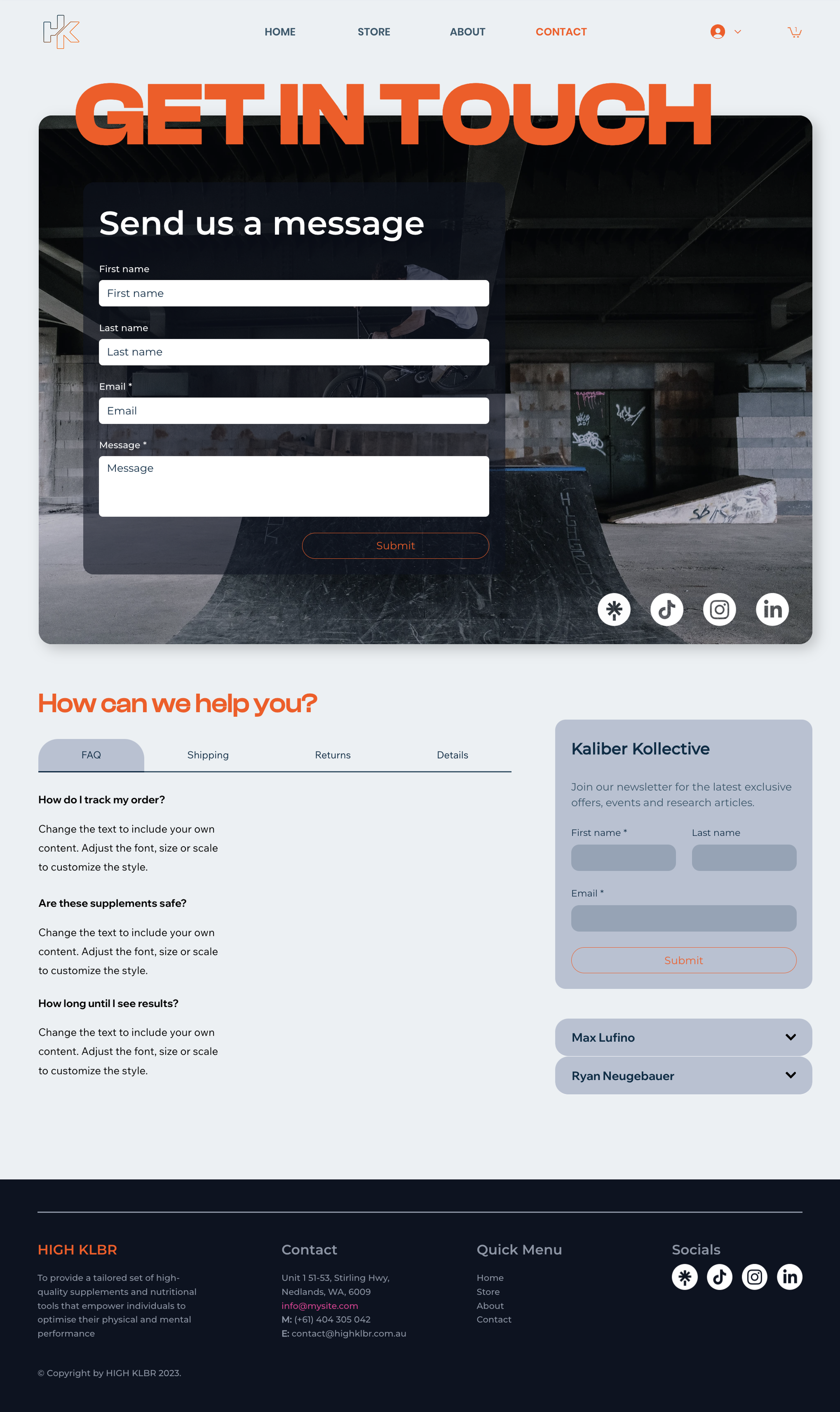
Contact View
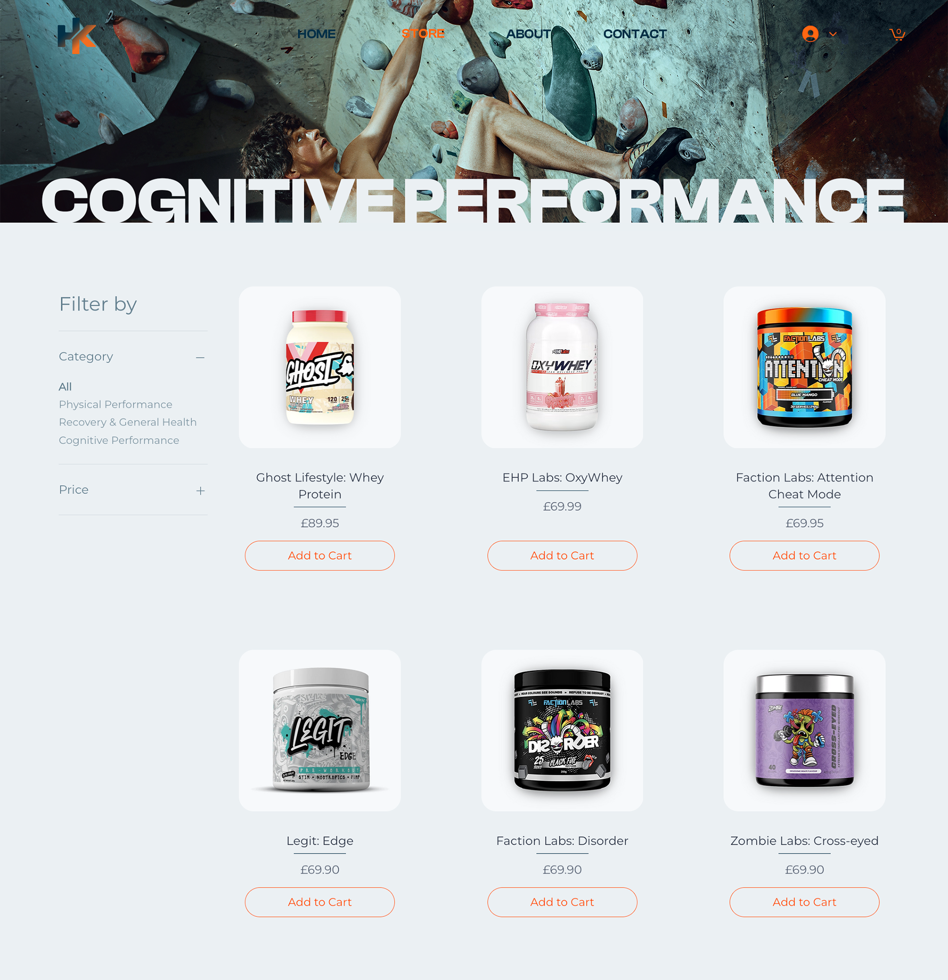
Product View
Measuring Success
For the site design, we've identified key goals like increasing brand awareness and generating leads. We'll track website traffic, lead form submissions, and time spent on key pages to measure success in lead generation. Additionally, we'll monitor metrics like social media mentions and brand search volume increases to gauge brand awareness.
To assess user experience and usability, we'll conduct user testing using the System Usability Scale and customer satisfaction surveys. We'll also utilise the Net Promoter Score (NPS) to understand customer loyalty, which can be valuable for future marketing initiatives.
Furthermore, we've created targeted surveys and interview questions aimed at uncovering any unforeseen user problems within the user journey, particularly focusing on key conversion points like contact forms or product purchases. We'll also conduct fly-on-the-wall testing to observe user interactions with the website's initial landing page and navigation, gaining insights into how to create a strong first impression.