about the projects
Embarking on a creative odyssey with 'Schools of Early Learning,' a Western Australian childcare haven deeply rooted in Indigenous teachings, my graphic design journey unfolded. Each visual element was meticulously crafted to resonate with the essence of cultural inspiration, fostering an environment where young minds blossom.
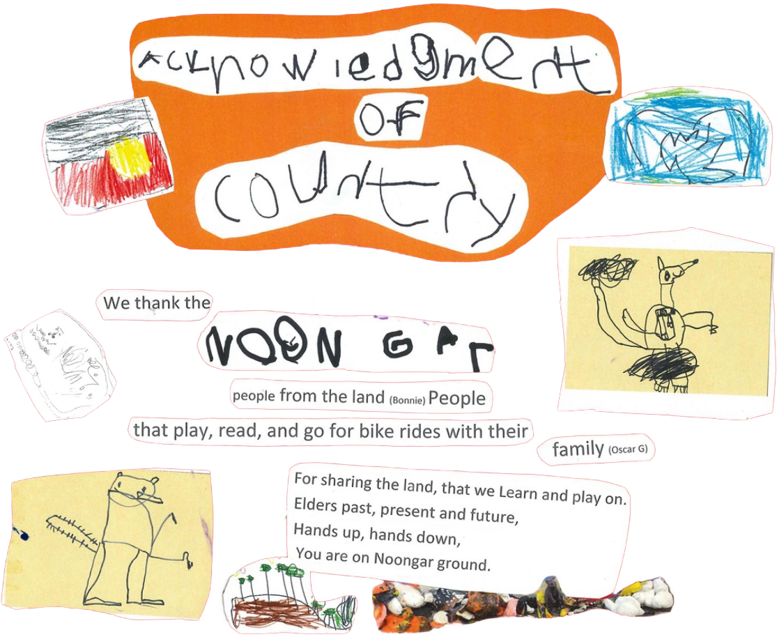
First Nations Peoples
Objective
To incorporate Noongar history and culture into the children's learning through day to day activities.
Our Commitment
To embrace and benefit from Indigenous knowledge and cultural inclusivity.
Celebrate, respect, engage and learn from the original custodians of this land.
Provide our staff and children with cultural awareness through children's incursions and projects so they can gain a greater understanding of and respect for First Nations peoples.

the project
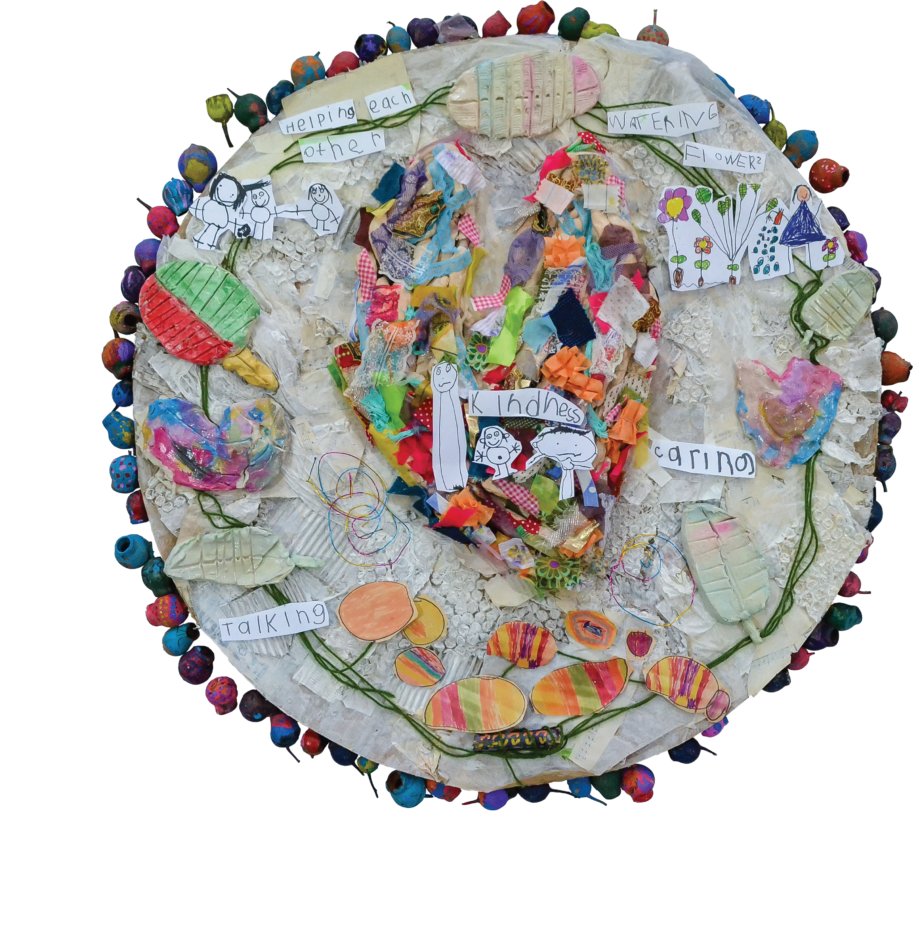
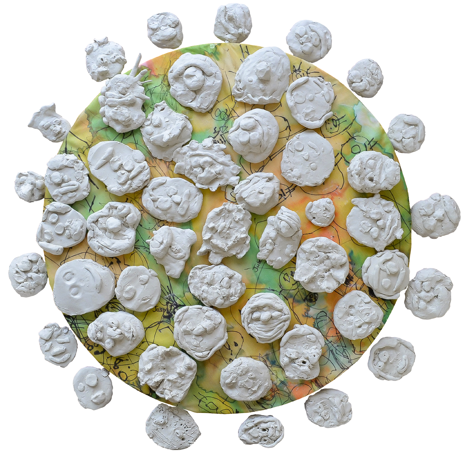
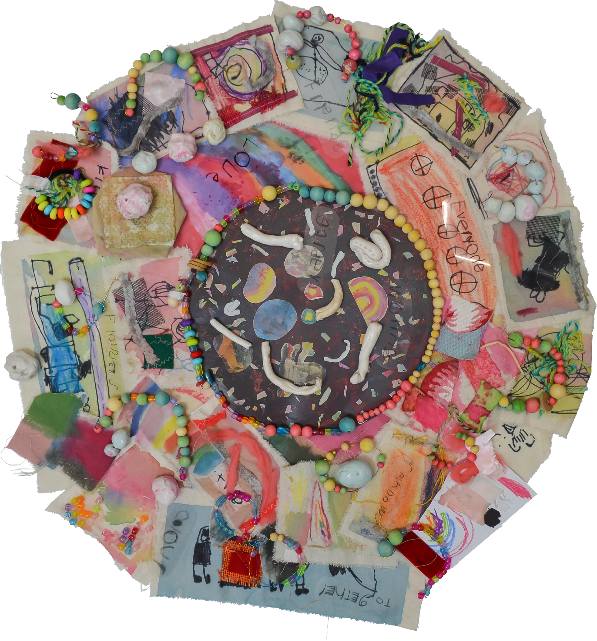
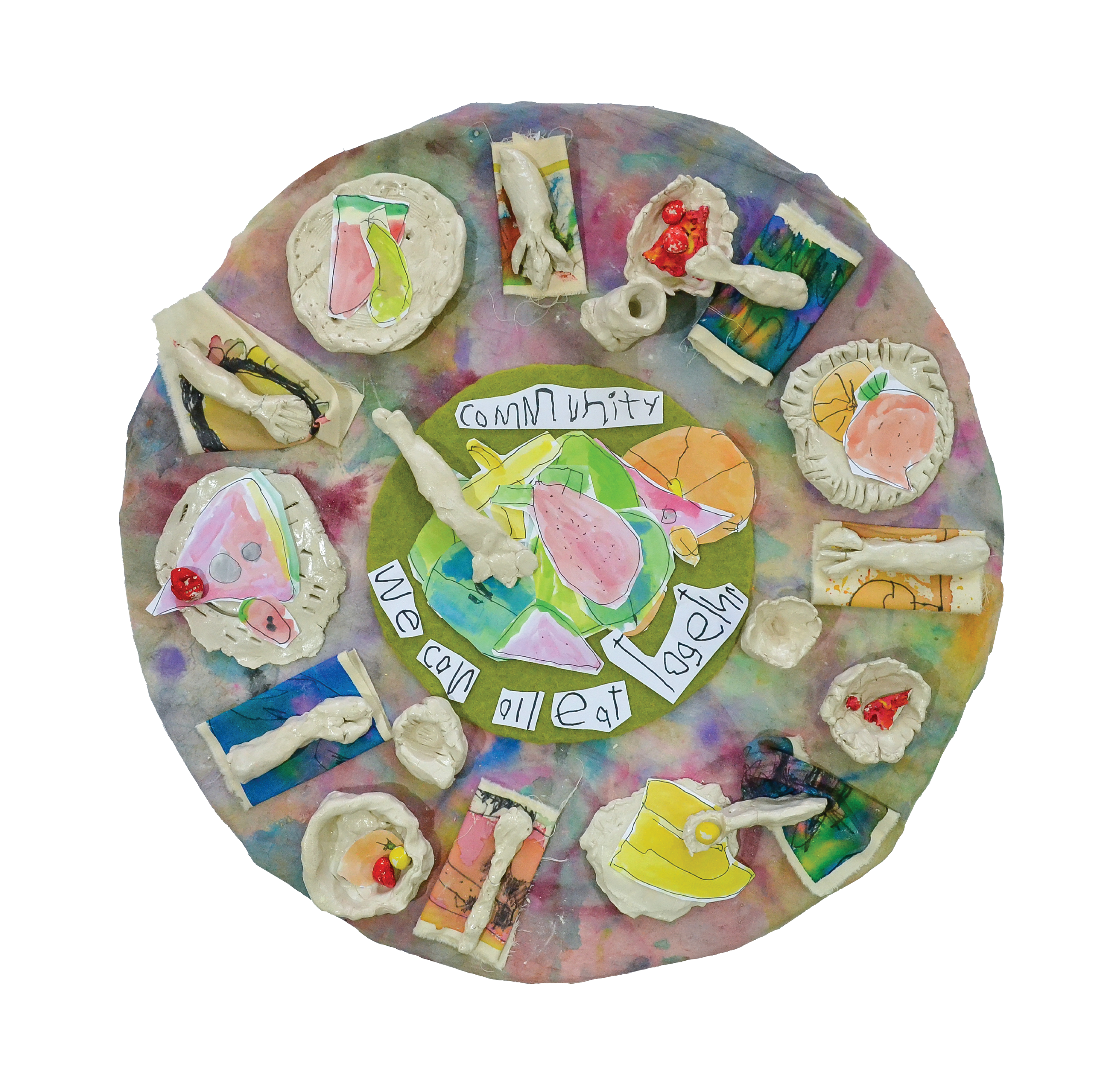
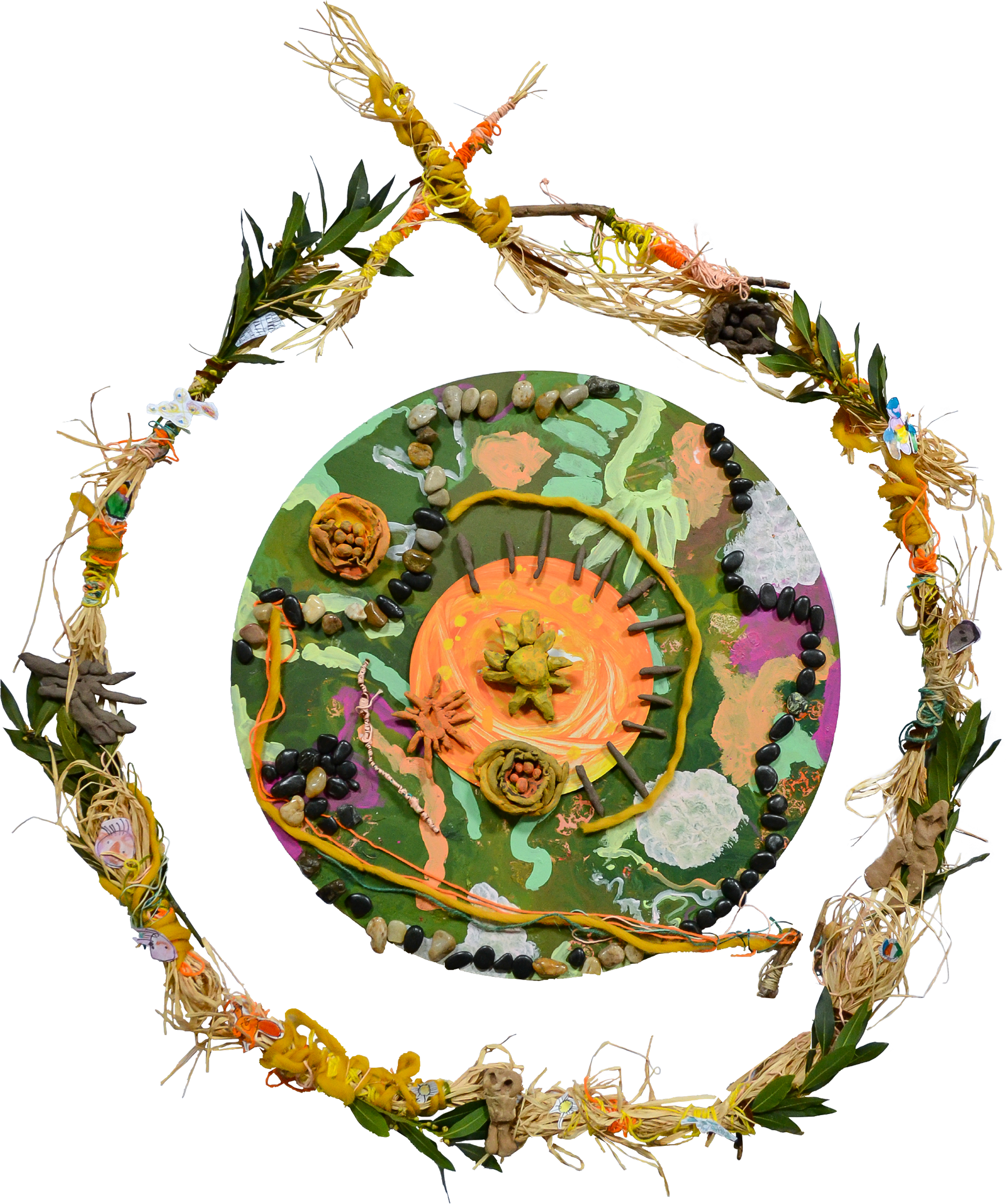
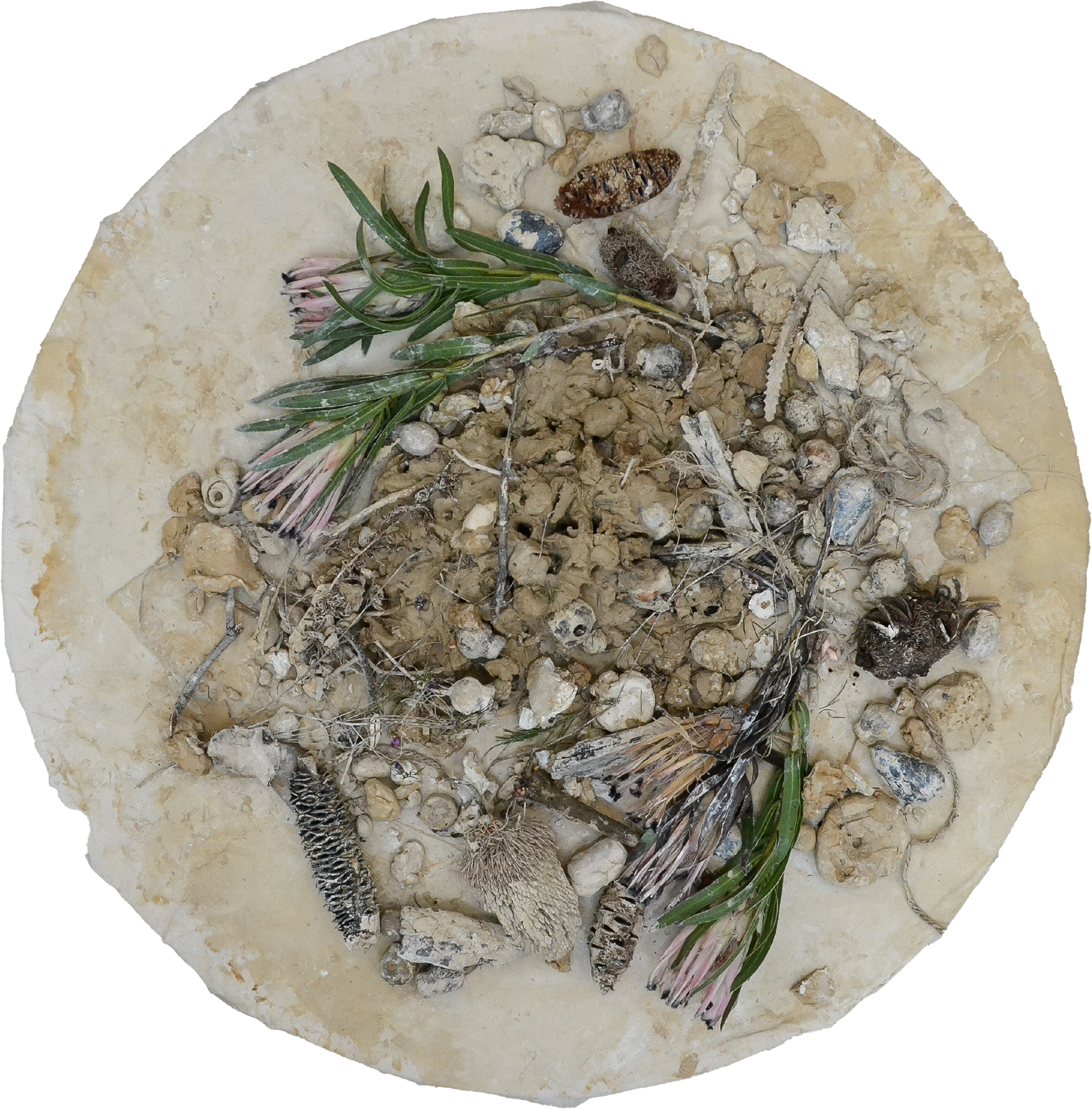
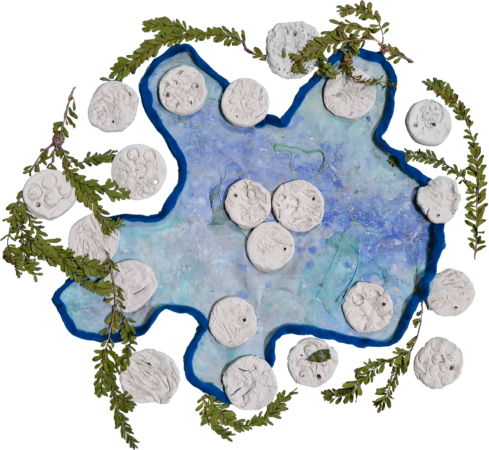
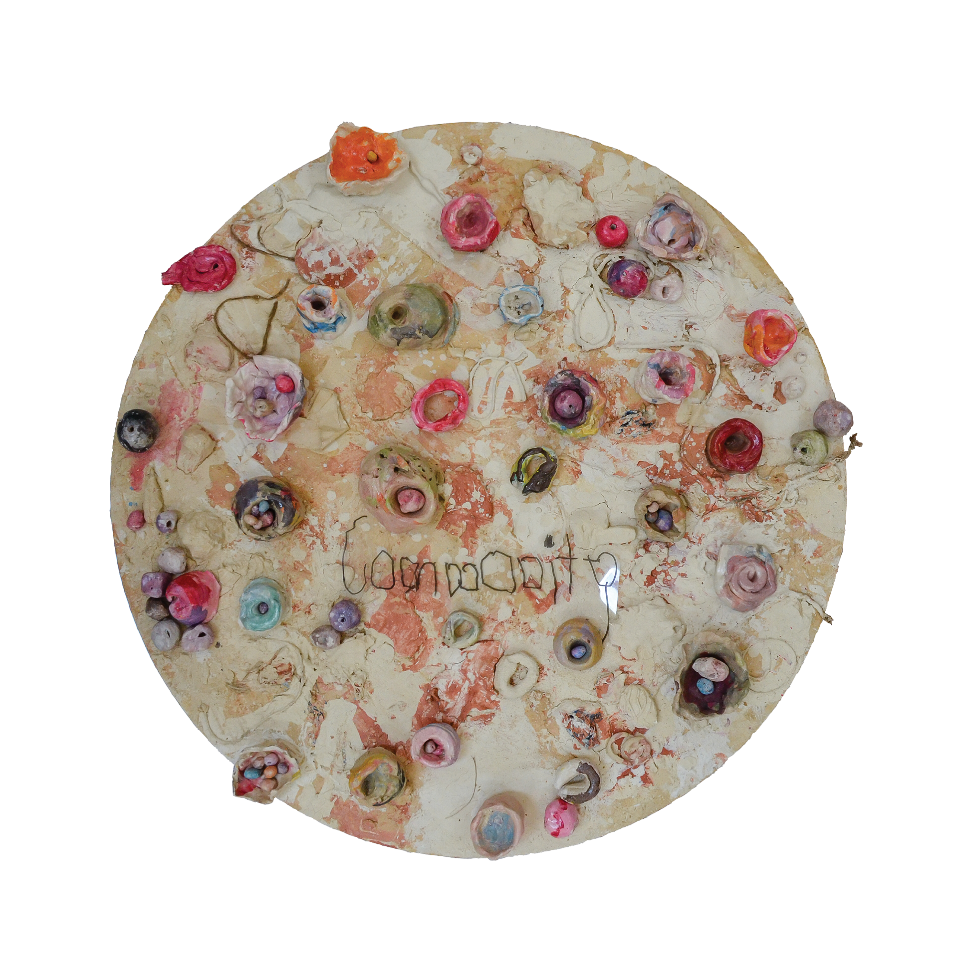
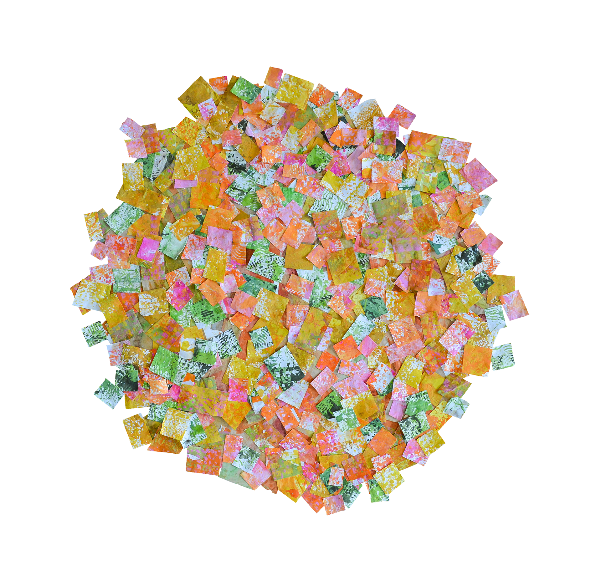
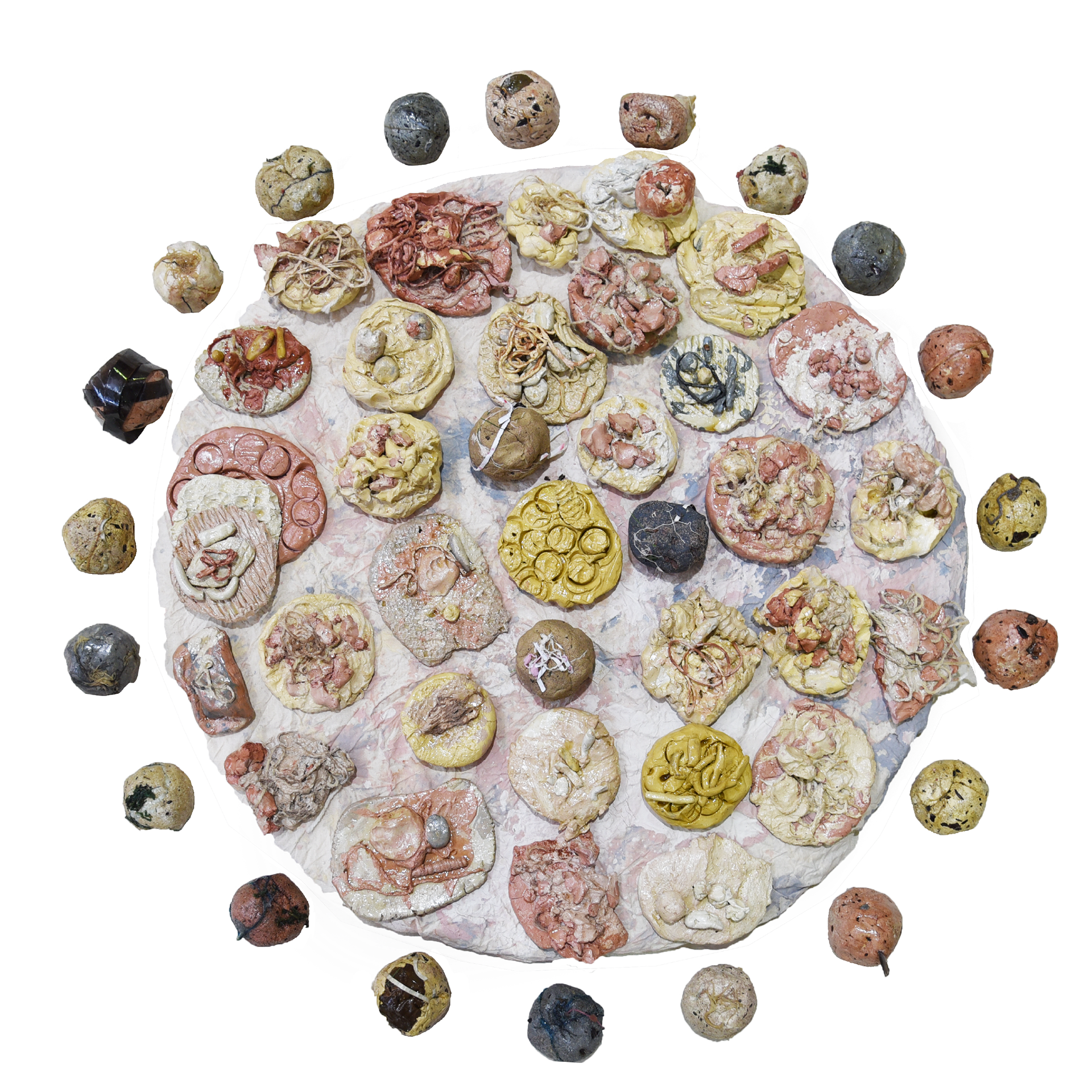
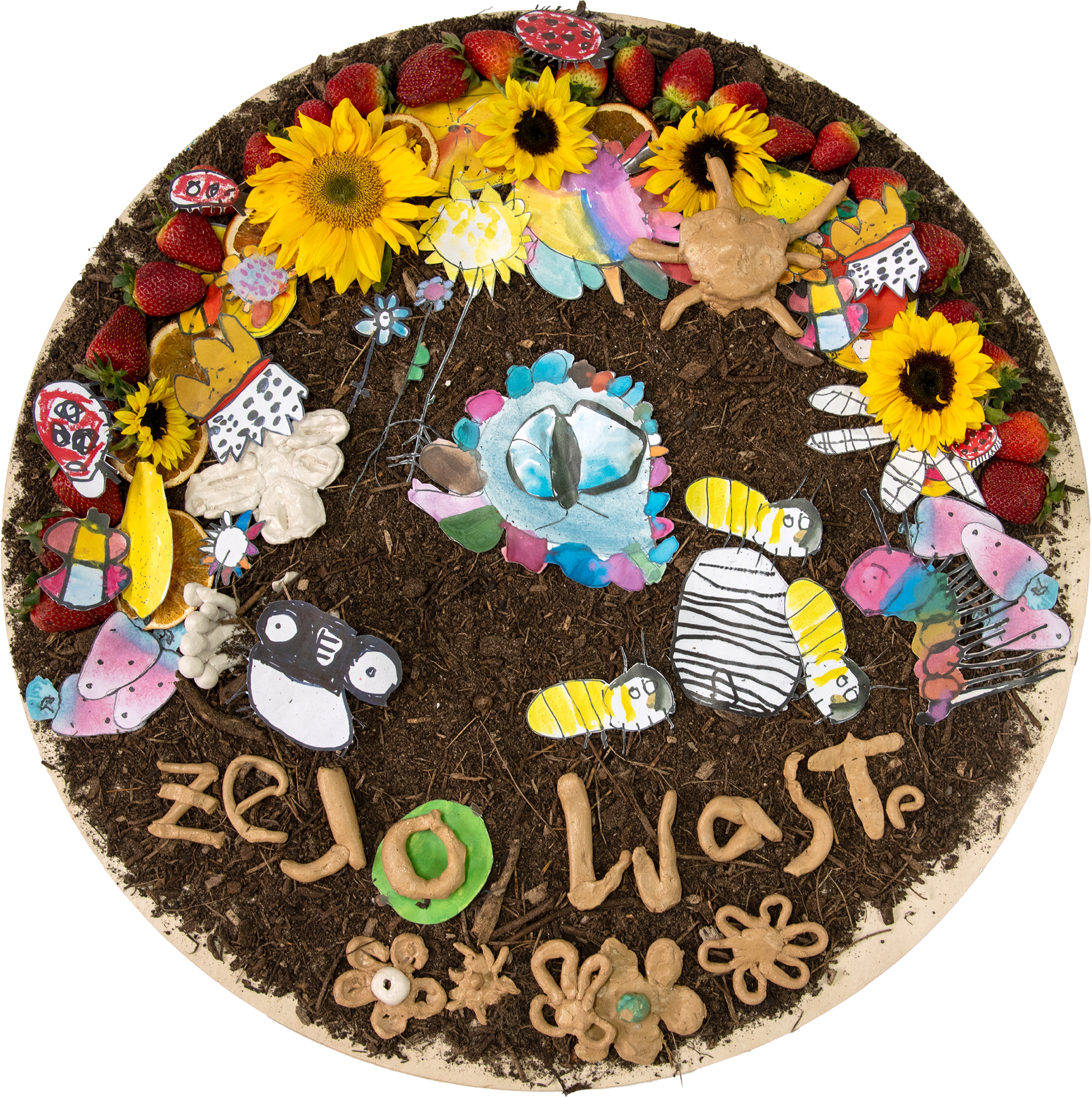
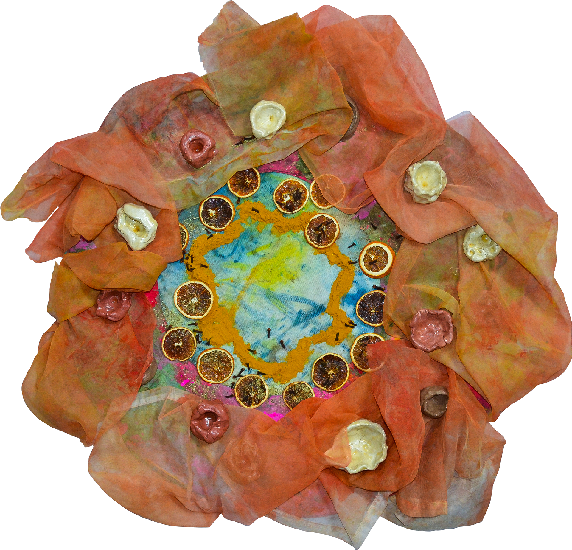
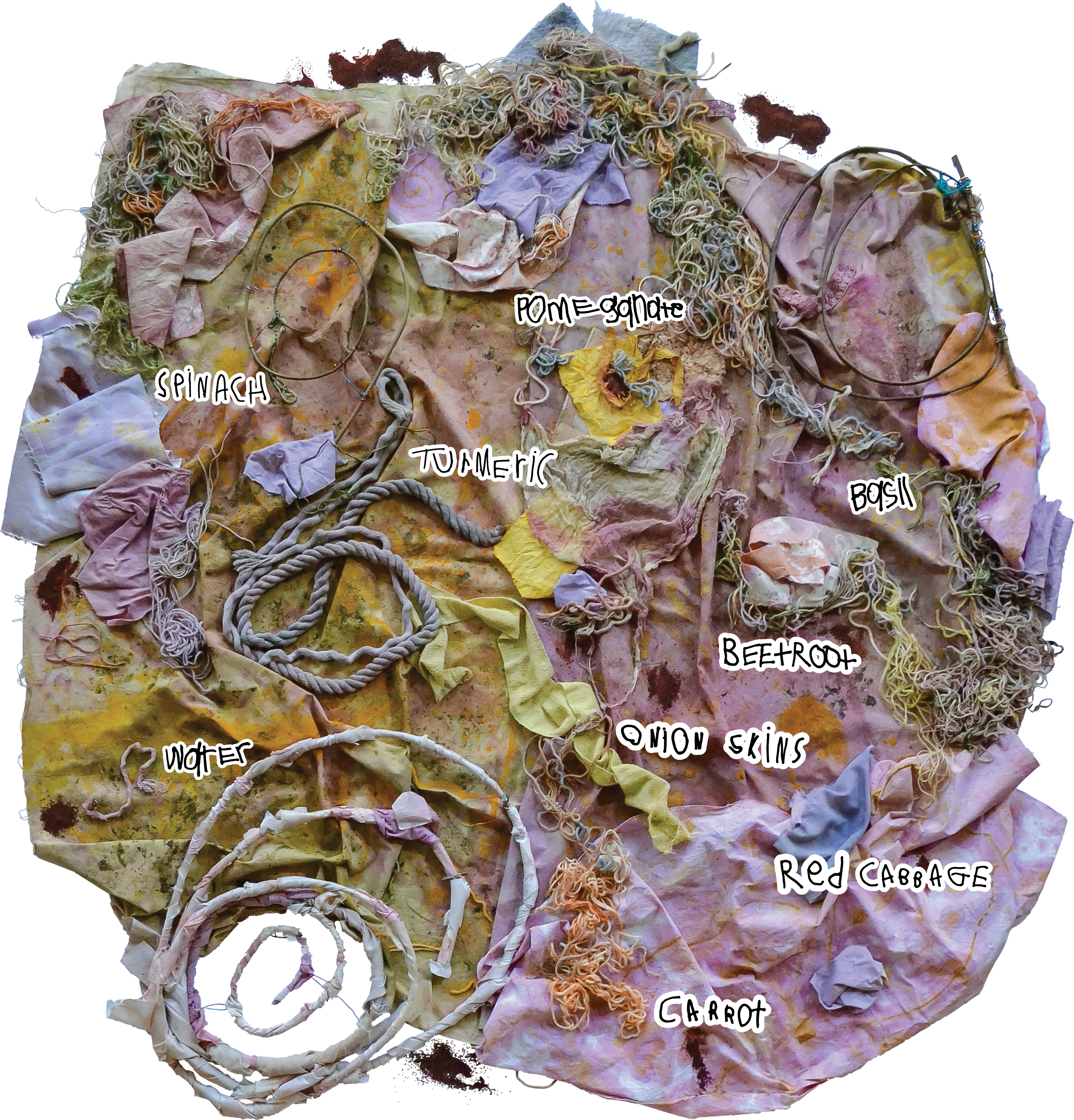
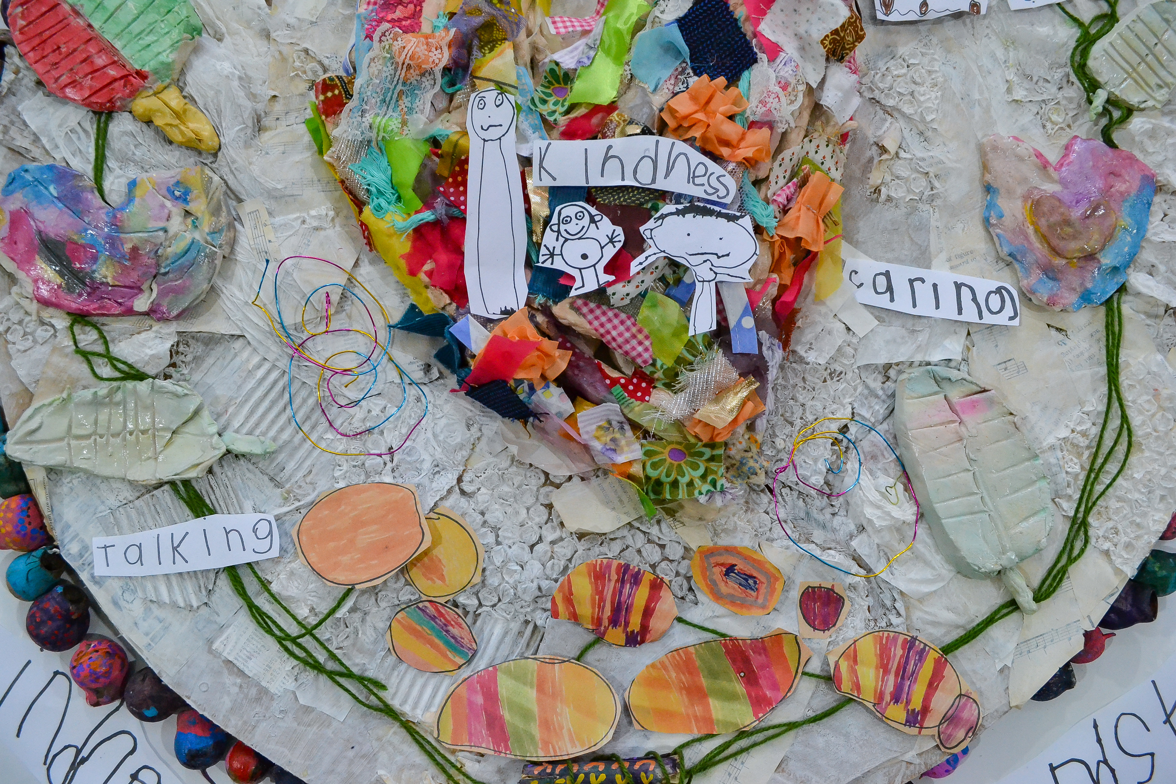
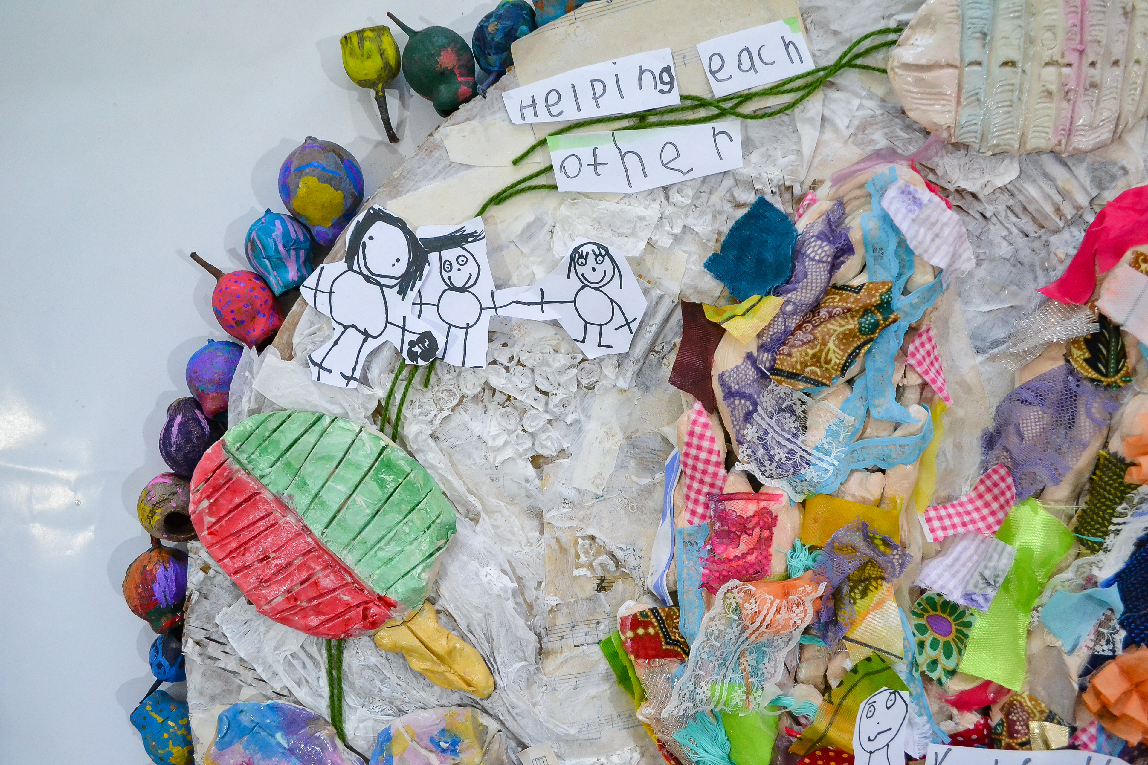
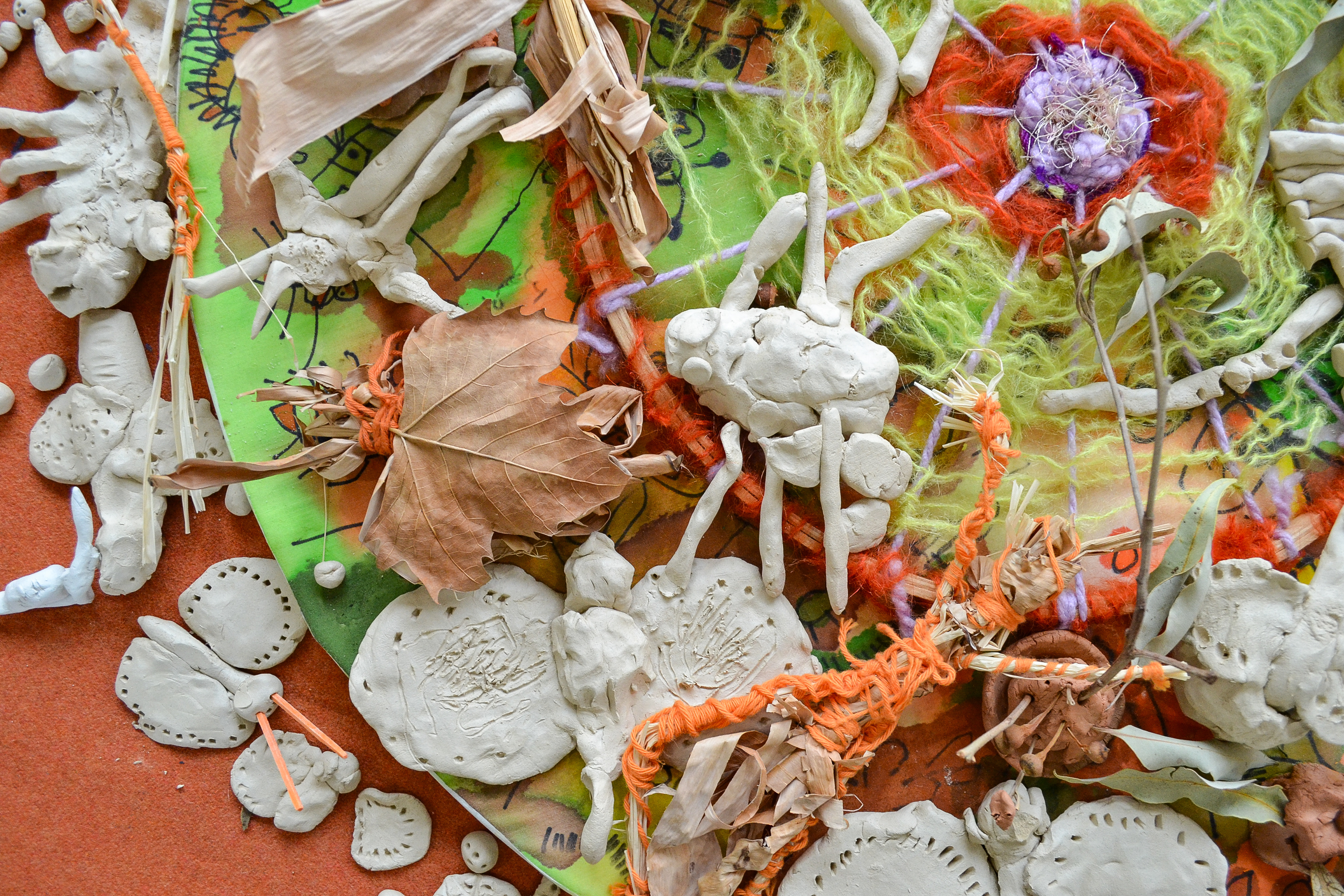
In the heart of 'Schools of Early Learning,' an annual tradition unfolds with the 'End of Year T-Shirts' project—a celebration of creativity, Indigenous wisdom, and the vibrant spirit of childhood. Children ages from 6 months to 4 years engaged in this cultural exploration project.
Explorations & Studies
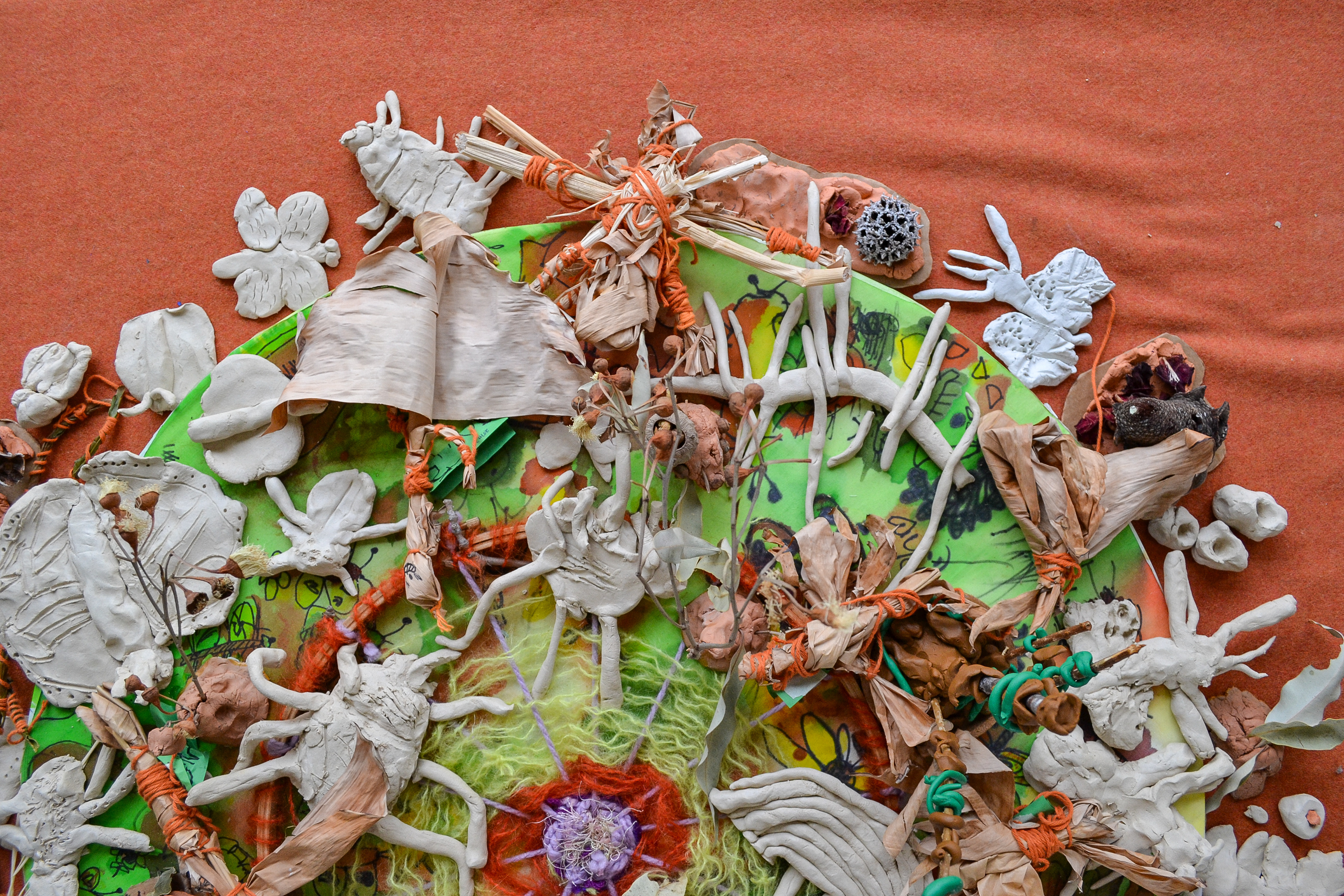
For six immersive weeks, I worked closely with each room as children delved into topics steeped in Indigenous culture—seasons, country, painting, self, animals, and more. Their collaborative efforts birthed expansive multi-medium artworks. As the resident visual storyteller, my role was to capture these creations, meticulously enhancing and preparing them for their final canvas—the annual commemorative T-shirts.
Design process
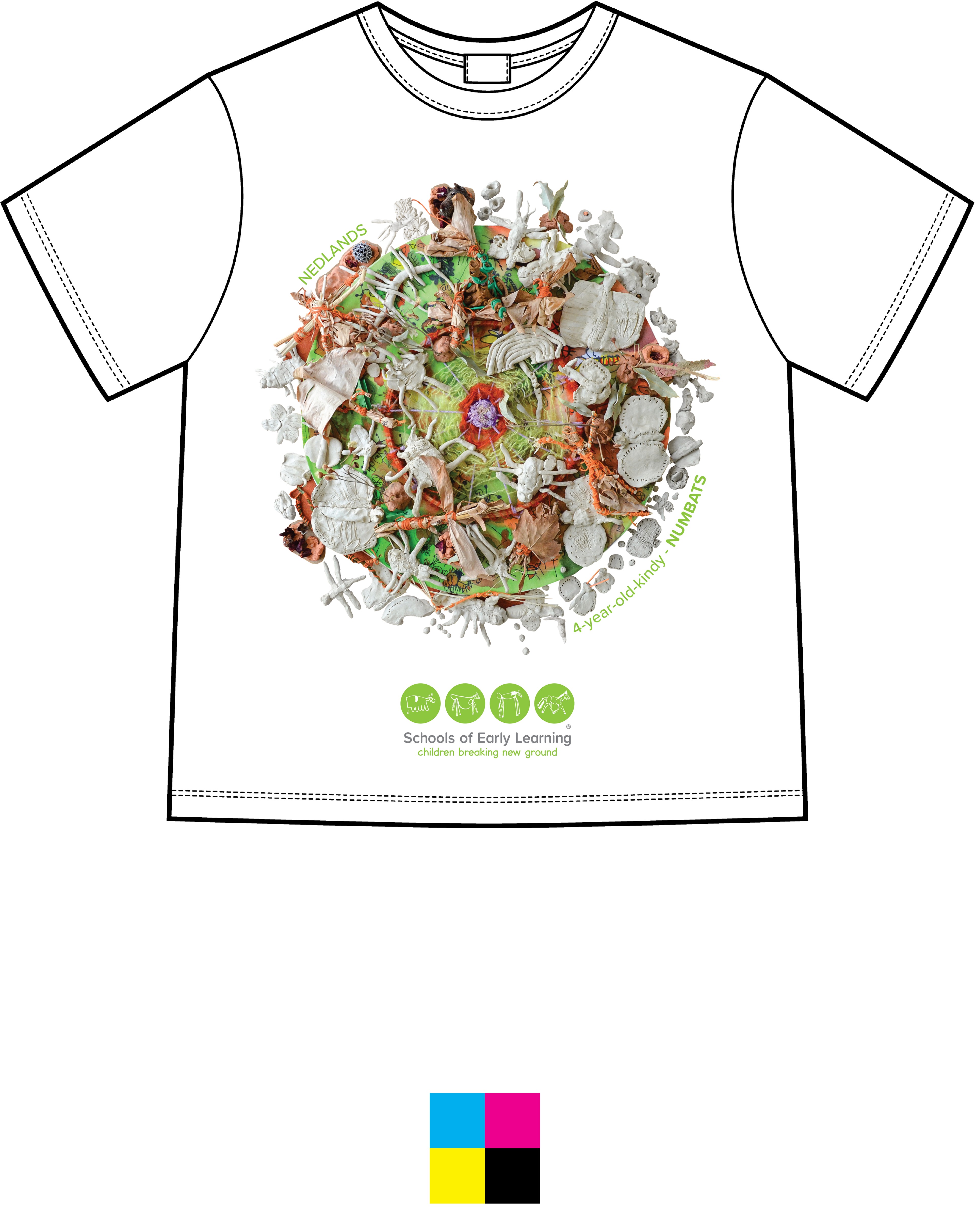
Behind the scenes, deep etching and colour grading in Adobe's suite of tools—Photoshop, Illustrator, Lightroom, and InDesign—played a pivotal role. Every brushstroke and hue underwent careful scrutiny, ensuring the essence of the original artwork translated seamlessly onto fabric. Sizing considerations for various T-shirt dimensions were meticulously handled, guaranteeing the consistency and fidelity of the print quality.
capturing culture, crafting memories
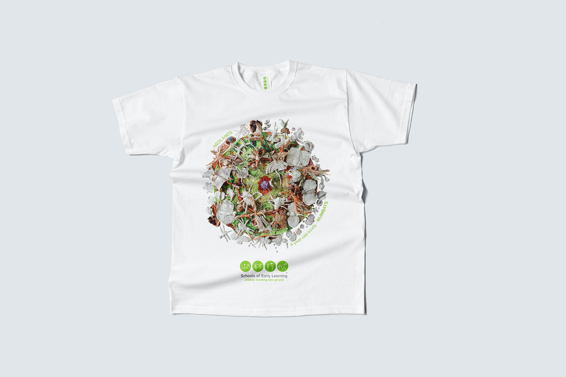
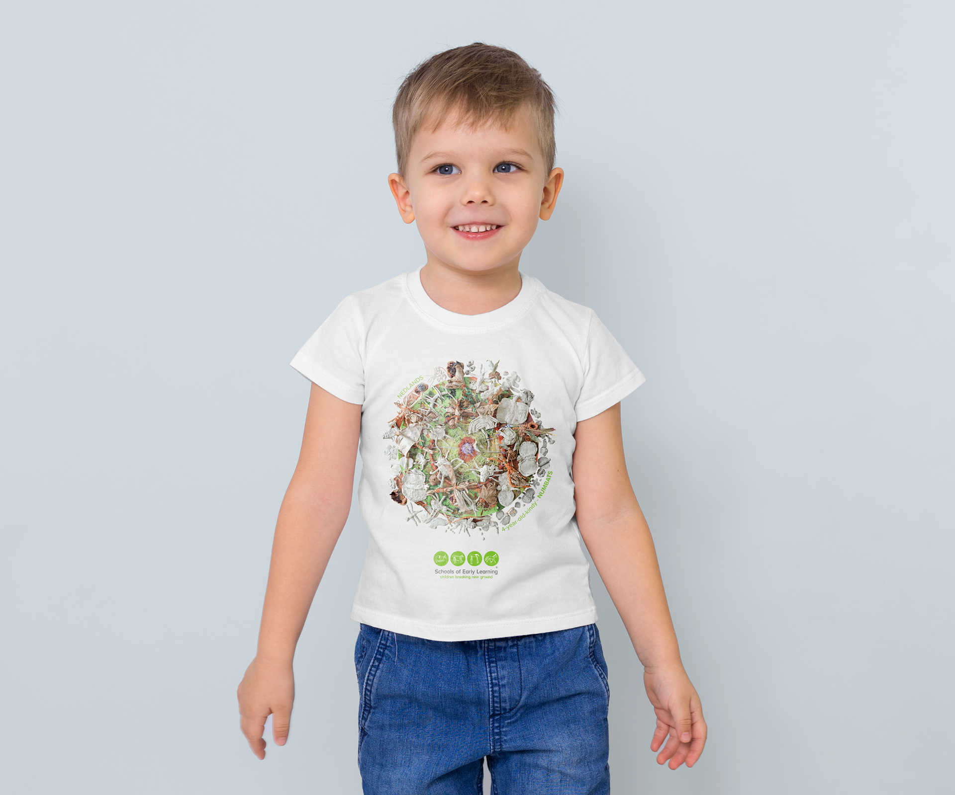
The result? Captivating imagery that not only encapsulated the children's artistic endeavours but also became a tangible expression of their cultural explorations. These unique T-shirts, rich with Indigenous narratives, served as heartfelt gifts to parents—a wearable testament to a year of creativity, collaboration, and cultural appreciation.
4 Year Old Kindy
3 Year Old Kindy

4 Year Old Kindy
4 Year Old Kindy

Babies
3 Year Old Kindy
4 Year Old Kindy

3 Year Old Kindy
Toddlers
Babies
3 Year Old Kindy
Toddlers
Toddlers
4 Year Old Kindy
Toddlers
Babies

photography insights
In documenting the 'End of Year T-Shirts,' I discovered the genuine intrigue and emotional investment of the children in their artworks. They weren't just creating; they understood the impact of Indigenous narratives, taking pride in explaining the meaning behind their pieces.
technical finesse
On the technical side, adjusting the camera's aperture was about finding a balance—making sure the artworks took centre stage. Managing ISO to reduce noise and playing with shutter speed aimed at achieving clear and faithful representations of their creations.
Beyond technicalities, it was about mastering the play of light. By reducing noise through ISO adjustments, the vibrant colours and details came to life. Shutter speed became a tool for preserving the emotional depth in each image.
finalisation & printing process
In the last phase, I worked closely with printers to bring the 'End of Year T-Shirts' designs to fruition. The goal was to transform digital creativity into tangible, wearable art.
Using Adobe InDesign, I ensured the technical details were spot on—printers marks, colour profiles, and precise dimensions. Attention to specifics like bleed, gutter, margins, and DPI was crucial for a smooth printing process.
digital to tangible
Moving from digital mockups to printed T-shirts involved a meticulous approach. It wasn't just about printing; it was the practical transformation of creative ideas into tangible stories—each T-shirt vividly narrating the cultural explorations of young minds.
The final result was clean, vibrant T-shirts that seamlessly integrated shape, form, and typography. Each shirt was a result of merging technical precision with creative vision, offering a wearable representation of the children's artistic expressions.

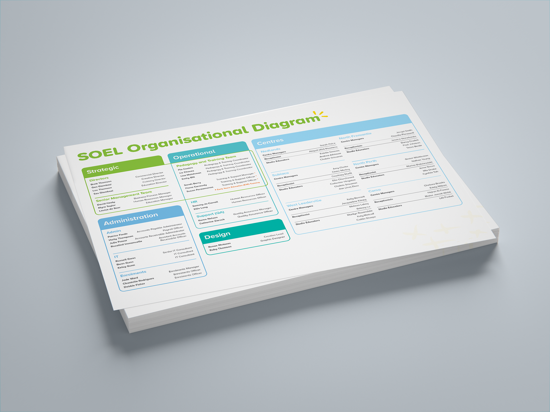
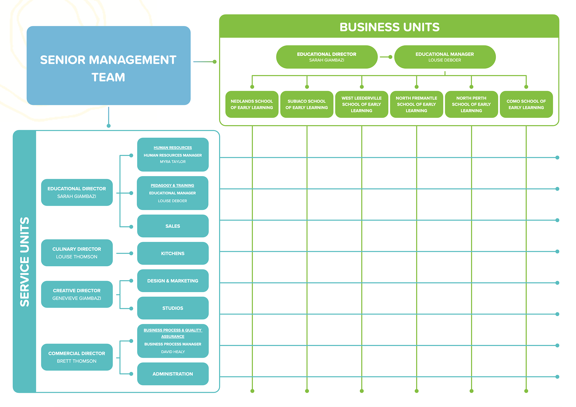
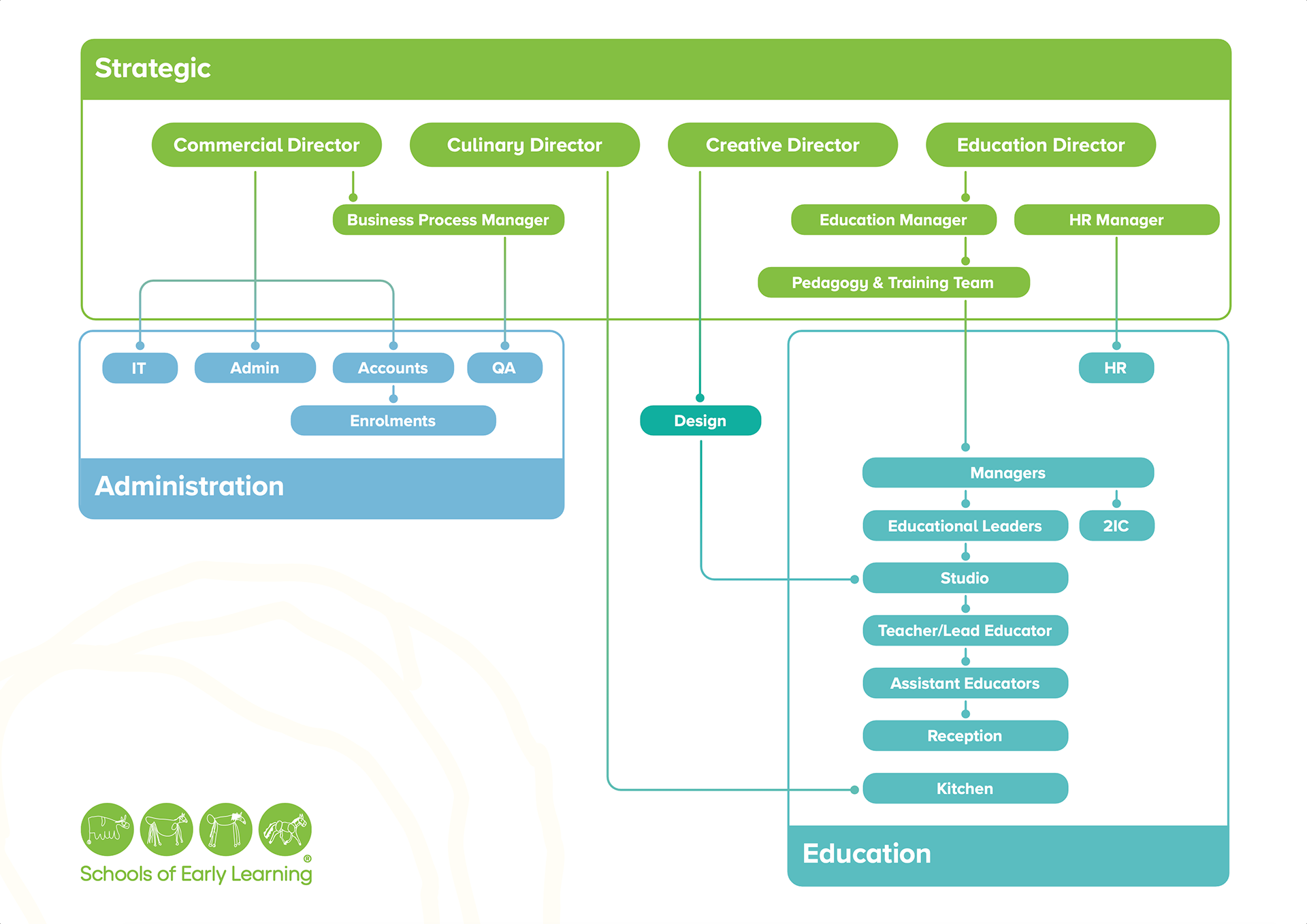
organisational diagram
The 'Organisational Diagram' project presented significant challenges due to the abundance of data and text that needed to be included while maintaining readability within the confines of A4 dimensions. The objective was to create a visually engaging and comprehensible diagram that effectively communicated complex organisational information.
Design Approach
To address these challenges, I adopted a methodical approach that involved extensive sketching and analysis of previous designs. This process helped identify key areas of focus and determine the hierarchy of information. Utilising colour hierarchy, derived from the updated brand palette and typography, played a crucial role in directing the user's attention to important details.
Managing Complexity & Visual Organisation
With an abundance of data to include, it was essential to prioritise readability and clarity. Strategically employing overlapping graphic elements, the diagram effectively delineated roles and responsibilities while highlighting areas of collaboration and intersection. This approach not only facilitated understanding but also added visual interest and depth to the diagram.


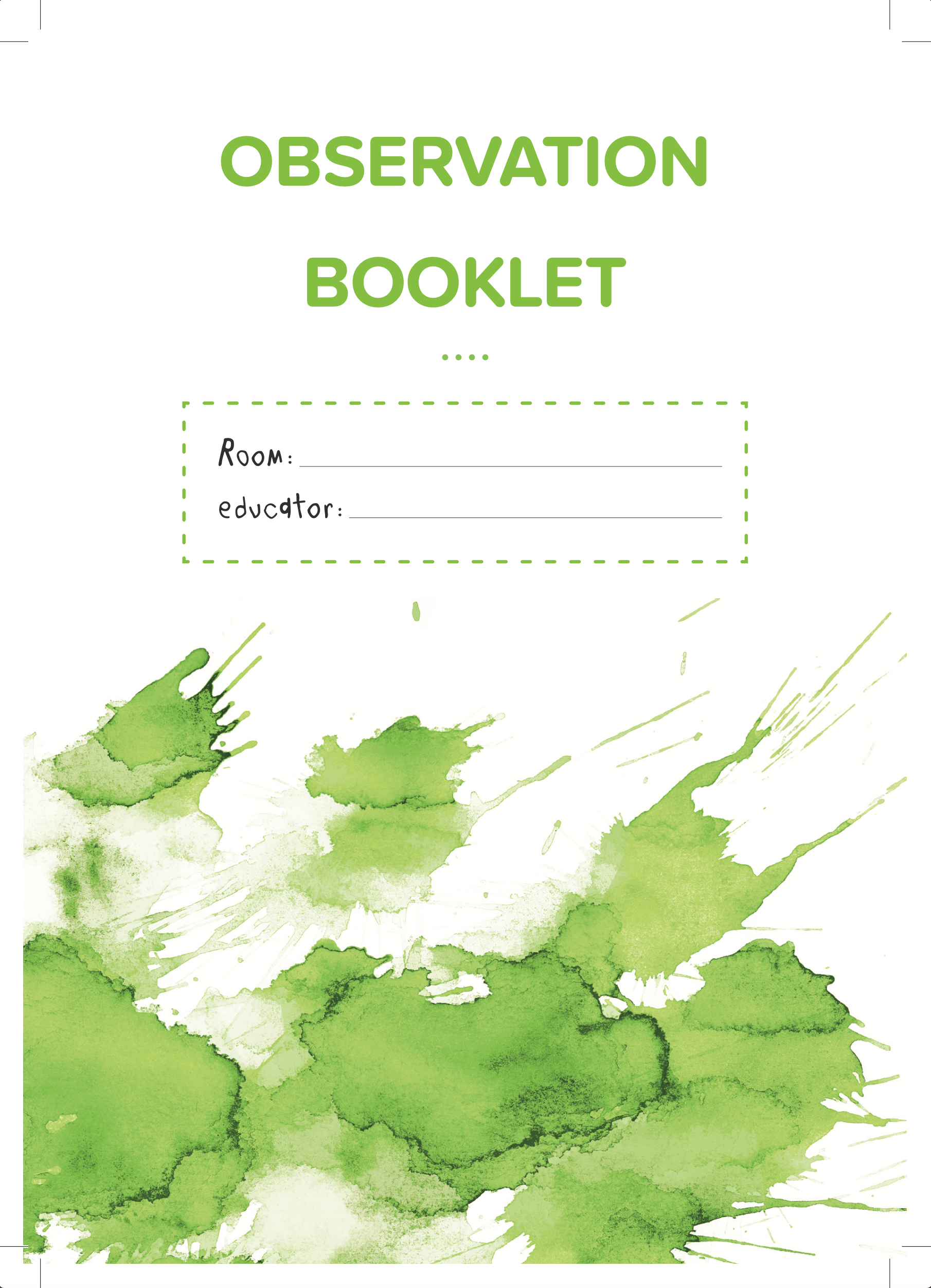
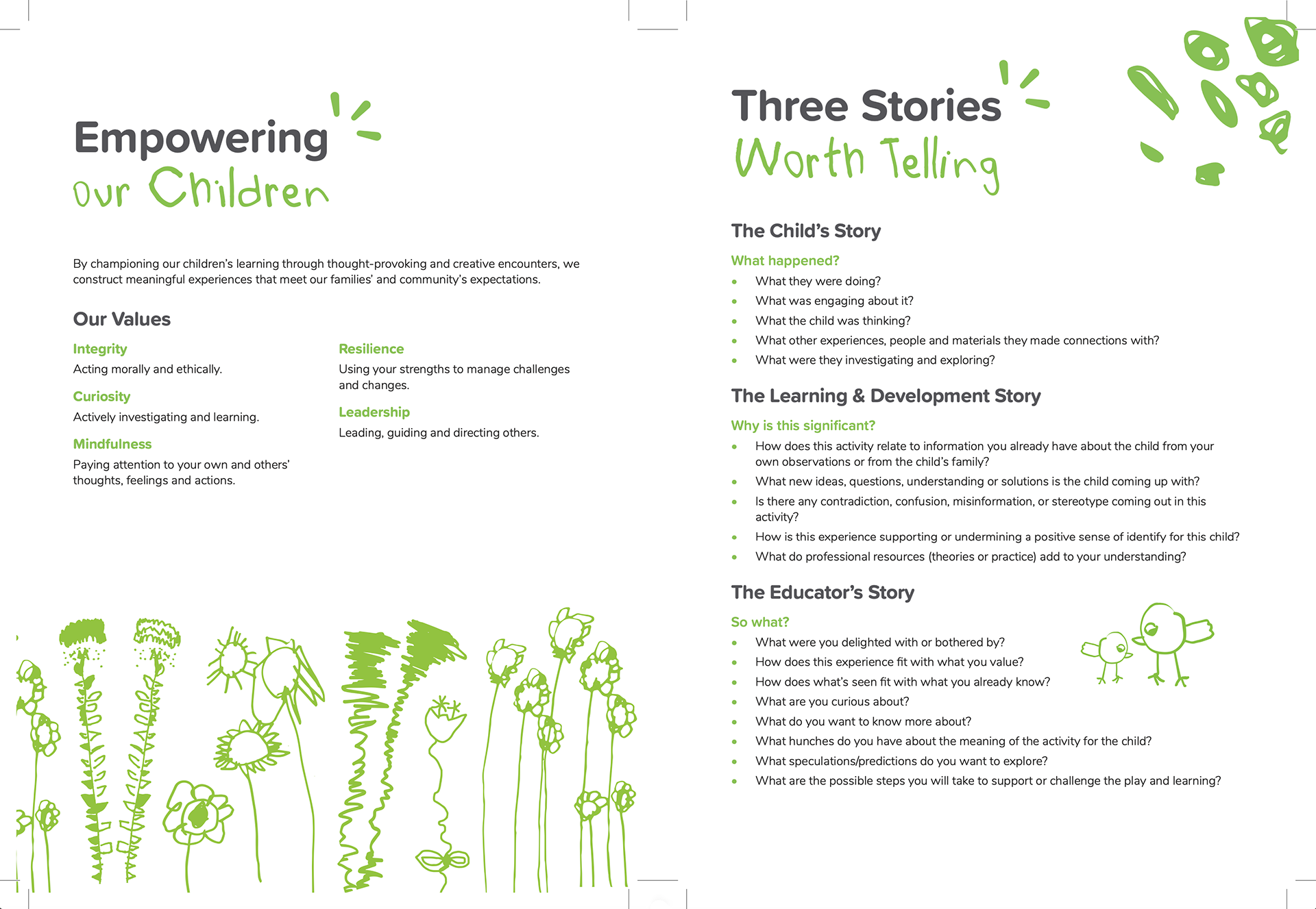
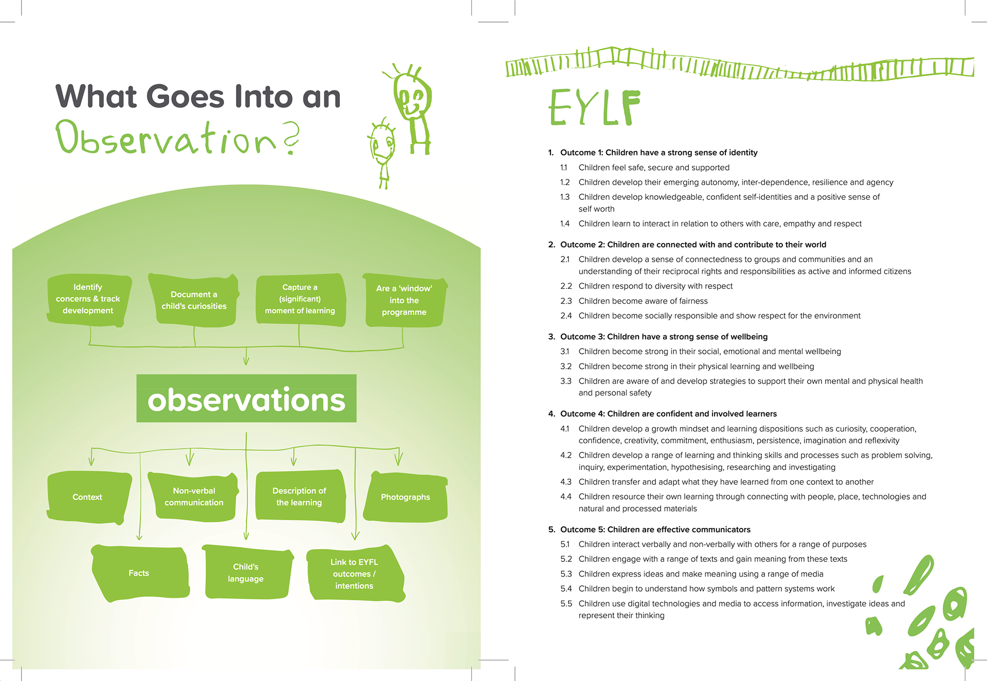
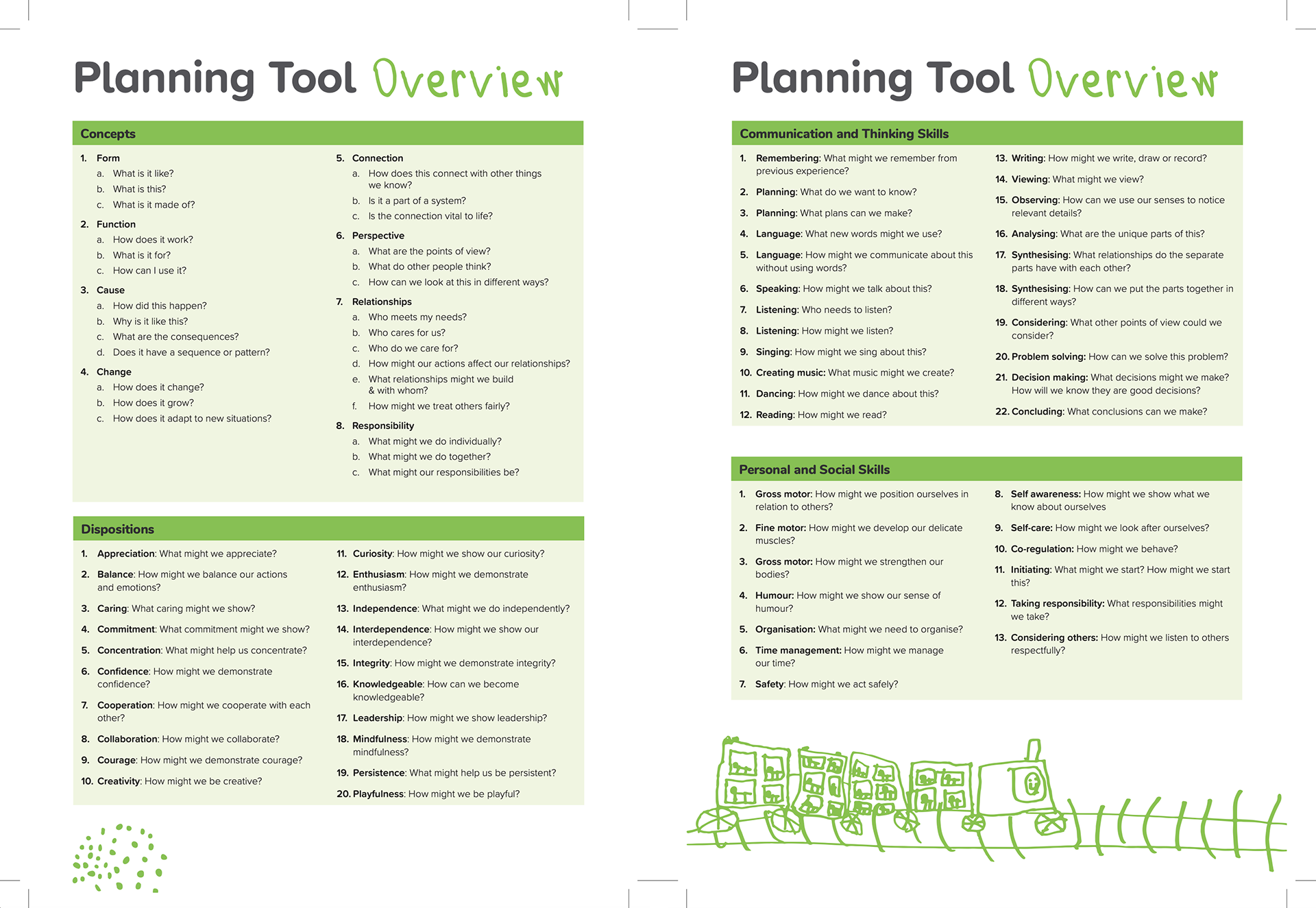
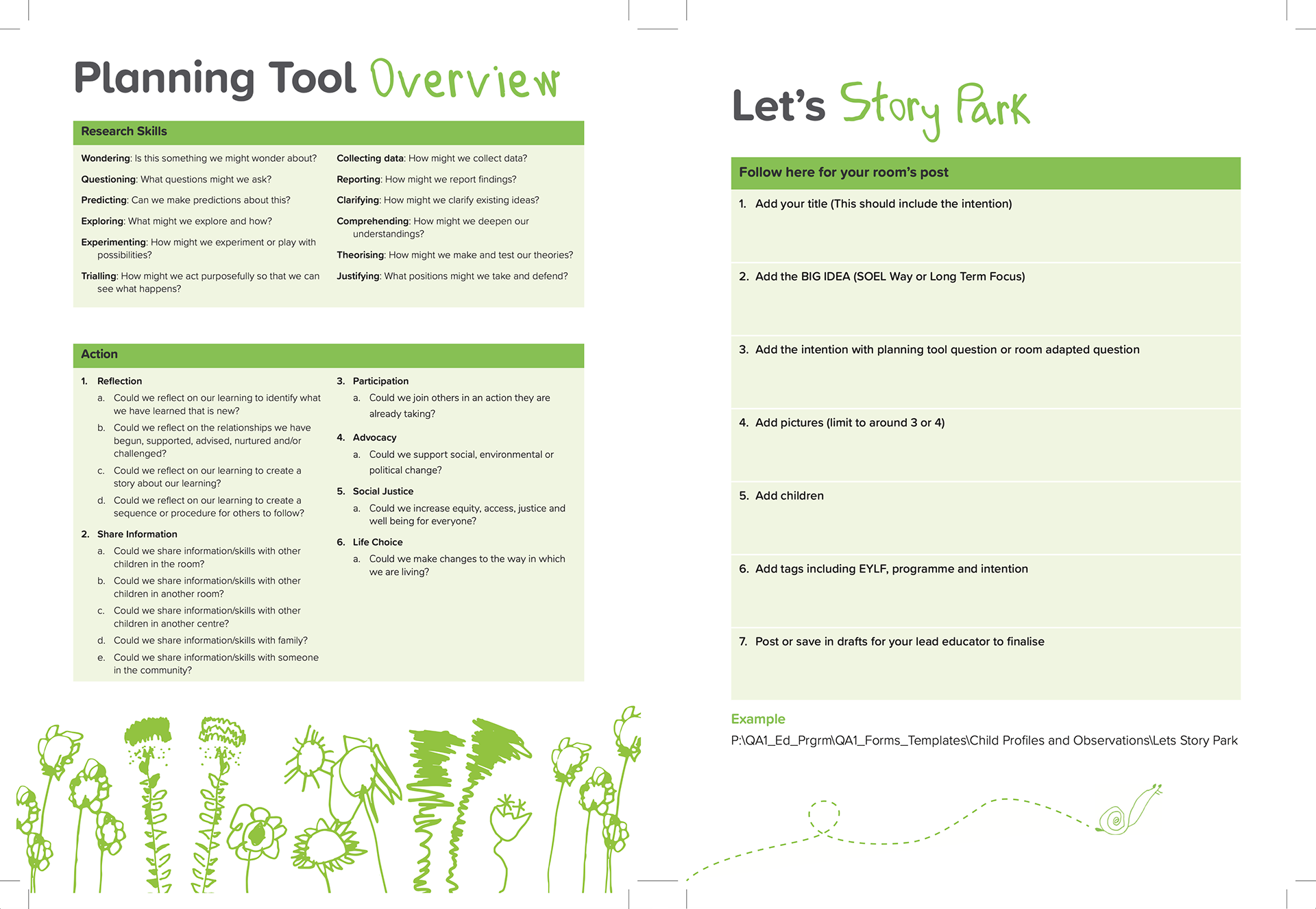
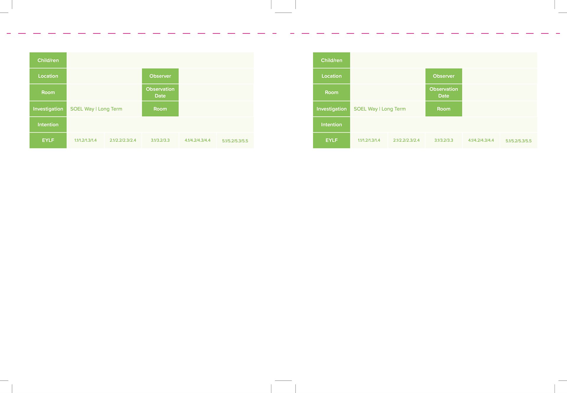
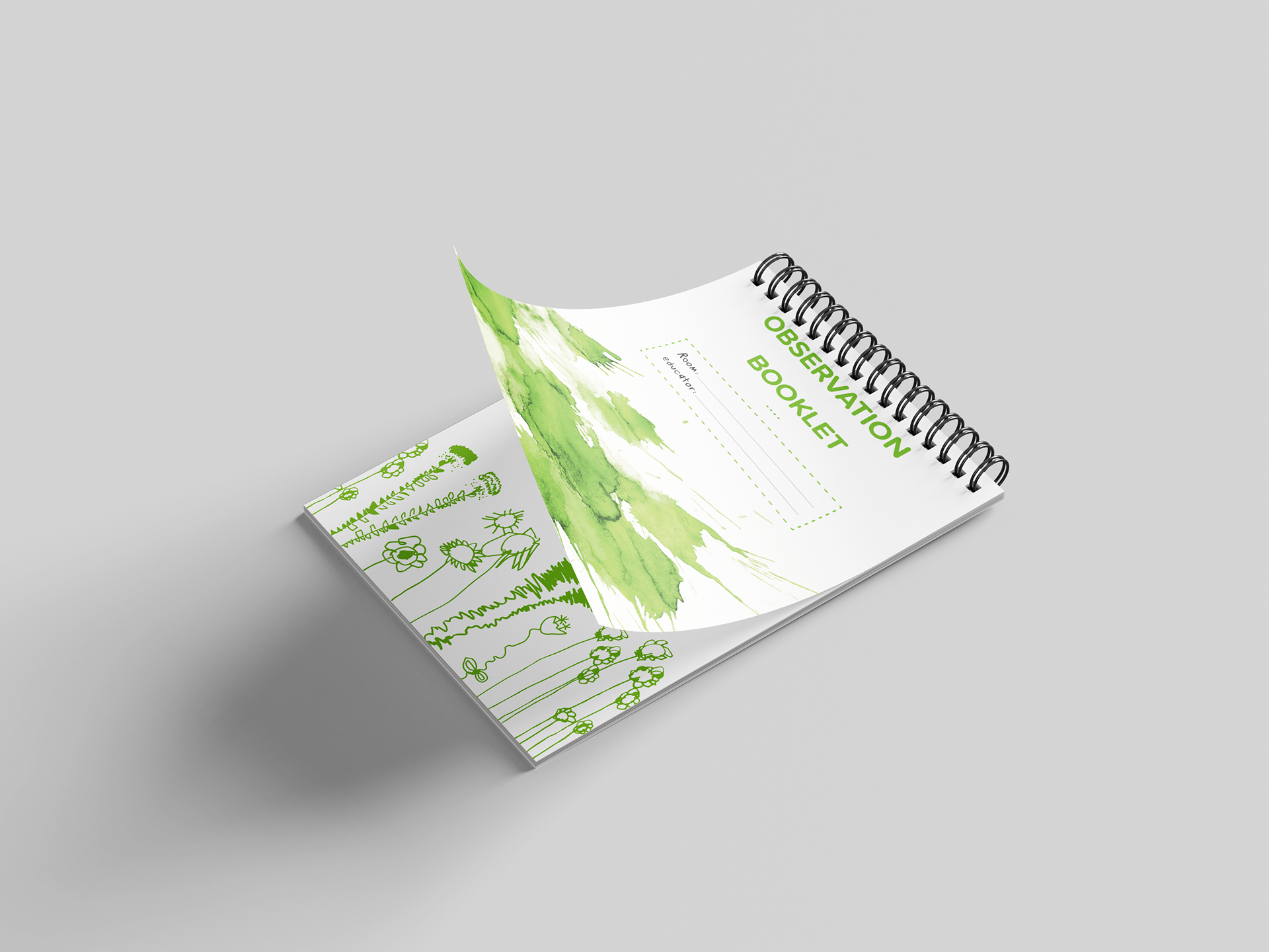
observation booklet re-design
The 'Observation Booklet' redesign aimed to refresh and enhance the previous year's design, providing new staff with a comprehensive guide to the observation process while doubling as a convenient notepad for recording children's observations. The concept behind the redesign was inspired by the idea of observing children and the mischief that may ensue when they are left unattended.
Design Concept
Drawing inspiration from the concept of children's mischief, the front and back covers feature a playful depiction of what happens when children are not watched—a mess. This whimsical approach sets the tone for the booklet's content, infusing it with a sense of curiosity and discovery.
Graphic Elements
To inject mischievous play into the design, children's drawings were vectorised and incorporated throughout the booklet. These illustrations not only add visual interest but also serve as a reminder of the joy and spontaneity of childhood.
Practical Considerations
In addition to the creative elements, practical considerations such as printers marks and colour management were crucial. Ensuring that colours were converted to CMYK and utilising paragraph styles and swatches helped streamline the design process and maintain consistency with the new brand styles.
Enhancing Readability
To aid in readability, children's handwriting was used for information hierarchy, adding a personal and relatable touch to the content. The layout of the diagram was carefully considered, with additional branches added to visualise the observation process more effectively.
Outcome
The redesigned 'Observation Booklet' successfully combines practical guidance with playful elements, providing new staff with a user-friendly resource while capturing the essence of childhood curiosity and discovery.
Cover
Spread 1
Spread 2
Spread 3
Spread 4
Spread 5

Spread 6
Back

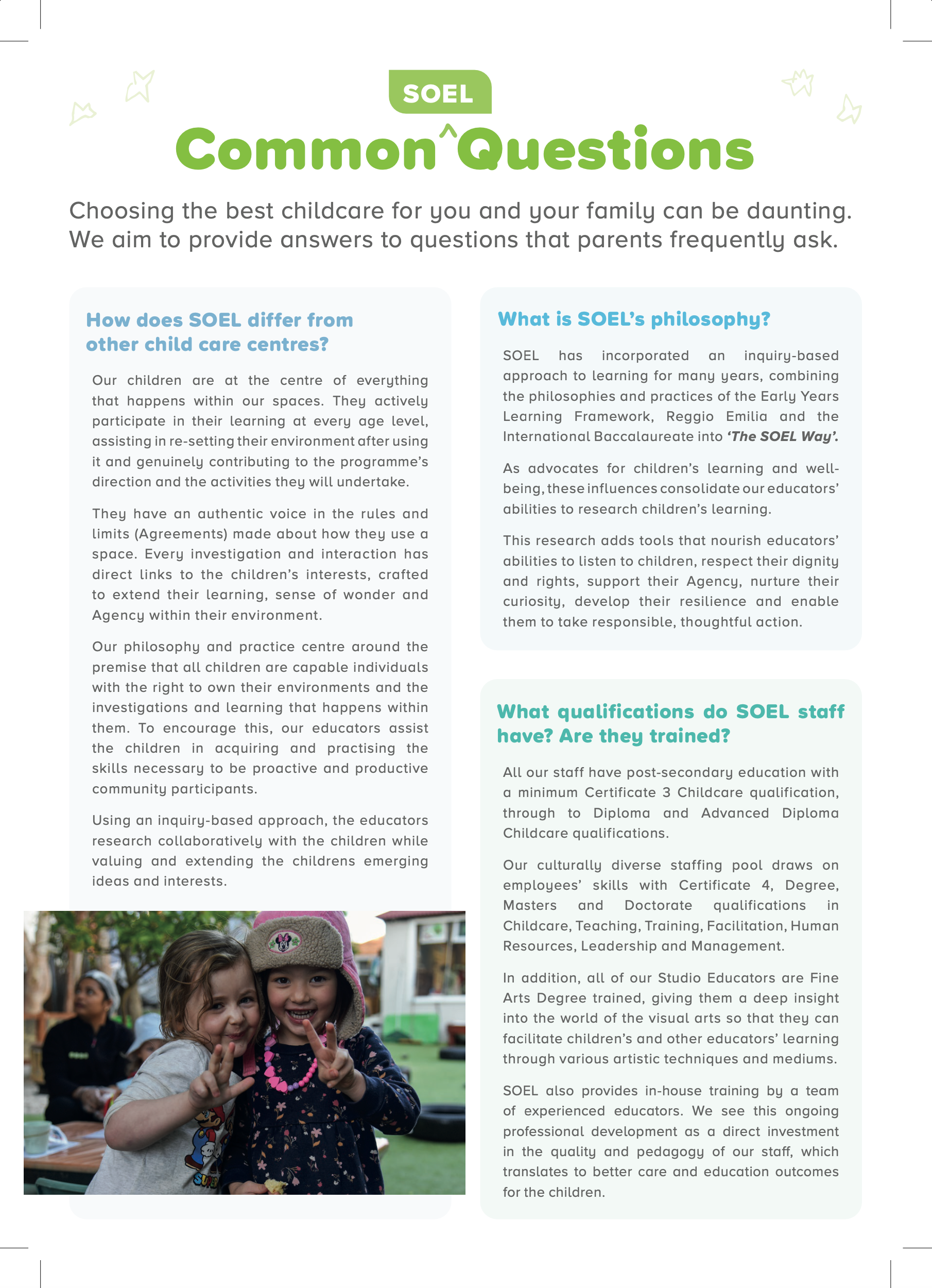
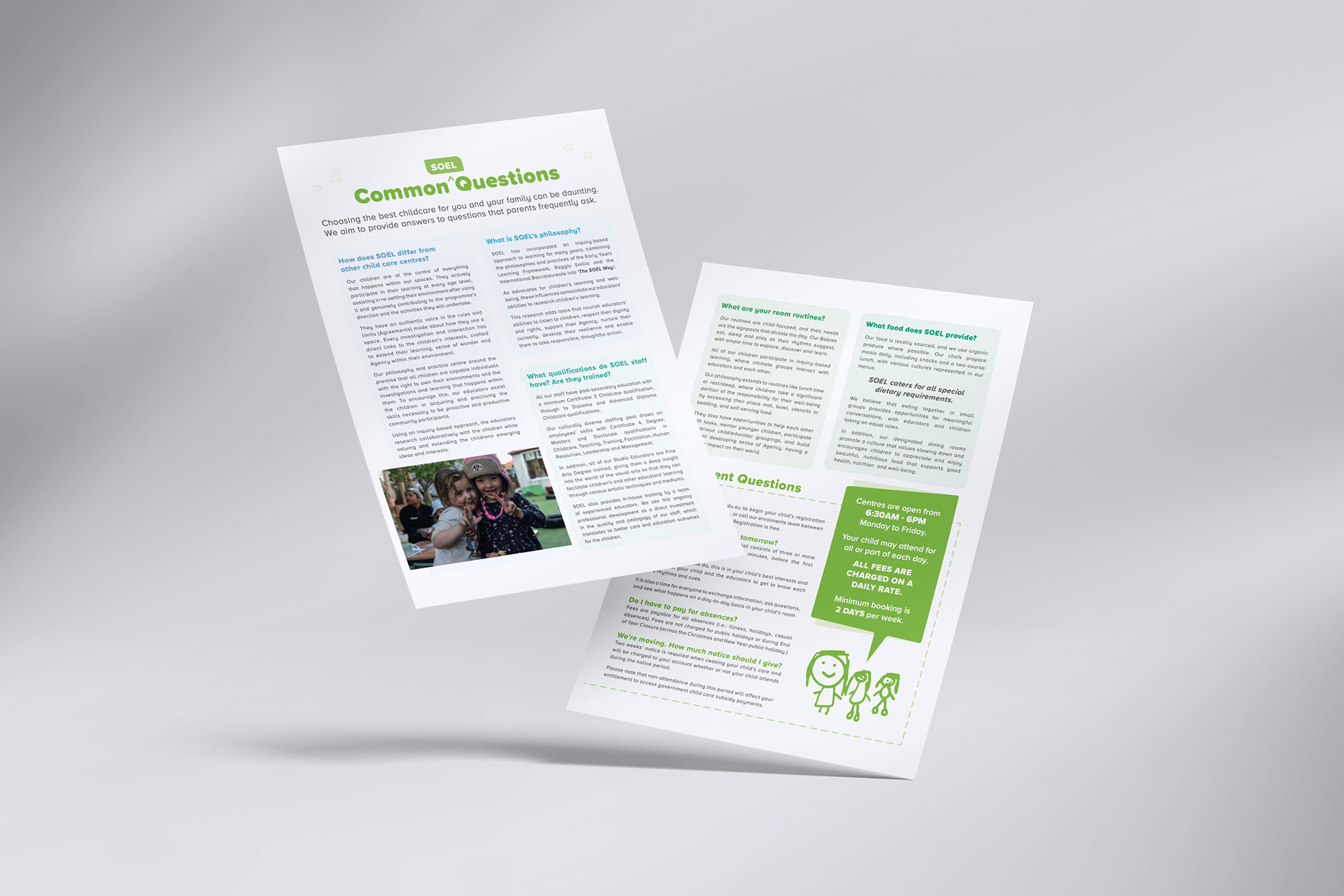
common questions
The focus of the 'FAQ - Common Questions' project was to revamp and update the layout of a previous design, incorporating the new brand palette and typography. The objective was to enhance readability, accessibility, and visual appeal while effectively communicating a wealth of information to the audience.
Design Approach
To achieve these goals, I adopted a multi-faceted approach. The creation of paragraph styles facilitated efficient updating of the document in the future, streamlining the process and saving time. The utilisation of the new individual room brand colours as information hierarchy features helped organise the content and guide the reader's attention.
Clarity and Accessibility
With a plethora of information to convey, ensuring readability, scannability, and easy navigation was paramount. Careful attention was paid to the layout and presentation of elements to facilitate quick access to relevant information, enhancing the user experience.
Emotional Weight and Aesthetic
To imbue the design with emotional depth and aesthetic appeal, vector children's drawings and photography were thoughtfully incorporated. These elements not only added visual interest but also served to humanise the content, resonating with the audience on a personal level.
Front design
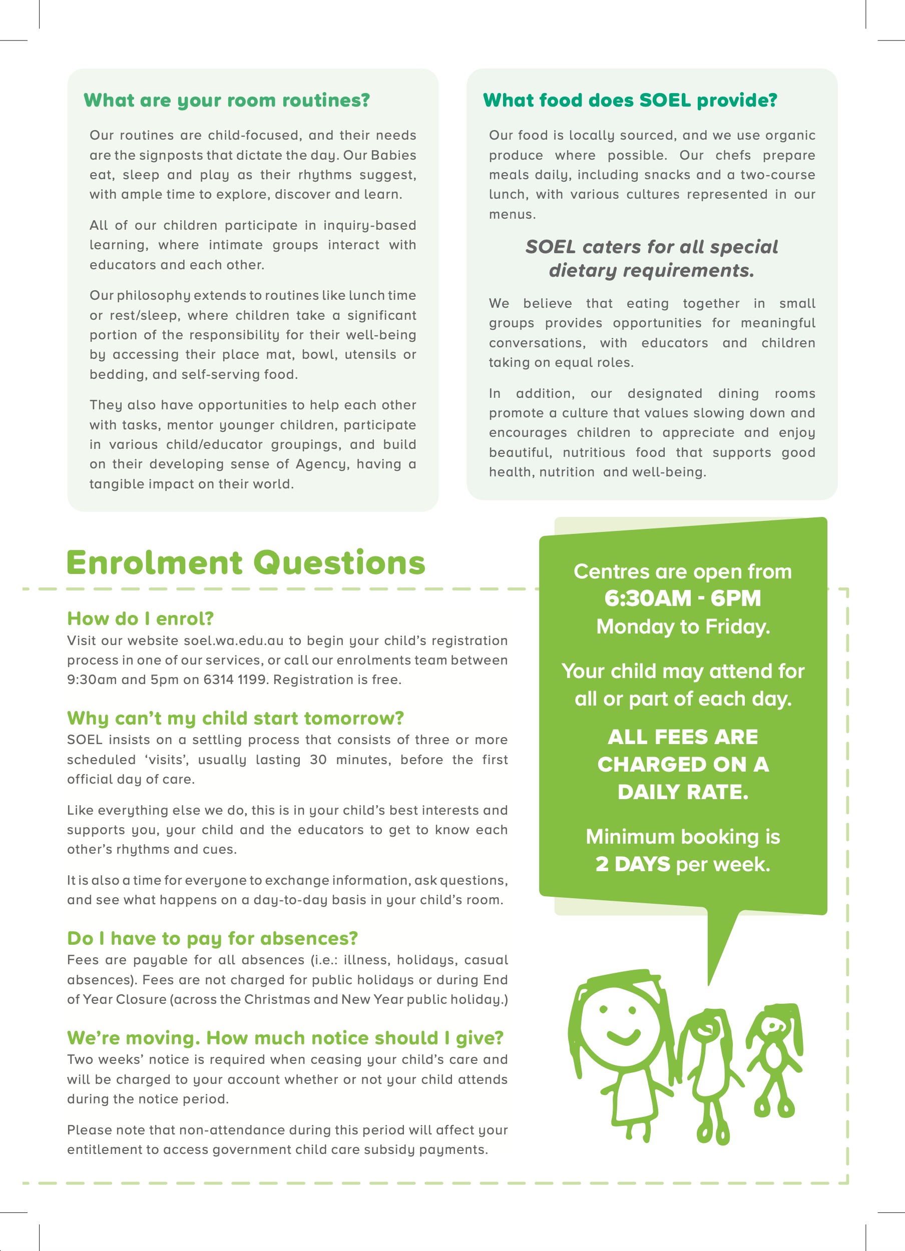
Back design

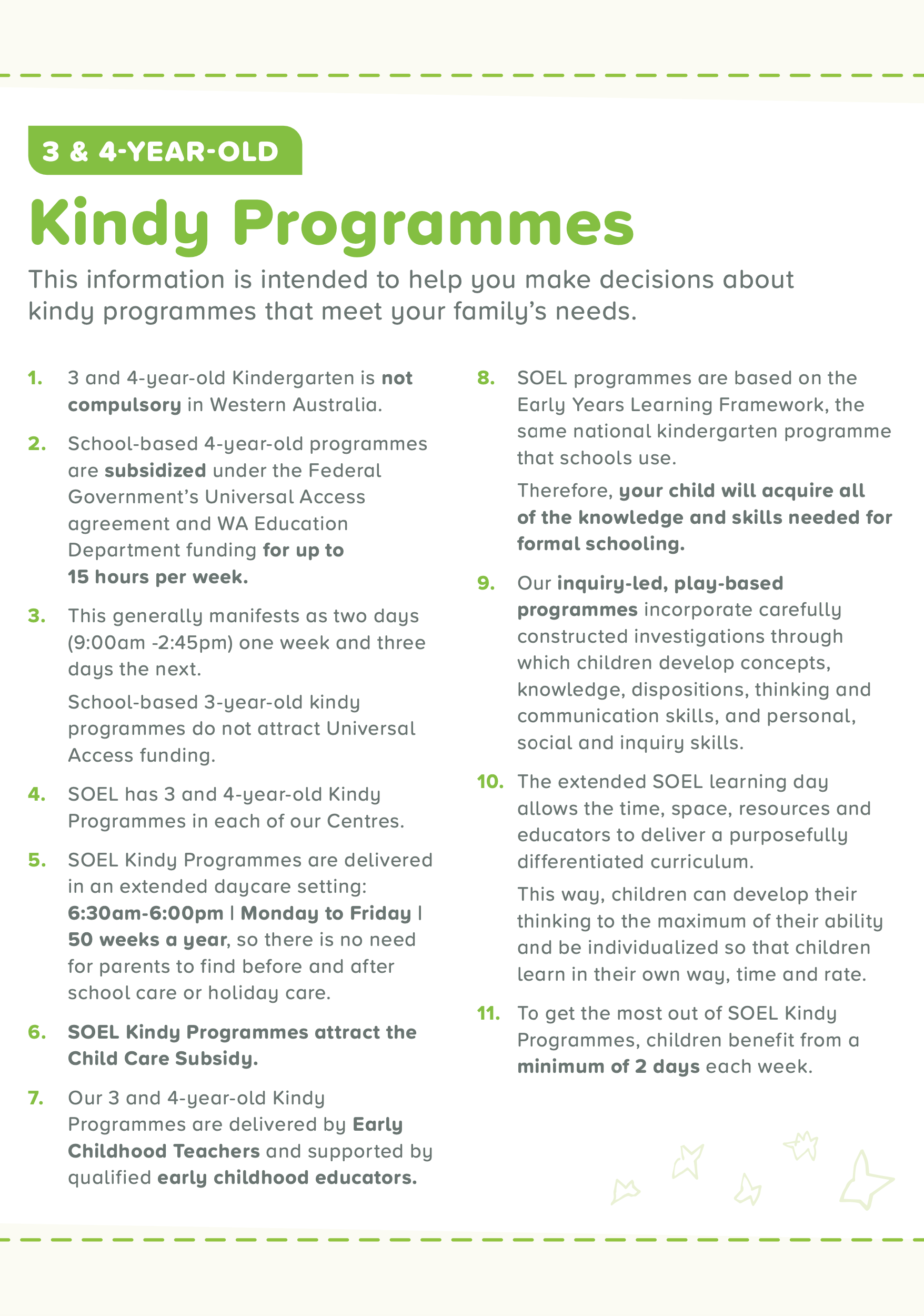
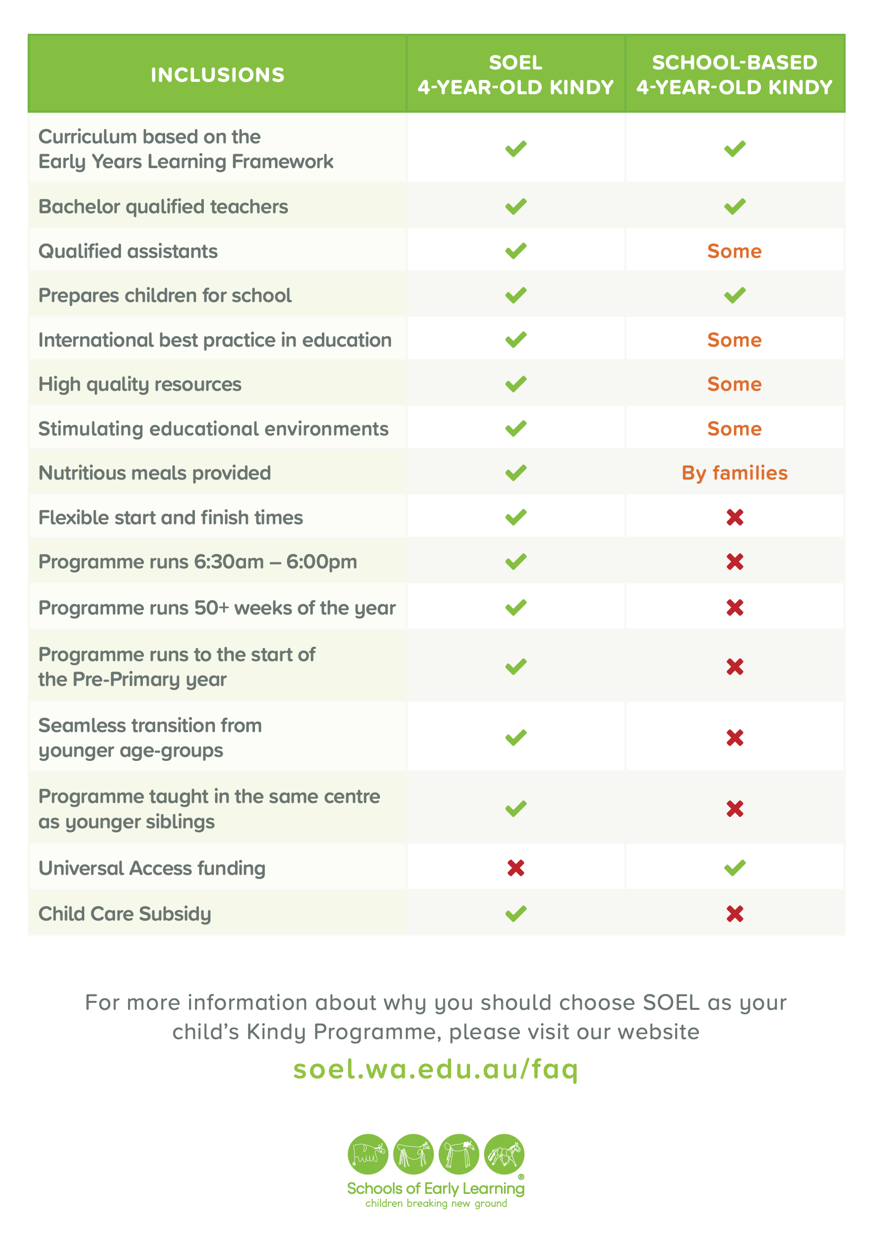
kindy programme
The 'Kindy Programmes' project involved re-designing and refining a previous design, incorporating the new typographic treatment and updated brand palette. The objective was to create a visually appealing and informative layout that effectively communicated program details to stakeholders.
Design Approach
To achieve this, I implemented several strategies to streamline and enhance the design. Utilising bold text and colour coding (red for "yes" and green for "no") helped establish information hierarchy and clarity. Iconography was introduced to further enhance comprehension and visual interest.
efficiency through styles
The use of paragraph styles was instrumental in optimising workflow efficiency. By updating and utilising predefined styles, the process of applying consistent formatting across the document was streamlined, reducing time and effort required for the redesign.
Incorporating Playfulness
To infuse the design with a sense of playfulness and engagement, vectorised children's drawings were integrated strategically throughout the layout. These illustrations added a whimsical touch while maintaining alignment with the brand's identity and thematic focus.
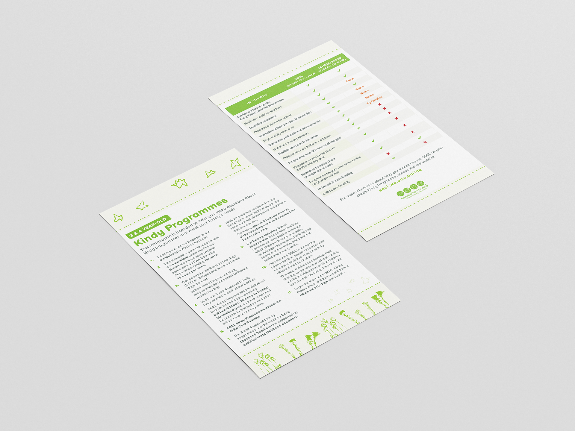
Front design
Back design

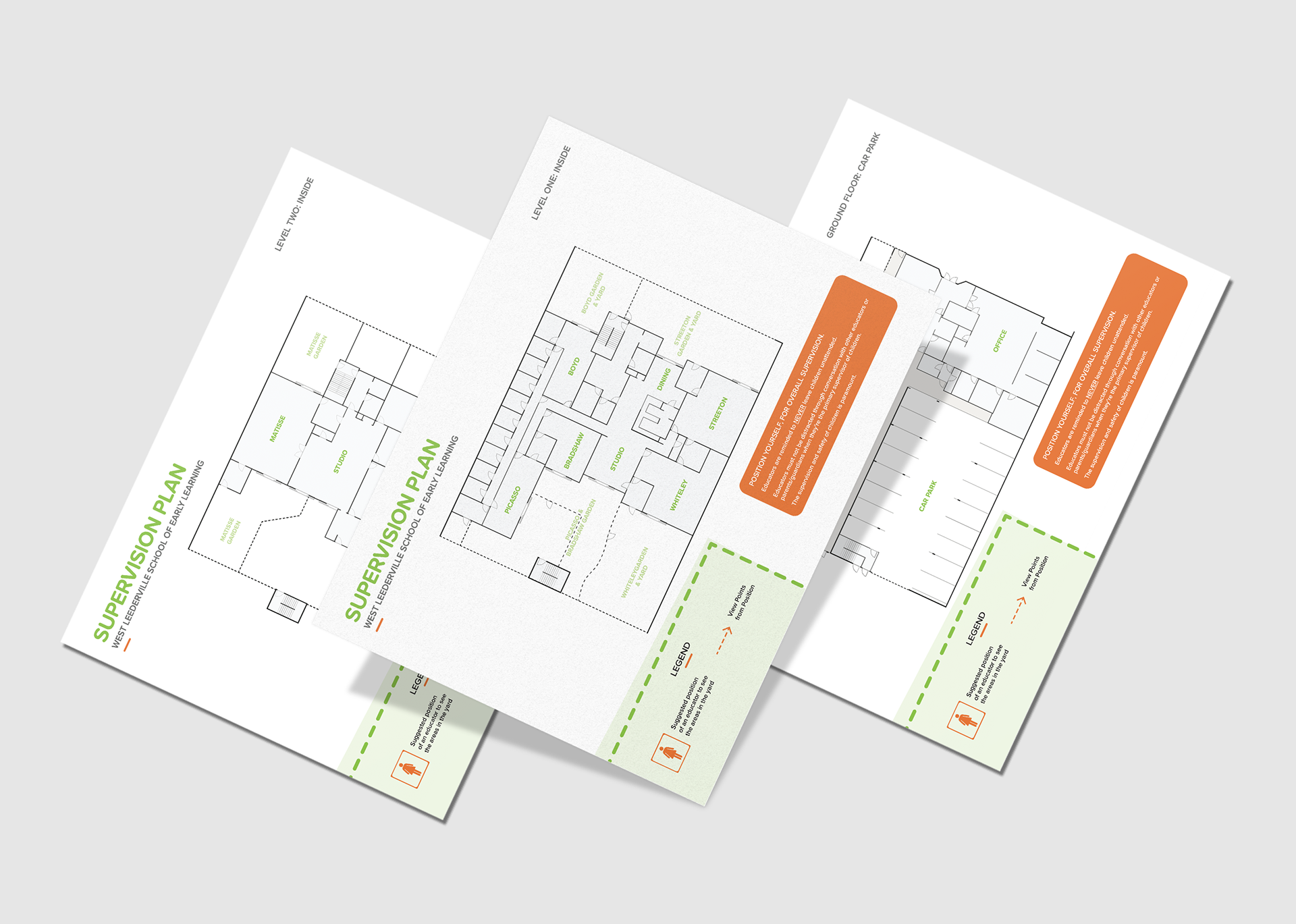
supervision plan
I undertook the challenge of redesigning architectural layouts for the new center, aiming to create easily understandable designs for both staff and parents unfamiliar with the environment. The goal was to simplify complex architectural sketches into clear and concise layouts.
Design Approach
My approach focused on simplification and clarity. I meticulously cleaned up unnecessary lines and text, ensuring that the layout remained uncluttered and easy to interpret. Color was utilised as an information hierarchy tool, with each colour corresponding to specific elements outlined in the legend.
Importance of Legend
The inclusion of a comprehensive legend was crucial to aid in understanding the layout. It served as a guide for staff and parents, explaining how to interpret the information presented and providing clarity on the layout's various components.
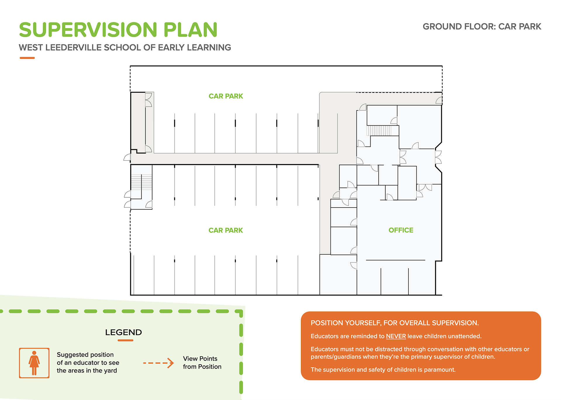
Ground Floor: Carpark
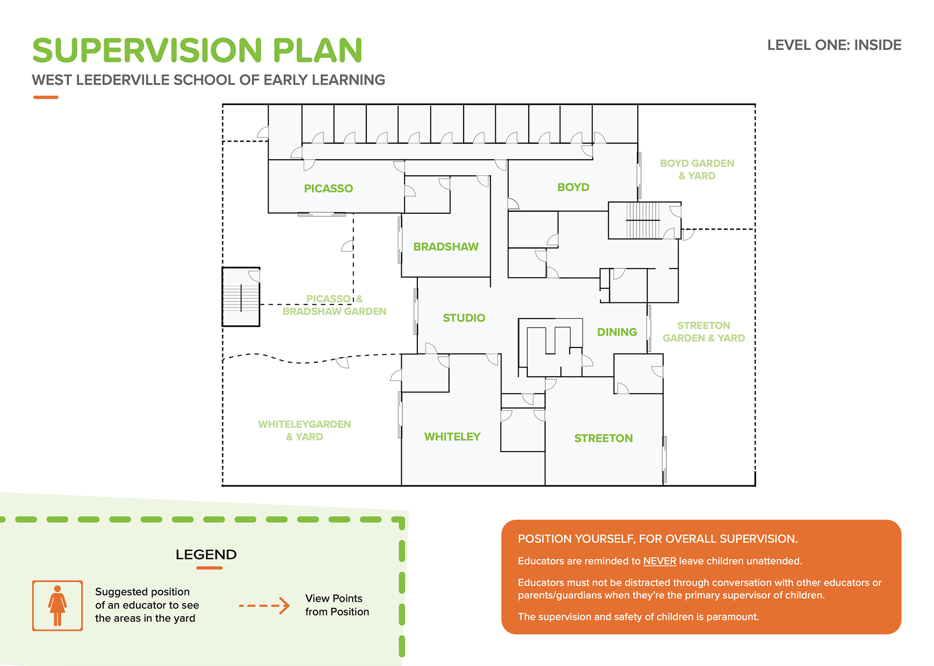
Level 1: Inside
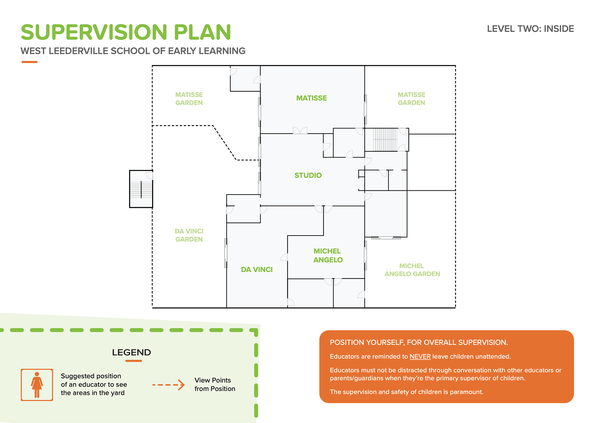
Level 2: Inside

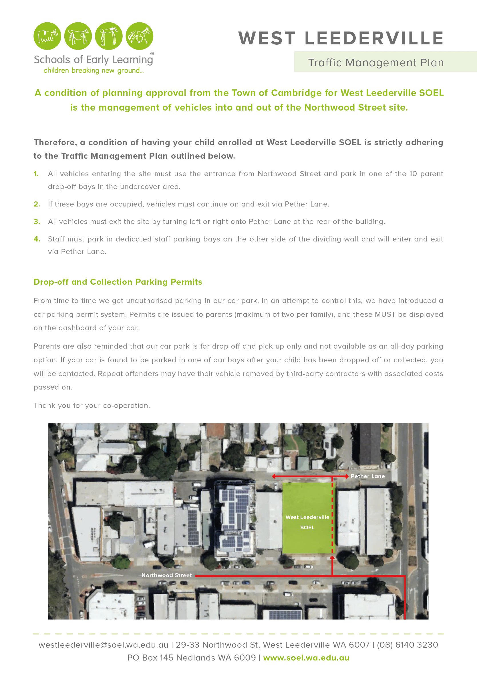
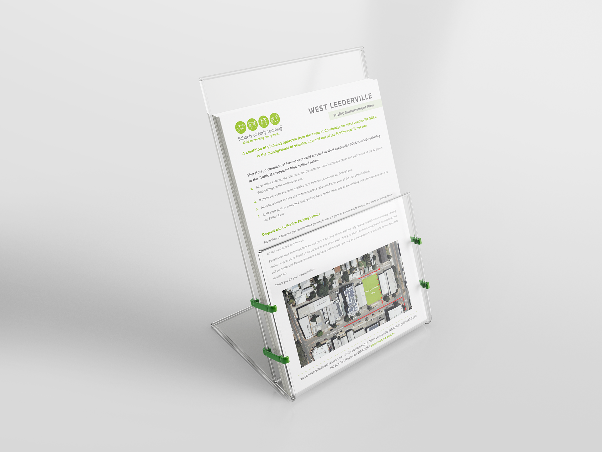
new centre management plans
Tasked with optimising traffic flow around the new center during peak drop-off times, I developed a comprehensive traffic management plan. The goal was to minimise congestion and ensure smooth traffic movement for parents dropping off their children.
Design Approach
Utilising a combination of colour-coded information hierarchy and clear directional arrows, I created a visually engaging flyer for new parents. The imagery quickly communicates key traffic flow patterns, while detailed text descriptions provide additional clarity and guidance.
Visual Communication
The use of colour for information hierarchy allows parents to quickly grasp the most important details, such as designated routes and traffic rules. Directional arrows guide them through the traffic flow, ensuring they navigate the area safely and efficiently.
Comprehensive Information
In addition to the visual elements, a detailed text description of the new traffic plan accompanies the imagery. This provides parents with a thorough understanding of the routes, rules, and guidelines to follow, enhancing their confidence in navigating the area.

new centre signage
I took on the task of creating signage for an additional newly opened center, focusing on practicality and visual appeal. The aim was to convey essential information while adding a touch of charm to the environment.
elements
The signage featured opening hours, contact details, and decorative vector graphics inspired by children's drawings. Each element was carefully chosen to balance functionality and aesthetics.
technical execution
I ensured that the designs met vinyl printing requirements and sizing standards, guaranteeing seamless execution and durability. Considerations were made for legibility and readability based on the sign's placement.
result
The final outcome was a series of signage displays that served their purpose effectively while contributing to the center's welcoming atmosphere. Through thoughtful design and attention to detail, the signage enhanced both the visual appeal and practicality of the space.

Signage Design