By artists, for artists.
mission statement
At Ruby Lu Studios, our mission is to be the catalyst that transforms artistic vision into digital reality. We are passionate about empowering artists, championing creativity, and fostering a global community of diverse talents.
Through innovative design solutions, ethical stewardship, and exceptional service, we enable artists to reach new heights in the digital realm, connecting with audiences worldwide and leaving a lasting impact on the creative world.
Values
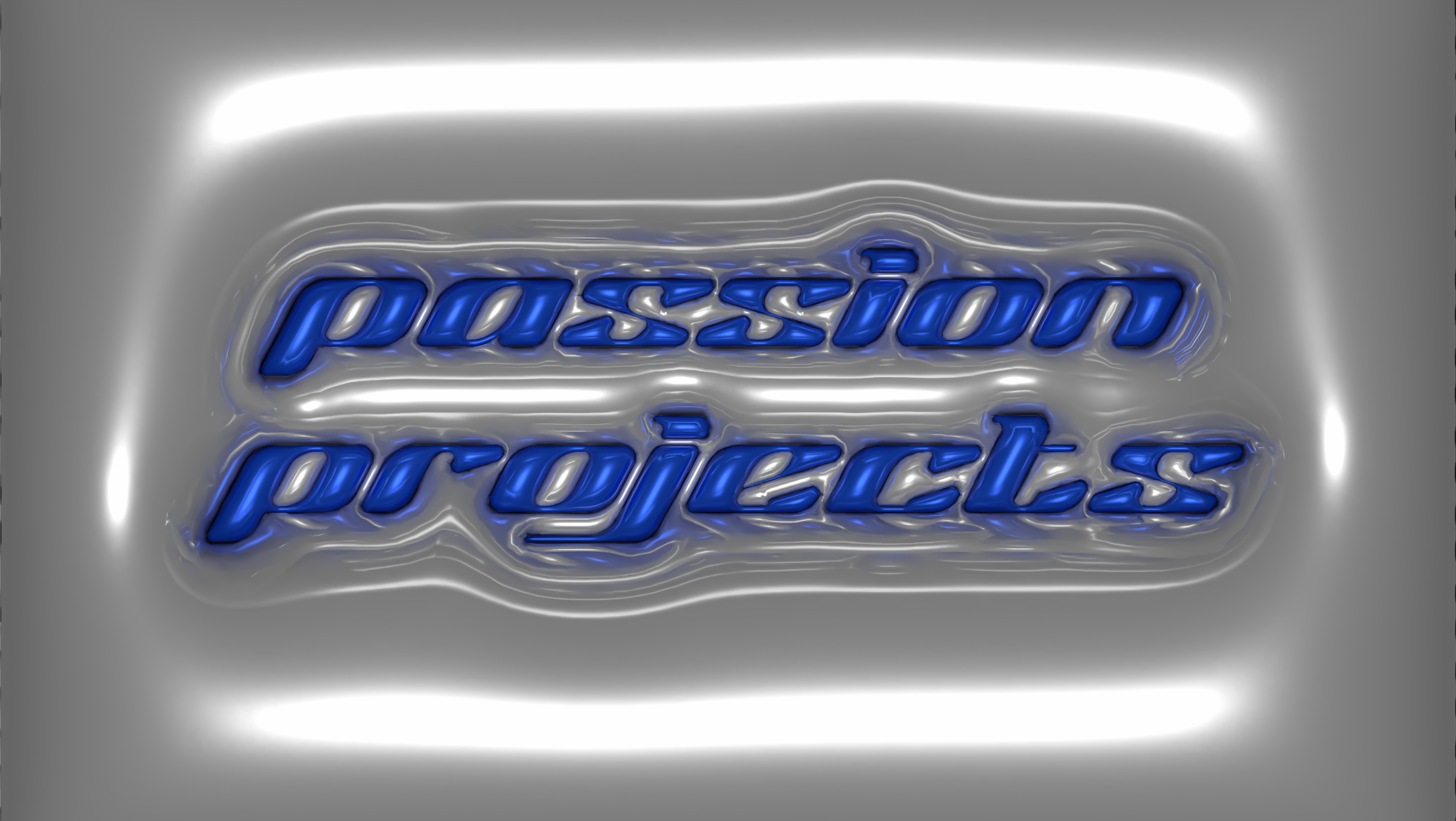
Passion & creativity - unwavering passion for art drives our creative spirit. Embrace every project with artistic zeal, ensuring that each digital solution is a unique masterpiece that resonates deeply with our clients & their audiences.
Collaboration & innovation - collaboration is the cornerstone of our approach. By actively engaging with artists, we foster a culture of innovation that results in cutting-edge & artistically inspired digital designs.
Ethical responsibility & sustainability - hold ourselves accountable for our environmental & social impact; commitment to ethical & sustainable design practices reflects our values & resonates with artists & clients who share our dedication to responsible business practices.
Exceptional service & empathy - exceptional customer service is not just a commitment but a promise. We prioritise transparent communication & a personalised approach, ensuring that every client feels heard & valued throughout their artistic journey with us.
Artistic empowerment & inclusivity - more than service providers; we are partners in artistic empowerment. Our mission is to empower artists in the digital space, helping them expand their reach, engage with diverse audiences, and effectively monetise their art. We celebrate the rich tapestry of global artistic expression by acknowledging & embracing diversity in all our designs.
Personality
Passionate enthusiasts & art appreciators - we are not just designers; we are passionate art enthusiasts who immerse ourselves in the world of creativity. We possess a deep understanding & appreciation for artistic expression, which fuels our dedication to helping artists thrive in the digital realm.
Collaborative & creative partners - collaboration is at the heart of our approach & intrinsic to our identity. We actively engage in a creative partnership with artists, working closely with them to ensure that their digital presence authentically represents their unique artistic vision and identity.
Innovative visionaries & technology pioneers - we are relentless in our pursuit of innovative solutions. We harness cutting-edge technologies & design techniques to bring artists' dreams to life, pushing the boundaries of what's possible in the digital world; ensuring that each project is a testament to our forward-thinking approach.
Community connectors - our commitment extends beyond business interests. We are deeply rooted in the artistic community, actively participating in sponsorships, workshops, and collaborations. We believe in fostering connections, celebrating diversity, and contributing to the growth of the art world.
Impact-driven advocates & celebrators of diversity - Ruby Lu Studios measures its success by the tangible impact we create for artists. We take pride in sharing success stories that highlight how our services have helped artists gain visibility, connect with audiences, & achieve their artistic goals. Our advocacy for real-world impact sets us apart in the industry. Additionally, we celebrate diversity by acknowledging and embracing the rich tapestry of global artistic expression in all our designs.
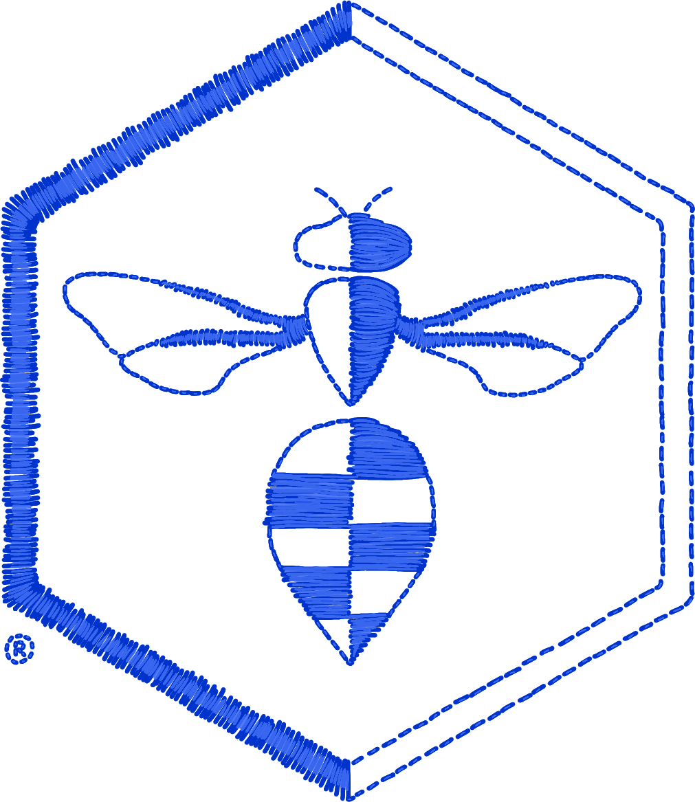
LOGO DESIGN
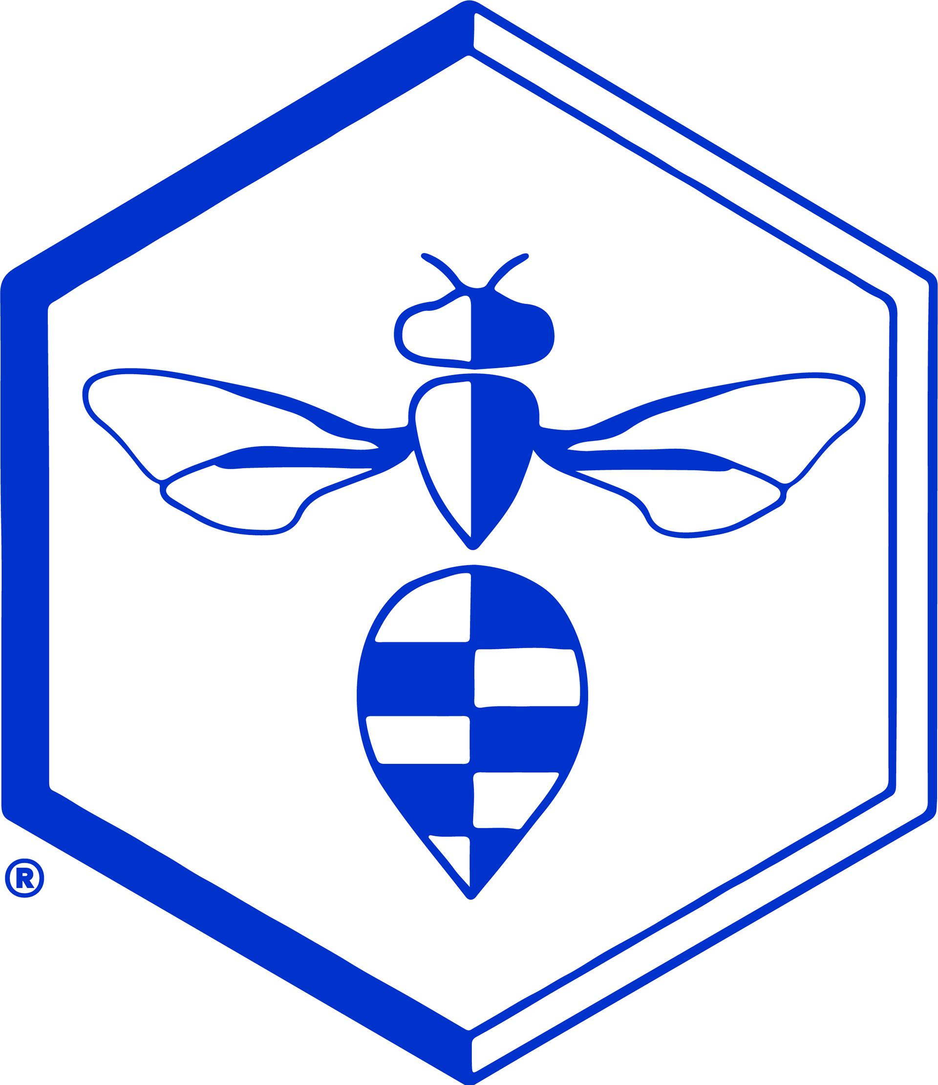
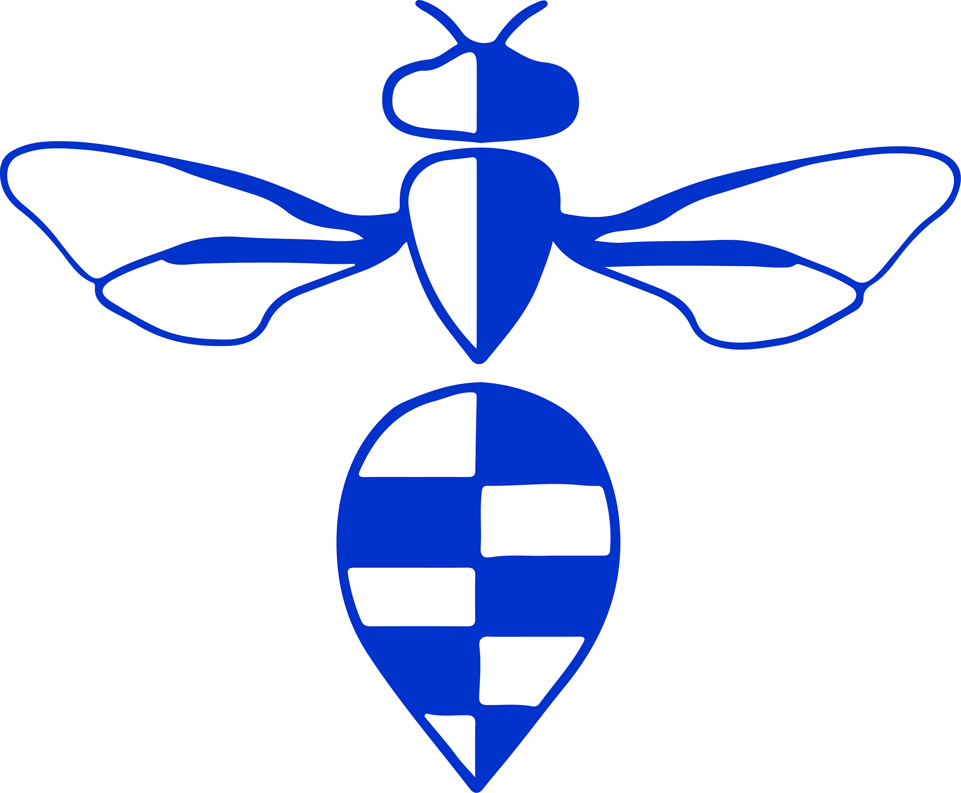
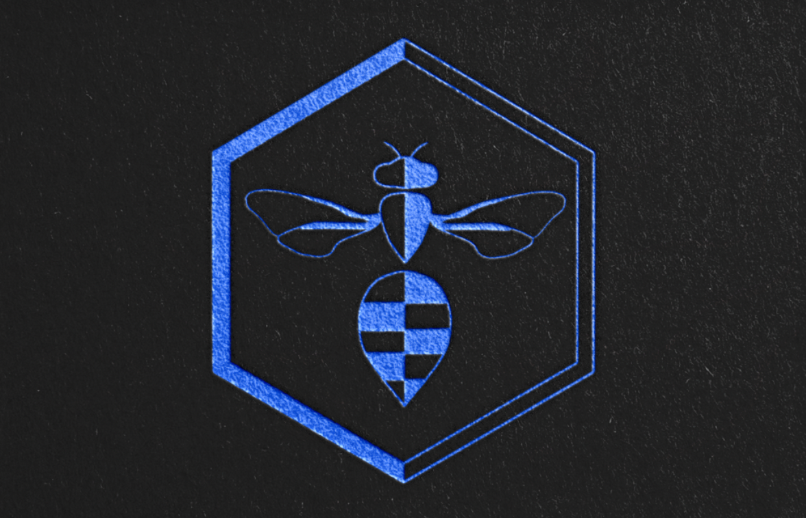
The 'Blue Banded Bee', native to Australia, is the inspiration for this logo design. A spiritual experience with this incredibly elegant creature was what ignited the idea & my path towards digital design.
The bee itself has mesmerising, bright blue chromatic bands on it's abdomen, a huge inspiration in my work and brand palette. Reducing the shape to it's simplest form produces an alluring, symmetrical & dynamic design. The hexagon represents the hive and community, while the bee symbolises dedication, team work, prosperity, generosity, rejuvenation & divination (Manukora, 2023).
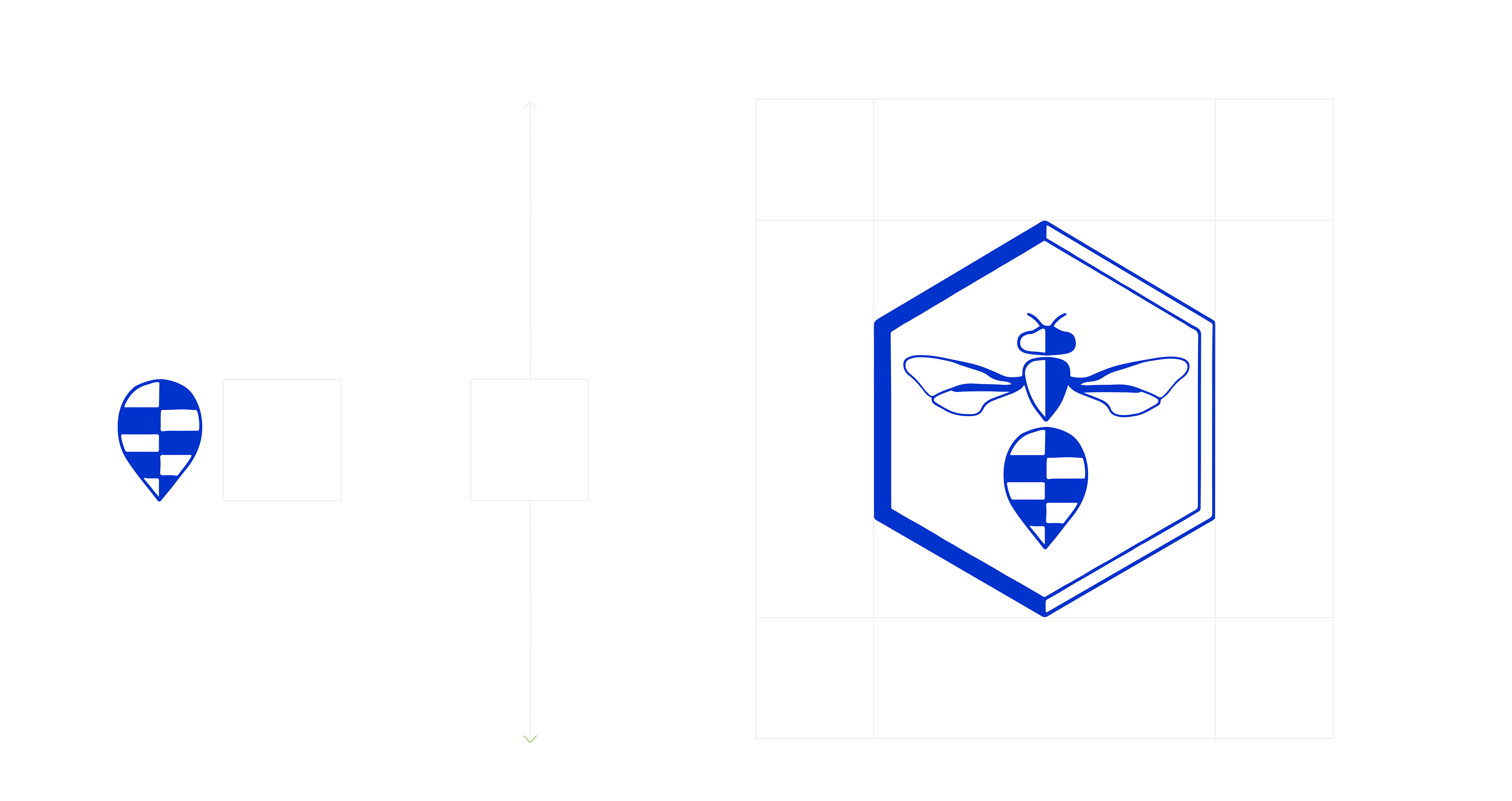
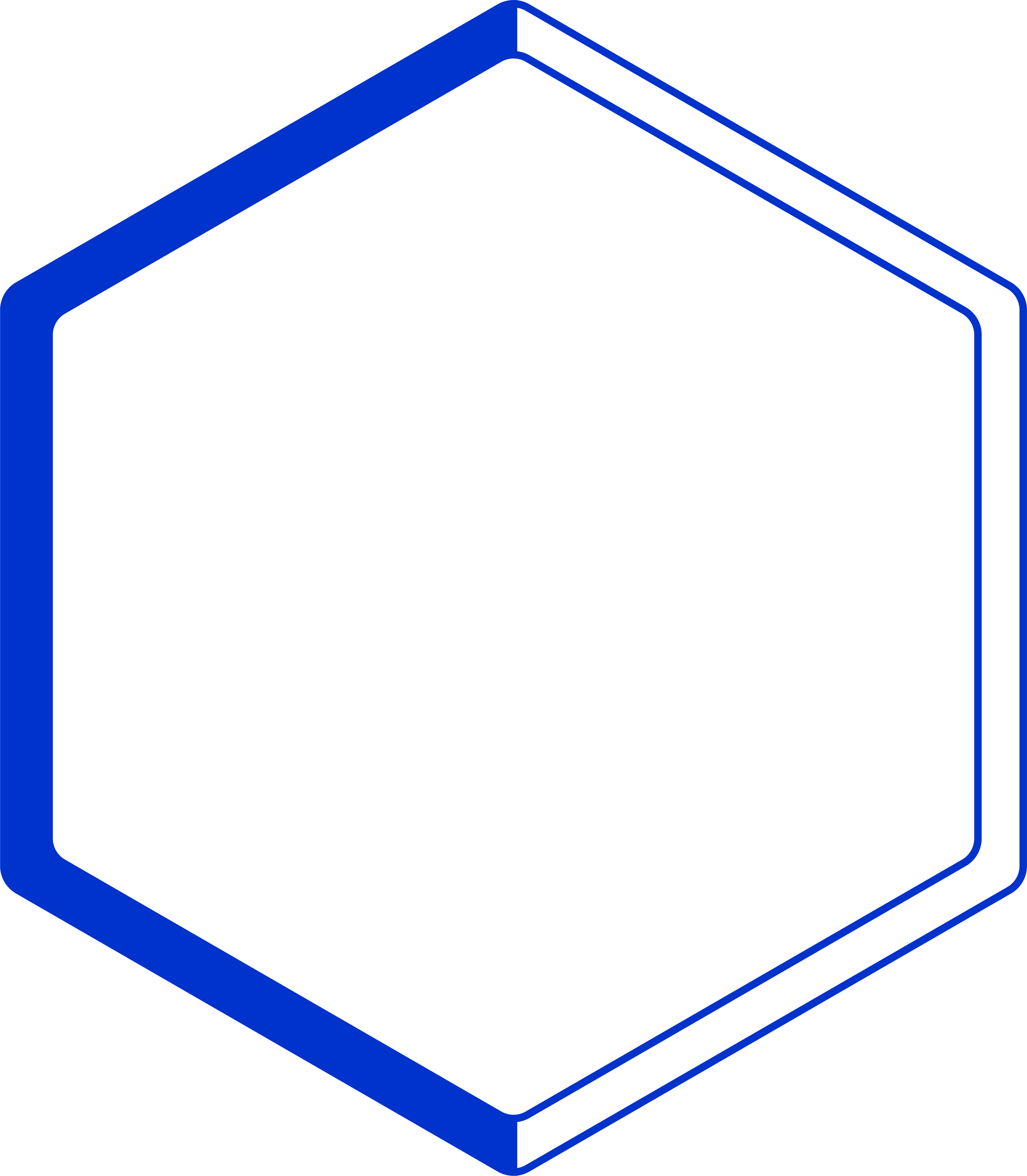
Exclusion Zones
It is essential to provide enough clear space (exclusion zone) around the logo to protect it from competing graphic elements.
The minimum exclusion zone is defined by the height of the Blue Banded Bees’ abdomen relevant to the logo size.
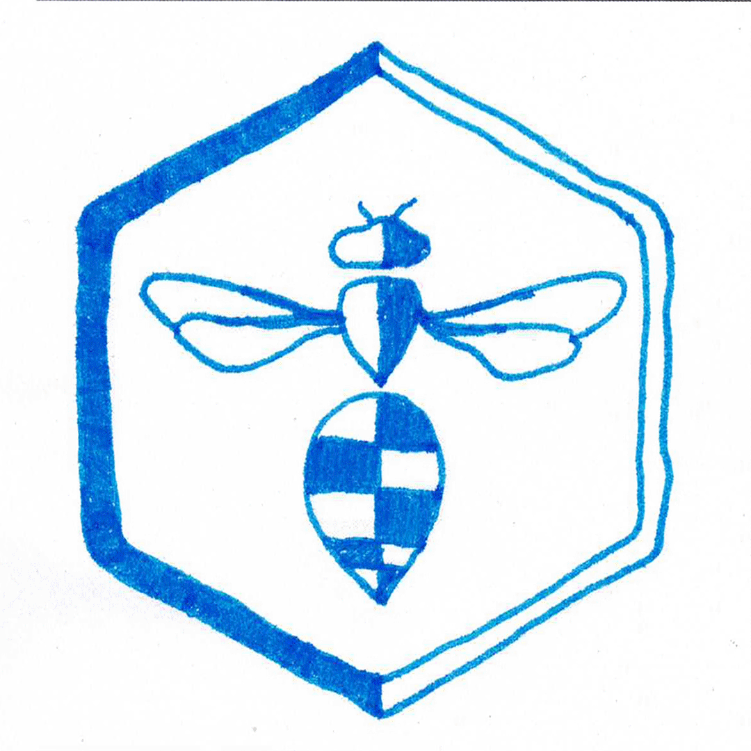
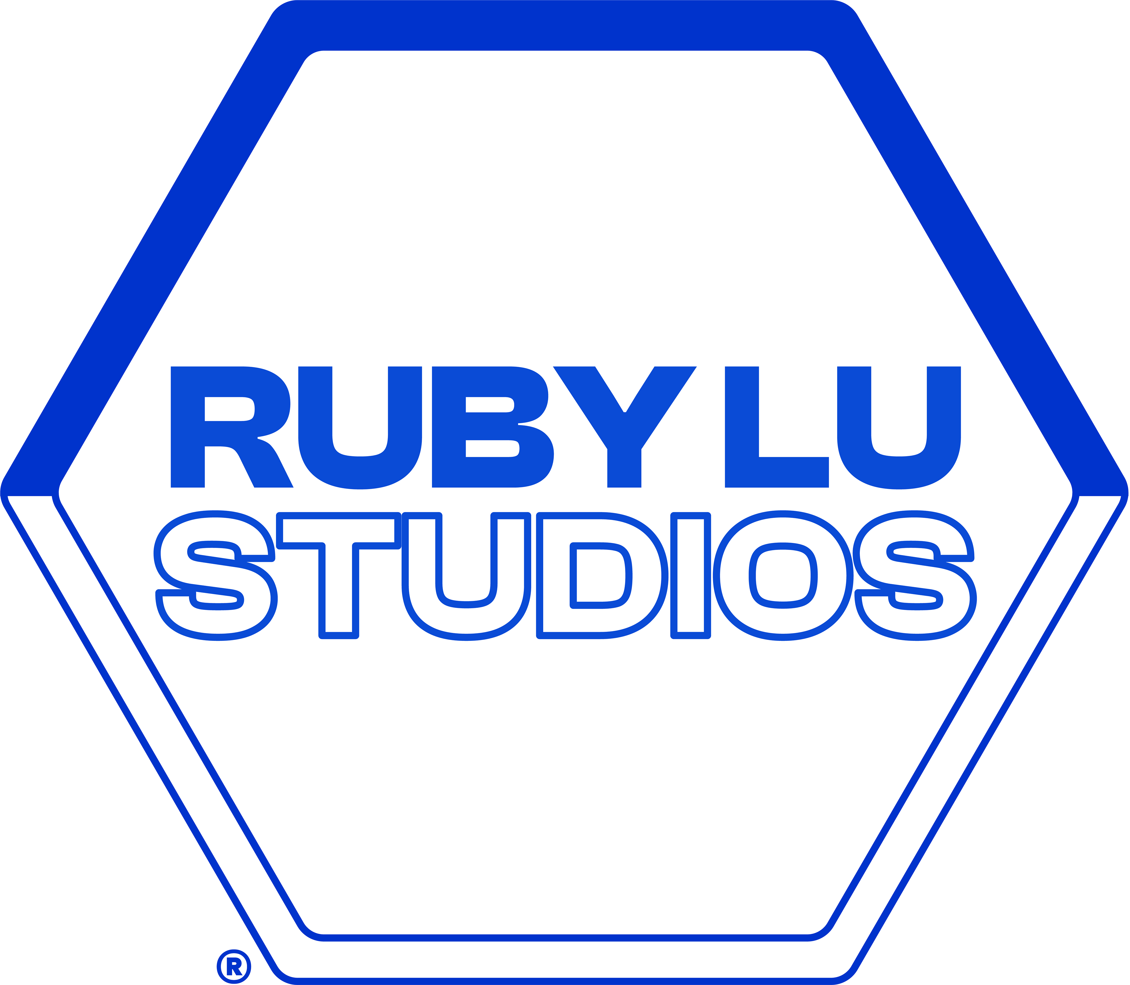
Logo Variations
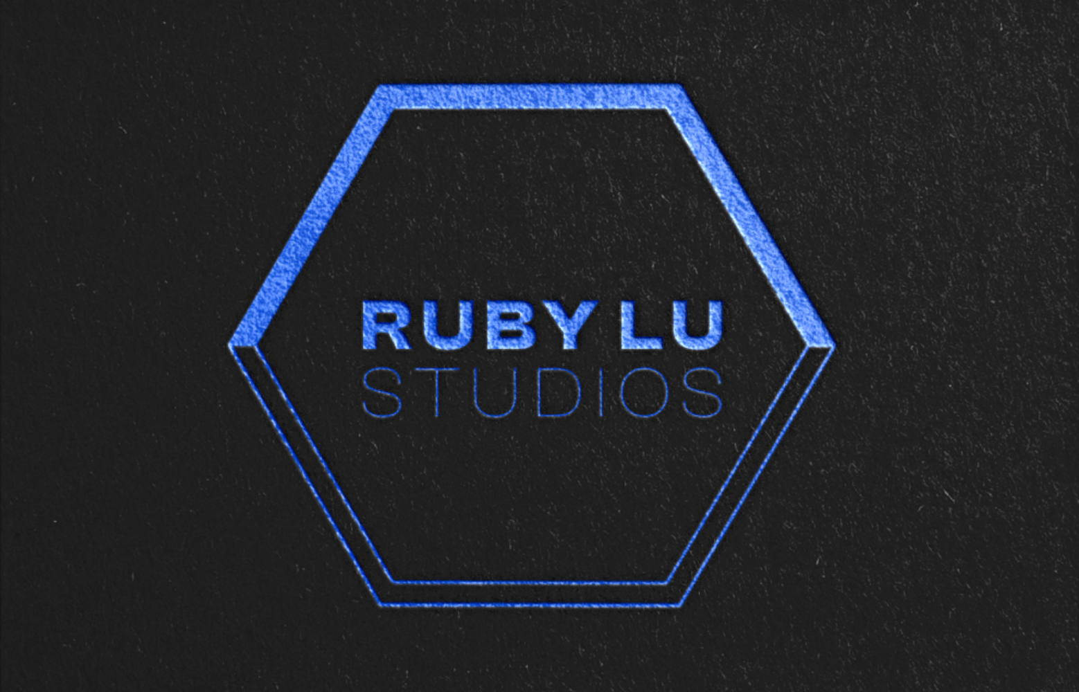
Leaning into the illusion of a cube within the hexagonal outline, this typographic / secondary logo brings forth another element of depth; maintaining the dynamic design & showcasing the typographic treatment.
Separated, the graphic elements from the main logo are able to be used individually for a distinctive, cohesive & recognisable visual tone.
Typographic Treatment
Utilising crisp & clean serif fonts with a hint of accent in san serifs.
'Clash Display' is dedicated to headings & sub-headings, 'Montserrat' dedicated to body text, & 'Dirty Line Display' being utilised for accent & occasional headings.
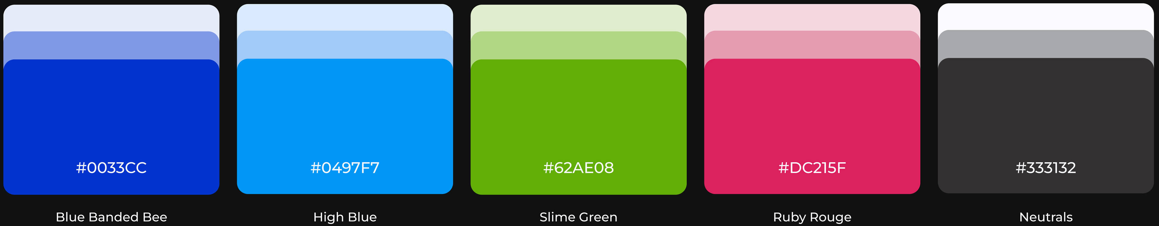
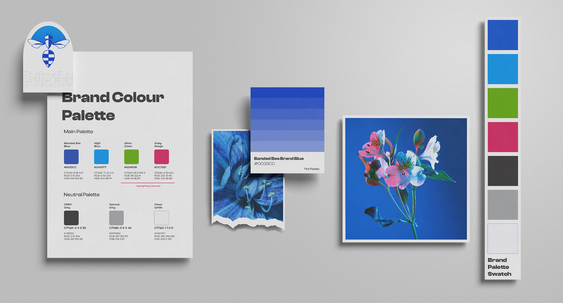
colour palette
This brand palette is representative of a futuristic & bold colour scheme; utilising the opportunity to name the hues I've increased individuality & thoughtfully came up with such titles.
Although not immediately obvious to all users, some titles have double meanings. For example, 'Slime Green' represents the colour of slime, but another meaning of the word 'Slime' is somebody you consider a close friend, even family. An attribute I'd like to bring into Ruby Lu Studios' work environment or "hive", if you will.
Maintaining the integrity of the Blue Banded Bee, the main brand colour is a royal blue.
Such a rich colour speaks loudly against most other colours and textured backgrounds; as well as being associated with trustworthiness, reliability, authority & strength (The Designer's Dictionary of Colour, 2017).
'Ruby Rouge' is this brands highlighting hue & accent; used for drawing attention to important information or specific design features to increase the user's experience.
'CRBN Grey', 'Tainted Grey' & 'Ghost White' are the brands neutrals used for backgrounds & filling negative / white space in designs; rather than straight black or white to reduce designs feeling unfinished or dry.
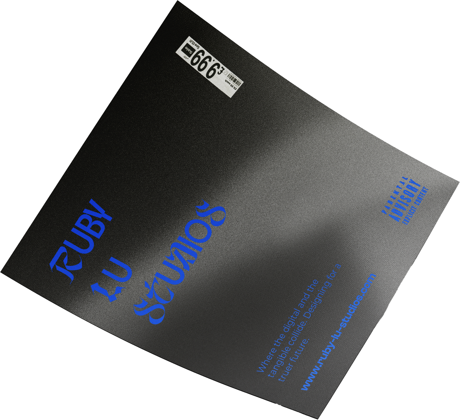
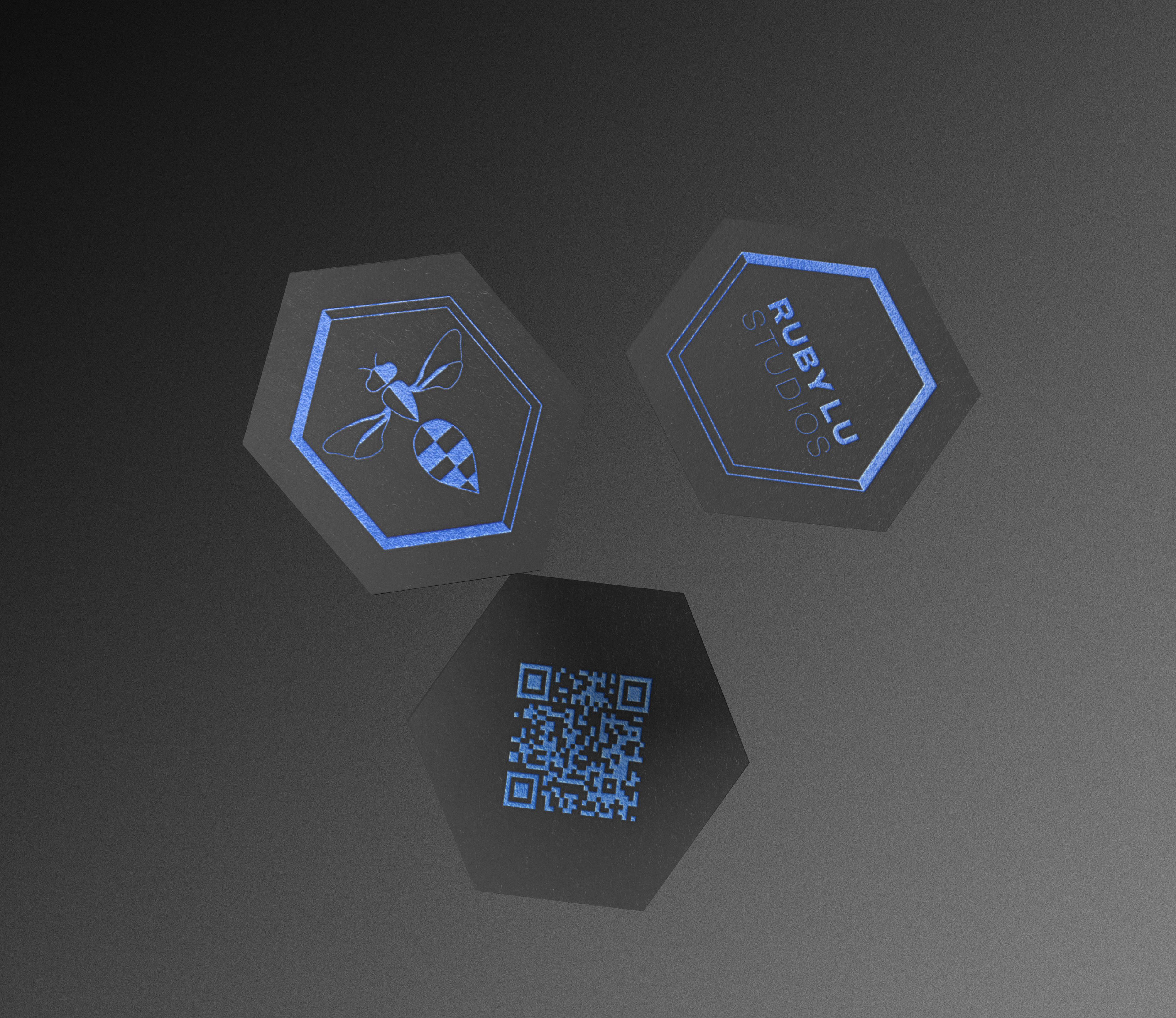
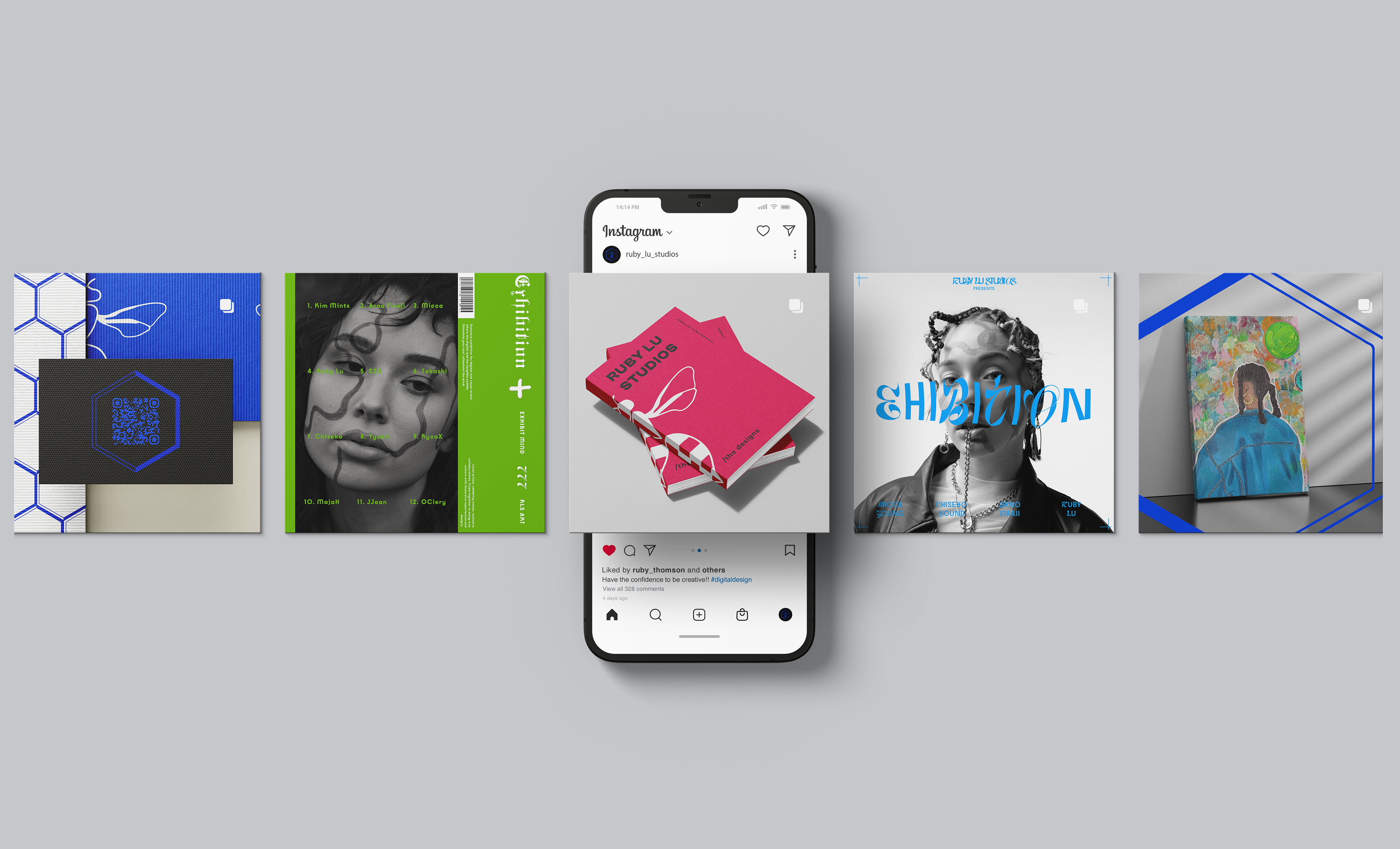
Business Card Design
My business card features two front designs: one showcasing the main logo and the other highlighting the type logo. Both designs are elegantly embossed in blue foil, lending a touch of sophistication to the clean aesthetic. The choice of blue foil is a nod to the blue chrome bands found on the Blue Banded Bee, while the hexagon shape represents the bee hive, symbolising concepts such as society, prosperity, community, and stability.
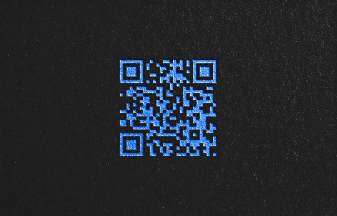
On the backside of the card, a QR Code links to my Linktree page, providing easy access to my contact details, social media profiles, portfolio, and websites. This streamlined approach ensures that recipients have all the necessary information at their fingertips, while maintaining the card's sleek and professional appearance.
social media
In this Instagram style, all brand colours are seamlessly integrated to stand out individually yet cohesively. Embracing a minimal and clean aesthetic, the focus is on reducing noise and allowing visuals to take centre stage in communication.
Inspired by the ambiance of an art gallery, the design ethos ensures that the work speaks for itself, while typography is employed sparingly as a subtle graphic element.
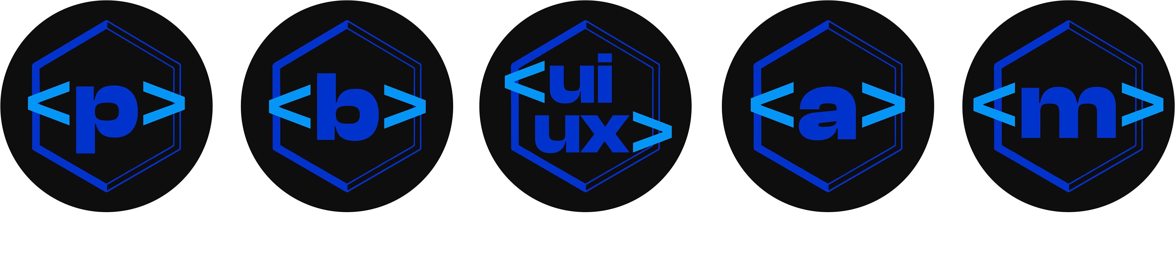
Iconography
Understanding that social media iconography brings a sense of character to a profile, I found it imperative I created my own whilst also taking the opportunity to bring in a taste of the brand.
With my personal passion for computer programming, a consistent element brought into my brand designs are guillemets. Representing the beginning of creation, such as divs in code.
user flow chart
Contact form input
Contact form input
Description about the paint points found and insights, and how / what solutions were made to address these pain points. Scrutinising the websites most streamlined flow chart allowed some insights into...
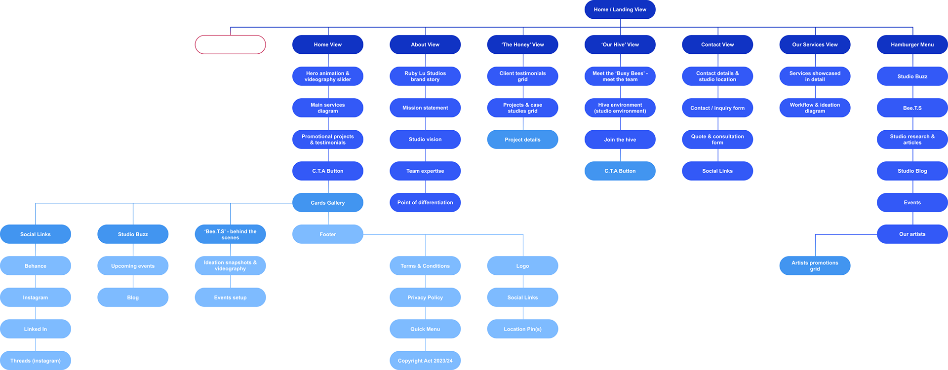
sitemap
The sitemap serves as a visual roadmap for understanding the user experience journey within the website. It enables me to visualise how users enter the site, navigate through various sections, and ultimately exit.
By using the sitemap as a guideline to build the prototype, I streamlined the development process and saved valuable time. This approach provided me with the clarity and mindset needed to focus on actualising the design vision efficiently.
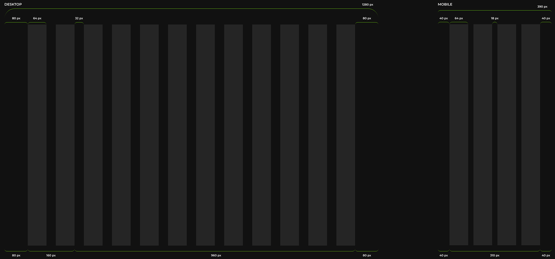
Grid System
Implementing grid systems (Josef Müller-Brockmann, 1981) has improved flow, visual hierarchy, alignment, and aspect ratios across multiple screen sizes. This systematic approach ensures consistency and readability while providing a flexible framework for responsive design.
In this design, I opted for a 12-column grid system with a 64px width, accompanied by 32px gutters and an 80px margin, tailored for a standard 1280px screen size. This layout cascaded smoothly onto mobile screens, which typically have a width of 390px, where the gutters and margins were halved to maintain consistency and readability across different devices.
user-centered site design
This website leverages the beehive as a visual metaphor for community, a core value for both the brand and the user experience.
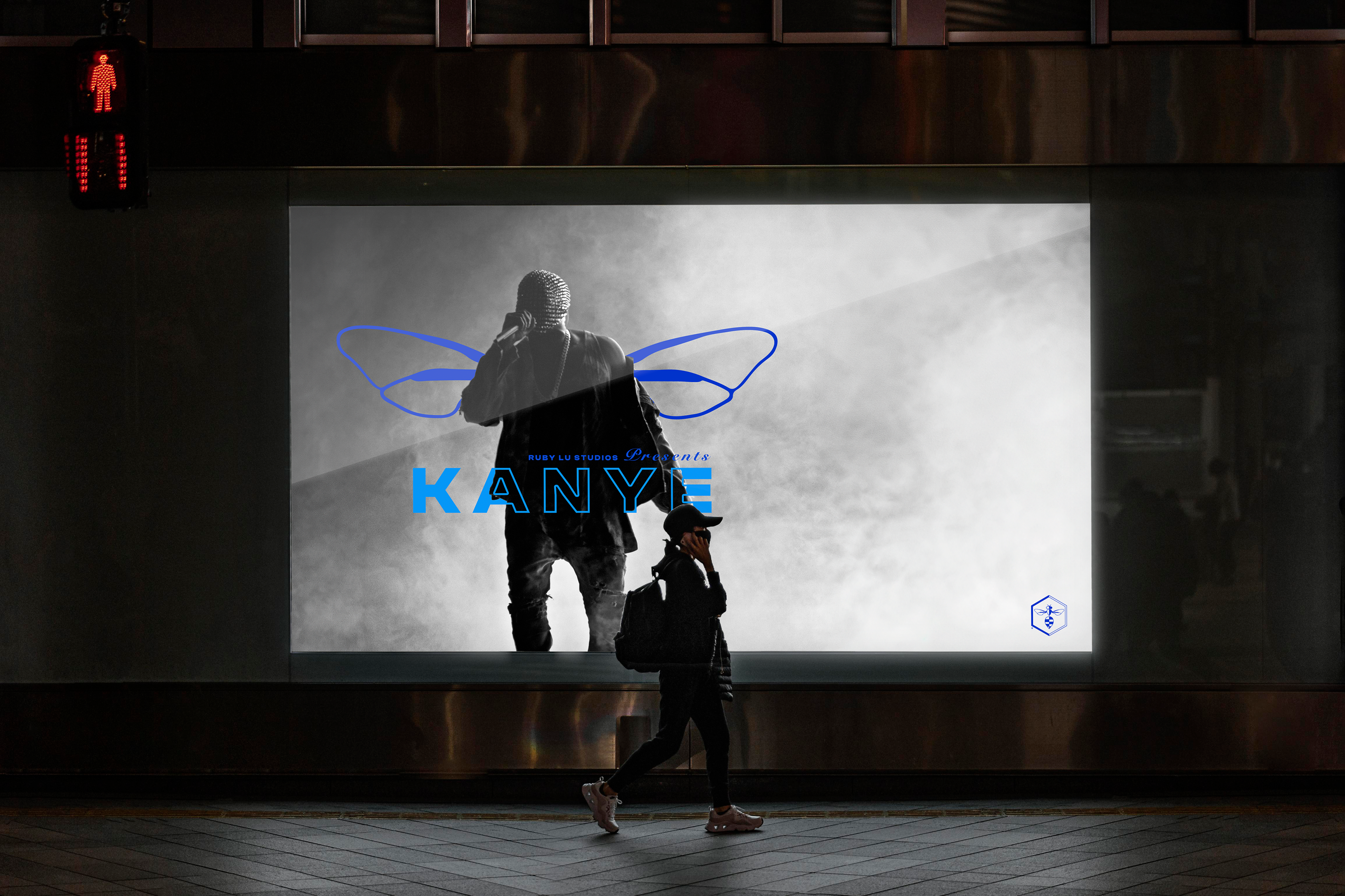
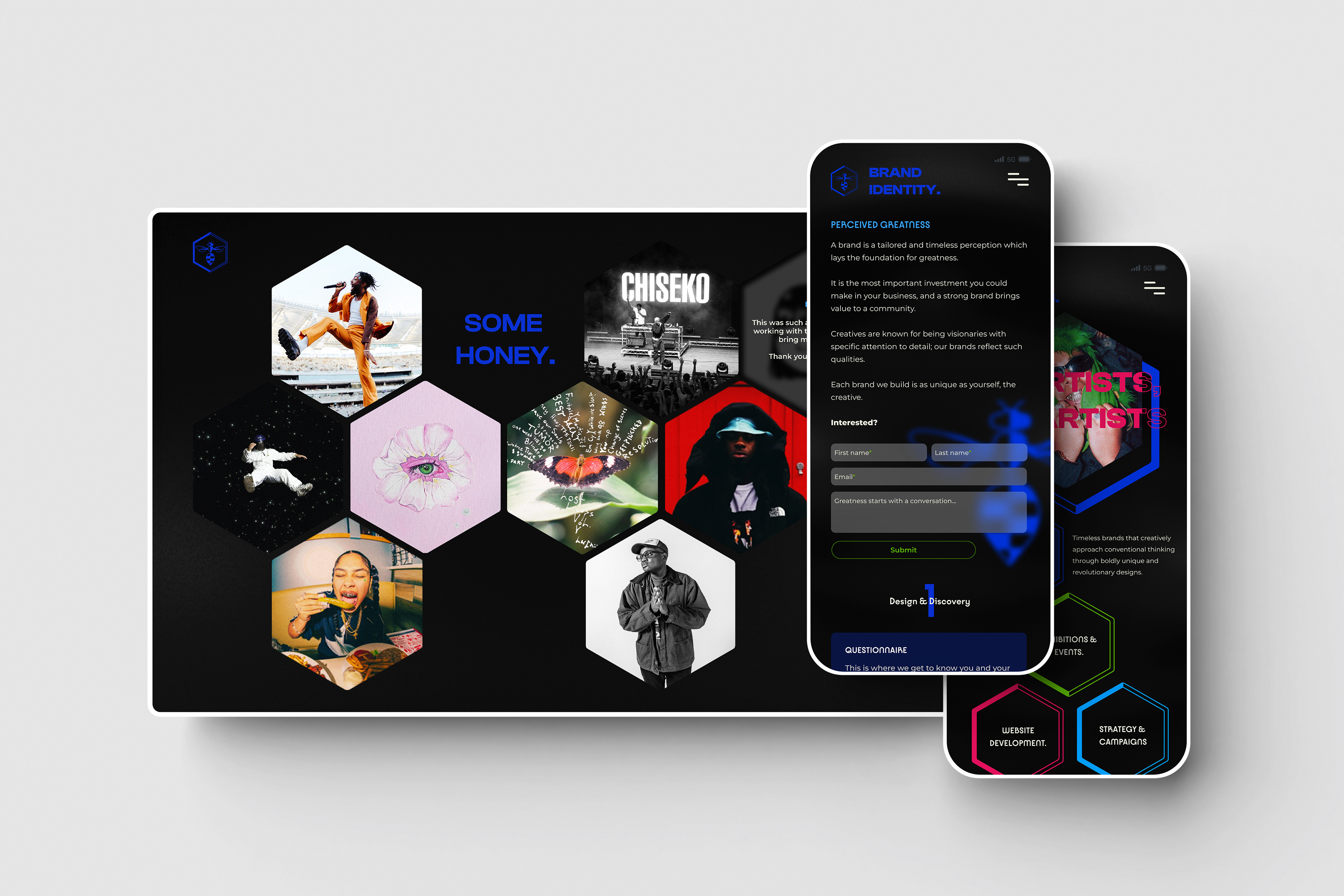
Hexagonal Hierarchy: The design employs hexagonal shapes throughout, mirroring the natural structure of beehives. This creates a visually striking and organised layout, particularly evident in the honeycomb grid showcasing case studies within "The Honey" section. A dark theme establishes a backdrop of elegance, allowing the vibrant typography and brand colour palette to take center stage. Clean lines and uncluttered aesthetics project confidence and clarity, ensuring a user interface that is both intuitive and effortless to navigate.
Interactive Exploration: "The Honey" section serves as a dedicated space for showcasing client reviews, previous projects, and insightful case studies. "The Hive" offers users a glimpse into the team and their creative environment through captivating photos from studio sessions. Subtle scroll and text animations add a touch of dynamism to the design. Hover and cursor animations further elevate interactivity, encouraging exploration and potentially extending user sessions.
User-Centered Philosophy: Every design choice, from the honeycomb layout to the user-friendly interface, reflects the brand's emphasis on collaboration and community. This user-centered approach fosters a unique and memorable user experience, a top priority for any creative professional. The design itself becomes an extension of the brand identity, fostering a sense of community around the brand.
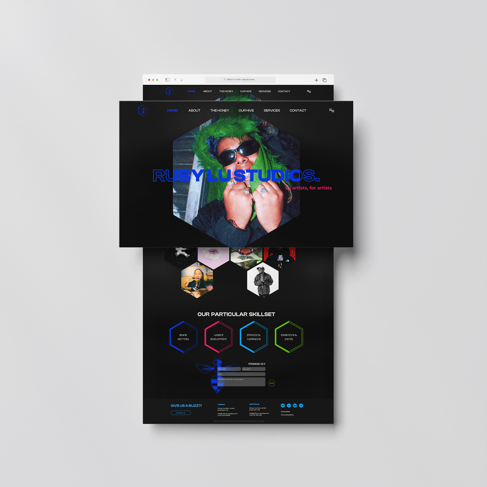
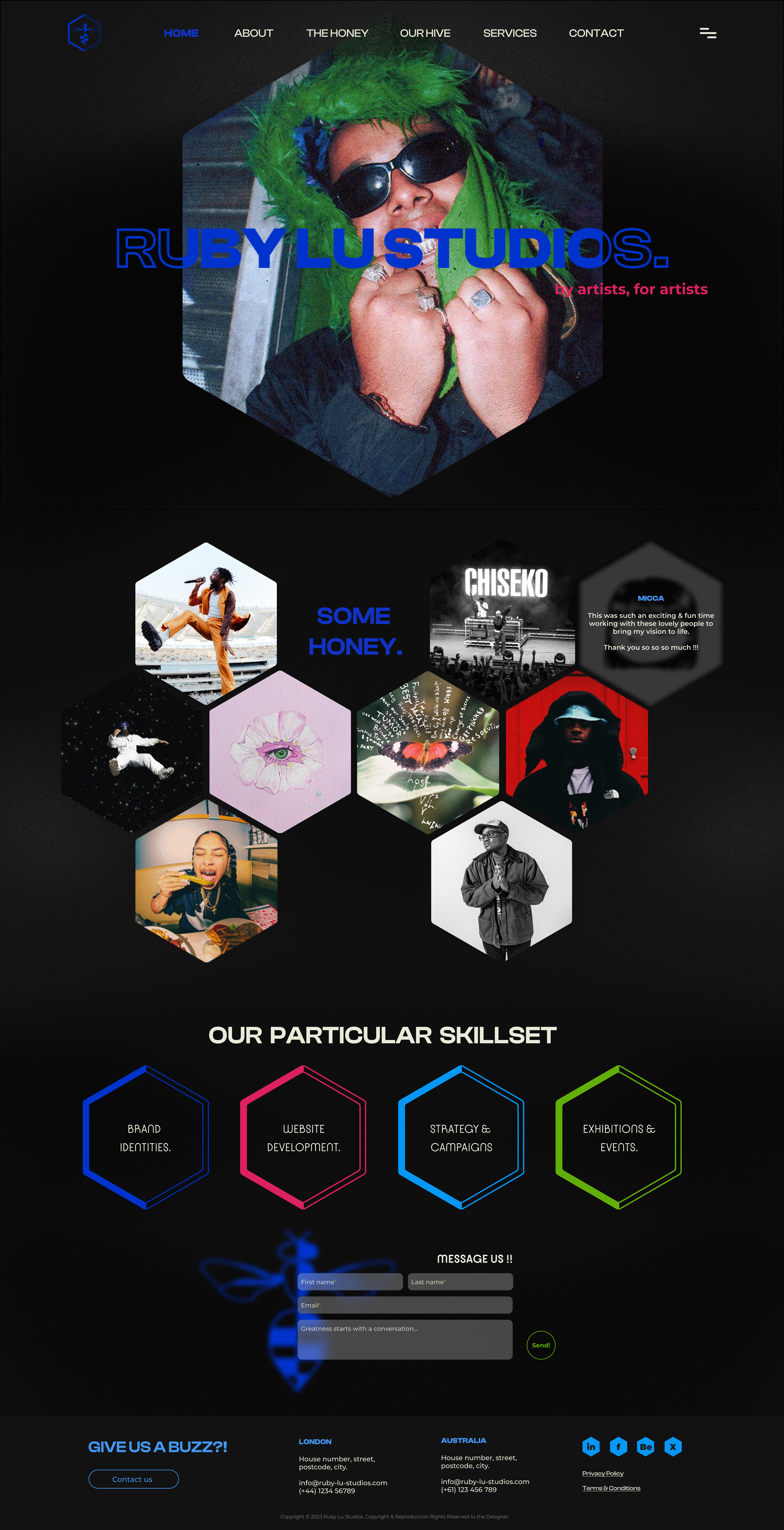
Home View (desktop)
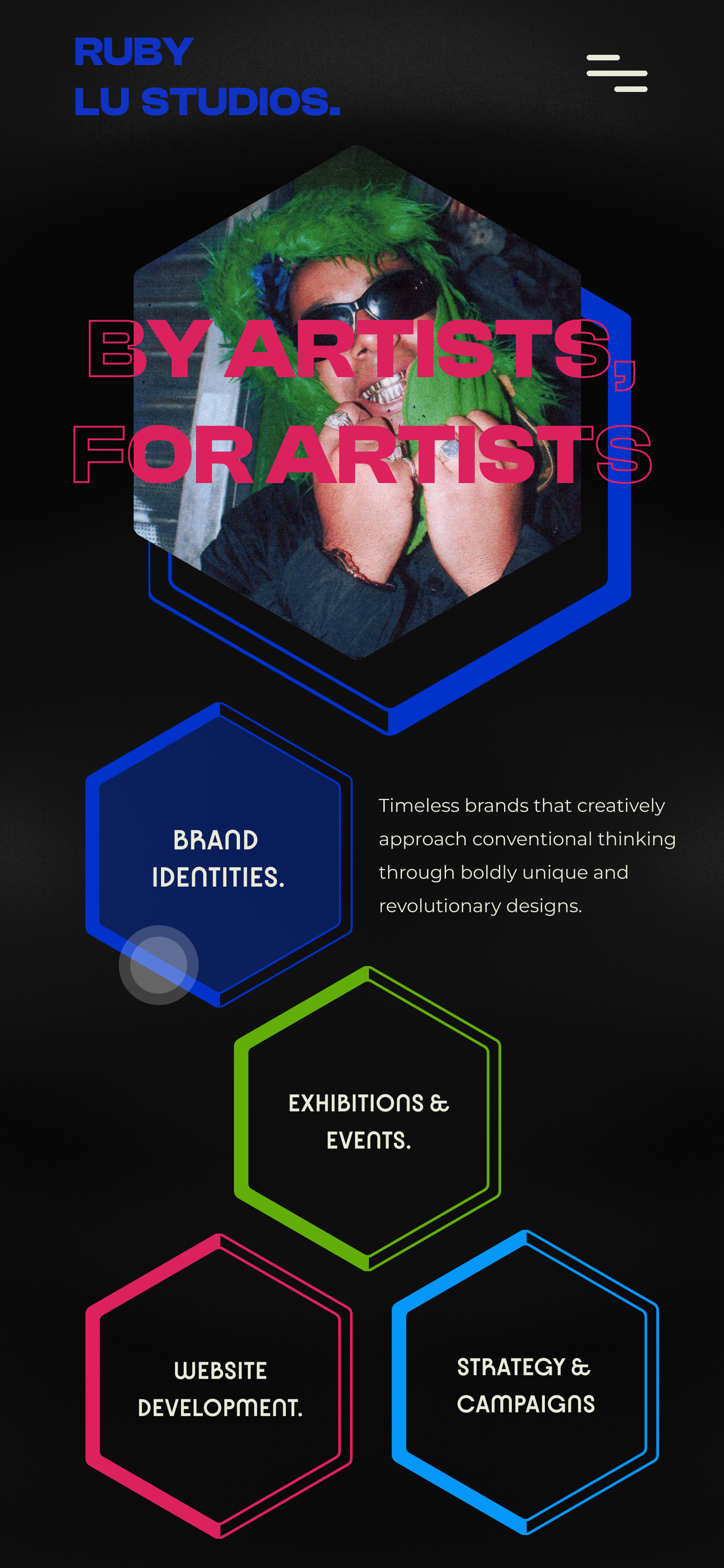
Home View (mobile)
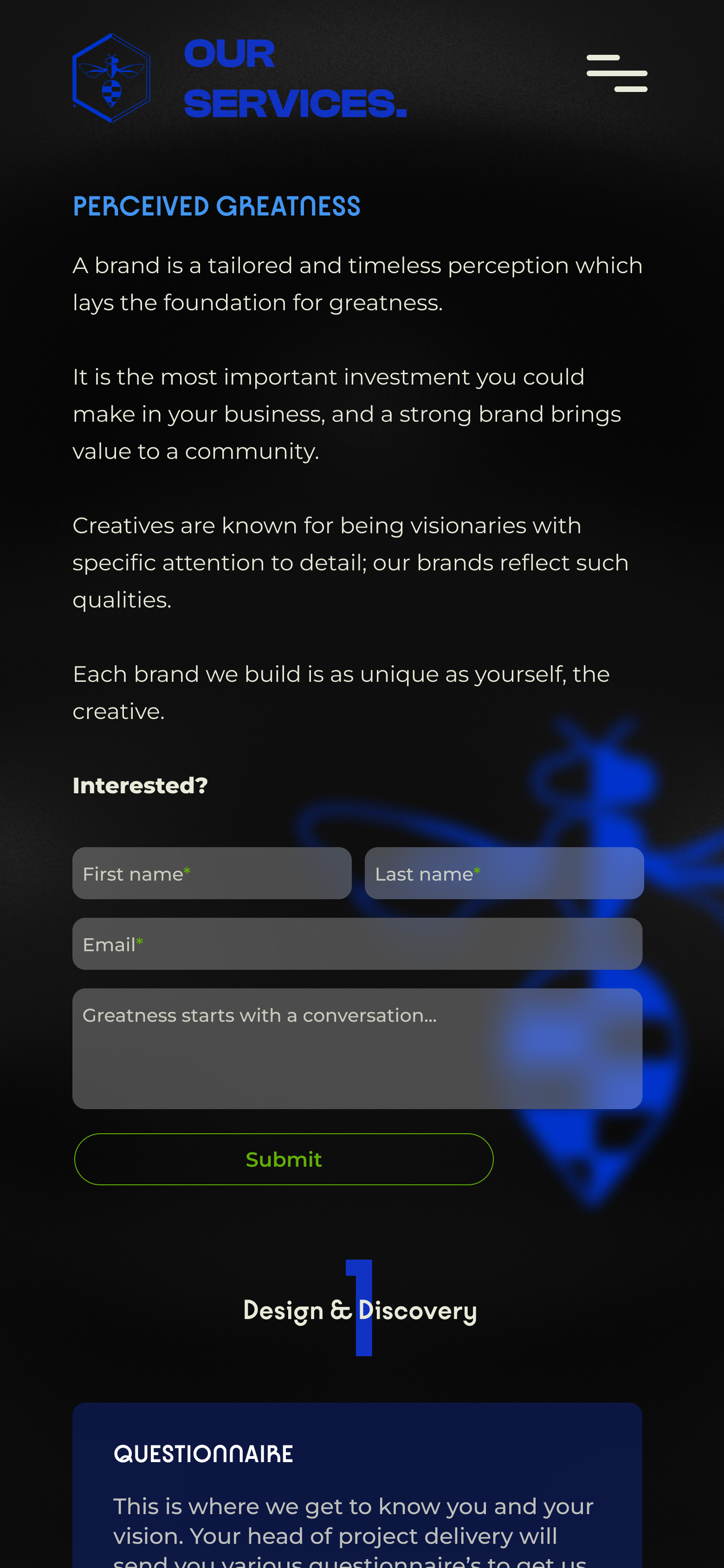
measuring success
Ruby Lu Studios is a dynamic space currently under construction, designed to be a captivating hub for creativity. I'm meticulously crafting a user experience that prioritises intuitive navigation and a visually stunning presentation.
To ensure this digital haven thrives, I'll be closely monitoring key metrics like traffic flow, session times, and click-through rates. These insights will be instrumental in refining the user journey and maximising engagement.
Success extends beyond functionality – it's about fostering connection. I'll be tracking form completions to gauge audience interest and measure the effectiveness of our calls to action.
Additionally, keep a watchful eye on brand awareness metrics like social media mentions and search volume increases. Ultimately, my goal is to cultivate a loyal audience captivated by the visual narrative I'm crafting, and empower them to connect with Ruby Lu Studios on a deeper level.