Design philosophy
Inspired by Lloyd Coenen's "Artists Freedom Formula," my website, "Ruby Lu Art," now reflects a harmonious balance between artistic expression and strategic channel design.
Drawing inspiration from Coenen's wisdom, my website encapsulates my creative journey while intricately engaging both art enthusiasts and potential clients through a thoughtfully crafted online presence.
Drawing inspiration from Coenen's wisdom, my website encapsulates my creative journey while intricately engaging both art enthusiasts and potential clients through a thoughtfully crafted online presence.
Channel Elements
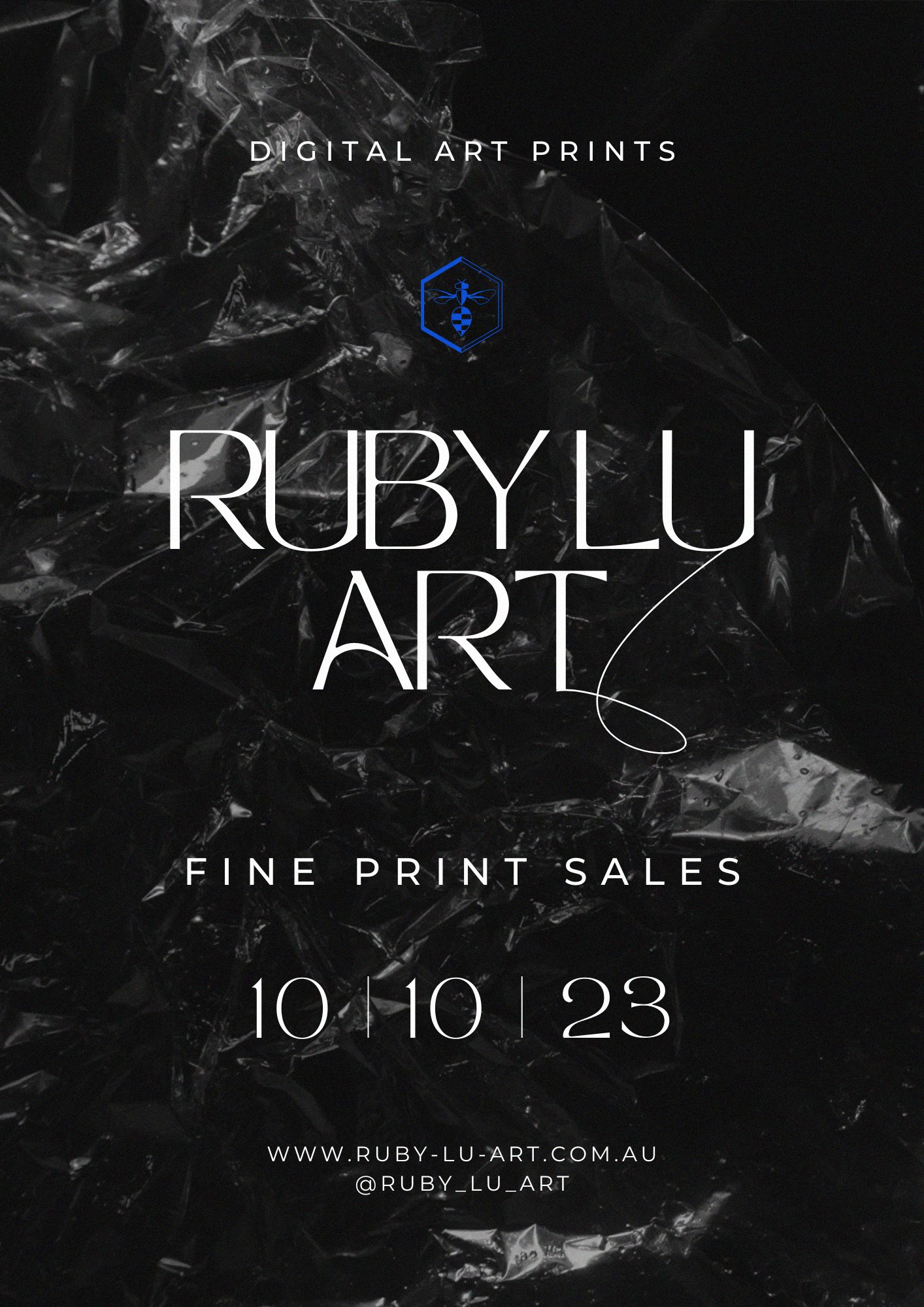
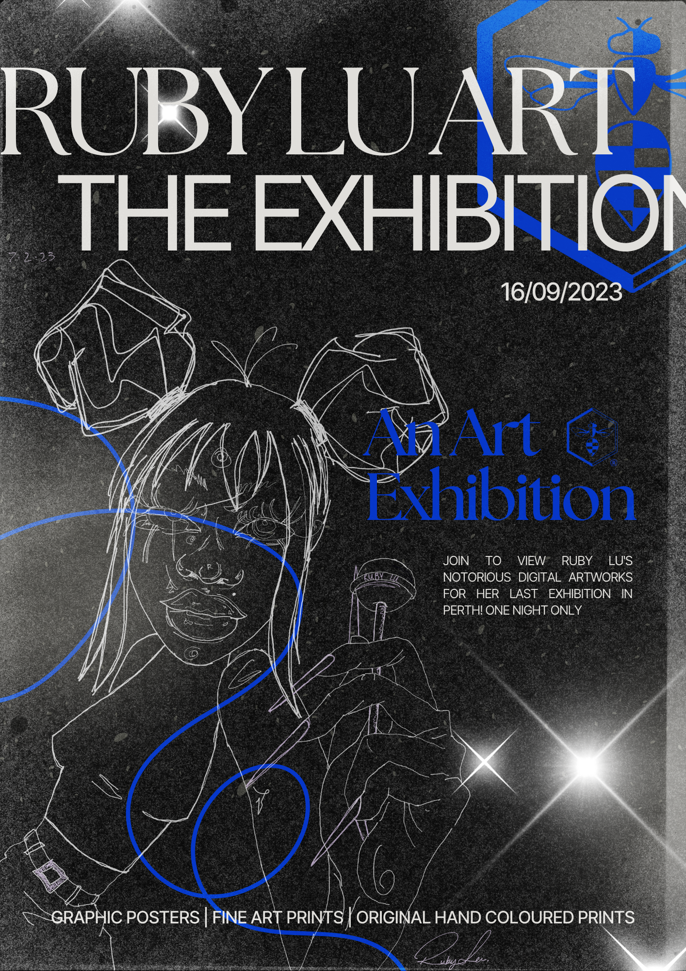
Website and Online Portfolio
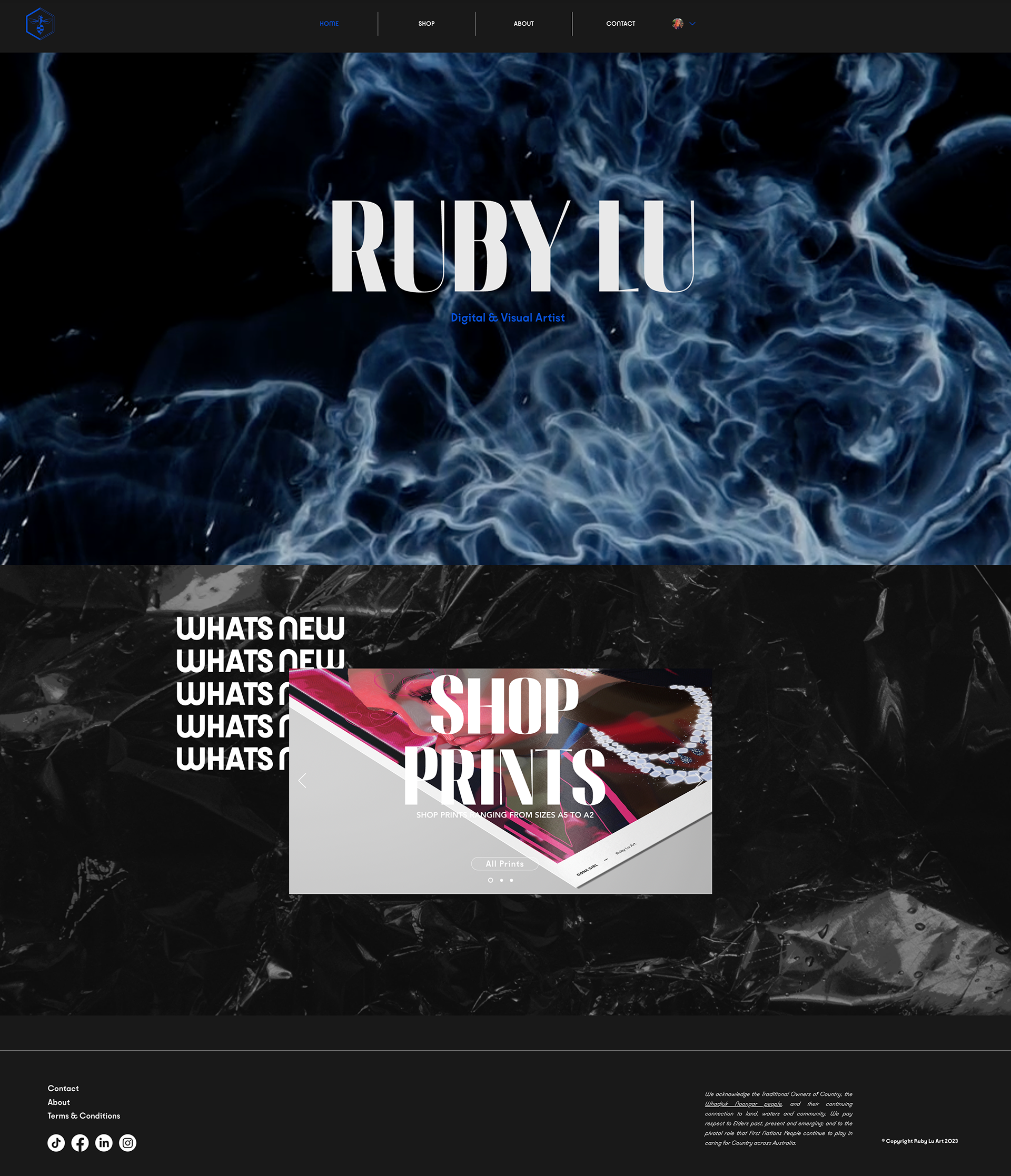
Inspired by Coenen's philosophy, each page of "Ruby Lu Art" becomes a canvas for immersive exploration of my artistic journey. The design reflects Coenen's emphasis on authenticity, offering a cohesive visual narrative that resonates with visitors.
Inspired by Coenen's philosophy, each page of "Ruby Lu Art" becomes a canvas for immersive exploration of my artistic journey. The design reflects Coenen's emphasis on authenticity, offering a cohesive visual narrative that resonates with visitors.
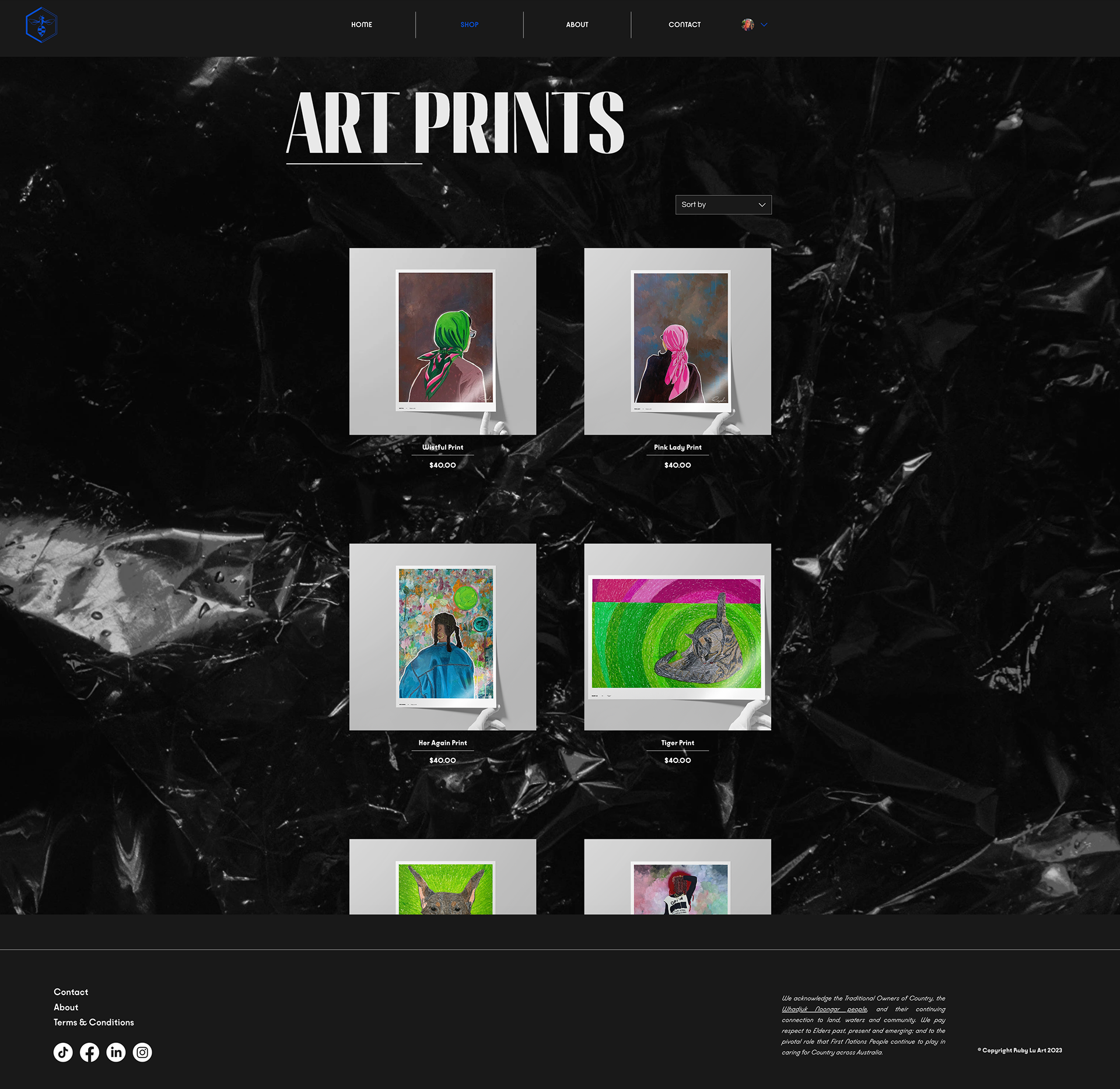
Online Store
More than just a transactional platform, my online store embodies Coenen's principles of artistic entrepreneurship. It empowers art enthusiasts to not only acquire my pieces but also participate in the spirit of creative enterprise.
More than just a transactional platform, my online store embodies Coenen's principles of artistic entrepreneurship. It empowers art enthusiasts to not only acquire my pieces but also participate in the spirit of creative enterprise.
Social Media Symphony
Coenen's vision of holistic artist branding finds expression in the seamless integration of social media platforms like Instagram, Twitter, and Pinterest. This allows me to connect with art lovers across various online channels, amplifying my artistic voice.
Coenen's vision of holistic artist branding finds expression in the seamless integration of social media platforms like Instagram, Twitter, and Pinterest. This allows me to connect with art lovers across various online channels, amplifying my artistic voice.
Sharing the Journey
Echoing Coenen's belief in the power of artist narratives, the blog and news section breathes life into my creative evolution. This platform aligns with Coenen's storytelling advice while fostering a vibrant community of art enthusiasts who embark on a shared journey of exploration.
Echoing Coenen's belief in the power of artist narratives, the blog and news section breathes life into my creative evolution. This platform aligns with Coenen's storytelling advice while fostering a vibrant community of art enthusiasts who embark on a shared journey of exploration.
Engaging the Audience
Embracing Coenen's philosophy of building a loyal audience, my website's newsletter subscription fosters ongoing dialogue. It reflects Coenen's call for nurturing long-term connections, transforming casual visitors into devoted art enthusiasts.
Embracing Coenen's philosophy of building a loyal audience, my website's newsletter subscription fosters ongoing dialogue. It reflects Coenen's call for nurturing long-term connections, transforming casual visitors into devoted art enthusiasts.
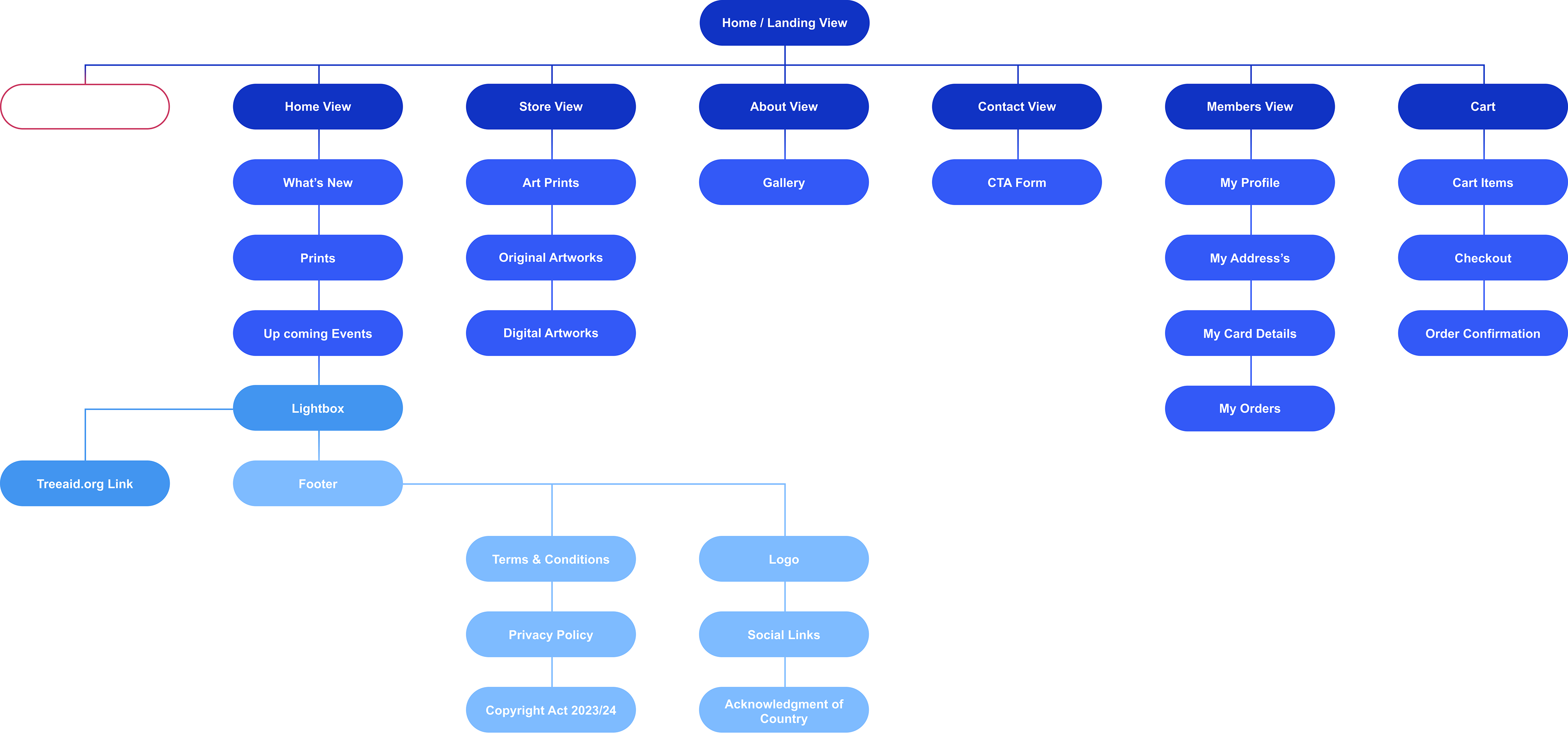
sitemap
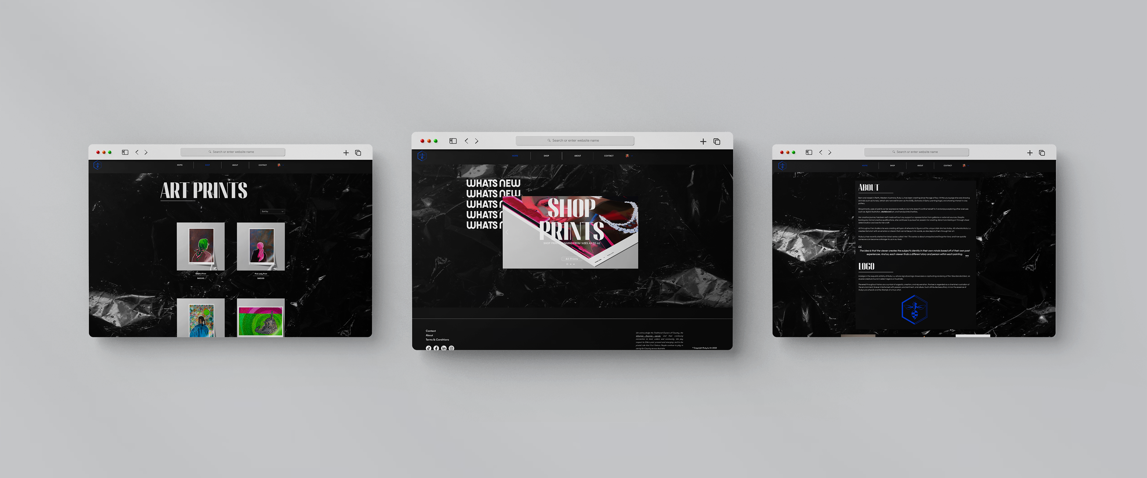
As a digital designer, I understand the importance of user experience in creating an effective online platform for showcasing and selling my artwork. This meticulously crafted sitemap outlines the structure of my art-selling website, prioritising a clear and intuitive navigation flow that caters to potential buyers.
Key considerations within the sitemap include:
Artwork as the Hero: The sitemap prioritises the presentation of my artwork, placing it at the forefront of the user journey. Dedicated pages for individual pieces, categorised galleries, and a search function ensure easy accessibility and exploration of my artistic portfolio.
Streamlined Navigation: The sitemap ensures a logical and streamlined navigation system, allowing users to easily find specific information such as artist bio, contact details, purchase options, privacy policies, and links to my social media platforms.
Intuitive Hierarchy: The hierarchy within the sitemap is carefully designed to guide users through the website in a natural and intuitive manner, minimising confusion and maximising engagement. The user journey is primarily focused on two key actions: purchasing artwork or contacting me directly through a readily accessible contact form.
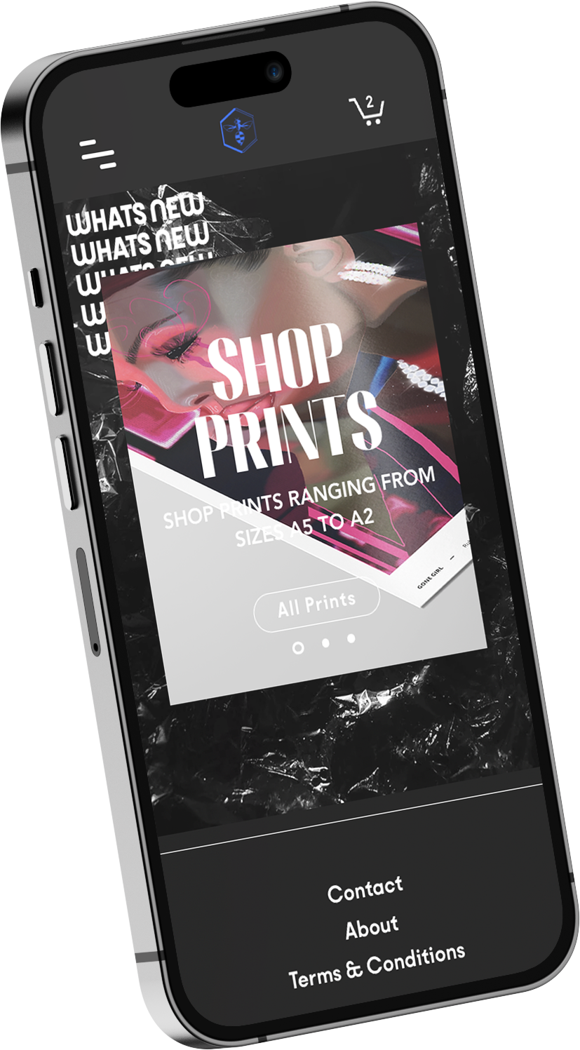
user-centered site design
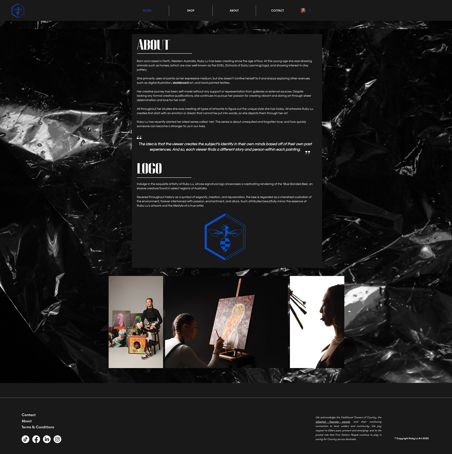
Exploring the unique landscape of my website, I take pride in its responsive design that dynamically adapts to various devices and screen sizes. Every element, from the meticulously crafted visuals to the intuitive navigation, has been thoughtfully tailored to ensure a captivating user experience. Through careful consideration of user interaction and accessibility, the design maintains its allure while effortlessly accommodating the diverse ways audiences engage with my art.
Embodying my design essence through its distinctive colour palette, user-friendly interface, typography choices, and unique graphics. These elements collectively capture my design style and personality, creating a space that reflects who I am as a designer, and as an artist.
Embodying my design essence through its distinctive colour palette, user-friendly interface, typography choices, and unique graphics. These elements collectively capture my design style and personality, creating a space that reflects who I am as a designer, and as an artist.
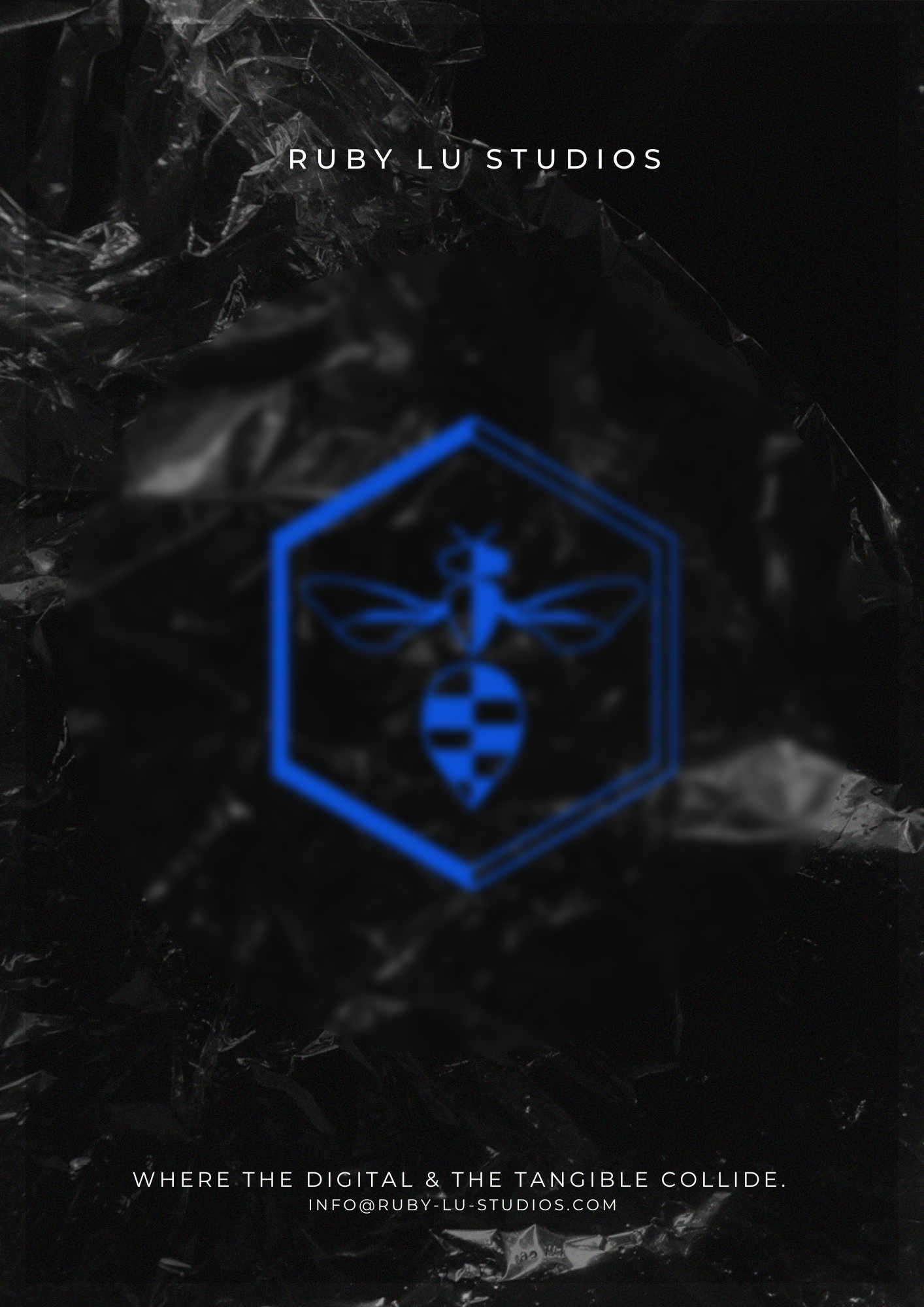
CRM Elements
Crafted with a touch of artistic finesse, the digital channel email concept for Ruby Lu Art & Ruby Lu Studios unfolds as an exquisite graphic poster, inviting users into a realm of visual opulence that transcends conventional promotions. With an air of sophistication, this design beckons to be printed at home, transforming any space into an artful sanctuary.
Measuring success
To achieve Ruby Lu Art's goal of cultivating a distinct and memorable brand identity that fosters customer loyalty and repeat business, we conducted research into measuring success.
Research Goal
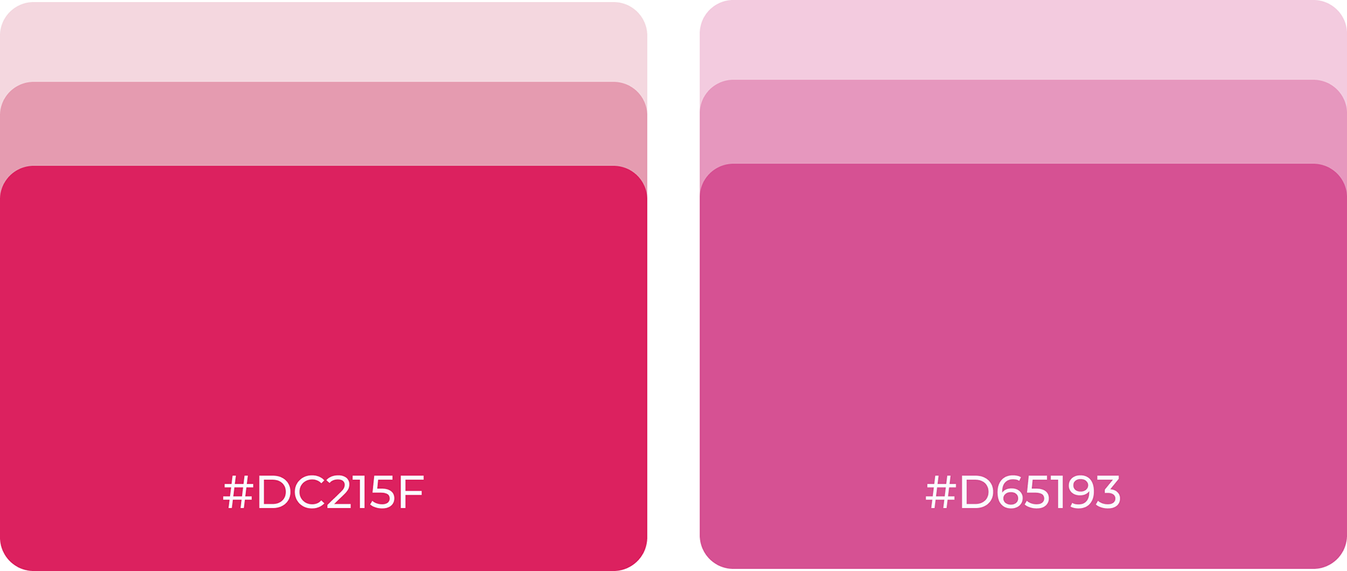
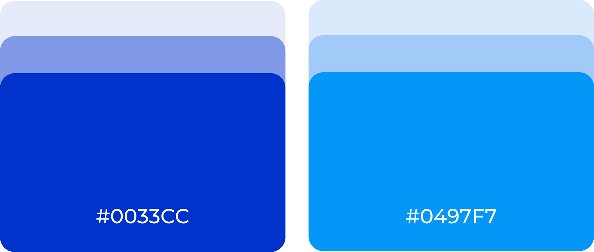
Shifting the website's primary colour palette from pink to a more professional and calming blue shade, aligned with current design trends, will lead to increased user trust and a higher perceived brand value, resulting in a rise in conversion rates
business value
By researching the impact of website aesthetics on brand recognition and return customers, we can gain valuable insights into how this website design is affecting the brand. This information can then be used to optimise the website's look and feel to create a more positive and memorable experience for users, ultimately leading to increased brand recognition and customer loyalty.
methodology
To understand the impact of website aesthetics on brand recognition and return customers, we can employed three research methodologies:
Usability Testing
Initial Impressions: This usability testing method involves presenting users with the website for a very short time (around 5 seconds) and then asking them to recall their first impressions. This helps understand the immediate visual impact of the website's aesthetics on brand recognition.
Comparative Analysis
A/B testing allows me to compare the effectiveness of two different website designs (e.g., one with pink and one with blue colour scheme) on real website visitors.
User Interviews
Overall, the blue palette seems to be more successful in attracting and engaging users, while also aligning better with the desired image of a modern and professional artist. However, the potential lack of contrast with the dark background should be considered for further refinement.
Key learnings & insights
Usability Testing
While the blue palette generally received positive feedback, further examination is needed regarding the dark theme's potential impact on readability and user experience. The hero image and video effectively capture attention; incorporating interactive elements within the hero section could further enhance user engagement. Additionally, the "clean" background texture was appreciated, but social media links might need adjustments to improve accessibility and encourage social sharing.
User Interviews
Overall, the blue palette seems to be more successful in attracting and engaging users, while also aligning better with the desired image of a modern and professional artist.
Pink Palette
Pros:
- Unique and aesthetically pleasing, offering a distinct visual identity.
Cons:
- Gave a strong Y2K impression, potentially feeling dated and somewhat out of touch with current design trends.
Pros:
- Unique and aesthetically pleasing, offering a distinct visual identity.
Cons:
- Gave a strong Y2K impression, potentially feeling dated and somewhat out of touch with current design trends.
Blue Palette
Pros:
- Users preferred the blue palette overall, stating that it "just feels better."
- Perceived as less amateur and more modern, leading to increased perceived professionalism of the artist.
- Maintained a simplistic yet expected artist website aesthetic with a fresh and modern presentation.
Cons:
- Some users found the blue didn't quite contrast against the dark background as well as the pink did, potentially hindering readability and visual clarity in certain areas.
A/B Testing
These findings suggest that the blue colour scheme is more effective in engaging users and driving traffic to the website compared to the previous pink palette.
Increased User Engagement: The significant increase in average session time (25.09 minutes) indicates that users are finding the website with the blue palette more engaging and are spending considerably more time exploring it. This suggests that the blue colour scheme is more effective in capturing user interest and keeping them engaged with the website.
Higher Website Traffic: The 40% increase in website traffic demonstrates that the blue palette is more successful in attracting new visitors. This implies that the blue colour scheme is more visually appealing and draws the attention of potential visitors, leading to a higher influx of traffic to the website.
Solutions
Possible solutions to implement:
- Conduct further testing to assess the impact of the dark theme on user experience and readability.
- Explore alternative hero image options that directly showcase your artwork.
- Consider incorporating interactive elements within the hero section to encourage user engagement.
- Evaluate the position of the social media sharing links/buttons, and explore alternative position choices if necessary.